
This article is a summary of the animated data visualizations I’ve created for UEFA Euros 2020, Copa America, Tokyo 2020 Summer Olympics (fencing, swimming), 19th FINA World Championships Budapest 2022 (swimming), Beijing 2022 Winter Olympics (ice hockey), Handball World Championship 2021, Roland Garros and Wimbledon 2022 (tennis).
Fencing, handball, and soccer results by using the same chart type

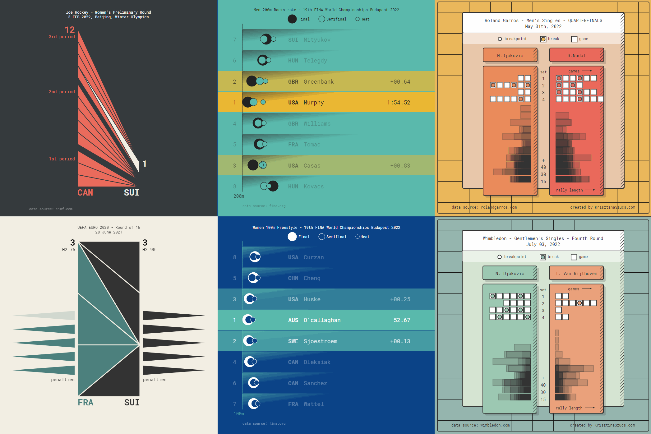
This “timeline triangles” visualization (thanks for the name, Neil Richards!) gives a recap of the match and shows the order in which teams scored. This works for several sport disciplines when teams or individuals win by scoring goals or points. When I used this chart type for different sport events, I always added small modifications to make sure it works with the actual sport discipline.
Handball – A team can score 20-30 goals in a match and the two halves can look very different. I divided the chart by half time and the Norwegian team helped showing the strength of this chart type by turning around this gold medal match in the second half.

Ice Hockey – Sometimes one team is winning the match easily, crushing the other team. As the losing team is falling behind, you can observe that only one side of the visualization is building up, highlighting the difference clearly.


Fortunately, most matches are not so one-sided and the losing party can even make a come back after falling behind by many points. The slope shows which team is currently winning and by how much.


Soccer animations will always seem quite simple compared to a handball match because of the low number of goals (0-3 goals per team is pretty common).


Penalties – When teams score the same number of goals during the match, penalties (soccer) or shootouts (hockey) can happen. I added triangles on the sides to represent these penalty scores. A penalty can be a score or a miss, so basically, it’s a binary true/false value. Since 0-0 is not a rare result in soccer, the penalty triangles create can big unused gap showing the missing goals. See the third image for an example of this case.


Fencing – In most sports teams can’t score in the exact same second. There is always a clear order who scored first. Fencing is an exception to that rule, as the two opponents can hit one another at the same moment in which case both get a point at the same time in the animation as well.

Swimming
During a swimming event athletes swim three times: a heat round, a semifinal, and a final if they are in the top eight.
It’s also less important how the other athletes are doing in the pool; athletes are rather competing against themselves and want to swim their best time. So one athlete could have up to three swim results per event and it helps to compare all these results (heat, semifinal, final) in the same animation.
The dataset contained only the split times, but I did add a little easing, since I wanted the dots to be a little faster as if they would “push” themselves from the side of the pool.


For some swimming events there are no semifinals. The final happens after the heats. 800m Freestyle is one example for this.


Tennis
Tennis scoring is very complicated, it’s also difficult to visualize all details that goes into a set.
This visualization focuses on the sets and break (on the top) and gives a quick glimpse into all points, rallies and lost break points that defines a match.
Roland Garros Final was an easy match for Rafael Nadal: straight sets and Ruud won only four service games during the match.

Wimbledon fourth round match between Goffin and Tiafoe shows a close and exciting match with a few break points, three tie-breaks, and five sets:

Swiatek won in straight sets in Roland Garros final and semifinal too, barely leaving any games for her opponents.


Full galleries
Soccer championships – UEFA Champions League

Copa América – South American Football Championship


References
“Timeline triangles” were inspired by Basketball Tower Charts (Andrew Garcia Phillips, Chartball.com)
Swimming visualizations were inspired by Replay: Ledecky 800m Freestyle created by nytimes.com.

Krisztina is a Budapest-based Data Visualization Designer. Her background is in Graphic Design and she has been creating data visualizations since 2012. Her primary focus is data visualization but she also practices UI and UX design. She won an Information is Beautiful Award in 2019 for the experimental chart creator tool PlotParade.com.
- Krisztina Szucs

- Krisztina Szucs


