
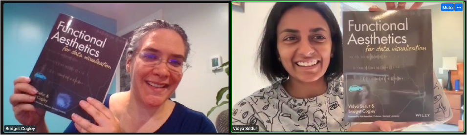
If you ever wondered how to make a visualization or a dashboard that’s beautiful and functional at the same time, then read on. I had the pleasure of chatting with Vidya Setlur and Bridget Cogley about their new book Functional Aesthetics for Data Visualization that just came out in the UK and in the US in September. It was a delight to learn about the behind-the-scenes work that make this new book so unique and not “yet another book about charts” #findthefiat.
Noëlle: Hello, Vidya and Bridget! Tell us about your background and what you do in the data visualization world.
Bridget: Hi! I’m Bridget Cogley, Chief Visualization Officer of Versalytix. I’ve been involved very passively in DVS as well, which I joined early on when everyone was like, “Hey, let’s get everybody together!” I have a lot of experience in the practitioner space of data visualization. I came into this journey organically, coming from American sign language interpretation.
I had to go through some learning curves to find my space and the value that I added. I’m not a computer science major, and I do not have one of those more conventional paths that you typically see. I found my superpowers when I realized: “this is what I can do, this is why visualization works, and why it’s really fun.”
Vidya: Hey! I’m Vidya Setlur. I head Tableau Research, and I’ve been at Tableau for almost ten years now. Prior to that, I was at Nokia research. I’ve been working in an industry research lab for about 17 years. I graduated from Northwestern with a Ph.D., and like Bridget, I didn’t have a data visualization degree per se. My background is in natural language processing and computer graphics, which essentially means that I’m interested in understanding the semantics of data, user intent, and how that helps inform how we could meaningfully depict data or information to the user.

My work with visualization started with maps, and you’ll see plenty of examples across the book with maps. I think maps are an inspirational form of visualization. The map community has been ahead in thinking about how best to represent a map to help a user navigate a particular task. So that’s my background.
Noëlle: It’s very common that many generations of data visualization folks did not have a visualization degree per se. Can you tell us more about how you got started?
Vidya: To be honest with you, it happened by accident. Nokia Research eventually shut down, and I was looking for a job. I reached out to Pat Hanrahan, who is a professor at Stanford and who has been my mentor over the years. He said that Tableau was thinking of starting a research lab headed by Jock Mackinlay, who is a technical editor of this book. That is where my journey began ten years ago. I think that with my unconventional background, I have brought in a fresh pair of eyes. I have learned a lot from the academic community and by watching expert practitioners like Bridget in their craft.
Bridget: For me, it started at a startup. I was working in the industry, managing and training interpreters. I did a lot around ethical advising, so when people would get into sticky situations, I would advise and mentor them through it. I ran into a situation where we needed some reporting, so I started out with Excel and learned how to do analysis in a form. This solution was not scalable. We needed something enterprise-level because we were servicing hundreds of hospitals. We also needed something real-time so that when The Joint Commission jumps in for an audit, they can see that each person had an interpreter at specific times. We started on this long journey in 2010, looking through a lot of solutions. We finally picked Tableau because we could deploy it on mobile and tablets. I really liked that process. I left that to go consult, and I enjoyed taking everything I’d learned and distilling it down into something actionable.
A lot of my training was hands-on. It was about “how to make things look nicer.” And I found Kelly Martin‘s work very early on. That was the first time I realized that you could make charts that aren’t ugly. Charts could be meaningful, beautiful, insightful, and not deceptive. That theme comes in the book quite a bit, and that was my realization that transformed how I did the work.

Noëlle: We can clearly see this encounter between the practitioner and the research sides. Together in the book, you talk about making beautiful and meaningful charts. Tell us how this book came about.
Bridget: Pat McCormick had reached out about two Tableau User Groups that were happening all in one day in Wisconsin. Because they were back to back, I could come to one and then drive to the other. So my husband and I got in our teeny tiny Fiat and drove to Wisconsin. Vidya was the first act up, and she went through her talk which to me felt like “the other side of the coin” to my talk.”
My talk was about The Logic of Dashboards. How to put charts together in a meaningful way so that other people could make heads or tails of them. I was lucky in that I got to watch Vidya go first, and then play off all her insights.
It was so exciting because I had all these theories, but I had no proof. And here was the proof, presenting and saying, “no, no, no there’s research. And this is how we do it better.”
After the first talk, Vidya agreed to ride with us to Milwaukee. She sat in the back of a Fiat, suitcases on one side, smiling and happy. We were chatting away about all the things we thought about data visualization.
Vidya: Yeah, that’s my favorite story! I will preface this by saying that it was my first Tableau User Group ever. I really had no expectations and was actually worried that the topic of my presentation may have been a little off base because I was talking about the role of semantics and colors. When Bridget came up, I also found her talk being “the other side of the coin.” I was like, “wow, this here’s another woman who is really thinking beyond the chart and getting to the meaning of the data.” And it’s funny how for a practitioner, research is proof, but for a researcher, practice is proof. You can write ten different papers, but if there’s no adoption, what’s the point? So our perspective of proof is actually from the other side, and that’s how the two of us ended up working well together.
“And it’s kind of funny how for a practitioner, research is proof, but for a researcher, practice is proof.”
It turned out, Bridget and I, beyond just the topics we share, are both vegetarians and love Indian food. I truly believe that food is something that brings people together and that was one of the first instances where we came together, and talked about the topics. Long story short, COVID hit us, and the presentation that we initially planned to give together at the Tableau Customer Conference did not happen. Instead, we wrote a book proposal and Wiley picked up on it.

Noëlle: Let’s pause here and talk a little bit about the cover.
Vidya: I think this is a really great way of portraying our story. You have the little blue Fiat on its journey where we’re having this conversation. You see the little conversation snippets there. And the background map with Indian restaurants we were searching for as we were driving from Madison to Milwaukee. And this is what really catalyzed the making of the book.
Bridget: The visualization that you see on the cover has been made in Tableau. It is a real map with actual data, and it is actually based off of a visualization I made. I feel like the cover is a meta way of pulling everything together. You’ll also find the Fiat on the cover. I’ve made the Fiat hashtag because we wanted a data visualization book that didn’t look like other books, and that’s not just about charts.
Vidya: I have threatened Bridget that they shall not sell the car.
Noëlle: I think if you sold the car, the #findtheFiat hashtag would have a very different meaning 😉
What a beautiful story! It is fascinating to see how the idea of a book came about from a Fiat trip and a shared meal. Speaking of meals, can you tell us about the bento box model that we see in the first chapters of the book?

Vidya: I think the bento box is a great metaphor to impress upon the aspect of space, place, and intentionality. There’s a reason why certain containers in the box are placed in the center, why there are adjacent containers to the main one that are much smaller and to the side. Each of those containers plays a role in creating this visceral experience around a meal. The main entrée, the sauces, the wasabi, and the tempura really compliment and support the main dish. They all play an important role in that meal in terms of adding to the flavor and the person who’s dining.
And to me, the dashboard is that metaphor. You have these charts all interacting with the user. Some play a bigger role in conveying a message, but all the other components of the dashboard support that role, whether it’s a filter widget, a text that describes or contextualizes that message, a legend that explains the colors and the icons that are going on. Everything comes together to provide a holistic experience.

To us, the bento box is a useful metaphor to help people relate to what we are trying to explain in the book, which is this notion of functional aesthetics of bringing perception, semantics, and intent to work together as a whole in providing beautiful and meaningful design. And at the end of the day, I would argue that the Bento box is a beautifully designed artifact.
Bridget: To Vidya’s point, the bento box is a beautiful work of art just by itself. You really look at how it’s designed and the proportions that are in play with it. The food is carefully placed in a very specific shape, in a very specific location. There’s only a certain amount of food that goes in each item, and it’s all very beautifully arranged. Color also plays a role. You look at the right of the bento box, and the food you’re putting into that ends up being the white of the rice. Here, you’ve got the green of the wasabi. Generally, you don’t have anything that’s of the same color red. And if you do, it’s only in one party. The presentation and the experience of working through the box make the meal, and it all matters.

Noëlle: That resonates with me, and hopefully to our readers as well. Who would have thought that a bento box’s content would have way more functionalities than containing our food in a well-organized way? The title of your book, Functional Aesthetics for Data Visualization, carries a lot of meaning. But then, if you flip the book, you read this is not another book about charts. How would you describe what the book is about? What are the different pieces or concepts that you report, and how do you help the reader tie them together?
Vidya: That’s a deep question. We found out as we were writing the outline of this book that there are a lot of books that focus on visual perception and kind of the prescriptive advice, and best practices around chart creation. Our goal was not to compete in that space, but to identify the opportunity, or rather the missed opportunity that the field of data visualization hadn’t really thought about.
We wanted to bring out the semantic elements that are being thought of as the underlying message in an interactive medium. As Bridget and I come from different backgrounds and did not start in data visualization, there was this richness around topics that found synergies as we were writing our chapters together.
I personally found a lot of the background that Bridget brought to the table from ASL and language systems in general, to be very synergistic. In computational linguistics, you understand the notion of pragmatics, context, and grounding a conversation–how the use of space, gestures, and placement bring that language to life.

In this book, we did acknowledge visual perception, but we also had a different spin on it.
We drew inspiration from art and other various cognitive psychology tests, like the Stroop effect, where the color and the word really matter in terms of how we process information. And then we got into the semantics and intent piece. Finally, we bring all of that together and provide a set of guidelines or heuristics for someone to be able to take action with.
Bridget: As a practitioner, I found there were a lot of resources on how to build a better chart, to reduce, and refine. What I was really struggling with was that composition piece. Like when you’re learning a new language; you don’t want to just learn the vocabulary but also the grammar. We have different words for things; we also have different cultures for how we present things. Those were the two things I felt like I was missing: the grammar and the cultural lens through which to put this.
Through the book, we address the perceptual piece quickly. We also spend time with semantics, which is a hidden system. To me, it is the answer to “how do you put all this together in a meaningful way?” It’s that missing puzzle piece for understanding how charts flow together, and how they’re not just charts on a page but charts that make greater meaning together.

“It’s that missing puzzle piece for understanding how charts flow together, and how they’re not just charts on a page, but charts to make greater meaning together.”
The final piece is intent. Am I writing to convince, to entertain, or to inform? All of those require different approaches that we spend years learning in school. And when I look in the data visualization space, there are certain topics that are fragmented, and different people who bring pieces and parts of these ideas. Working with Vidya, I added rigor to some of the ideas I had but didn’t really have good language for. I was also able to take advantage of a lot of the research that’s out there.
There are a lot of people researching parts of this. We talk about the Stroop effect. That is when you’ve got red, yellow, blue written in words, but red is colored in blue and yellow colored in black, and then you have people either read or tell you the color, you see that people struggle and that’s because it’s a cognitive burden. The word and color don’t match. Well, we do that all the time in data visualization, and these are the ways that we create unintended friction.
In this part of the book, we start to address this: “These are the things that you think you’re doing, but this is what the actual intent or the effect is.”

Noëlle: Before you had encountered each other and started the adventure of this book, how were you dealing with the missing research or practitioner pieces in your work? What’s changed? Many of the people who read the book would either be researchers or practitioners, and they might identify themselves with your practice before and after the book.
Bridget: From a practitioner angle, I was working off of what I call spitballing. I have all these ideas I think are true, but I didn’t necessarily have a lot of proof. I would still do some research on certain topics, but what I found felt a lot like prescriptive advice, which didn’t always feel right. So before the book, I would have what I’d call bad behavior. It’s like breaking the rules that have been set out for me. I had a whole process that I effectively borrowed from interpreting where I’m looking at the intent and the tone. I’m looking at what we call a register – which is a big part of the book – and then I’m trying to express these things.
For me, a portion of this was already there pre-book, and you can see that in my blog, in some of the experiments where for instance, I’d investigate what effect color has, then would go through and make the same visualization I felt was good. But again, it didn’t feel like I had that rigor or that proof, or the scale and the repeatability and sometimes the “why” behind things. After the book, I’ve particularly been bringing text back in my charts.

Vidya: I think for me, a lot of my research focused on using natural language and computational linguistics algorithms to either process information, like create more sensible coloring, codings, or icon codings for data visualizations or creating natural language interfaces so that people can interact with their data through language.
However, in the process of writing this book with Bridget, I was able to uncover a greater degree of applicability of my research and my collaborator’s work in areas beyond what my papers had initially focused on. So, for example, when we were working on the chapter on semiotics, which is a study of symbols, it was really insightful to see Bridget listening to my rhetoric around semiotics and show me a dashboard by Kelly Martin, which essentially brings whatever theory and research that I was talking about to life through a concrete example. Her use of icons to show flights and crashes using splashes of visual marks was not only creative but also spot on.
I encountered multiple examples like this throughout the book where I would have a certain example that I would bring in from my paper, and Bridget would supplement that with practitioner examples that she personally had crafted. Or, inspiration from people like Kelly Martin, that really opened my eyes in terms of what the practitioner community is already thinking about without necessarily going through the academic rigor of publishing.
Noëlle: You talk about balance and there is this triangular visual that recurrently appears in the book. It seems to indicate how the topic being addressed is more from the research or the practitioner’s side. Could you tell us more about that visual?

Bridget: The triangles to me, are another form of proof. A lot of times when I read books, I’d ask myself if something is research or somebody’s opinion. And I would have a hard time parsing out where a “rule” came from and what’s it grounded in. I didn’t want to do that in my book. I wanted to bring in the theory and research. But as Vidya says, you can only spitball so much in research without proof. Like you can have ideas, but they have to be spelled out as well as their limitations.
These triangles are a way of reifying that. It makes it so that somebody else who’s not me, or Vidya, and not part of this book, if they are a researcher, will have an impression of what practitioners do. These triangles balance between what we know, where we are today, and what we see. There can be a lot of research or not; we can have some research and some theory. We have practitioners doing this based on theory; we have practitioners and researchers working hand in hand.
Vidya: I also think the triangle was more of a meta kind of realization of eating our own dog food in the book. They serve as visualizations by themselves. They serve as scaffolds, which we talk about in the book, supporting and distilling the key takeaway from each chapter into bite-size consumable things that people can remember or refer back to. They serve as breadcrumbs as people are wayfinding through the information presented in the book.
And lastly, we have a chapter about text and charts and how text is a first-class citizen that should sit and be considered alongside charts. And if you look at these triangles, there is a useful juxtaposition of the triangle as a visual but also some pithy concise text that explains what is going on.

Noëlle: As I am reading through the book, I find the triangle does a helpful job in informing me whether what I am learning is more of a theory, a practitioner’s guidelines, or a researched-based affirmation. What I really appreciate in these visuals is that they not only help me assess the things I am reading but also leave me the responsibility for choosing how I situate my work in the middle of this information, and take action from there.
Bridget: Kelly Martin has a quote: “Beauty is meaningful design,” and we put it in the book and it really is that.

Vidya: Noëlle, you succinctly said exactly what we had in mind for the reader. The rounded corners of the triangle serve a few purposes. The first iteration in designing the triangle was to soften them. We are acknowledging that the space between research, theory, and practice is a flow. Some ideas may have started in research, but practitioners may have been embracing and using them in their own way and vice versa.
We wanted to acknowledge that these communities are all kind of working together in their own ways. And we don’t need to have this hard boundary between each of the three.
The second thing is the notion of register. It’s about the form and the formality of how information should be presented to an audience and the purpose that it serves. We wanted these triangles to be accessible to the reader. We didn’t want readers to be crippled or paralyzed by “What decision should I take? Are these really hard prescriptive guidelines that I shall follow, or I’m gonna perish.”
It’s up to the reader to figure out what they want to take and consider in their line of work, and these are just gentle nudges to get people to think through and be more mindful about how they go about practicing and thinking about data visualization. It is empowering to the reader.

Bridget: I had an experience with interpreting, where I got to work under several of what we call Children of Deaf Adults or CODAs. Just watching them sign, I got to understand that they wouldn’t make a movement for no reason. They were very clear and concise in their movements, but not so much that they were rigid. Just like when you learn to speak a language, you expect there’s a certain flow. It can be very stilted. You can struggle to find the right words in the right spots. But even if you have all the words, just the pitch and other parts may not be right. That’s part of what we’re doing here. To me, there is the function on one side, the aesthetics on the other, and they work hand in hand. And when you nail them both, things work in a way that we wouldn’t expect them to.

Noëlle: Would you say that for someone who will have a piece of work for which they would find the dot in the middle of the triangle, that means they got things right?
Vidya: I will say that the goal of the book is to acknowledge that there are so many disciplines and areas beyond just pure data visualization that share commonalities and synergistic perspectives. Whether it’s from art, perception, a language system, or computer science, in terms of understanding intent, the provenance of how the inspiration comes in could be from research, theory, practice, or a combination of them. And it’s fine to have the dot exist in any part of that space, but at the end of the day, the goal is to figure out how you actually take those aspects of information and try to create something that is functionally aesthetic for your line of work or your research, or for the target audience.
In the book, you will see a lot of inspiration from how maps work, how food works, how impressionist artists would work on medium, and how language systems evolved. You’ll just see these different perspectives to really shine a light on how this field can be informed from disciplines and walks of life beyond what the current community has focused on.
Bridget: It’s also the beauty and the intent of the chart. When I tell people I’m still interpreting, what I mean is I’m still taking, if you will, from one language to another. I’m taking from the language of data and putting it into the language of charts so that the audience that I’m approaching can understand.

Noëlle: Any final message for the (future) readers out there?
Vidya: I will say something that’s a little cheesy, but it’s “find your own Fiat” through this journey of reading the book. This has been a journey for us. I learned a lot working with Bridget and trying to articulate these thoughts into writing.
We are hoping that a reader who picks up this book finds joy and other aspects that are insightful. And we would love to hear from readers to see what sort of examples they build and how they think through the sensibilities of design and function when they’re creating dashboards.
Bridget: For me, it’s this pendulum shift from interpreting. With ASL interpreting, we started with this hard mode of “I am here to help. I only interpret what’s there. You can’t do this or that”, which was really disempowering. And then it shifted to, “I’m just a machine. I’m not going to touch these things.” And you saw this pendulum shift back and forth until it found a spot in the middle, where you’re accommodating for culture and addressing linguistic differences.
You recognize that two cultures don’t always operate the same so you can’t just be literal in your interpretation. That’s what I hope this book does: instead of rigidly telling the reader what they must do, I hope it will remind them that there is this middle space somewhere in between where it’s not just about making the right or wrong chart.
Noëlle: Vidya and Bridget, thank you so much for this interview. I can’t wait to read what others have learned from the book. To our readers, you can find more details about the book and its sellers on the website https://www.functionalaestheticsbook.com/.
*All images are excerpts from the book, Functional Aesthetics for Data Visualization.

Noëlle Rakotondravony is a Ph.D student in Computer Science at WPI. Her research focus is at the intersection of culture x HCI, data visualization, and natural language. Prior to WPI, she was a cybersecurity researcher at the University of Passau in Germany, which she joined upon graduation from the Telecommunications Engineering School in Tunis, Tunisia. Noëlle is also a polyglot, an editor for Nightingale, and a proud member of IkalaSTEM and its editorial team. Connect with Noëlle on Twitter or LinkedIn.
- Noëlle Rakotondravony

- Noëlle Rakotondravony

- Noëlle Rakotondravony

- Noëlle Rakotondravony


