
This article spotlights Ali Tehrani’s design process. This visualization was featured as Tableau’s Viz of the Day on April 26, 2021.

Earlier this year, I came across this tweet.
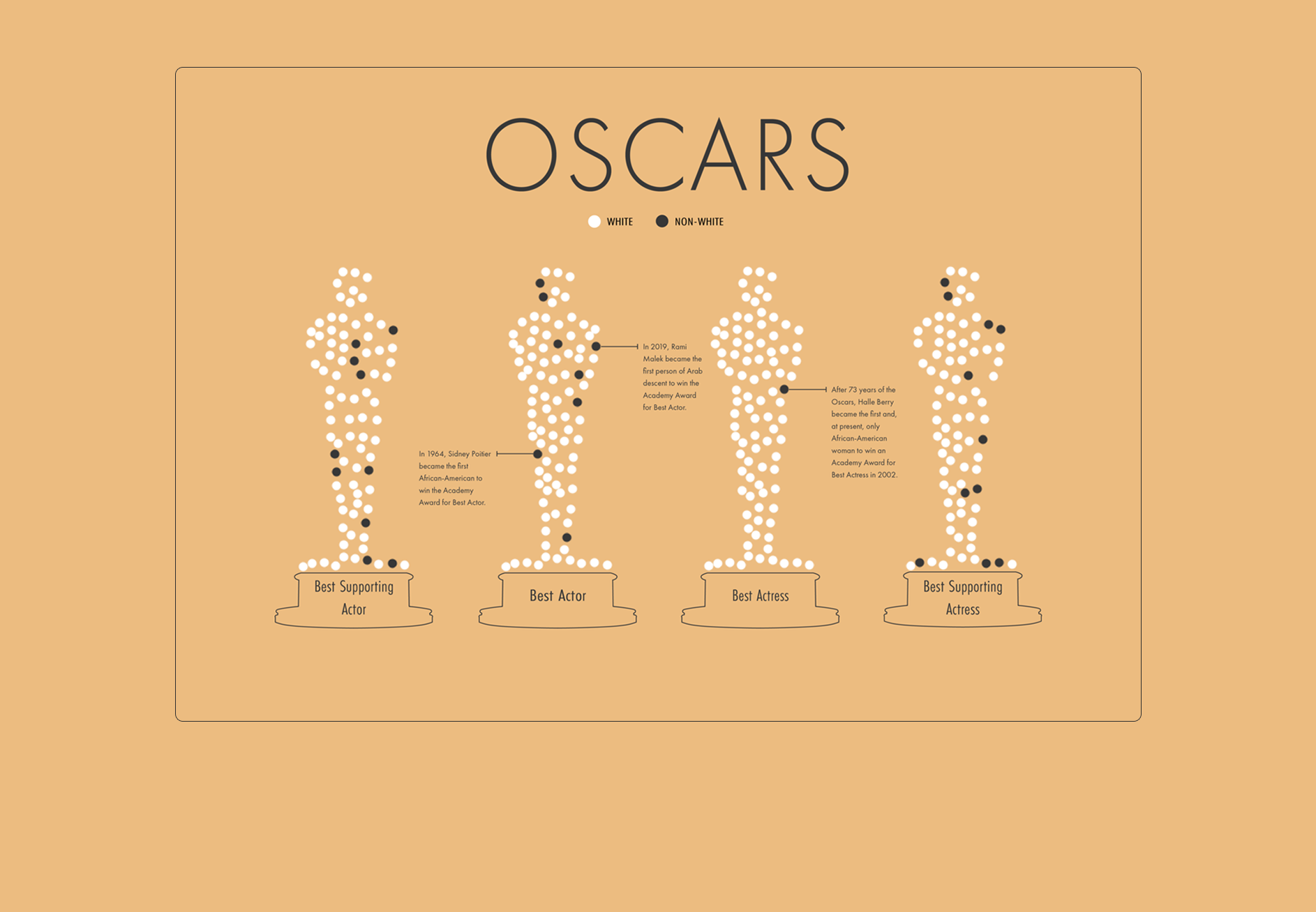
This subject captured my attention. I am a big movie fan and I decided to focus my visualization on the Oscars. Luckily for me, the timing was perfect–the Oscars were in two weeks.
When I think about the Oscars, I think about the red carpet, celebrities, and the statuette. The Oscar’s statuette symbolizes the pinnacle of winning and, since the theme of that month’s IronQuest was diversity, the first thing I thought of was exploring either racial diversity or gender diversity among winners. Upon consideration, I did not want my visualization to be overly crowded with gender distribution of different awards categories. The four acting categories are already split up by gender, so I eventually decided on racial diversity.


I referenced an image of Oscar’s statuette from Google Images and then created the statuettes using the Curvature tool in Adobe Illustrator.
The data for the Statuettes were extracted using WebPlotDigitizer. I also scraped the main data for each award show’s winners from the Academy of Motion Picture Arts and Science’s site using Python and merged the two datasets together.

For every data visualization that I attempt, I think deeply about the design and I always strive to create a clean, concise, and unique result. I have never studied art nor taken any design courses. I am self taught. Here, I will dissect some of the design choices that I made.
Line Spacing and Alignment

Line spacing refers to vertical space between lines of text. If the space is too tight it makes the text harder to read, while more spacing increases readability. Also, the text is left aligned so that the viewers’ eyes return to the beginning of the next line effortlessly.

Everything in my visualization is placed purposefully. Studies have shown that the average human attention span is now eight seconds. The design elements and the way I place them have to be concise, consistent, and crisp so that they draw the viewers’ attention quickly.
White Space
There are 354 data points in this visualization, but because of the magic of whitespace, the visualization feels much less overwhelming and more visually appealing.
Color
I used a shade lighter of black in order to make the visualization more prominent than the text. For color to be effective, it must be used sparingly. Too many colors takes the focus away from the message and creates a sense of confusion. Therefore, I limited the colors used in this visualization to three (#EABA80, # FFFFFF, # 373737).


It was shocking to see that in 2002, after 73 years of the Oscars, Halle Berry was the only woman of color to win the Academy Award for Best Actress. In the beginning, I was so shocked by the results for this category that I thought my dataset had an issue, and I even double checked the race/ethnicity for each winner several times. Now, nearly twenty years later, she still remains the only one to win that award. There have been 93 Oscar commencements, and only ONE woman of color has won Best Actress? That is just unfathomable and offers a glaring indictment of the entertainment industry’s progress toward diversity.

Ali is a recent graduate from the University of California, Riverside, with a bachelor's degree in statistics. He was born in Tehran, Iran and moved to the United States in 2012. And, starting July, he will begin his career as a data visualization consultant for Lovelytics.
- Ali Tehrani


