
This content originally appeared as part of The ‘Gale newsletter.
Eli Holder is principal of 3iap (3 is a pattern), where he helps clients design and develop effective interfaces between busy people and their messy data. On the side, Eli builds silly things like Haiku Datasets, Caffeine Simulators and Dataviz Experiments. You can follow Eli on Twitter or Medium. He’s written several articles for Nightingale.
1. If you could be any type of chart, what would you be?
I’d be a Nigel Holmes visual pun, because chuckles are the surest path to changing minds. Even great data falls flat without a receptive audience (esp. now that the most important issues are so polarized). But as a chuckle-worthy, illustrated chart, I’d be able to disarm my viewers and perhaps actually change some minds.
2. If you were stuck on a desert island, what viz would you want to create and what would you use to make it?
I’m going to assume that by “stuck” you mean “glamping” and by “desert island” you mean “tropical and remote, but near a liquor store.” In which case I’d like to thoroughly explore the proper ratio of ice / tequila / lime in a 13 oz. blended margarita. I’d assume a minimum of 1 oz. of each ingredient per drink, but would otherwise vary each ingredient by 1 oz. per trial. I suspect the 10 oz. tequila days will be slow going, but I think I could cover all possible combinations within ~30 days (at which point I’d introduce tequila brand as the 4th dimension, and may need another 300–600 days to complete this experiment). I’d visualize this using the “Oriented Slivers” technique (see below for detail), where the x-dimension is # oz. of tequila, Y is # oz. of “mix” and I’d overlay boundaries for taste and melt-time maxima.
3. What is one visualization that has inspired you?
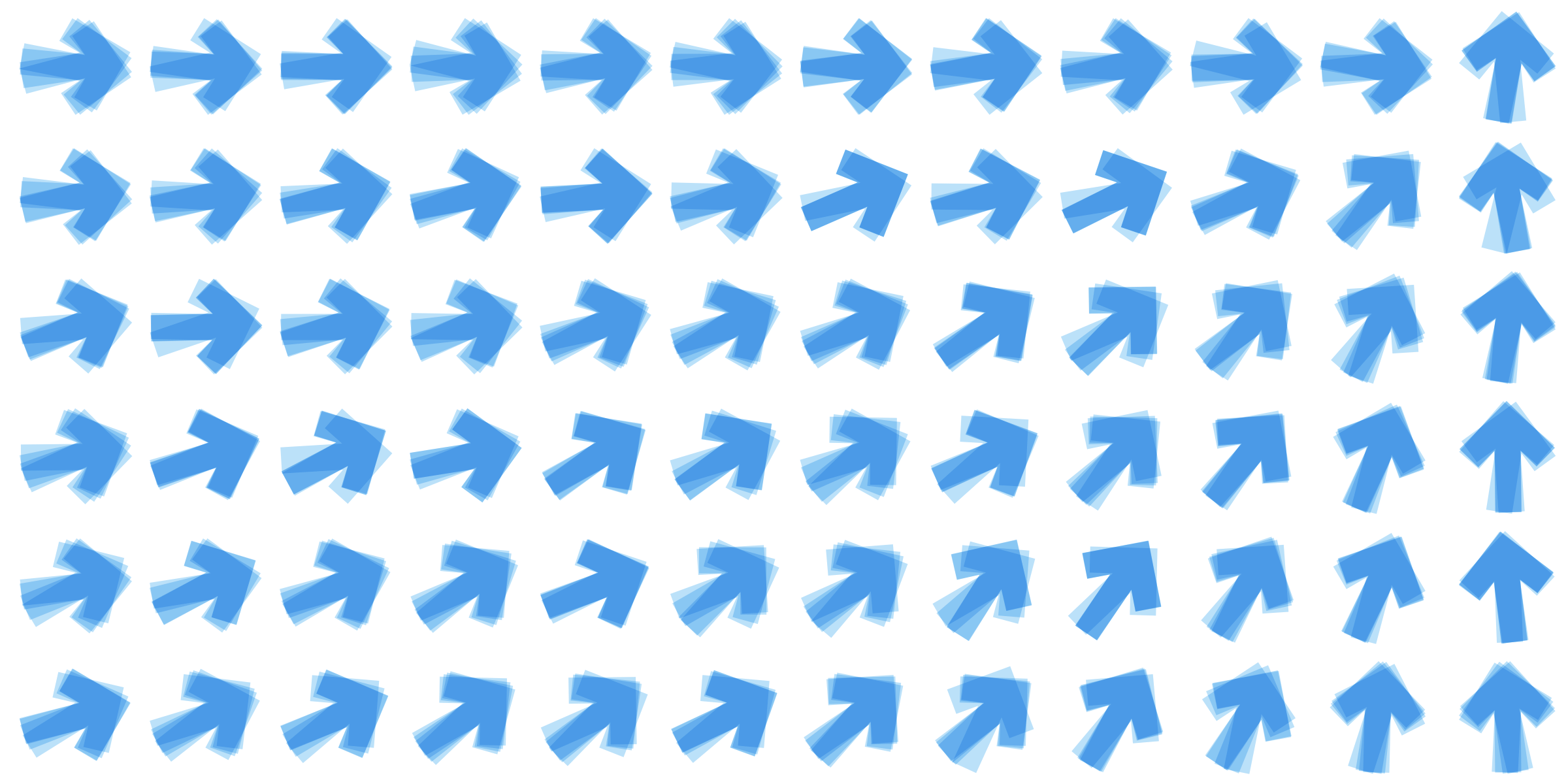
When I was in college one of my advisors did incredible research in scientific visualization. Before meetings I’d wait across from his office and stare at the screenshots he posted on his office door. I still think about one of those posters today, ~15 years later… It was from this paper: “Oriented Sliver Textures: A Technique for Local Value Estimation of Multiple Scalar Fields.”
It’s a way to visualize overlapping areas of different dimensions of a dataset without sacrificing the ability to tell them apart. Instead of assigning different visual cues to each dimension (e.g., dimension 1 is color, dimension 2 is opacity, dimension 3 is brightness), each dimension is represented as a different orientation of a common texture. It affords a ton of density without overwhelming the user with discordant clutter.

It’s sometimes easy to get tunnel vision around the classic Cleveland/McGill encodings (e.g., position, volume, orientation, color, etc.), but thinking back to the Sliver Textures viz reminds me that the field is still (relatively) new and there are certainly still elegant, simple representations yet to be discovered.
Claire Santoro is an information designer with a passion for energy and sustainability. For 10 years, Claire has worked with governmental agencies, non-profit organizations, and higher education to accelerate climate action by communicating complex information in an engaging, approachable way. Claire holds an M.S. in environmental science from the University of Michigan.
- Claire Santoro

- Claire Santoro

- Claire Santoro

- Claire Santoro


