
For the past two years, the data visualization narratives we’ve become familiar with infection curves, maps of health zones, and models of how the virus works. There are less visible, but no less real, stories. These tales feature our day-to-day lives, more abstract, and less measurable: what do you want? How do you feel? What kind of progress have you made?
Data humanism is a way of visualizing data that most interests me for its potential to bridge understanding. In this article, I share two personal data visualization projects: the first, a personal project for my girlfriend, and the second, a commission from a friend.
Point to point
I’ve always been a bit of a romantic. When I had been dating my partner for a year (in 2017) I set out to put numbers to our love. I recorded how many times I expressed that feeling with her digitally over the course of a year. I not only analyzed the number of those exchanges, but also the time of day those messages were sent (in WhatsApp and chat).

The aim was to go beyond the data itself to show how the correspondence between two people can demonstrate the patterns in a relationship, and what it says about their personalities. And broader questions arose about how we each feel depending on the time of year: such as are we more affectionate in summer, or do we feel sadder in winter? Are we more affectionate in the morning?

The poster, printed on A1, is actually a modern epistolary record. An epistolary is constructed from a succession of letters exchanged between two people. Historically, you had to wait for letters from the person you loved, as opposed to how we communicate now. This piece was shortlisted for the prestigious Information is Beautiful Awards, in the People, Language & Identity category.


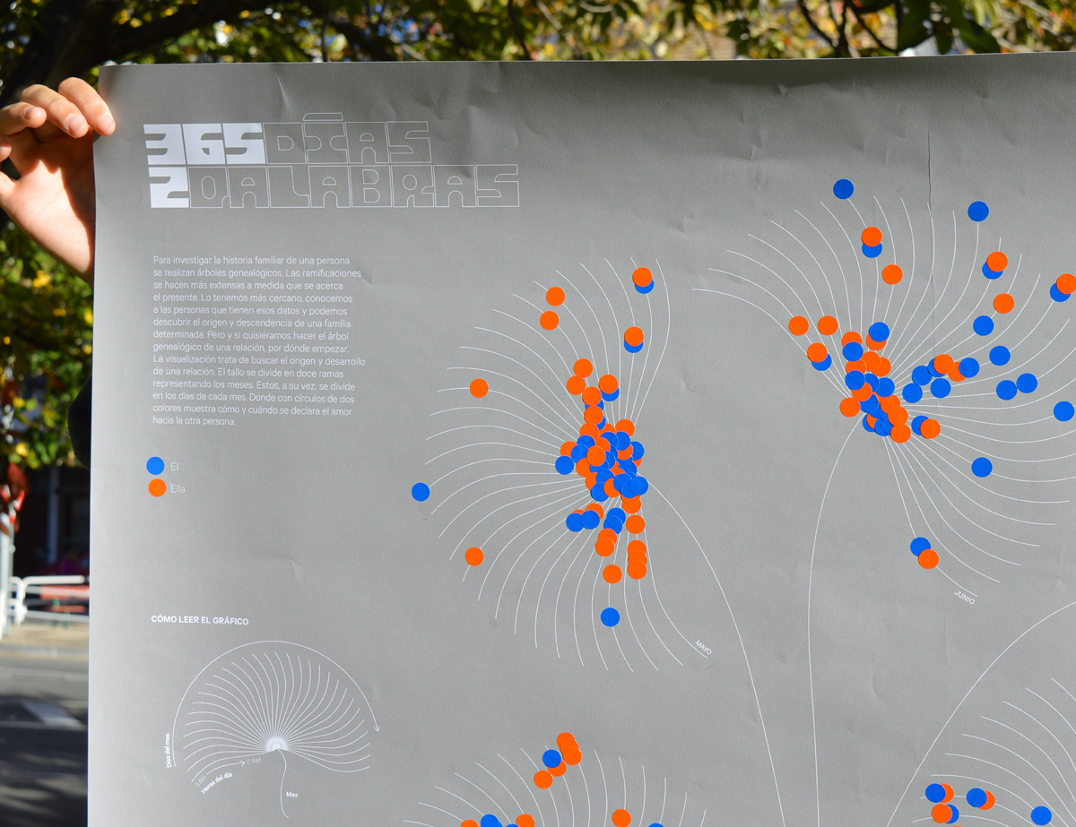
Geneology of a relationship
Family trees are useful when investigating and visualizing a person’s family history. At the beginning of a genealogical tree there are fewer people and, as you get closer to the present, there are more branches. The ramifications become more extensive as we get closer to the present. As we move closer, we know the people who have the data and we can discover the origin and descendants of a given family. But, what if we wanted to trace the origin and development of a relationship, where do we start? In 2021, I worked with a friend who wanted to give a special gift to her boyfriend. She asked me for an infographic and, instead of ‘making it’ for her, I made her a template so she could make her own visualisation.
The stem of the flower is divided into twelve branches representing the months of the year. These, in turn, are divided into the days of each month and the length of the stem shows the hours. With two-colored circles (stickers) we can check how and when they declared their love for each other.


Data visualization is a language that can help to verbalize the abstract, making what sometimes seems less quantifiable, less real, and more accessible. It helps us to understand. Understanding can bring us closer to others, and from that newfound closeness, we can build! The exercise, and the beauty of this project, is that with a template and some colored stickers, my friend, who is not a data visualization ‘expert,’ but a high school teacher, was able to collect her own data, find patterns, and visualize them–without prior knowledge and with easily accessible materials.
Anyone with a minimum of explanation can make their own graph. If you want to make your own visualization, here is a template with which you can visualize how you feel about the person you love.
Data visualization is a universal language that can connect us.

Alberto Molina is a designer at Errea with a special interest in branding, data visualization, and typography. He has a degree in Journalism from the University of Navarra (Spain) and a master’s degree in Brand Creation, Activation, and Management.
Alberto’s focus has always been storytelling, whether through branding, typography, or data visualization. It is in this last field that he has been developing through personal projects to learn new skills and delve into topics that interest him.
You can find his portfolio at http://www.albertmolina.es and the website of the studio where he works at http://www.somoserrea.es


