
I first heard about the Data Visualization Society’s State of the Industry visualization challenge when Loris Mat posted the design process behind his winning entry. Around that time, it caught my eye because I was trying to learn Canvas and interactivity techniques to increase my knowledge in data visualization. Having struggled with making complex visuals look less clunky, I really admired his natural-like implementation of force-directed graphics and scrollytelling. I still frequently reference his “Among Us” entry to check if my own pacing and transitions feel right.
When the Data Visualization Society announced their challenge for the State of the Industry Survey this year, I wanted to try my hand at my first competition to see how I compared with my peers and collect indirect feedback. We were all taking the same prompt and data but coming with different approaches. I would then inspect other people’s work and understand what they did that I should have done in my project. However, I was pleasantly surprised to hear that I won third place for the explanatory category! Thus, I’m happy to share my thought process behind this project.
Step 0: What do the judges want?
Before coming up with any wild ideas, I wanted to figure out what the judges were asking for. I found the prompt very open-ended, so I wanted to gain more confidence by comparing the criteria against other data visualization competitions. I recalled reading this post from Information is Beautiful on creating a good entry. In order from left to right, it required a balance of information, story and goal (which I combined in the same step), and visual form. I roughly used their criteria as checkpoints throughout my process, which I broke down into three steps:
- Find the content to answer “What information do I use?”
- Find the explanation to answer “What story do I tell and why?”
- Design the visual form to answer “How do I make it look interesting?”
Step 1: What information do I use?
I started off on the wrong foot by reading the survey questions and expecting myself to know which questions I wanted to use for the visualization. This approach ended up feeling overwhelming because there were 58 questions and multiple layers to compare. I got distracted from comparing data types between different sets of questions. I couldn’t even foresee whether the visualization would look promising.
The better way to understand what data I needed was to get hands-on and play with the data myself…
I took a step back and thought about how I would normally approach this. Wearing my analyst hat, I would examine features to uncover trends and use intuition to come up with explanations. In my work experiences, I have gotten used to dealing with data I was initially unfamiliar with and communicating it to different people. The best way I could prepare myself for storytelling was to explore the data and notice trends myself, then I would be better at anticipating questions from others.
For the exploration step, I used pandas and matplotlib in Python to do my data processing and basic visualization. My preferred way to visualize non-time series data would be bar charts because they are the quickest. Here’s a compilation of some of the data I looked at.

For the sake of finding explanatory data, I was looking for charts that brought out insights. I was looking for a single chart that provided enough comparisons so that a reader would not be done observing it so quickly. The charts I showed above didn’t make the cut in my visualization for several reasons:
- The left side shows the amount of time doing different data visualization tasks. The distributions looked too similar across the categories. It wasn’t “interesting” nor “insightful”.
- The top-right is just a one-dimensional chart that shows the distribution of roles. Being an analyst myself, I saw this distribution and the only thing I could really say was “well, duh.” It was “obvious” and “boring”.
- The bottom-right word cloud actually brought out some insights that I liked. The majority of words consisted of people-related aspects (e.g., management, client, team, others, stakeholder). There were fewer specialized tasks like research, product, paper, and strategy that showed a split between roles. It still didn’t go in my final visualization because I was running out of time to structure and analyze the free-form responses. It was too “unstructured”.
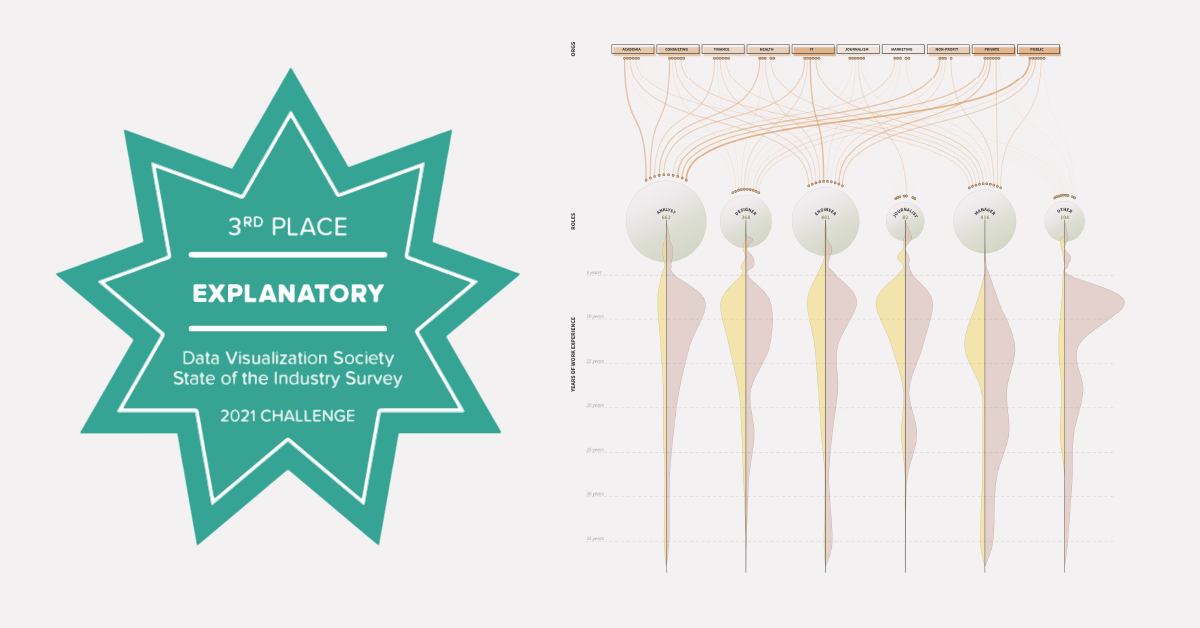
I continued playing around with random one-dimensional and two-dimensional charts until I found one with enough insights, which means variability in shape. The picture below contains the first set of charts that I liked. It had a variety of data types (orgs as categories, roles as overlapping categories, employee count as a continuous number, etc.). I jotted down some quick observations (some listed below) to revisit later:
- Most industries except journalism have majority analysts (the most popular role overall).
- Visualization in academia is driven largely by analysts rather than leadership compared to other org sectors.
- In IT, more engineers than analysts do data visualization.

Step 2: What story do I tell and why?
After doing enough exploring through the dataset, I decided that my explanation would be nonlinear because I would show everything at once. I combed through all my bullet points and became certain that the chart in Step 1 contained the majority of explanations I wanted to show. Using that chart as the starting point of my dataset, I joined additional features of which had notable explanations in my notes. One example was a segment that indicated whether the respondent used data visualization as a primary or secondary responsibility. Using more data allowed me to add more color and context to my overall explanation.
After collecting all the fields that I planned to include, I did a sanity check by tracing myself through all the segments I collected just to see how I fit in with the surveyed community. This helped me create the explanations post-visual where I wrote down what different characters would observe if they were to find themselves in the visualization. At this point, we should know the story to tell and why it’s relevant to the reader.
Step 3: How do I make it look interesting?
The creativity part is the most fun section of open-ended projects, but it’s also the most challenging. One of my goals was to bring out unconventional formats by encoding lots of data into one visual. I was inspired by information designer Federica Fragapane’s illustrations to piece something together that could be appreciated as art, even by people who don’t care about reading text or data.
I spent two days intensely doodling random ideas on paper until I had a concept that blended all the data I wanted together. The most unorthodox feature I came up with was radial ridgeline plots. I never had the occasion to make ridgeline plots, but they looked so good. Can you believe they even sell them as t-shirts? I wanted to make it a radial chart because I never found an attempt made on my Google searches. Plus, I find it rewarding to make something complex look good.
I manipulated the data into JSON format for D3.js, and I proceeded to code the visual. Turns out that no one makes radial ridgeline plots because they’re really ugly. I had already invested so much time, so naturally I wasted a few more days trying to salvage my idea. My data was way too sparse and the shape just didn’t fit the aesthetics even after trying different methods of scaling. Finally I gave up.

I didn’t want to start back from scratch, so I took increments in making my idea more basic. Instead of doing a radial, I made the chart linear. Unraveling the messy chart became easier and my final ideas came more naturally. The simpler the chart became, the quicker I worked, and the clearer (thus better) it looked. The final design was not what I had planned, but I was relieved that I still managed to include all the data from the original complicated design.

Lessons Learned
Looking back, there were things I could have done better on the UX front but was short on time:
- Improve accessibility by using more contrasting colors and larger font. There are certain styles I like that I shouldn’t have used for a broad audience visual.
- Improve interactivity by adding pop-ups on hover events to engage the audience throughout their session. Having explanations that follow your eyesight is more enjoyable than switching between the visual and explanation on different sides of the screen (or worse, the fold).
This data visualization exercise felt different from my past personal projects because I was delivering a creative piece to someone rather than myself. In my learning process, I have been approaching personal work with the developer-oriented goal of applying a new technique. Even when I successfully implemented something new, I was struggling with making the end result feel cohesive. With this project, because there was so much data to choose from, I learned to plan my work more carefully, spending more time figuring out the content before planning the aesthetics.

Sarina is a data scientist who photosynthesizes in Southern California. She enjoys storytelling and designing, and she shares her journey in art and technology through her portfolio at ifcolorful.com.
- Sarina Chen


