
Loris’s visualization won first place in this year’s Data Visualization Society Census Challenge, exploratory category.
As a data visualization designer hobbyist, participating in the DVS Census Challenge opened new opportunities to me. It was a milestone in my learning path, and a boost in my recent career moves. Here, I’m sharing the process behind “Among Us,” my entry for the exploratory category.

At the end of 2020, the Data Visualization Society was organizing its annual challenge to visualize the data collected during their annual census survey. Back then, I was quite new to data visualization and I was practicing and recreating techniques I’d seen in the field. It seemed to be the perfect opportunity to publish a finished project, which I was having some trouble doing.
It was also a perfect opportunity to engage with the community.
I actually came across the data visualization community once before, back in 2018. This community felt real. Real, simply because I met many famous practitioners in person, as a volunteer student who helped organize the OpenViz Conf in France. I remember giving the microphone to Jan Willem Tulp before his talk on visualizing 60K+ data points in the browser (which could have been a reference for this visualization, in fact, which I’ll detail more about). The audience and speakers were full of people from different backgrounds and the diversity could be perceived in the way people talked and dressed. It would take me almost three years to realize I could be part of it. I remember keeping a sticker from the conference on my old laptop and wondering sometimes if I would be there again, as a spectator or a speaker.
I took a not-so-different path as I became a data analyst, then data scientist, for a thriving startup in Paris. Although really interesting from a business and technical point of view, the creative part of my job was close to nonexistent. When I became conscious of that void, I started working on data visualization projects on the side. I started by imitating visualizations I was seeing around, a process provocatively called “stealing” by Austin Kleon in his book Steal Like An Artist. I was eager to learn more, adding ideas to growing lists, creating unfinished projects, and starting to feel overwhelmed by everyone out there creating awesome stuff (the reason why I’m trying to limit my Twitter activity). I came across the DVS Census Challenge and it looked perfect to me. I would be competing against people I’m following, with data about people like me, and I would be judged by some of the most famous names around. I did not really feel legitimate, but I was sticking to the Show Your Work! main concept from Austin Kleon, again, which suggests that, if your work is not online, it doesn’t exist.
The process behind “Among Us” relates to my experience. In the end, you can picture yourself as a dot along the way, and see where you belong. You realize the community is diverse, and when scrolling back to the top, you feel part of a whole. Here is why it actually taught me several lessons, from technical points to a career move.
The idea behind the design
The contest rules are simple: you have to design a visualization based on the results from the annual census survey, and take part in either the exploratory or the explanatory category. I didn’t participate in the survey, and I was unfamiliar with the data itself. What struck me at first was the multitude of questions. These included topics like: how people learn data visualisation, what are the tools used to visualize and so many other options. I decided to take part in the exploratory category to see what people were like in this field.
From there, I should have “focus[ed] on the static form first and foremost.” This simple advice from Mike Bostock in 10 Years of Open-Source Visualization encourages you to focus on what is the most interesting to you and your users, regardless of the techniques and interactivity. Too many of us might focus on web development instead, which risks obscuring the most interesting insights.
The truth is, I did exactly the contrary. I was participating to learn. My personal goal was to get more technical. In fact, some days before, I came across a visualization from the Guardian that combined two things I had in mind: the use of force-directed graphics to represent groups of people and the scrollytelling techniques that I was seeing in every famous newspaper. My personal guidelines was to combine the two techniques, no matter what. Today, I’m convinced that is absolutely not the right way to think when it comes to data visualization, and still consider this approach a beginner mistake.

Scrollytelling and force-directed graphics, a good choice a posteriori
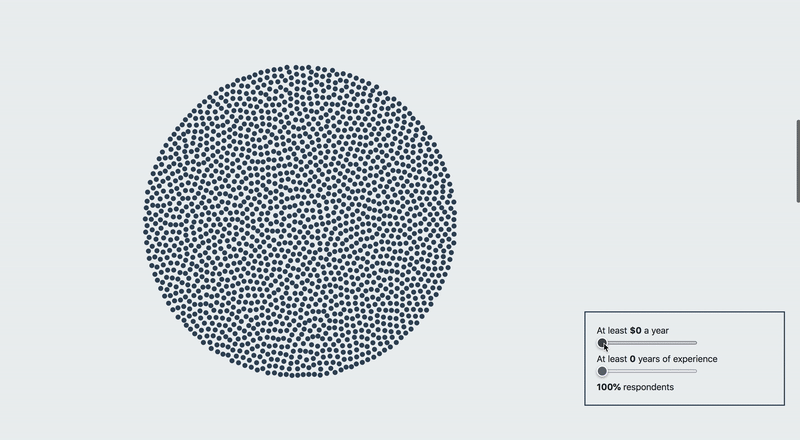
I wanted to visualize many variables, but the visualization could quickly become overcrowded. I actually saw an entry in the 2019 contest that succeeded beautifully, but I really wanted to stick to scrollytelling and force-directed graphics. (And, I was a little intimidated by how cool that dataviz was!) The scrollytelling is a subtle alternative as it helps to guide users through what you want them to see. It is also quite convenient: users do not get too much information at a time. On top of that, it helps keep the data visualization pure and minimal, with important metrics and legends on the side.

Using the force appeared to be a good match as well. Not too many data points are represented here (although there is a technical issue on this, which I’ll elaborate on further in the article). Step by step, the group is being split depending on the socio demographics variables I wanted to reveal: adding colors, strokes, and middle points to differentiate such variables.
Finally, on my way to explore the data, I added an interactive panel that would stick across the whole visualization to represent salary and experience metrics. This would engage users and display details on demand to satisfy two of the six Distill research principles on interactivity: “connecting people and data” to make your readers part of the experience and “reducing cognitive load” to avoid providing too much information at once.

Three mistakes I could have avoided from the beginning
Here are at least three things I should have done differently:
- The scrollytelling is homemade… and still is. I don’t recommend it. It is a pain to implement, and leads to a sluggish browser experience. Later on, I discovered Waypoints, a super easy-to-use Javascript library for Parallax effects. I’ve seen many people using Scrollama which I haven’t tried, but it also looks easy to use. If you want to try out other libraries, Russell Goldenberg, the creator of Scrollama summarized what’s around for you!
- Representing more than 1,000 points in .svg on a web page might break the experience, making the browser sluggish as well. The visualization I was inspired by is actually using Canvas instead of .svg, which does not render the points as DOM elements, making it feel smoother. This technical aspect has been covered many times, by the same Jan Willem Tulp’s talk I was referring to earlier, for example. It also inspired me to write my own article on the topic.
- Responsiveness has to be considered from the beginning, not in the end. And it does not always combine well with scrollytelling. Russell Goldenberg wrote another article about the best scrollytelling practices for mobile, which I regret not reading earlier. In the end, I tried to do my best making the article responsive by splitting the mobile screen in two pieces, the dataviz on top and the story at the bottom. There are other options such as giving up the responsiveness completely on mobile, which makes sense in some situations.

The end result
On January 10th, the annual Data Visualization Society Survey Contest ended. On my way to learn d3.js, I was submitting my first entry in an official contest. I learned new technical skills and developed a valuable side project to share in my portfolio.
On February 22nd, the DVS awarded the participants. I learned I was getting the jury prize for the exploratory category. Although my decision to leave my company was already made, winning this challenge helped me feel a bit more legitimate in turning data visualization into my full-time job.
Today, I am working with my first clients. Some of them were recommended to me by people I met within the DVS community, while participating in other contests. My clients’ gratitude gives me more and more confidence and I cannot thank the data visualization community enough, including evangelists, open-source contributors, and designers for their visible and less visible work. I can focus on my skills, keep on learning, and explore even more of the creative parts of the job I was secretly missing.

Loris Mat is a French Web Developer and Data Visualization Designer. After three years as a data scientist, he decided to focus on web technologies to design with data. He is now working as a freelancer for French, German and American clients.
- Loris Mat


