Greetings from the Data Visualization Society, your global hub for connecting with resources, experts, peers, and data while expanding your own network and data visualization capacity. As you know, the DVS is on a mission to share the joy of dataviz with any and all. To do that, we need your help!
As one of its ongoing efforts, the DVS conducts an annual survey. We know, We know, it seems like anyone and everyone wants us to share our time and data … answer some questions after shopping online, respond to an opinion poll, provide feedback before you leave a website. Usually it feels like our responses go into the ether and we have no idea if anything we said will result in useful changes. This isn’t the case with the DVS survey—we, the data visualizer community, benefit by participating!
If you’re already convinced that your data will be used for good, skip right to the survey! If not, read on.

The data that you and hundreds of your closest friends provide is used to tell important stories. For example, in the Data Viz Today podcast, Alli Torban examines 2020 data for insights about pay: 40% of freelancers in the U.S. reported charging between $50 and $100 an hour, while 10% said they charged between $100 and $125 an hour. Comparing pay ranges by years of experience shows that hourly rates were influenced more by total years of professional experience than by years of specific dataviz experience—that’s great information to know! Many questions in the DVS survey ask about variables that can help both practitioners and employers identify industry standards for benchmarking and provide the DVS with data to describe and advocate for our membership.
Our collective responses can be used to inform how resources are tailored to the data visualization community. You can help by sharing which tools you use, what types of vizzes you’re creating, preferred learning methods, and pain points during the process. A visualization using data from last year’s survey invites us to explore how many people in various roles use similar tools. With this knowledge you can head to the DVS Resources page or connect with others in the #topic-tools Slack channel.
Are you ready to take the survey yet? Still need more reasons? Okay…
Unlike those surveys where our responses disappear into the ether, the DVS shares the data widely with the people who can make the most of it—you, the practitioners! Everyone is in a different place in their data visualization journey; sometimes it’s beneficial to practice engaging and communicating about a coherent dataset, or perhaps you have your own questions about data visualizers. As extra encouragement to use the data and practice those mad skills, when we publish the data (cleaned and anonymized), the DVS also posts a visualization challenge—an opportunity to explore, visualize, understand, play with, and share insights from survey responses.
Contributing to this survey and visualizing its data changes lives. If you’re thinking, “Well that’s just ridiculous,” check out Loris Mat’s story about his career transition and DVS Challenge experience. Even if your experience doesn’t put you on a new career path, the survey includes helpful prompts to reflect on our work processes and goals, perhaps in considering time allocation or finally getting started learning that new tool.
So go ahead, take the survey…and share this invitation with anyone who visualizes data! The DVS knows that it hasn’t reached everyone who might benefit from its resources and networking opportunities. The survey welcomes participation from members and non-members alike. Diana Ow, who created the tools dashboard shown above, explains it well:
“The 1,766 respondents do not perfectly represent all people involved in data visualization globally, but [the 2020 results are] currently the most updated and comprehensive dataset and hence the best [available] representation of the dataviz community.”
– Diana ow
The maps below show where last year’s survey takers are located and this interactive viz from Virginia Chen explores participation by country population. How well are you and your viz buddies represented?
Have you considered all of the compelling arguments above and are still on the fence? Well, we’ve got one more trick up our sleeves: everyone who takes the survey is eligible for a discount on some awesome DVS swag and entry into a drawing for other fun prizes, including one free year of General Membership or a LinkedIn Learning subscription.
Now all that’s left is for you to take the 2021 Data Visualization: State of the Industry survey…and invite your friends to contribute, too!
P.S. Many of you submitted questions for inclusion in this survey, and we sincerely appreciate the thought and time that went into compiling those recommendations. While you won’t necessarily see your exact verbiage, you’ll see the spirit of many of your ideas represented in the 2021 questions. Thank you so much for engaging in all phases of the Data Visualization: State of the Industry Survey development process.
Acknowledgements:
Hearty thanks to fellow members of the DVS survey committee for their tireless work refining the 2021 State of the Industry survey.
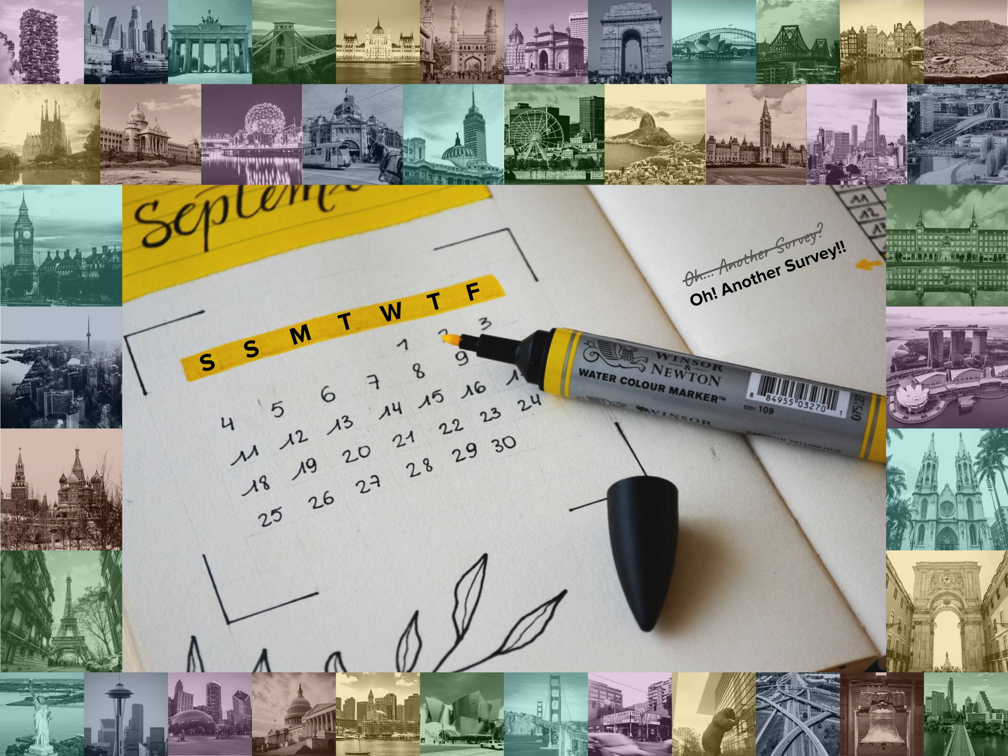
Photo credits for the header image: Calendar by Estée Janssens on Unsplash (lightly edited here: re-labeled days of the week & replaced marginal note). For cities (cropped & recolored) see the following links, all from Unsplash:
- First row: Milan, Buenos Aires, Berlin, Bristol, Budapest, Hyderabad, Mumbai, New Delhi, Sydney, Brisbane, Amsterdam, Cape Town
- Second row: Barcelona, Bengaluru, Vancouver, Melbourne, Mexico City, Montréal, Rio de Janeiro, Ottawa, Bogotá, Oslo
- Left column: London, Toronto, Moscow, Paris
- Right column: Madrid, Singapore, São Paulo, Lisbon
- Final row: NYC, Seattle, Chicago, DC, Boston, Los Angeles, San Francisco, Portland, Denver, Atlanta, Philadelphia, Austin


