
Influence has consequential implications. Consider Wharton marketing professor Jonah Berger’s findings from his book, Contagious:
“A word-of-mouth conversation by a new customer leads to an almost $200 increase in restaurant sales. A five-star review on Amazon leads to approximately twenty more books sold than a one-star review. Doctors are more likely to prescribe a new drug if other doctors they know have prescribed it. People are more likely to quit smoking if their friends quit and get fatter if their friends become obese. In fact, while traditional advertising is still useful, word of mouth from everyday Joes and Janes is at least ten times more effective.”
Jonah Berger
Perhaps it’s not surprising then that, since Twitter’s emergence in 2007, social media listeners have been interested in digital network mapping.
Mapping human connections has applications in other fields as well. During my recent summer vacation to Gloucester, Massachusetts, I explored the abandoned inland settlement of Dogtown and was fascinated to discover aerospace engineer Mark Carlotto’s book visualizing the social networks represented by the stone cellars that remain and what they suggest about the mysterious people who inhabited the area in the mid-1700s.
In my work as an experience researcher, I often think about and explore relationships among social networks. For example, I studied the referral behavior within a local entrepreneurial support network to determine how to more efficiently serve aspiring business owners. In his new book, Mapping Affinities, Harvard University researcher Dario Rodighiero uses design to visualize the affinities that exist among scholars at universities, factoring in not only existing relationships, but also examining their potential for future collaboration. While I do not bring academic experience to my review of this book, I am convinced by Dario’s argument within it that visualizing affinities provides an incredibly valuable new means of quantifying scientific and academic practice.

“Visual mapping is the way in which insights can become observable.”
– Dario Rodighiero
Regular Nightingale readers will appreciate the historic dataviz contained in the early chapters. I was surprised to learn that today’s organizational charts can trace their roots to aristocratic family trees. Dario highlights the “impoverishment of visual language” with the chart’s evolution from one where individuals were cited to exemplify the characteristics of their ‘line’ to today’s organizational charts where individuals are anonymized by their titles and easily replaced. From there he explores how sociograms became artifacts used to represent degrees of friendship obtained via qualitative interviews and the eventual origin of network diagramming as a specific form of information architecture.
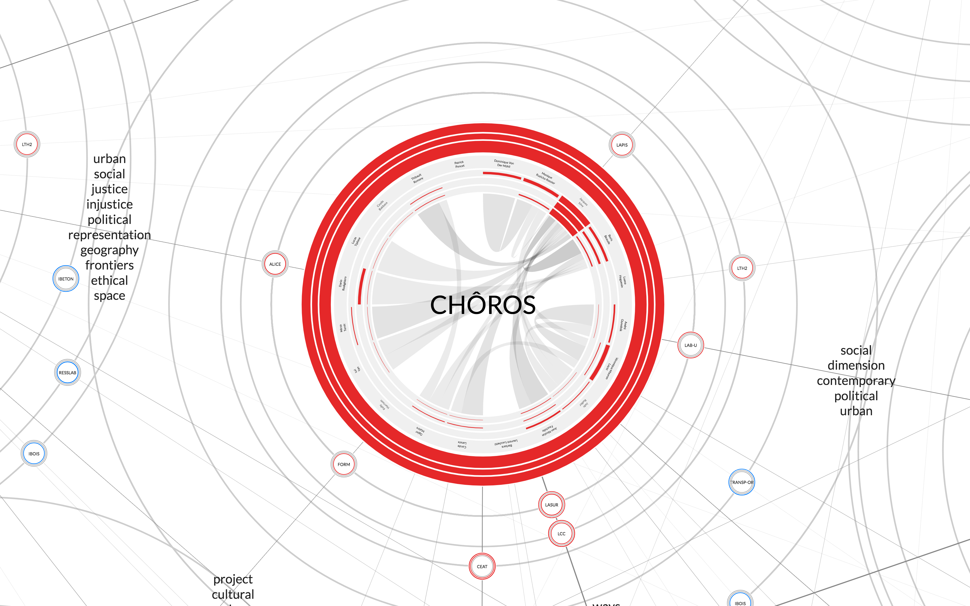
The rest of the book serves as a design and participatory research-driven ‘how-to’ for using affinity mapping in university governance. What began with the management of the School of Architecture, Civil and Environmental Engineering (ENAC) School to aid in decision making was eventually embraced by its academic community as a mechanism for self-evaluation. I was particularly interested in seeing the process, as it was so similar to how a user experience study is run. First, community interviews were conducted, followed by early sketches and prototype development, and then experimentation to test specific elements. The way the team considered and incorporated keywords was particularly instructive. (Keyword taxonomy is a topic I’ve wrestled with in my work. It can lead down a rabbit hole and is often highly subjective.) In this case, the team used keywords as connectors (as indicated in the lead article image above, more versions available on the author’s website) in their visualization to provide additional context for understanding lab collaboration.

During foundational work, I try to establish alignment on research goals by auditing what we already know, or the ‘known knowns.’ It was interesting to see how this practice looked on the ENAC School project as the team considered their available data sources. Academic community members had the opportunity to hold back sensitive data and to review for accuracy. They developed a form to allow the addition of external collaboration, a source that was “missing data” in the original audit. They adopted a data policy to keep private data about funding that could have engendered resentment among labs. The team exercised intention regarding data visibility, validity, and creation–going beyond data quality to develop what seemed, to me, like a potential standard for data stewardship.

Proximity is a critical component of affinity mapping. There can be trade-offs between visual distance and readability. The team factored ethical considerations into design choices to avoid the use of the map as an evaluation tool. For example, the rings around the laboratories are of a consistent thickness in order to prevent comparisons about publication quantity. I love how several distinct visualization techniques were applied collectively. The final map incorporates Sankey diagrams, clockwise orientation of lab members (the most senior occupying the 12:00 position), color-coded nodes with varying thickness of rings for academic practice, oriented in a hexagonal pattern that supports zooming in and out via orbiting satellites that represent external collaboration.
I was particularly struck by Dario’s discussion of the relationship between design and reading. They are inextricably linked.
“Thinking about the reader as a unique individual interacting with the visualization is reductive, especially because a visualization is a tool at the disposal of an audience… if the designer gives a visual form to the reader’s daily practice, the reader might change practice when they are influenced by the visualization of data”
– Dario Rodighiero

Further elaboration of this idea could be promising in advancing data literacy/fluency/graphicacy (and validates the reading lexicon the industry has gravitated to in describing this topic area).
There were three distinct audiences for this visualization: the scholars, the management, and the external community. The visualization took several forms, including as a physical installation supported by a dedicated event. In order to recreate the zooming functionality of the digital viz, audiences could choose to observe from the ground or balcony level. A future walkable visualization is even under consideration! Perhaps one of the coolest aspects of this case study is that the visualization from that event was repurposed into gift bags for individual scholars, depicting their position within the map.
After finishing the book, I’ve been reflecting on potential applications of the best practices Dario shared. The power of the affinity map is in its ability to reveal potential, encourage collaboration, and foster belonging. For organizations that believe their culture IS their strategy, what could an affinity map of your organization and its surrounding community help you to better understand? What practices are hidden that, if you could see them, would open up new opportunities and offer new pathways for enthusiastic self-evaluation among your staff? What kinds of changes would a new focus on individuals and their social ties inspire? How might you use this map to engage your broader community? I highly recommend Dario’s book for experience researchers of all types, as well as designers, organizational leaders, human resources and talent management, and for anyone who would like to further develop the collaborative potential of their own social ties.
In addition to purchasing a copy of the book, available in English and French, you can also download your copy of the book for free.

For 20 years, Mary Aviles has stewarded projects driving strategy and content, human experience, concept development, and systems change. A graduate of the University of Michigan, her work has spanned the business-to-business, health care, and nonprofit sectors. Mary is a mixed-method UX researcher at Detroit Labs and the managing editor of Nightingale. She writes about dataviz in real life (IRL) in an effort to help practitioners and "non-data" people enjoy better understanding and experiences in their shared ecosystems.
- Mary Aviles

- Mary Aviles

- Mary Aviles

- Mary Aviles


