
Now that the Spring 2022 issue of Nightingale Magazine is showing up in mailboxes all around the world, the editorial team wanted to share some reflections about what we learned during the process of making it.
As we created the first issue of Nightingale Magazine, we knew we would share our learnings along the way, but now that it is here, the process has seemed so long, and yet so utterly natural that I fear my comments may read more metaphysical than practical.
It all started with a simple idea – wouldn’t it be great if there was a magazine for dataviz? Over the years I’ve set out on more than a few entrepreneurial projects – record labels, music festivals, I even co-founded a startup a decade ago. I have learned a fair bit about how to establish a brand and then make progress towards lofty goals. This is what I want to emphatically share with people – it’s not about dreaming the dream, it’s really more about having the confidence and persistence to make something happen.
Barring chance opportunities or unrealistic financial windfalls, making something happen is really a daily ethos of hard work and investing in people. Yes, it is a lot of work, but that work is deeply joyful. It’s a process of perpetual learning, of finding time to collaborate, and embarking on a journey of creating something together and this is where the investment pays off – in the act of co-creation.
Sure we learned a lot of practical lessons and made loads of mistakes. Sure, we squabbled about details – but we never compromised our collective vision to focus on the community and bring a new standard of design and editorial quality to our approach.

Let me end with a story of transparency and resilience. When we started we assumed that it would be easy to sell advertisements. Unfortunately, it turned out to be extremely difficult without having a clear example to point to – after all, a dataviz mag like were planning was quite novel. We put our heads together and realized that we could generate the necessary funds by appealing to the community with a subscription drive. That 1,000-member subscription drive was what made Issue 1 possible. It proved our financial viability and reinforced just how strong our community is.
Thank you all SO MUCH for your support, we are thrilled to continue on the journey with Issue 2! (And reach out to advertise – Ha! nightingale@datavisualizationsociety.org)
– Jason Forrest
I’ll admit that, at the start, the prospect of developing the magazine was overwhelming. Several of the steps I knew we needed to take were things none of us had experience with and I couldn’t see the processes: developing a magazine framework, fitting specific content to design–and vice versa–at a sizeable scale, converting membership information into shipping details, and finding print and fulfillment partners that could ship to 53 countries in a reasonable amount of time and at a reasonable cost. Both the budget and the delivery timeline were essentially fiction until we had nearly completed development, which felt profoundly uncomfortable.
Printing is a chicken or an egg dilemma (pun absolutely intended!): how do you know what quantity of a print run to commit to if you don’t know how many orders you’ll have? We had to start the process by fundraising to get a sense of the demand, but that meant delaying design. Getting truly started on the deliverables took several months and it pushed back our delivery timeline. We had TONS of content to choose from, but we needed to organize it, re-edit it for print, and obtain image rights — or replace images. We underestimated the coordination those steps required.
We did not underestimate the shipping challenge. We explored shipping from both the US and Europe and we found an awesome German printer with a shipping partner to handle fulfillment. However, shipping from Germany meant a tradeoff in postage costs in order to deliver outside Europe in a ~10-day window. (The alternative was 8-10 weeks and we were worried about subscribers that had already waited for months.)
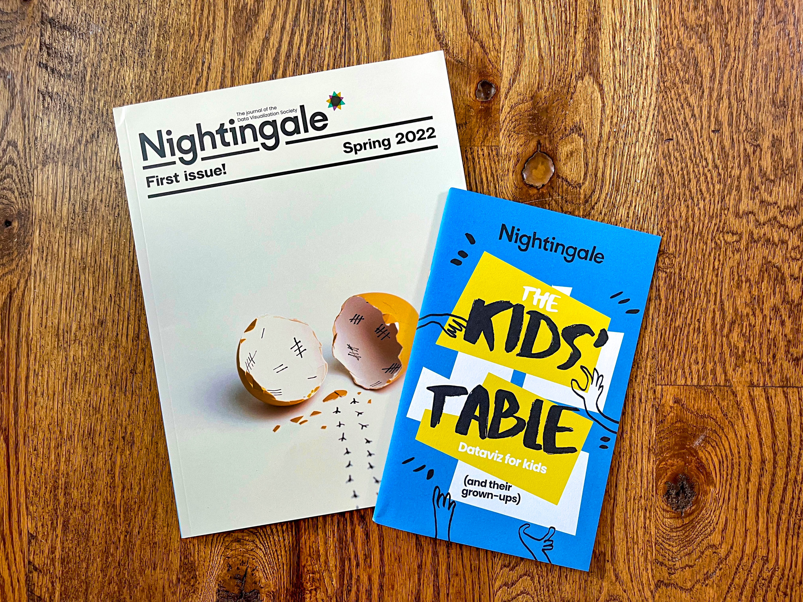
We had always planned to package the kids’ content in a fun and kid-friendly way, but we went into the design without a set vision. Julie came through under extreme pressure with the wonderful ‘zine format, but that added some unanticipated time and cost. Finally, we faced some constraints using the technology platform we had to collect shipping details — the lag time to fulfillment meant that several folks had address changes. We were not prepared for the data cleansing requirements and, since we’d selected the fulfillment partner after we collected data, there were several data transformation steps necessary to meet the shipping label requirements. (I know many of you can relate!) Here, I am eternally grateful to Claire and her Excel magic.
It is against this backdrop that working with people you can trust and depend on is so critical. Together, we devised a content organizer from which we were able to better understand our progress and next steps. (We’ve got a version in place for Issue 2 and we are filling it up already.) We prepped digital content for print by mobilizing our editorial committee volunteers. We learned what we needed from each author such that we now have a print submission checklist to avoid having to go back to each of them several times 🙂 We have a process in place for staging pieces in InDesign. We now know what works best when we’re communicating with our German printer and shipping partners. In fact, they helped us source sustainable paper and encouraged us to pay Mehrkosten: compensation costs to offset the emissions from printing so the magazine could be CO² neutral. For Issue 2, we have a better idea of our deadlines and what we need to do to ship sooner. And, yes, we need to adhere to a hard deadline 🙂
And, as it turns out, that’s how you make something. Someone has the courage to voice a big, beautiful vision and other people have to begin to see it and commit their time and talents to it. Soon, a community supports it and patiently waits for it. And then it becomes tangible and we all get to hold it in our hands, beaming with pride. Thank you for your extreme patience. We hope you think it was worth it!
– Mary Aviles
We always knew the first issue would be a learning process. How do you make a magazine anyway?? We started out with so many questions, but eventually, we ran out of things to Google and had to just dive in and begin. I’m an inveterate planner who thinks everything ought to be organized by a color-coded spreadsheet, so the idea of trying to pull this off without a plan was terrifying to me. But there were no instructions to follow, so we just kind of… figured it out as we went. And it worked! (I feel like there’s a life lesson in there somewhere.)

Now, with some hindsight, I can say that two of the most important things you need to make a magazine are patience and perseverance. (But also a color-coded spreadsheet.) The process involved a ton of trial and error, iteration, and frustration, but also joy and excitement and inspiration. Every time something went awry, we made a note of it so we could do better next time. For example, a few things we learned:
- Writing for print is totally different than writing for the web—don’t use URLs, keep the text shorter, and avoid in-line images. Each of our 40+ magazine articles had to be rewritten or edited multiple times as we figured out what worked.
- Think about the rhythm of the magazine—vary article lengths, layouts, and topics in a meaningful way. This is something we didn’t pay much attention to until we were compiling everything into a single document. By that point, we had limited ability to change things. For Issue 2, we will consider rhythm and flow from the outset.
- Figure out image copyright sooner rather than later. (This is now part of our initial communications with writers.)
- When you think you’re finished copyediting, read the whole thing again.
- Clearly communicate expectations around shipping and fulfillment. This was challenging for us to do for Issue 1 because we had no idea what a reasonable timeframe for making, printing, and delivering a magazine was, but we tried to keep our subscribers updated as we went. Next time, we’ll be able to set a hard deadline.

And then there are things we’re still figuring out—chief among them, how to manage an e-commerce site and the resulting database of global subscriber addresses. Data validation is nearly impossible when every country formats their addresses differently! If you have any ideas, please send them our way 🙂
In the end, bringing Nightingale Magazine to life was a huge challenge, but we are so, so proud of what we were able to pull off as a team.
– Claire Santoro
When Jason, Mary, Claire, and I started this adventure of making Nightingale go print, we didn’t think it would take us approximately the gestation period of a beluga whale. Though here we are, one year later, reflecting on what we learned along the way. As many subscribers are still receiving their first issue in the mail, I feel more in the mood of giddily celebrating than peacefully drawing lessons from the road we took, but I’ll do my best.
While Jason, Mary, and Claire were tackling the huge task of clearing out all the editorial content, I simultaneously started working on the design of Nightingale. I first defined its core values to figure out how these principles could be translated visually and then I broke it down into smaller design components.


One of the main challenges of our magazine was that Nightingale is a collective publication, a collective effort with many voices, many visions, and many designs. We needed to find a good balance between letting these individualities express themselves and building a cohesive ensemble. Rather than imposing a rigid design system, flexibility seemed a better option to build an inviting space for every kind of style and expression. I also decided to put a strong emphasis on fonts, using typography as the foundation of the magazine design. I feared that adding too many other visual elements such as illustrations would overwhelm the already profuse variety of the content. Typography seemed a good alternative: it allowed us to embody the singularity of each piece by using fonts embracing the subject of the articles (or even creating custom fonts for some) and also drew a bridge between every separated piece. Titles became strong and bold visual elements on their own, as well as highlighted entry points that guided the reader through the 130ish pages of the magazine.
After having defined the look and feel of the magazine, I started designing templates for each type of article with a basic column-based layout to go with it.

All the volunteers were helpful, but especially Jason and Claire who undertook the long task of putting the text of every article into these templates and copyediting them at the same time. I took these working bases (InDesign files) to create each article one by one, trying to embrace every time what made them stand out and give justice to their authors’ vision. I would usually create about five articles a week that we would then review altogether every Wednesday during our weekly meeting. When all the articles were done, I gathered them into one complete file – the first skeleton of the magazine (a very exciting milestone!)- and harmonized them all together. A very long work of meticulous copyediting started for Jason, Mary, and Claire while I implemented all their corrections and made sure everything was optimized for printing. Then, it was time to send the final files to the printer in Germany!
As for any long-running project, everything seemed to take ages while being done in a blink of an eye. Though it may have been long and was a lot of work, now that the first issue of Nightingale is laying next to me, I only remember the excitement and joy of spending hours on Adobe creating each piece. My biggest take on this adventure would be that, even though planning is great and important, the most creative solutions are the ones you find while doing it. And I’m more than excited to find out more when creating the next issue of Nightingale!
– Julie Brunet
A limited re-print of Issue 1 is available now! Get yours while you still can — we sold out our print overrun in ~two weeks!

For 20 years, Mary Aviles has stewarded projects driving strategy and content, human experience, concept development, and systems change. A graduate of the University of Michigan, her work has spanned the business-to-business, health care, and nonprofit sectors. Mary is a mixed-method UX researcher at Detroit Labs and the managing editor of Nightingale. She writes about dataviz in real life (IRL) in an effort to help practitioners and "non-data" people enjoy better understanding and experiences in their shared ecosystems.
Datacitron (aka Julie Brunet) is an independent data & information designer as well as the Creative Director of Nightingale, the journal of Datavisualization Society. She believes in the accessibility of information through design and storytelling, and the virtuous role data designers can play in our society

Jason Forrest is a data visualization designer and writer living in New York City. He is the director of the Data Visualization Lab for McKinsey and Company. In addition to being on the board of directors of the Data Visualization Society, he is also the editor-in-chief of Nightingale: The Journal of the Data Visualization Society. He writes about the intersection of culture and information design and is currently working on a book about pictorial statistics.
Claire Santoro is an information designer with a passion for energy and sustainability. For 10 years, Claire has worked with governmental agencies, non-profit organizations, and higher education to accelerate climate action by communicating complex information in an engaging, approachable way. Claire holds an M.S. in environmental science from the University of Michigan.
-
Claire Santoro

-
Claire Santoro

-
Claire Santoro

-
Claire Santoro


