
My career path in data visualization might best be described as meandering.
I started as a public health analyst, writing reports and web content for the USAID Global Health Bureau as a contractor. I ‘discovered’ data visualization as a field in 2012 when I was attending the Strata conference, and increasingly shifted my work around health information systems, monitoring, and evaluation to focus on data visualization, eventually leading a small dataviz team and running workshops on dataviz design for partners around the world.
I pivoted to a more domestic focus in 2017 when I joined a tech consulting firm as the data visualization lead, where the products I was building were primarily dashboards and reports rather than static, analytical visualizations and infographics. I worked with clients ranging from Fortune 500 companies to the CDC, staying in touch with my public health roots.
This year, I left my full-time job to focus on my role as the Executive Director of DVS and freelance projects around public health data visualization.
One of the most common questions we see from DVS members is around where to start if you’re new to data visualization. Going back to the basics that I’ve taught in workshops and worked on with mentees, here’s what I would tell my younger self if I was starting out in data visualization today.
Start with fundamentals
I picked up knowledge about data visualization through a lot of self-study and community support. I read books and blogs, listened to tutorials, took workshops, and, more than anything else, practiced both through projects at work and in volunteer projects and community activities.
If I was starting in data visualization today, I would start with learning about the following topics, each of which I still use to guide my design decisions today:
- The Grammar of Graphics
- User-Centered Design (techniques for understanding and centering your audience)
- Pre-attentive attributes and Gestalt principles
- Decluttering
- Purposeful use of color
- Writing meaningful text on your charts
- Inclusive design and accessibility
An excellent article that broadly covers the science and research around visual communication is The Science of Visual Data Communication: What Works. Dig into the citations for a rich reading list!
This is by no means an exhaustive list! Each of these topics is cross cutting and relevant, regardless of what kind of data visualizations you’re creating, which is why they’re so important. You can take data visualization fundamentals workshops and eLearning courses from a number of different trainers and training platforms that hopefully cover many of these fundamentals as well (DVS dues-paying members get discounts on some introductory courses and coaching programs through our partners).
Once you learn the fundamentals, practice applying some of the ‘rules’ of data visualization, and build your confidence crafting charts, you’ll see those same rules broken often by well-regarded and experienced practitioners. That doesn’t mean they’re not useful: understanding the fundamentals allows you to make more purposeful decisions about when to choose a different design direction.
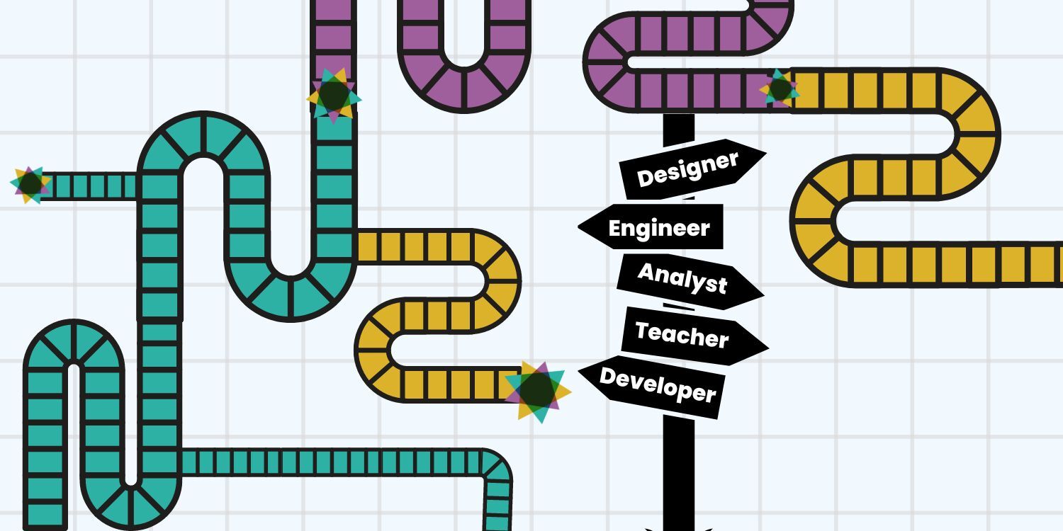
Answer two big questions (if you’re trying to carve out a career in dataviz)
If you’re interested in making visualization a central part of your career, there are so many paths you could take!
Just browsing the DVS Jobs Board, you’ll find opportunities to be a data journalist (where you’ll likely need to know some code to create embeddable dataviz) to business intelligence (building dashboards in tools like Tableau and PowerBI) or data art and illustration (using a wide range of platforms to create bespoke visualizations.

The two questions I often pose in career coaching conversations around data visualization are:
- What kinds of data visualization do you want to create?
- What topic/subject/industry do you want to work in?
Let’s unpack why those are two helpful things to consider as you plot your own learning path, including identifying what tools to learn.
What kinds of data visualization do you want to create? Exploring this question can help inform the skills you need to learn to be successful in a given role. The graphic design mastery of a data artist or illustrator is quite different from the UX mastery of an effective dashboard designer.
Here are some illustrative kinds of visualizations people create career paths around, in case you need to jump start your thinking, along the axes of explanatory/exploratory and conceptual/quantitative (adapted from Harvard Business Review’s Good Charts).

What topic/subject/industry do you want to work in? Considering this question will help you to further refine what tools or languages you need to learn.
Different industries have different norms about the tools and languages used. If you’re creating visualizations in the social sciences, you’re likely to encounter a lot of R users rather than Python for analysis and visualization. If you’re creating dashboards, I’ve seen increasing demand for PowerBI, because of its lower price point than competitors and its integration with the broader Microsoft stack, common to many federal agencies in the US.
My public health graduate school advisor gave me great advice that is just as applicable to mapping your learning journey in data visualization: look at the job postings for roles you are interested in applying for, then identify which requirements or skill sets you don’t have yet. Spend time, whether in a formal degree program or through your own self-guided learning, building those skills so you’ll be a competitive applicant.
If you’re looking for job postings to browse (which can also help with identifying job titles commonly used!) check out the DVS Jobs Board.
Start with one visualization tool, then diversify
You’re likely to see jobs that include multiple tools. Sometimes you’ll see a mix of tools and languages used for different purposes: SQL for running queries to pull and shape data, Javascript for front -end visualization design, Airflow for setting up automated data pipelines, Tableau for developing dashboards.

Not every tool in a dataviz job description will be a front-end design tool, and that’s intentional. To create data visualizations, you need to be able to manipulate and work with data!
If you’re just starting out and are brand new to all things dataviz, Excel can be a great place to start because you can shape data tables, create queries (with PowerQuery), and design and refine charts all in one program. You might be surprised by the elegant charts you can create if you go beyond the design defaults in Excel!
If you want to create embeddable data visualizations, perhaps start with a visualization tool like Datawrapper or Flourish (both of which require you set to up and manage your data tables elsewhere, like in a spreadsheet).
If you’re keen to become a dashboard designer, start with a widely used platform that is low-code to start, like PowerBI or Tableau, both of which can connect to a variety of different underlying data sources.
The list of scenarios could go on endlessly. Where you focus your energy should be informed by the answers to the two questions posed earlier about the type of viz you want to create and the industry you want to work in.
Starting out, I offer the same advice my biostatistics professor gave me when discussing different public health stats analysis programs (at the time, STATA, SAS, SPSS): pick one tool and learn how to use it really well. That will give you a foundation to learn other tools for creating the same kinds of data visualization products.
Don’t endeavor to master Tableau and PowerBI simultaneously! Start with one, use it to practice those dataviz fundamentals we talked about earlier, leverage the incredible learning communities supporting that tool, and when you feel you have a good baseline set of skills, give another tool a try!
Don’t be intimidated – we were all beginners once!
I’m blown away by some of the work that early career professionals are creating in data visualization today: it makes me excited for the bright future of our field.

That said, it’s so easy to get intimidated by the beautiful visualizations you see that are ultimately the products of hours / days / weeks of work, often by cross-functional teams or through an iterative process of trying different design approaches.
Think of the data visualizations you see published in the world as the highlight reel of what someone creates – we all have dozens or even hundreds of designs that end up on the proverbial cutting room floor. The visualizations that go viral on Twitter and Reddit for their beauty and visual appeal can also create confusing expectations for more functional visualizations, like business intelligence dashboards or charts summarizing evaluation results.
Simple is also beautiful in data visualization, and as long as what you’re creating is meeting the needs of your audience, you’re succeeding in making data more accessible to more people, which is an incredible talent in itself.
If you’re looking for more detailed recommendations for getting started in dashboard design/business intelligence or health data visualization, which are the two areas I’ve worked in the longest, watch for the next installments in this series!
Recommended Resources
These are resources that I have found useful on my own learning journey, or that I found summarized key concepts effectively. This list is not exhaustive, but they are a great start–there are so many great books and blogs out there today!
Design Resources + Best Practices
- Storytelling with Data (Cole Knaflic)
- Better Data Visualization (Jon Schwabish)
- The Functional Art and The Truthful Art (Alberto Cairo)
- Visualization Analysis and Design (Tamara Munzner)
Community Resources/Challenges
- Data Visualization Society
- Nightingale, the Journal of the Data Visualization Society
- Back to Viz Basics
Representing Data Accurately
- Avoiding Data Pitfalls (Ben Jones)
- How Charts Lie (Alberto Cairo)
Ethical Dataviz Resources
- Dataviza11y GitHub Repository
- Do No Harm Guide: Applying Equity Awareness to Data Visualization
- We All Count

Amanda Makulec is a health data visualization designer, teachers, and speaker based in Washington D.C. who volunteers as the Executive Director for the Data Visualization Society. She holds a Masters of Public Health from the Boston University School of Public Health, and worked in more than a dozen countries leading teams and developing user-centered data visualization products for federal, non-profit, and private sector clients.
- Amanda Makulec

- Amanda Makulec

- Amanda Makulec

- Amanda Makulec


