
The reality around us is packed with data. The weather, the frequency of the people we see, the cars we see on the street, the videos we engage with on social media, and the average earning of people in our country. But we adults are not the only ones who could see and benefit from those data. Kids and teenagers, especially today, are also exposed to tremendous amounts of data. Which is why middle schoolers need to learn how to read—and create their own—data visualisations.
As middle school teachers, we have noticed how data visualisations benefit young learners. Namely, it allows them to improve their data literacy. Learning data literacy can help students to understand, analyse, interpret, and gain insights from data. It can also give them the critical skills to engage with an ever-increasingly complex world. Second, learning data visualisation helps to foster middle schoolers’ creativity and problem-solving skills, crucial for innovation and collaboration. Data visualisation can challenge them to see their world beyond what is visible, to make decisions based on data, and find new ways to express their ideas. Third, it enhances their communication and presentation skills, which are vital for sharing their knowledge and opinions with others. Data visualisation can help them craft compelling stories and arguments with data.
We saw these benefits first-hand when we incorporated data visualisation into a curriculum for middle school students in Jakarta, Indonesia, from March 2023 to June 2023. Over this time, we focused on teaching data and its type, exposing the students to many kinds of data visualisation. Then, we turned to making data visualisation through project-based learning so that they could obtain, understand, analyse, interpret, and present data throughout the creation process.
Teaching and Learning in SMP Kembang
Situated in the middle of an urbanscape, Kembang middle school (known locally as SMP Kembang) in South Jakarta is a non-formal middle school that offers a progressive learning process by involving students as members of the community and invites them to gain firsthand experience through interaction with a local context, learning from experts, field trips, and various creative endeavours. In SMP Kembang, project-based learning is the backbone of the learning program and all teaching approaches, which enables students to own their learning process and choose topics based on their personal learning interests.

Each school year is divided into four learning quarters or units, with a robust theme assigned to each learning unit, which also becomes the theme for students’ projects. Each nine-week unit starts with thematic or topical exploration. Students are exposed to various topics related to the theme by learning with teachers and guest speakers, doing hands-on experiments, and exploring various sources of information (including literature study, watching videos, and browsing the internet), all permeated with discussions and reflections. By the third week, students brainstorm some project ideas and conceptualise the project in a project plan or proposal. The following weeks focus on execution and production, all in preparation for the final presentation to peers, teachers, and public audience. Sometimes, their final projects are shown in an internal or external exhibition after evaluation and refinement during the final week.
A Project-Based Learning Unit on Data Visualisation
In one of these project-based learning units, we ask students to explore the realm of data visualisation. Before starting the unit, we discussed the end goals for the term with the students and came up with the key question: How do we present complex data (and represent complexities) in a simple, interesting and meaningful way? Based on this big question as our goal, we identified their learning needs and started to design the curriculum.
It’s important for teenagers in today’s world to understand firsthand the importance of learning data visualisation, and so their first week started with discussions around the small and big data that are easily found online, mainly from Data Viz Project and Satu Data Indonesia. We continued by exploring the basics of data visualisation by learning types of data (qualitative and quantitative, discrete and continuous), statistics, basic data visualisation (such as pie chart, scatter plot, and line graph), and creative data visualisation (such as sankey diagram, exploded view drawing, progress bar, choropleth map).
The first week ended with a mini project, to help students apply and demonstrate what they learned. They tried to collect data from their classmates in any topic they are interested in and create a data visualisation by hand based on the data they collected. As this is their first project in their first week, they were creating simple diagrams such as pie charts and bar graphs, but there was one group that tried to make a chord diagram about classmates’ seating partner preferences.

In the second week, students continued learning topics from the first week, such as statistics. We also had a session with Arran Ridley, a data visualisation researcher. The session started with a lecture about data types. We also discussed data storytelling and how data visualisation can be utilised to convey messages and make an impact. After this, students were given a group activity to make a data visualisation by combining two types of data. They were allowed to use imaginary data.
One group of students made a set of information about capybaras consisting of imaginary facts. Students that like anime made creative bar charts about the heights of various Kaiju. Another group mapped African dictators and the number of deaths attributed to them during their periods of rule. The other two groups made an imaginary data visualisation, one about the hobbies of some people using chord diagrams, and the other predicted populations of Indonesian living abroad in 2050. Through the session, students were getting more confident to explore the topic they like and use different types of data visualisation. They also gained more knowledge and could distinguish between quantitative and qualitative data.
The students continued their learning by brainstorming ideas for their projects. They made three lists inside three separate circles, each containing (1) various topics of their interests, (2) questions that sparked their curiosity, and (3) data visualisation types that they’d like to explore. They marked the most interesting topic, question, and data visualisation and drew lines to connect questions, topics, and data visualisations that could be merged. This process helped them to think creatively about the data they might use and make decisions based on the most interesting and feasible topic in a given time frame. Some topics they chose included the most endangered animals, drugs in Indonesia, human emotions, the world cup, weekend schedule, trans java toll, sinking Jakarta, perception towards music, and junk food among adolescents. We were amazed to witness how the students even discussed some sensitive and controversial topics with ease, for they see it as a part of human reality that needs to be learned and explored, free from prejudice, stigmas, and conflict of interest.
After choosing a topic and planning on their project, students started to do research and collect data. This time, most students chose the internet as their data source. This might be caused by the wider topic scope compared to the previous project. To help them consider other options, we discussed each data collection method’s pros and cons. As a result, their data collection method became more varied. Some still preferred to collect data from the Internet, but some others tried to use observation and surveys, utilising interviews and questionnaires. They collect various data, such as frequencies of natural disasters in Japan, adolescent behaviour towards junk food, Java Island’s toll road development over time, dominant flavours of Indonesian food in several regions, and effectiveness and comfort of friends’ preferred working spot.


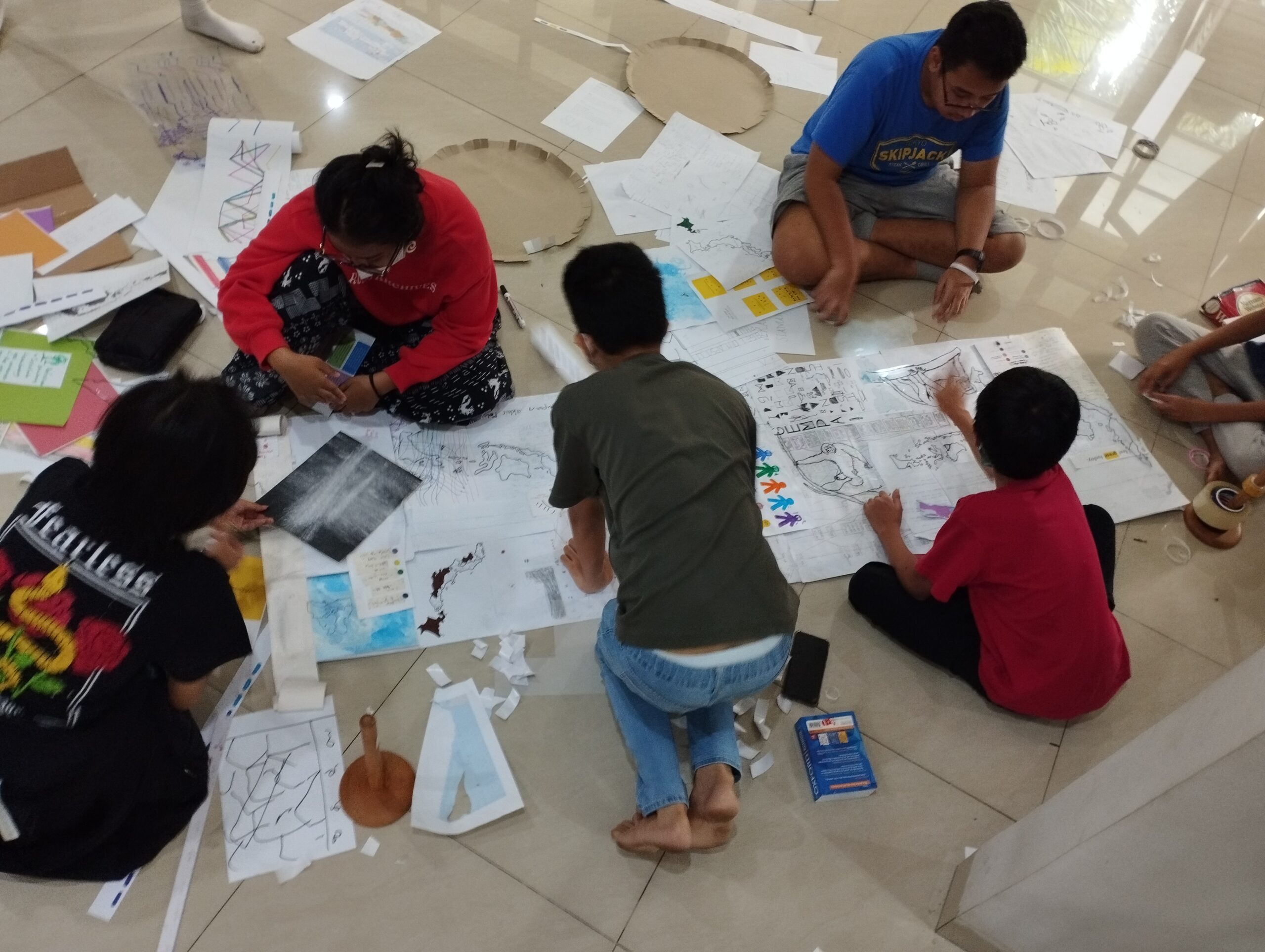
While collecting data, they also decided on the data visualisation type they planned to use. However, this could also be changed as they found more interesting data visualisation types. On their first try, students made their first data visualisation draft. Their aim was to make it as good as their first mini project. The draft would not be their final product, as there would be a lot of revisions. From previous experience in mini projects, students still have some improvement ideas. Therefore, in working on the data visualisation, we try to make the process iterative between drafts and revisions.

In this case, students learned to use effective data visualisation to present their information and ideas. They even considered the colour, font, and other details to ensure their data visualisation sends the message they want. Throughout the process, students encountered some challenges: organising and linking data from many sources, choosing the data visualisation suitable for their data type and quantity, making a hand-drawn grid and using a scale, choosing handwriting styles and colour palettes to create unity in visual composition, and maintaining the quality of their final products.


As the students finished the project, they were given an opportunity to present and exhibit their final product in an art space in Jakarta. The audience included other students, teachers, parents, public visitors and viewers on social media. The students explained their data visualisation, prompting discussion on the impacts of the data and feedback from different perspectives. From the students’ presentation, we captured some reflections such as:
- “It’s difficult to find data about illegal substances in Indonesia because different sources state different information. I need to be extra careful of the data I could trust.”
- “I hope through my project I could influence other people to actively protect our environment.”
- “This is the most challenging project so far. For me, it should be highly scientific and highly artistic at the same time.”
- “I’ve just realised that this was the first time I involved my classmates on my project. Previously, I tend to choose topics that could be learnt through the internet.”
- “I am so happy to learn many kinds of diagrams that could visualise data. I could see the benefit of it to deliver different messages and information to the people.”
Here is a collection of images from the final showing:

“Classroom Dynamics” – A creative mapping of the change in classroom arrangements, class members learning & working spot preferences, and level of comfort in seven days. Photo credit: Davy Linggar 
“Copa del Mundo” – A long bump chart depicting the rise and fall of 20 countries in World Cup from 1930 to 2022. Photo credit: Davy Linggar 
“Moodwatching” – Visual survey on daily experiences and feelings. Photo credit: Davy Linggar 
“Songs of A Down” – Parallel coordinates on diversity of themes perceived by 10 respondents toward 20 songs listened. Photo credit: Davy Linggar 
“Siamang, Orangutan, & Bekantan” – A poster comparing the habitats, diets, morphologies, and populations of three endemic primates of Indonesia (siamang, orangutan, bekantan). Photo credit: Davy Linggar 
“Trans-Java Toll” – A Trans-Java toll route map divided into five time periods, with each period denoted by a different coloured marker on five separate OHP sheets. Photo credit: Davy Linggar 
“Weekend Life” – Abstract pixel art represents the weekend schedules of 15 middle school students. It consists of 15 separate colour-coded timelines, with each colour representing a different type of activity. Photo credit: Davy Linggar 
“JDM Cars” – An alluvial diagram about 13 Japanese sports car specifications, such as horsepower, speed, machine capacity, price, and size. Photo credit: Davy Linggar 
“IS IT WORTH IT?” – Set of posters consisting of diagrams, insights, and facts about junk food and adolescence. Photo credit: Davy Linggar 
“Narcotics, Psychotropics, and Addictive Substances Importer” – 3D diagram showing narcotics, psychotropics, and addictive substances importer country to Indonesia in scalactic diameter. Photo credit: Davy Linggar 
“Flavours of Indonesia” – Indonesian map with colour-coded five major island. Each colour representing dominant food flavour in particular region. Photo credit: Davy Linggar 
“Priced Hobby” Photo credit: Davy Linggar 
“Our Nature” Photo credit: Davy Linggar 
“Jakarta Sinking” – Interactive data visualisation, visualising the predicted depth of water in various iconic spots in Jakarta. Photo credit: Davy Linggar 
“Evolution of The Tyrants” Photo credit: Davy Linggar 
“Disasters of Japan” Photo credit: Davy Linggar
Reflections and Some Insights From the Project
Seeing the impact of this unit so far, we decided to make this topic (data visualisation) one of the mandatory project topics for all students. From this whole process, we’ve obtained some key takeaways that could be applied the next time we explore this theme and for other teachers that are interested in teaching data visualisation to middle school students:
- Conducting various data collection methods is a key learning experience.
Interestingly, all of the students chose the interview as the data collection method for their mini project, probably because, given the short amount of time, it was easier for them to interview their peers than to collect data from other reference materials. At the beginning of their main project, the majority of them chose the Internet as their data source. From this result, there’s a need for students to get experience in trying different data collection methods before doing their projects.
- Data can also be collected in the visualisation itself.
When collecting data from their peers, some students directly recorded the data, such as interview answers on their data visualisation media, such as on numeric scale and chord diagram.
- Revision and refinement play an important role.
After seeing their results in the mini project, students realised that it was possible to continue to make improvements even after submitting their final result. When we applied this practice of iteration and revision to their final project, we could see significant improvements in the quality of their projects.
- Document and archive all project drafts.
During their project development, students had a lot of raw data compilations, processed data, experiments, drafts, journals, sketches, diagram dummies, and other forms of documentation. We teachers found that it would help both students and teachers to keep track of the project development if this inventory is managed and organised throughout the process. Going forward, we plan to find a strategy to archive all those artefacts to increase clarity and support a systematic process in data visualisation.
- Presenting data in various ways provokes community engagement and vice versa.
During the process of gathering data, students engage with friends to obtain some information, thus making them participate as part of the community. This exercise, in combination with the public exhibition and presentation process, gave students the sense that their data matters to the community.

Beyond all that, both students and ourselves, the teachers, could deeply see data not just as a result of gathering facts from the world but as a tool to make meaning of reality. The process of visualising data helped us to discover the interconnectedness between our experience and this world of data. Visualising data becomes a portal for us to engage with difficult or complex topics. Data allows students to critically analyse one topic or issue from many perspectives and fields of study, ranging from socio-cultural and political to medical and environmental lenses. It’s an integral part of learning about their world, and we are so pleased that they can now take these skills and dispositions forward.

Agnes Vilia
Middle school teacher in Sekolah Kembang. Fostering empathy, self-assurance, and fulfillment in students, while promoting a safe learning environment that nurtures holistic personal growth.

Aquila Adimurti
Principal and middle school teacher in Sekolah Kembang, empowering literacy across curricula and nurturing students’ learning dispositions through intersections of artistic and scientific endeavours.

Regina Nurashari
Middle school teacher in Sekolah Kembang.
Exploring learning dispositions to empower students as self-fulfilled members of society in pursuit of an equitable world.

Arran Ridley
Arran Ridley is a researcher and writer from the United Kingdom who lives in Jakarta, Indonesia. His work mainly focuses on the theory and application of data and visualisation in society.
-
Arran Ridley

-
Arran Ridley


