
Declutter and focus are two guidelines for creating clear and efficient visualizations. The declutter guideline suggests removing all the non-critical elements of the chart like gridlines, excessive labels, and unnecessary colour variability to emphasize the relevant data. The focus guideline recommends using techniques like a clear title that describes the relevant data pattern, highlighting the important data values with a unique colour, and adding written annotations to steer the audience toward the intended conclusion.
If you think about it, both the declutter and focus guidelines are common in our daily life as well. We are asked to declutter our desks, underline the important points in a written test, choose colours in a room based on where we want to draw attention, and so on.
To ensure that the data visualisation is understood correctly, numerous dataviz experts tout the benefits of design principles like concepts of declutter and focus. Nonetheless, until now, there was no empirical evidence to validate whether following these guidelines actually makes a significant difference in effectively conveying a message to an audience.

This was the motivation for Steven Franconeri, a psychology professor at Northwestern and head of Visual Thinking Lab, to conduct research along with his students (Kiran Ajani, Elsie Lee, Cindy Xiong, and William Kemper) and collaborator Cole Nussbaumer-Knaflic, to find out if these techniques actually worked.
“Cole, one of our co-authors, wrote the book Storytelling with Data outlining numerous data visualization guidelines. She was involved in this project from the start and was a big part of the reason why we decided to research the declutter and focus guidelines specifically.”
Kiran Anjani

The research
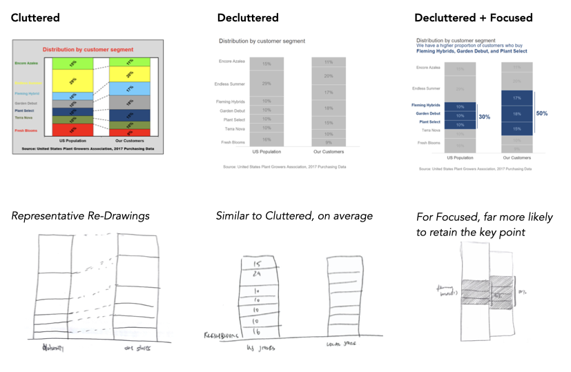
The study tested six graph topics: car, holiday, news, plants, prison, and tires. Three versions of each graph were created – cluttered, decluttered, and focused.
1. Cluttered Graphs – Utilized a large colour palette, heavy borders and gridlines, background shading, redundant labels, and a lot of bold text.
2. Decluttered Graphs – Omitted unnecessary colours, gridlines, and bold text, but kept the chart title, axes, data values and labels, and added white space between major elements.
3. Focused Graphs – Highlighted points in the cleaner version to draw the focus of the viewer to those data values. The highlighting was done by adding single colour to specific data points along with a one-sentence annotation describing the intended chart conclusion.

There were 24 participants in the study, students or community members of Northwestern University, and the average participant was 20 years old. The experimental procedure involved two parts – memory assessment and subjective ratings.

In the memory assessment, the participants were given a prompt that briefly outlined what each graph was about. Then, two versions of any three topics for a total of six graphs were shown. Their first task was to redraw the graph after seeing it for 10 seconds. Their second task was to recall the topic of the graph and the main conclusion.
For the subjective ratings, the participants were shown all three visualization designs – cluttered, decluttered, and focused – for all six topics. They were asked to rate the three versions across four different attributes: aesthetics, clarity, professionalism, and trustworthiness, where one indicated the most negative and five indicated the most positive rating for each attribute. Then they were asked to explain their reasoning for choosing their ratings in an open-ended response.
The results
For the redraw and recall task, the findings showed that for cluttered and decluttered graphs the participants came up with a wide variety of responses and largely missed the relevant point for both types of charts. Thus, these visualisations were not very effective.
Presenters have “a curse of expertise,” Franconeri says. “They see what’s important in a graph, and they think the audience does, too. They are typically wrong.”
When the focus technique was used, the participants were much more likely to capture the main conclusion in their written descriptions and redraw the appropriate trend. This finding suggests that this technique has a positive effect on comprehensibility.
As Kiran pointed out, “The recall of relevant conclusions being higher for the focused charts certainly supported our conclusion that focused graphs convey specific messages better than cluttered graphs.”

Participants rated the decluttered graphs higher for professionalism, while they rated the focused charts higher across all four parameters of aesthetics, clarity, professionalism, and trustworthiness.
Interestingly, some participants, in written comments, perceived the focused charts as untrustworthy because the presenter appeared to be pushing an agenda. While students Elsie and Kiran were surprised by this input, Cole pointed out that they had not supplied the source of the data visualisation during the study, which seemed to affect the credibility for some participants.
As Steven Franconeri says, “We didn’t find the cognitive benefits that were predicted for the decluttered graphs, but people absolutely had better memory for the highlighted pattern,” reiterating the point that decluttered graphs alone were marginally more effective than cluttered graphs, but with focussed charts, there was a definite improvement in recall value and positive sentiment.
The Virtual Thinking Lab’s study succeeded in showing that recall is higher in focused charts and that focused charts impart the desired attributes of aesthetics, clarity, professionalism, and trustworthiness to audiences. They also found that the decluttering technique does impart professionalism and is therefore an improvement over cluttered charts, especially by keeping the colours and other chart junk to a minimum. Finally, though the focus technique can sometimes come off as too prescriptive, Franconeri thinks the cognitive benefits outweigh this potential downside because he posits that people appreciate being guided to the intended pattern–provided they perceive transparency related to the data source.
Conclusion
The data visualisation experts have widely advocated the declutter and focus principles, yet they are not vastly followed in the real world. The empirical evidence provides support for the practitioners and instructors who need to convince not only the creators and readers but also colleagues and supervisors in their respective fields. This empirical validation shifts the long-standing design principles from a preference to a guideline and helps dataviz designers feel confident about following them.
Of course, there is an opportunity to broaden the parameters of the study to further quantify the results since the participants were young college students which might skew the findings when compared with people in business for a long time.
“Our study can serve as an initial model for preferences of data visualisations, it should be used as a jumping-off point to do more studies with other, more specific populations, especially people in business settings.”
The researchers

Remember that the intention of the data visualisation should be the driving force to decide the design. The declutter and focus principle is of maximum value when the objective is to communicate a message efficiently to an audience which may not be the goal of an exploratory dataviz or data art.
Shachee is a freelance data designer who helps people and organizations convey their messages in a visual form. She is an advocate of fusion and visual communication is her tool to combine the intellectual with the emotional. Other than creating effective visualizations, she loves coding, traveling and reading fiction!


