
Viz For Social Good began as a passion project (like many a great endeavour) from our founder Chloe Tseng in 2016. She felt that whereas at the time there were many ways for data visualisation practitioners to learn and share their work in the online community, there were not so many opportunities to make a difference. By identifying and liaising with non-profit organisations who could benefit from data visualisation assistance and enrolling a number of volunteer contributors initially from the Tableau community, it quickly developed through 2017 into a thriving community, winning an Information Is Beautiful award for best Community Visualisation Project in the same year.
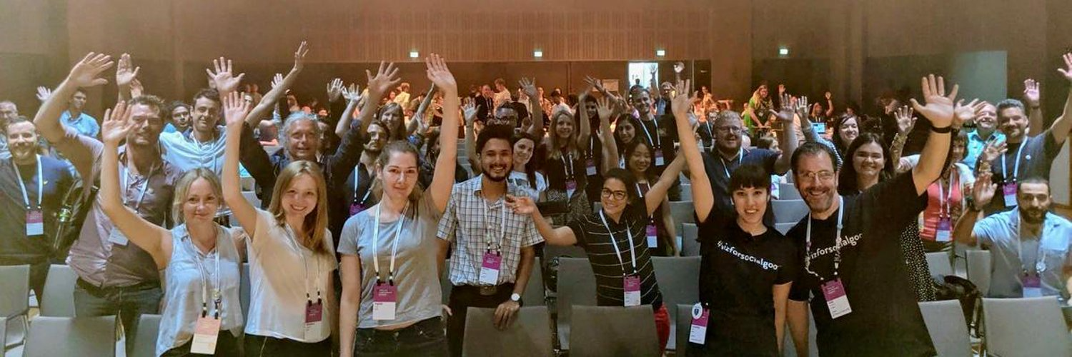
Since then, we have grown to an international community of volunteers who have helped many mission-driven non-profit organisations around the world to understand their data – by creating data visualisations using either public data or specific data provided by the non-profit in question. Into 2021, we have continued to expand with over 4,000 people registered with the organisation, including a passionate core of regular visualisation volunteers, all excited about harnessing the power of data visualisation for social change.
This growth eventually meant that the journey of developing our identity, which began as a hashtag (#vizforsocialgood) before becoming a website (https://vizforsocialgood.com), had gotten to a stage where a more formal branding was needed for our organisation. After all, as we continued towards official non-profit status, it became clear that we didn’t have a true logo. We did have a familiar “look,” albeit one that was little more than using the Brandon Grotesque font to stylize our group’s name.

Granted, that has a certain amount of familiarity to it (it adorns our T-shirts!), but how did we take the next step and go through the process of designing and adopting a logo?
There were a few key considerations we had when devising our logo:
- We want to communicate our identity visually with the use of the logo.
- Viz for Social Good is an organisation which is deeply rooted in data visualisation and design.
- Viz for Social Good is global; our volunteers come from around the world with many diverse and divergent backgrounds.
- We want the logo to not only represent the fundamental principles of visualisation, but to emphasise the organisation’s optimism, energy, and willingness to make a difference.
In terms of data visualisation principles, this meant that we wanted to keep the design simple, sleek and uncluttered. This led to us focusing just on the four initial letters of the brand rather than the full organisation wording, as per our current “logo.” We wanted to respect colour theory by utilising an accessible and stylish colour palette that would not look out of place in a data visualisation, and so focused on a small palette featuring one base colour.
So how did we go from this hashtag starting point to a finalised logo? Needless to say, the design of the logo went through several iterations and mock-ups. Our final pencil draft looked something like this …

1. Sleek and Simple Design
We made the decision to keep the logo simplified to the name of the organisation, with no additional visuals included. By using only the initials of our name we could create something small, easy to memorise, and scalable to social media apps. The four initials were also in line with the number of steps a volunteer would have to go to to participate. Step 1 – register as a volunteer. Step 2 – VFSG announces a project. Step 3 – explore and visualise the data. Step 4 – submit the visualisation.
2. Representing the Organisation
VFSG is a young, energetic organisation with a welcoming and selfless community, which helps us create social impact. How could we transmit that in our design? We chose to use geometric elements, such as triangles, rectangles and semicircles. Circles are traditionally associated with unity and togetherness, and triangles together can also be associated with internal strength. Additionally, the familiarity of geometric over more organic unstructured shapes give a data visualisation feel to the logo too, confirming our identity as a data visualisation community.
3. Colour
Our colour palette was deliberately simple and based on one colour. It was chosen to avoid impactful colours or colours associated with negative emotions such as conflict or danger, and this led us to the focus on a more peaceful teal colour scheme. We kept our design to three main colours (dark teal, light aqua and black), with different hues of the same colour to create diversity, pattern and texture.

4. Attention to Spacing
By focusing on the initials and keeping them within a square shape, this allowed us to maintain the same proportions for each initial, as well as equivalent white/negative space around each letter. The flexibility and versatility of the square logo frame also allows it to be used in large templates (e.g. T-shirts, flyers) as well as smaller areas such as social media profiles and favicons.
Deconstructing the Logo

V: We start with the strongest colour in the top left to draw the eye to the start of our name, the triangle where it all begins, and the representation of V for ‘Visualisation.’ Of course, we as an organisation are deeply rooted in visualisation – it is the primary product that we deliver.
F: Here we wanted to integrate different geometric elements and layer various hues of the same colour, to represent the diverse community we work with, both in terms of our non-profit partners and our contributing volunteers. The overlap of the triangles helps to emphasise parts of the community coming together as a whole.
S: With S representing ‘social,’ we wanted to use a lighter colour. We utilise the association of the colour green with hope, and the constituent shapes themselves link together as if on a Venn diagram, representing the commonality we have with our partners and volunteers: the ultimate belief in a better world, and the underlying principles of how we can drive social good.
G: Lastly, we arrive at the G, standing for ‘good.’ It is a representation of a whole formed by many parts – as with a globe. We are a global, inclusive organisation, at a time when inclusion and diversity have never been more important. This shape closes the “cycle”, making use of the dark teal prominent in the V and the light grey from the F. The lighter hue of grey allows us to bring the journey through our logo to a natural conclusion. In order to emulate the G a little more, the circle itself is not entirely closed, but Gestalt principles of proximity are at play here, leaving us in no doubt that this represents the fourth letter in the logo.
Our final logo below combines all the above elements, and while still retaining familiar elements from our previous text-only branding.

We learned a tremendous amount through the rebranding process, not just the least of which is the understanding that it really helps to be a part of an organisation and integrated within its culture before undertaking a logo redesign, but also the various considerations in play, such as colour theory, accessibility, and Gestalt principles, all a part of the logo design process in the same way they are within the field of data visualisation.
The final logo is presented with huge thanks to our Education Director Nisa Mara, for whom this was definitely a passion project resulting in a data visualisation inspired logo we’re excited to launch. We’d love to know your thoughts on the logo – and if you’re interested in becoming part of Viz For Social Good, please volunteer via our website or join our Slack community to find out when our next project starts!
Neil Richards is currently the Editorial Director for Viz for Social Good. Neil also blogs at vizforsocialgood.com and has an extensive portfolio of Tableau data visualisations (including those contributed for VFSG projects as well as many more) on Tableau Public.

- Neil Richards

- Neil Richards

- Neil Richards

- Neil Richards


