
I was looking forward to reviewing ColorWise by Kate Strachnyi for two reasons. Firstly, Kate is a huge presence in the online data community. In particular, she has grown a strong data and visualisation brand on LinkedIn which has helped me and thousands of others. Her DATACated conferences have introduced me to talks and conversations that have grown my network, and inspired my professional passion towards improving data literacy.
Secondly, many of us learn the basics of colour in data visualisation as we enter the field, sometimes informed by colour theory from other disciplines and sometimes through advice from peers and websites. However, I’m not aware of many resources or books that focus purely on colour from a data visualisation perspective. My own book, Questions in Dataviz, for example, devotes a chapter to colour and then leaves many questions unanswered!
Kate’s book is best pitched at beginners, and is written with the assumption that what is included will be new to readers, whilst acknowledging that for those with a little more experience, it remains a really useful reference tool.
In many ways, the most important advice is in the preface, where Kate emphasises to “use colour intentionally in everything you do. Don’t just use the default settings because you think it ‘knows best.’” It’s this thought process that, for me, is the key takeaway that underpins many decisions on the subject of colour.
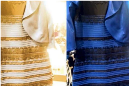
Reading from start to finish allowed me to fill in gaps in my own knowledge. Some of these gaps included additive versus subtractive colours; hues, tints, shades and tones, and that dress making an early appearance in the book with an explanation I never really understood when it was doing the rounds a few years ago.
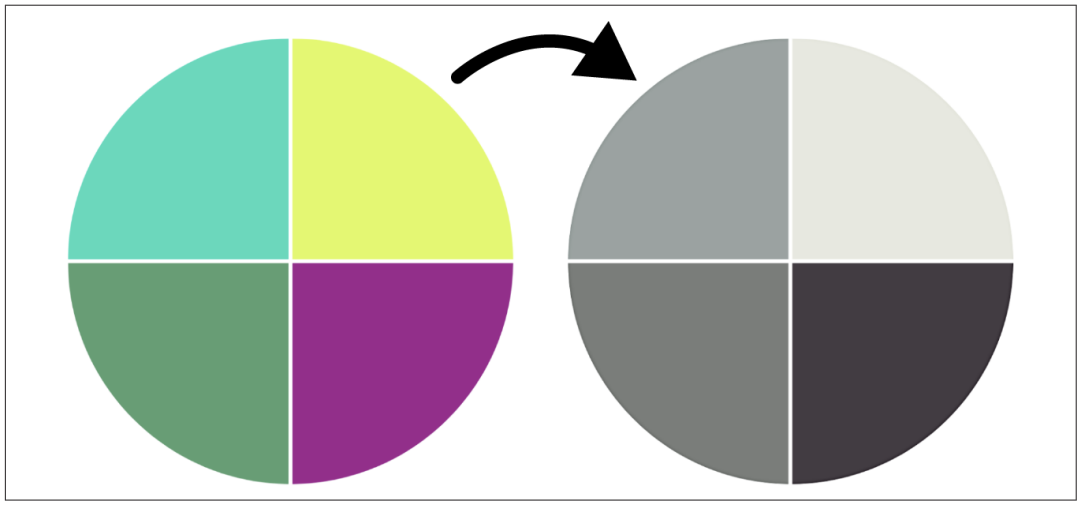
Credit: ColorWise
As is so often the case with data visualisation advice, the best practice examples are illustrated equally well with pitfalls and bad practices to avoid as much as with good practices to adopt. We are introduced to storytelling techniques; advice on complementary colour palettes; sequential, diverging, and categorical palettes; accessibility and colour blindness considerations; cultural considerations of different colours; and many more issues, always with examples of what works and what doesn’t.
**********
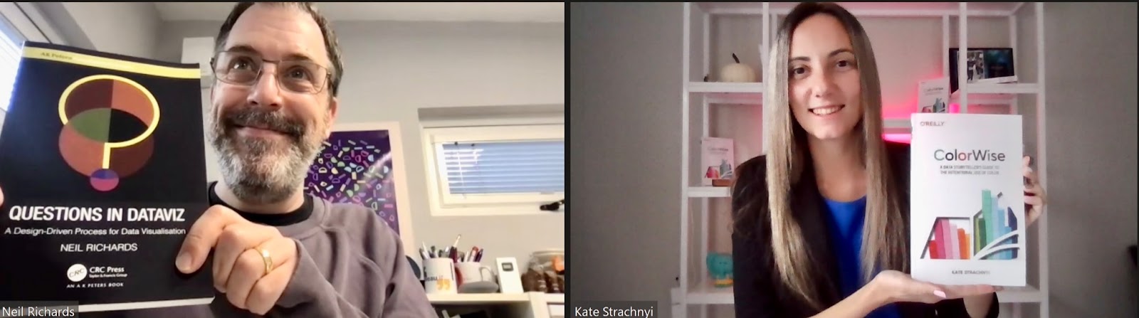
I wanted to know more about the book process and everything Kate is doing in the data field, so I was delighted to be able to talk to her and catch up about the book, which starts with an obligatory self-indulgent mutual book selfie! Below are some highlights from our chat:
Neil Richards: Congratulations on your book! How cool does it feel to have something physical in your hand?
Kate Strachnyi: As cool as it feels for you, I’m sure!
NR: How long did the process take you?
KS: So, the thought was in my mind for probably about three or four years, but the actual writing process didn’t take that long. I would say probably about a year. I have a whole story about how I got to write with the publisher. I have self-published books before, and this time, I really wanted to work with a publisher, mainly for the experience. I spoke to a long list of publishers, and I kept coming back to the idea that maybe I should self-publish. O’Reilly didn’t say yes right away—it was funny because they reached out to me to write a different book, on data visualisation, storytelling, Tableau, or something like that. I didn’t want to do that. I wanted to write about colour. And the word from all the publishers was that it was such a unique and niche topic—who is going to care enough to read just about colour?
NR: Unique and niche is good, isn’t it? I’ve read your book and enjoyed it. One of the first things I thought about was that we learn so much about colour. We get told things, we learn best practices and we find them out from our mistakes sometimes, but I have a bookshelf full of books and not a single book about colour in data visualisation. So that’s why I think you’ve found such a great topic to write about. But why did you pick colour—was it for that reason, or was it something that particularly interested you?
KS: I used to teach data visualisation best practices and storytelling, and we used to talk about three things: one was making sure you select the right chart, another was reducing the amount of clutter so that everything would be neat, and third was colour. I think the first two were covered enough in books and videos, but there was not enough talk about the topic of colour. The feedback I got from publishers was that maybe there’s a reason for that. Maybe people don’t care? But there is not a book, at least until now, that is specifically for colour for data visualisation and storytelling. I did a workshop session for O’Reilly about colours and visual best practices where they noticed how engaged the audience were. They were just so excited to talk about it. A couple of days after that session, they came to me and said, “Okay, Kate, let’s talk about the book!”
“If you read one page, it should be the page that says, “Don’t accept default settings.”
NR: We often see colour theory books from a design point of view, but not specifically about data visualisation and data storytelling. I notice you market your book very specifically at data storytelling. What’s your thinking behind that?
KS: The reason for the term “data storytelling” is because even if you’re visualising data, you’re still telling a story. Even if it’s a chart that goes to email, that’s still data storytelling. Some people interpret it as standing up in front of a big crowd presenting, and using data to tell a story, but I think all data points tell a specific story.
That’s partly the explanation, but also the publisher picked the subtitle: “A data storyteller’s guide to the intentional use of colour.” I wanted to make sure that the “intentional use of colour” was in there because for me that’s the main takeaway of the book. If you read one page, it should be the page that says, “Don’t accept default settings.” There might be nothing blatantly wrong with them, but the point is to be intentional in your use of colour.
Credit: ColorWise
NR: That’s interesting. You’re going to think I wrote this the other way around, but in the review I’ve already written to accompany this chat, that was my one takeaway from it as well—exactly that!
KS: I’m happy they let me keep the title! There were about four different titles that I was thinking about. How do you interpret ColorWise?
NR: It’s nice because it’s a one-word title, and it imparts the wisdom and knowledge about colours that you need to have in order to make that intentional decision. Did you learn anything new while you were bringing together what you had learned in practice? While you were researching it, was there anything where you thought, “Wow, I didn’t know that!”?
KS: The only thing that came up—and this is something my daughter taught me, and I showed her where I put that in the book and credited her—is the fact that pink and blue used to have very different meanings for gender, because pink was known as the stronger colour, and blue was known as the weaker, calmer colour. Now it’s changed where pink is more feminine, or associated with female babies, and blue is the stronger colour. But overall, there are cultural nuances where colours are interpreted so differently: a colour here would be interpreted as really good, but somewhere else it would be really bad. It’s so important to know your audience and make sure that you’re taking all of that into account. If you have a very mixed audience, where one colour might confuse or lose someone, then it’s best to be on the safe side and use less colours.

Credit: ColorWise
NR: That’s one of the things that I’ve always been fascinated about. So what do you think about pink and blue? Would you use blue and pink for male and female, to determine sex in a visualisation, or would you stay away from it?
KS: At this point I would stay away from it. I think staying safe is the key, and using two colours that are clear, and maybe using good subtitles. I tend to go with blue and orange as my go-to for colours when I’m not sure what to use, just because they’re so easy to differentiate. So I would probably experiment with blue and orange, where blue would probably be for men and orange for women. Not sure why, but my intuition says to stay away from pink.
And sometimes, use no colour—use something else!
NR: That’s the interesting thing, you can be doing a book all about colour, where one of the things you might actually advocate for is that you shouldn’t be using so much colour! Sometimes you don’t want to encode with colour at all, but with something else.
There are a few pitfalls mentioned in the book – what’s the biggest mistake that you find that people make?
KS: One thing that’s going to surprise a lot of people is the fact that we don’t pay enough attention to colour blindness and accessibility, and the fact that many people, especially men, suffer from colour vision deficiency where some colours look very similar to each other, for example red and green. This would be crazy because especially in the financial world, red and green are the most used colours, where red means “bad” and green means “good,” at least in Western cultures. And when you put a lens or filter that simulates a colour blind individual, everything starts to look very much the same, as one mixed colour that doesn’t look very pretty. The point I’m making is that it might be very surprising to some people that even when we think, “It looks different enough to me,” not everybody sees colours the same way.
NR: It’s one of those things you learn as you move into data visualisation and think, “Why have we never thought about that before?” I still get requests for this regularly: Can you do this in red and green, please? And I’m sure you must do, too.
KS: I do, and then that’s the time to educate, to demonstrate, and show them. What I used to do with clients was that I would do as they asked, create a better alternative, and then let them decide which one looks better. Sometimes they still want the red and green, just because that’s what they’re used to, and other times we are able to educate them as to what it would be like for certain individuals. Even if you don’t have those individuals on your team, it’s just something pretty simple to do, so why not do it, and make life easier for someone else?
NR: I want to pivot a bit and learn more about DATACated, your company, and what you do. Our paths have crossed because I’ve been to your events. I also follow you on LinkedIn and I’ve seen the great stuff that you put out. But what more can you tell me about that?
KS: DATACated has evolved over the years. First of all, it’s a play on words, with me being dedicated to data, and with the sound of my name Kate. I actually trademarked the name. I fell in love with it, and so far everyone for the most part has liked it. It is a media company as well as a community. So part one is, I work for organisations—sixty or seventy companies. Sponsors pay to do live shows, sponsor conferences, for newsletters, posts, email blasts to promote their conference, their webinar, their book, whatever it might be. So that’s the media company. Then I also host something called the DATACated circle, which has courses on data storytelling and data-to-dashboard with tools like Tableau, PowerBi, R, Python, Excel. Eventually, I might have a course on colour—but not yet! And then I write books. So that’s the other piece of the brand. And I have courses on LinkedIn Learning on Personal Branding and another one coming out soon on Data Careers. So the short answer is I like to bring data professionals together in various ways.

Credit: Colorwise
NR: It’s awesome. I have attended one or two of your events and been able to see some great talks by data literacy experts, and so I thank you for that! My next question is, what’s next? I know this book has recently dropped, but have you got another book or project in mind?
KS: You know what it’s like as an author! You publish a book, and then… now what? I am working on another book which is basically an almost daily journal of running my company. The book is called Running DATACated, and it’s all about how to run a media company, how to get clients, run events, conferences, write books, read courses, grow your brand—all of that is going into the book. I’ve already started writing it on a platform called Substack where people pay a monthly fee to get access to whatever I post there. I’m sharing everything, working on my thought process for next year, what goes into planning for live shows. I’m also writing about running marathons and running, so it’s a mixed book about running DATACated and actual running. I’m going to capture my running adventures, my marathons and ultramarathons that I plan to run this year. I will write daily or almost daily. I don’t work every day, I have kids.
NR: This can be a rhetorical question, but how do you find the time?!
KS: There is so much I want to share with the world, and this gives me an outlet. I think it will be so much fun at the end of the year to go back and ask, “What did I do on May 3rd? I was thinking of doing this, did that actually work out?” Eventually, I will either write it all myself, or hire a smart person to put everything together into a book. It’ll probably be 300 to 400 pages.
NR: It’s been great to meet you, Kate. Good luck with your current and future projects!
In all, the book is of manageable enough size that I recommend everyone reads from start to finish, whatever their experience level. For those new to the field, it’s a great primer in enough detail to increase your understanding of colour in data visualisation, and to enable you to make your own informed colour decisions from one of the most dedicated and passionate people in the business. For those more experienced, it’s a great reference source and refresher which is still likely to introduce you to at least one or two examples or concepts you hadn’t encountered before.
Disclaimer: Some of the links in this post are Amazon Affiliate links. This means that if you click on the link and make a purchase, we may receive a small commission at no extra cost to you. Thank you for your support!

- Neil Richards

- Neil Richards

- Neil Richards

- Neil Richards


