
In February 2021, people on Twitter were challenged to re-create the historical data visualizations of W.E.B. Du Bois. The goal of the challenge was to celebrate his data visualization legacy by recreating the visualizations showcased at the 1900 Paris Exposition using modern tools. This is the story of that challenge: how it began, its process, results and lessons.
How It Began
The idea for the #DuBoisChallenge came from Allen Hillery and Sekou Tyler. In early February, 2021, Allen and Sekou approached me with the idea of creating an online challenge where people would recreate selected Du Bois visualizations and share their work online. Allen was aware of my prior work recreating over 50 Du Bois visualizations, and since I had the data already compiled, I was thrilled and delighted to help.
The Process
All of the visualizations (the originals and my recreations) and their underlying data were already collected in my github repo, so I made a special directory for the challenge. The participant’s goal was to re-create the visualizations using modern tools of their choice (Tableau, R, ggplot, Stata, PowerBI, decksh, etc) and submit their re-creations to Twitter using the hashtag #DuBoisChallenge. The challenge would run over several weeks, highlighting one visual per week. Officially, the challenge ran for seven weeks, starting February 16, 2021, but given the nature of online communities, people continued to submit their re-creations, re-mixes and reactions long afterwards.
The Challenges
For the challenge, I curated a list of Du Bois’s visualizations that would best represent his work, while giving people a range of chart types to work with – from simple bar charts, to maps, to the famous “Du Bois spirals”.
Here are the challenges – one for each of the seven weeks, plus three “bonus challenges” (note: the titles are taken from the 1900 originals and use antiquated terms to refer to populations of color):
- Comparative Increase of White and Colored Population in Georgia
- Conjugal Condition
- Occupations of Negroes and Whites in Georgia
- Proportion of Freeman and Slaves Among American Negroes
- Income and Expenditure of 150 Negro Families in Atlanta, GA, USA
- City and Rural Population 1890
- Assessed Value of Household and Kitchen Furniture Owned by Georgia Negroes.
- Bonus: The Georgia Negro. A Social Study by W.E.Burghardt Du Bois
- Bonus: Migration of Negroes
- Bonus: Negro Population of Georgia by Counties

After curation, the announcement about the challenge went out on Twitter. To prepare participants, I tweeted a short introduction for each challenge, identifying the chart for that week’s re-creation and offering a few notes on interesting features.

The Reaction
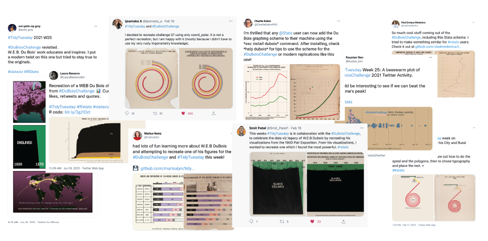
The response to the #DuboisChallenge was immediate and overwhelming, and the high quality and variety of the submissions were amazing.
Check out Allen’s…

and Sekou’s reactions:

Early in the challenge, Allen teamed up with others in the dataviz community, leveraging #TidyTuesday, and a fruitful collaboration was born. A collection of the submissions is available:

People used a variety of tools to make their re-creations, including R/ggplot, Tableau, and Stata. It was interesting to see users of Stata, representing the social sciences community, embrace the challenge. Popular re-creations included plate 25, one of Du Bois’s iconic spirals, and plate 27, his fan chart comparing occupations:

Some people went beyond re-creations to re-mixes:

and some made their own visuals with a modern twist:

In fact, the challenge moved beyond the bounds of Twitter to YouTube, where Luke Stanke posted a video on making a Du Bois-style wrapped bar chart and pyramid area chart:

and Sekou posted to Instagram:

To monitor the activity of the challenge, Sekou created a dashboard in Tableau. It was very interesting to see the global reach of the challenge; there were participants from North and South America, Europe, Africa, China, India, and Australia.

Where Du Bois was limited to a single physical venue for a limited time, social media allows us to reach the globe instantly, and allows people to participate long after the initial “event”.Beyond reaching a global audience, it’s notable that via Twitter we were able engage with dataviz luminaries like Alberto Cairo (@AlbertoCairo) and the Financial Times (@ftdata).

Lessons
It’s interesting to contrast the methods used by Du Bois in 1900 (physical, hand-drawn graphics designed for an event in one location), with the “modern megaphone” used today (digital creation, global distribution, communities of interest, social media). I like to think that Du Bois the social scientist would have been an enthusiastic user of social media to spread his message. As he pointed out in his autobiography, the need to “get the word out”:
“Where had I failed? There were many answers, but one was typically American, as the event proved; I did the deed but I did not advertise it… in the long run Advertising without the Deed was the only lasting value. Perhaps Americans do not realize how completely they have adopted this philosophy. But Madison Avenue does.”
Other lessons is that it was very useful to have github data ready to point people to resources, and the twitter thead is a useful mechanism for exposition.
Connecting with other communities (dataviz enthusiasts, Tableau users, social scientists, academics) was an important aspect of the success of the challenge. For example the #TidyTuesday group acted as a force-muliplier, adding more people to the challenge. Finally the challenge taught me that social media platforms can work in concert. For example tweets can point to other media like Instagram and YouTube.
The challenge will live on, we plan to repeat it in February 2022 (look for the #DuBoisChallenge2022 hashtag).
Also, it would be interesting to not just re-create the historical visualizations, but apply the Duboisian style to modern data. Here is a start:

References
To learn about how I re-created the visualizations using decksh, see: Recreating the Du bois Data Portraits. This presentation contains the full catalog of re-creations at the end. Also, here is a quick guide to the “Duboisian” style.
More information on the Du Bois Work at the Paris Expo can be found in Jason Forrest’s multipart series: W. E. B. Du Bois’ staggering Data Visualizations are as powerful today as they were in 1900.


