
Few folks doubt the value of repetitions in any information-giving context. Shrewdly deployed, repetitions can be a powerful tool to ensure something stays memorable. Comedians use the trick routinely: many revisit aspects of an earlier joke in a later setting to make sure that earlier message truly hits home. Educators—especially math professors—are no stranger to this.
While introducing a fresh concept, what helps often is mentioning that idea thrice: once through some prelude before the actual introduction happens, once while the idea is being introduced, and once after the introduction gets over, summarising what was achieved. Authors or film directors stress some aspect of a person’s characters at several places to make sure that aspect stays solidly in the reader’s or viewer’s head. And cognitive science theory agrees. See the 2018 work of Zhan and others, for instance.
While repetitions are useful, if you notice closely, there is a condition that needs to be met for repetitions to happen in the first place. Something must flow, that is, change, over which the possibility of repeating something opens up. In most of the examples above, it is time. In a stand-up comedy performance, or in a movie, or in lecture, or in the song’s chorus, what was said earlier may be repeated at a later time. Or it may not be literal clock time, but convenient proxies. For the author, one unit of written text, say, one sentence, may play the role of one minute. A reader can go “back in time” in this sense, unlike in the literal time examples.
Sadly, with frozen non-interactive visuals, this comfort of a possibly changing foundation is taken away. Time deserts us. And we are left stranded mainly with space. Achieving what repetition promises, just over space, though, could prove tricky. If I flood a blank page with fifty images of the same shape—a circle, for instance—that’s repetition all right, but that brand of repetition quickly gets boring. The challenge over space is to repeat and still stay interesting. And—which should go without saying—to stay genuine and authentic: informational distortions are not allowed. Meaning with each repetition, we cannot alter the main message in the original diagram. That is, we cannot sneak in new information. That, then, wouldn’t be a repetition. Would it?
The possibility of better comparisons
We showcase one instance, one way through which interesting and authentic repetitions can be achieved over space. The method may be implemented whenever a triangle is tasked with pointing something out. A triangle remains the key ingredient. We urge readers to visit our earlier essay, Pyramids of Priorities and a Poisoned Omen, so they have a firmer grip of the context. This is because in that earlier piece, triangles were deployed to represent something. Figure 1 shows four typical examples. The base of those triangles (equal to the “support”) showed how frequently folks in a survey believed a business issue was important; the heights (equal to the inverse of the lengths of the confidence intervals) showed how reliable that guest was.

In our previous essay, these triangles were piled up on top of each other to bring out possible differences in the general response patterns across demographic, gender, or age divides. In this essay, for demonstration purposes, we sample two issues: A: how crucial is it for businesses to increase profits each year and G: how vital is it that they should treat customers with respect. Table 1 documents the heights and altitudes for these issues for younger, Republican-leaning men and older Democrat-leaning women (note we have sampled from the extremes of the axes) and Figure 1, the four isosceles triangles that result with these values.

Were you to glance for once at Figure 1 and compare two triangles, whatever conclusions you derive will probably not stay in your memory for a long time. Comparisons are possible, surely—the A series triangles seem significantly taller than the G series ones, across genders—for each triangle, the contrast being supplied by convenient neighbour, but those comparisons may not truly leave a mark on you especially, if, like the third and fourth cases on Figure 1, the triangles are nearly similar. What we crave are ways that create the possibility of registering a difference (no matter how minor) more solidly. And here is where repetitions (over static space) may help. Ask yourself which one of Figure 1 and Figure 4 do you find more impactful? They are both made of the same ingredients, though. Only Figure 4 takes the building blocks from Figure 1 and repeats key aspects of those blocks in interesting ways.
These repetitions (and a few other subtleties we’ll see below like the background-foreground tussle) make us pay heed even to minor differences in shapes (altitudes, bases, or areas) many times, forcing us in the process, to retain the differences much stronger and for much longer. Our proposals go along with the contemporary fetish for impatience. One need not spend a lot of time to notice subtle differences. These will be delivered quickly. We offer a structure composed of many substructures, each echoing the ineffectuality of stagnant, one-off comparisons. But the larger collective will find a way to efficiently entangle these smaller shapes starting with simple rules, revealing predictable patterns at seemingly unpredictable places (an emergent property). Each structure will mutate into something else. No structure will become a relic.
The building blocks: Penrose’s tiles
We need some rules, so we both repeat and remain interesting. Any time we witness an isosceles triangle, we would check whether it falls into Category 1 or Category 2. Figure 2 below demonstrates. Category 1 triangles are those with angles (72°,72°, 36°) while Category 2 triangles are those with angles (36°,36°,108°). Two adjacent Category 1 triangles will unite to form a quadrilateral called the “kite” (sometimes written as “kyte”); and two Category 2 triangles will join forces to form a “dart”. Figure 2 shows the alchemy under “union profile”.

If you notice, a kite and a dart may, in turn, unite a former rhombus (just shove the “T” vertex alongside “I”). To trigger repetitions, we need a system to fracture a shape. This is what the “decomposition profile” documents. A Category 1 triangle disintegrates into two Category 1 and one Category 2 triangles, and a Category 2 triangle disintegrates into one Category 1 and one Category 2 triangle. These rules may seem awkward but there’s a plan behind the madness. English mathematician Sir Roger Penrose discovered that just with two shapes like kites and darts, there is a way to cover up an infinite two-dimensional space through repeating patterns—with these shapes alternating—and the pattern will stay interesting only if these decomposition rules are followed.
Here is how all this is relevant to our business survey context. Given a bunch of triangles, like the ones on Figure 1 to compare, with different bases and altitudes—we can always pick one—we will call this the “reference” that can be made to act like a Category 1 triangle. We will see how in the next section. The repeating pattern that will emerge out of it following these disintegration rules will lead to a perfect Penrose tiling, that is, a covering of the floor with tiles that fit perfectly or the laying on the ground of a patterned carpet that has no holes in it. Relative to this “ideal” rug, others whose origins are near-Category 1 triangles (but not exactly) will look a little imperfect, but perfectly or interestingly so, in the sense that their imperfections will also neatly repeat.

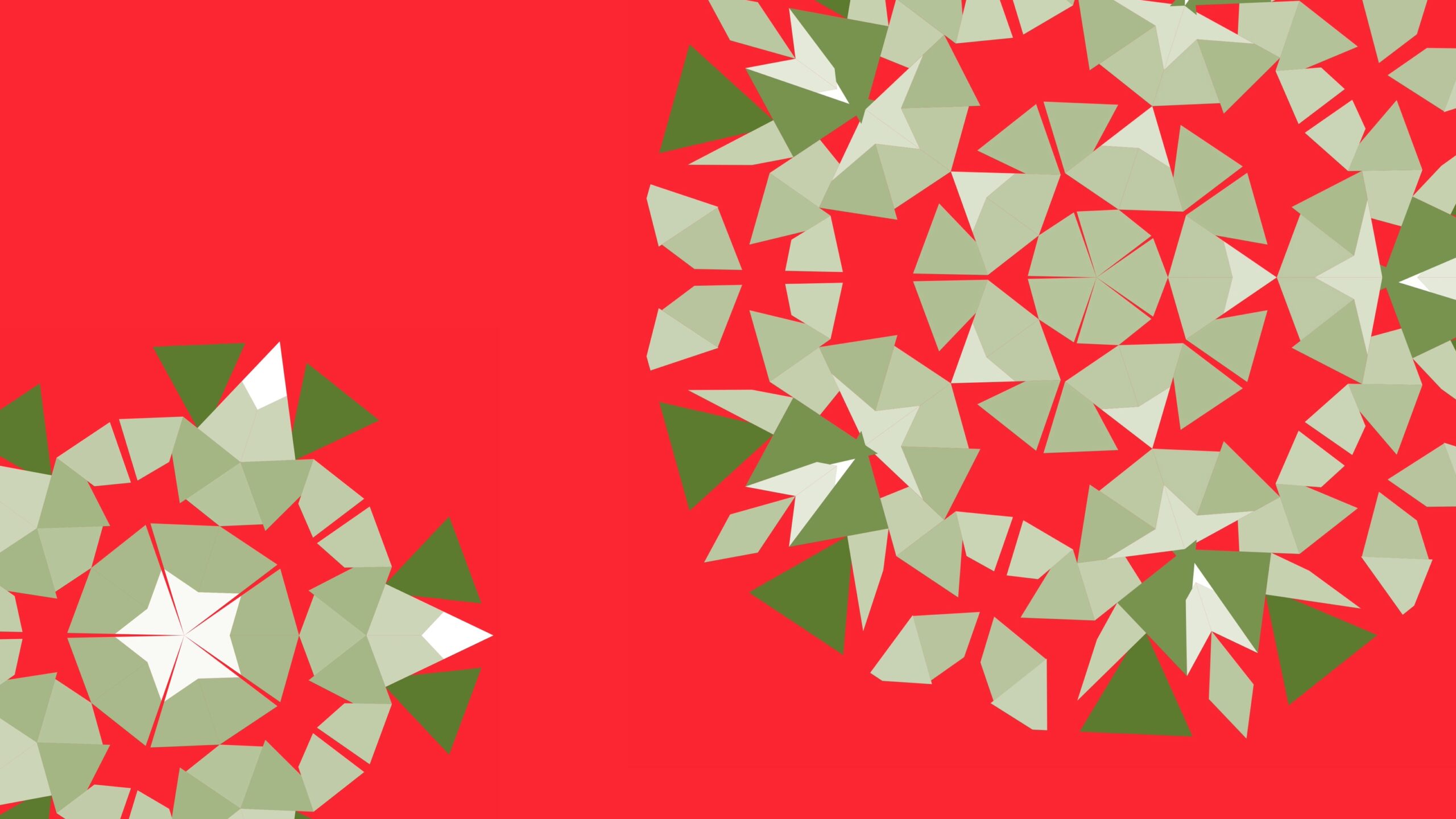
As an example, we may take the first triangle on Figure 1—the one about younger Republican-leaning men’s attitudes to whether it is vital for businesses to increase profits each year—as our “reference”, relative to which imperfections will be measured. The second panel of Figure 3 shows how placing many sets of two such triangles (each of the two a Category 1 triangle) side by side, spiraling sequentially eats up the floor fully, that is, no portion of the background stays visible. Each set of two such triangles forms a kite—as agreed and as highlighted on the third diagram. This neat covering up is best described through the last column of Figure 3 where, starting with generation 0 (the top panel where no decomposition is yet done) we begin with five kites (that is ten Category 1 triangles, each an 11A triangle, younger Republican-leaning men’s one) glued side to side. 72° * 5 = 360° is the reason why this spiral perfectly eclipses the central patch of the floor, that is, with no overlaps of the triangles and with no gaps between adjacent pieces. The “G” vertex of a kite measures 72° (check Figure 2) and there are 360° around any point in two dimensions.
We may not start with five kites but, with say, two or three or four, as the other columns show, but in that case, some portion of the floor will not be fully eclipsed, although in between the patches, there will be no gaps. Next, examine the jump from the second row to the third. How, no matter how many kites you begin with, each Category 1 and Category 2 triangle gets fragmented according to the decomposition profile in Figure 2. At each step of breaking up, therefore, the shapes become smaller and smaller, but always in such a way that no portion of the previous background becomes visible. You will notice two colours: the kites (like GHIJ in Figure 2) are shown in green and the darts (like QRTS in Figure 2) are in red, except, of course, on the first diagram where darts have not yet started showing up.
Perfect and fractured tessellations


Note the Category 1 triangles—the building blocks of these repeating patterns are special cases of triangles with angles x,2x,180-3x degrees with x=36 degrees, which leads to an isosceles configuration. We may insist on an x,2x,180-3x pattern, but sadly, with the given base and altitude—some shown in Table 1—this may not lead to an isosceles triangle. For instance, with the A triangle from the young Republican-leaning men with 0.83 as the base and 1.29 as the altitude, this leads to 35.658,71.317,73.025 degrees—not exactly a Category 1 configuration, narrowly missing it. In general, we may show, through an application of the sine rule, with a and b representing the altitude and the base of the triangle,

where p is a solution to the non-linear equation:

So next, we treat the first angle, 35.658 degrees, from this reference triangle as the “anchor” and alter the angles about it to make the reference triangle a Category 1 triangle. 36anchor is a multiplier that updates 35.658 perfectly to 36.
This updating of the 35.658° to exactly 36° is what we meant, in the previous section, by “the reference triangle will be made to act like a Category 1 triangle”. With the other non-reference triangles, this 35.658 changes, depending on what the non-linear equation leads to (depending, in turn, on their a and b), but this anchor from the reference, won’t. So for them, angle A in Figure 2 will be something other than 36°. Ten of those triangles arranged spirally would not, therefore, for these non-reference triangles, cover up a patch of the floor like they did for the reference triangle (fifth column, Figure 3). There will be gaps in these “carpets” at places where the near-kites attempt to join, through which, the background, that is the “floor”, will show through. Figure 4 documents this phenomenon, showing on each row the progression (that is, the steps of decomposition through varying “generations” or “tessellation depths”) starting with one isolated triangle seen on Figure 1. And these gaps will keep repeating too—just as the near-kites and the near-darts do—at each level of fragmentation—generating patterns with three colours, not two, making small differences even more vivid. The recurrent breakages reminding you of the perfection that could have been… Departures from the perfect covering up—the ideal tessellation—are occurring in eye-catchingly periodic, yet chaotic ways. The more empty spaces that show through the cracks, the more the imperfect tessellation has drifted away from the perfect, “reference” one—these tears—these imperfections too, you could argue, constitute a pattern of their own.
This is already an improvement. We have come a long way from single triangles on Figure 1 to repeating patterns made from them on Figure 4. See how telling the difference between the first two triangles on Figure 1 was difficult, owing to their nearly similar shapes, but telling the difference between the first two rows on Figure 4—made through amplifying these differences—is easy, especially if we fragment the triangles many times, say, till generation six. Where the claims of one-off comparisons falter, the claims of re-showing and re-re-showing pick up the slack. Against the charge that our tessellations are soulless, mechanical copies of the source, we assert they are promising protests against a tawdry way of seeing—a unique and forceful sensibility that arrests attention and keep us from papering over minor dissimilarities. That these tessellations represent primarily, a broadening—a spreading out—of a temperament, only secondarily, of a shape, will forever function as a key theme in our defense of these patterns.
But this strategy has other benefits. It makes the viewer become conscious of the background. For men, we chose light yellow, and for the women, pink. But this is quite arbitrary. With the pattern generated from our reference triangle—due to the five kites perfectly covering up the background, the first or the subsequent iterations on the first row of Figure 4—we can see no part of the yellow floor—the foundation on which the rug is laid. This is not the case for the non-reference rows due to their imperfect covering up. Patches—and repeating patches—of the pink floor become visible—the additional colour of the floor making comparisons stalker. But it points to a deeper primacy: that there is a background. This would have gone unnoticed if we had looked at Figure 1 only where you probably wouldn’t even be aware of a foreground-background distinction (philosophers, especially of the mind, are never tired of stressing this subtlety… the ying and the yang… without the shadow there can’t be the substance…but we digress…). And the distinction, wisely exploited, will enable you to squeeze in another piece of deferring detail. The imperfect tessellations’ inability to neatly cover up the background—the “floor”, so to speak, on which the rug is laid—accentuates the presence of a background—the existence of a floor, a foundational base that occasionally reveals itself through the cracks. We are outsourcing part of the task of pointing out differences from the foreground to the background. Perfect repetitions—the apparent spiraling outwards and inwards of these imperfect triangles—compel us to devote attention to the backdrop—the stage upon which the drama is being played.
Tessellation Animations


In conclusion
We observe each triangle on Figure 1 just once. The base represents how commonly a business issue is thought to be pressing, the altitude showing our confidence in that guess. The problem of comparing two triangles gets especially aggravated if, like the first two, or the last two, they are similar, but not adjacent. Contrasting two such similar-looking triangles gets potentially impossible if an analyst observes them once. In this essay, we offer a system of remedy through the principle of repetition. Each triangle is divided many times, each time respecting its original shape so no new information, not present in the gathered data, can creep in, and the resulting fragments are organised in a circular fashion giving off the illusion of spiraling, simultaneously, both inwards and outwards. The benefit is in amplifying minor differences in the original triangles. A viewer observing similar shapes being repeated many times will be able to register smaller differences between similar shapes—again, through experiencing these differences many times—more solidly than they would have had they seen these shapes just once. Through showing us a new visual code, these cosy warpings alter and enlarge our notions of what is worth looking at.
These circular shapes bring out quasi-periodic patterns, that is, patterns which are self-similar but non periodic. The ordered—that is, the self-similar—aspect helps one experience the benefit of repetition, while the random—that is, the non-periodic—aspect, through a chaotic seduction, helps one retain interest, despite that repetition. The patterns originate from group theory and noncommutative geometry and are special cases of Penrose’s tessellation (the perfect covering through the reference triangle). They are seen in ancient architectures in Isfahan, Tehran, the Maths Department at the University of Oxford, on tourists’ pavements in Helsinki, among other places. Edward Tufte, in his book Visual Explanations showcase the effectiveness of parallelism and repetition in graphics, much like how good orators or authors use them in speech or prose, through tropes of language.
Our strategy is general enough. Not everyone will be interested in business surveys generating “support” and “confidence”. There are still many contexts where a two-item system may be deployed or estimated (take estimating the posterior mean and the posterior standard deviation, for instance, in a Bayesian setting). Once one item is identified with the base and the other with the altitude of a triangle, these ideas will go through. Depending on the context, one may choose the reference relative to which comparisons can be carried out (one can, for instance, choose the triangle with the tallest altitude, representing the biggest confidence, or, in a different setting, the deviation relative to a standard (market profits, etc.)).
Our dashboard and codes show ways of making these tessellations, in general. The tessellations will not lie. Triangles that were similar will not be made to look different. The last two on Figure 1 are cases in point. Note how they initially were similar, and the tessellations that resulted from them in the third and fourth rows on Figure 4, still, do look similar. It is only if the source triangles were different—even slightly so—like the first two on Figure 1, that their tessellation—the first two rows on Figure 4—will magnify the gulf, for our better grasping. A movement on Figure 4, to some, may give the illusion of time flowing. And we wanted to avoid repetitions over time. Note that this generational track is just for record-keeping. We could have frozen the flow through showing simply generation six. Our dashboards bring out repetitions—and differences through these repetitions—at frozen “time” snapshots.
To repeat is to confer importance. There is no triangle that cannot be beautified through these tessellations; there is no way to suppress the tendency inherent in all triangles to accord value to the message they are bursting to convey. Still, as is the case with nearly everything, moderation is the key. Once their initial glitter wears off, these tessellation-esque mandates to record in its entirety the extravagant candors of pointy triangles could go sour. In repeating triangles—no matter in what catchy quasiperiodic ways—you don’t alter the fundamental geometry. You get triangles, still. There could be ways of generating new shapes. We are working on other essays. Watch this space!!

Acknowledgements
This work was supported, in part, by the Research Enhancement Grant awarded to the second author by the American Mathematical Society and the Simons Foundation for the 2024-2027 cycle. Bentley University’s summer research grant is also gratefully acknowledged.
References and further reading
- Zhan L, Guo D, Chen G, Yang J. Effects of Repetition Learning on Associative Recognition Over Time: Role of the Hippocampus and Prefrontal Cortex. Front Hum Neurosci. 2018 Jul 11;12:277. doi: 10.3389/fnhum.2018.00277. PMID: 30050418; PMCID: PMC6050388.
- Bhaduri, Moinak, 2024. Do we let businesses get away with dodgy ethics and loose morals? An application of Markov random fields. Chance (forthcoming).
- Zahirodini, Bahareh and Bhaduri, Moinak, 2024. Pyramids of Priorities and a Poisoned Omen: Differing Hierarchies of Desired Business Ethics, Nightingale, https://dvsnightingale.wpenginepowered.com/pyramids-of-priorities/
- Penrose, Roger, 1978. Pentaplexity. Eureka. Vol. 39. pp. 16–22.
- Tufte, Edward R. 1997. Visual explanations: images and quantities, evidence and narrative. Cheshire, Conn. Graphics Press
- Dashboard for tessellations: https://moinak.shinyapps.io/Tessellations/ and https://zahirodini.shinyapps.io/Tessellations/
- Dashboard for details and subtleties: https://public.tableau.com/app/profile/bahareh.zahirodini/viz/Gallup-Bentley/Gallup-BentleyBusinessEthicsAnalysis
- and https://moinak.shinyapps.io/GallupShinyM/
- Dashboard for general support motivation: https://moinak.shinyapps.io/MarketBasketDashboard/
- More on market-basket ideas: Bhaduri, Moinak. 2023. “Using ‘basket complementarity’ to make product recommendations.” Real World Data Science, March 2, 2023. https://realworlddatascience.net/ideas/datasciencebites/posts/2023/03/02/basket-complementarity.html

Bahareh Zahirodini, MSBA, (bzahirodini@falcon.bentley.edu, zahirodiny@gmail.com is set to work as a research assistant alongside Dr. Moinak Bhaduri at the Department of Mathematical Sciences, Bentley University in Massachusetts. Her research interests lie in financial modelling with an emphasis on social issues. Bahareh served as a research and teaching assistant and as a trading room analyst at the Hughey Center for Financial Services at Bentley. Bahareh recently won the second place at the Annual NABA X Bentley Business Bowl and was chosen to join the Beta Gamma Sigma, an international business honor society (for business major students who are in the top 20% of graduates).

Moinak Bhaduri (mbhaduri@bentley.edu) is currently a tenure-line Assistant Professor at the Department of Mathematical Sciences, Bentley University in Massachusetts. His faculty page is https://faculty.bentley.edu/profile/mbhaduri Rooted in applied probability, he studies spatio-temporal Poisson processes and others such as the self-exciting Hawkes or log-Gaussian Cox processes that are natural generalisations. His primary interests include developing change-detection algorithms in systems modeled by these stochastic processes, especially through trend permutations. Moinak heads the editorial board of the NextGen column of the New England Journal of Statistics in Data Science.
-
Moinak Bhaduri

-
Moinak Bhaduri

-
Moinak Bhaduri

-
Moinak Bhaduri


