Diversity isn’t just a buzzword—at least I hope it isn’t. It’s a crucial element driving business success in today’s competitive landscape. While many organizations tout their commitment to diversity and have established key performance indicators (KPIs) to measure progress, the reality often tells a different story.
Despite the efforts to create a balanced workforce, true equality remains elusive. Consider this: globally, 23.3% of cabinet members heading ministries were women. This glaring disparity highlights the ongoing struggle for equitable representation at the top.
And here’s another cool data story by Ken Flerlage about sabotage in the US Congress.
I liked the idea of displaying a kind of monolithic majority—people who have power in their hands—White Christian men. And this majority is compared to all the others, with a more diverse community. This graph perfectly shows which party is more diverse, and which is monolithic, where all people are similar to each other.

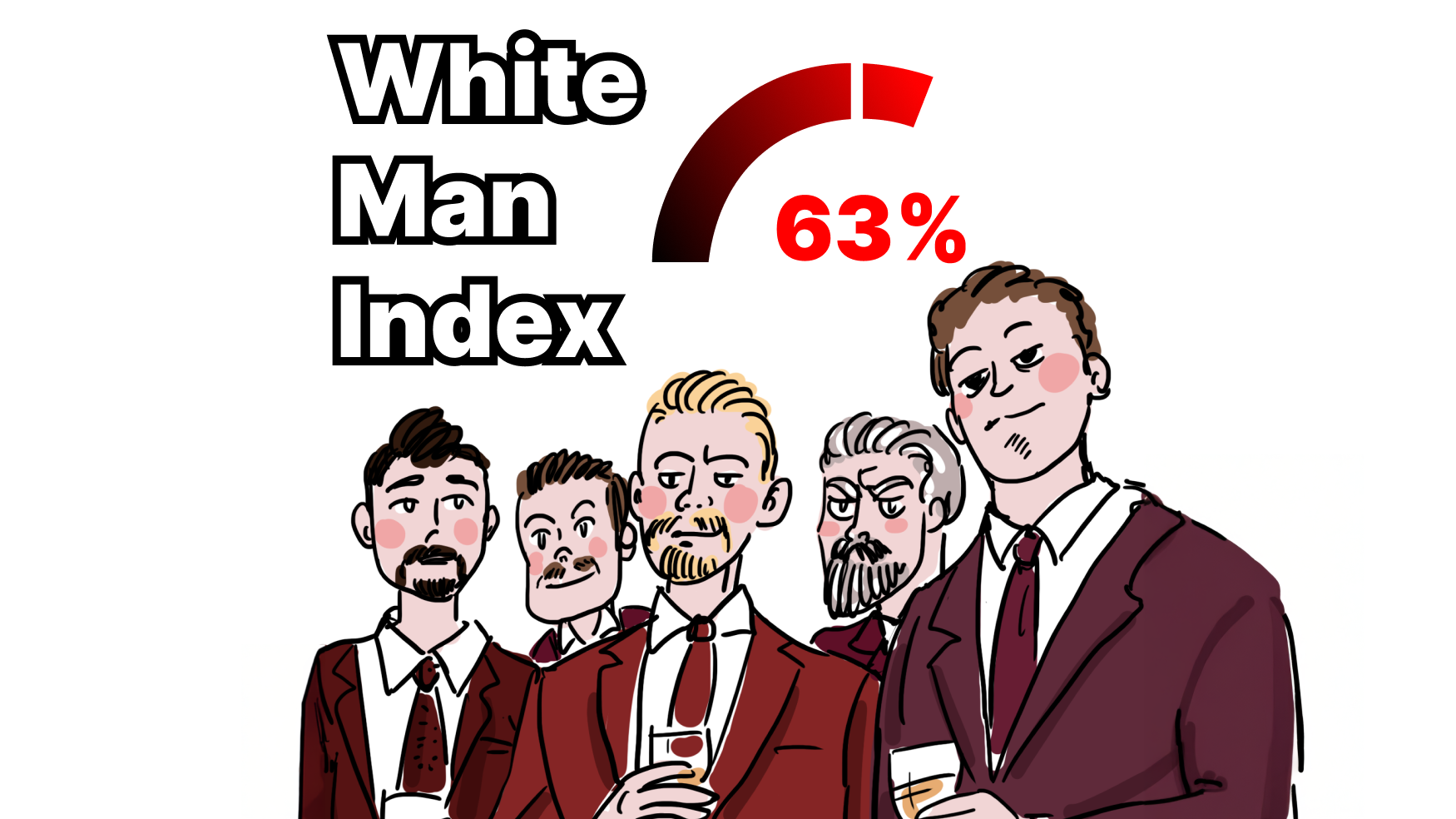
This visualization made me think about an index of the majority…
Ministers and congressmen! Let’s move on to the data visualization community, and generally start with me!
White Man Index. Let’s blame… me!
…First, for arrogance, because when I began to organize my own dataviz conference, I thought that I would definitely pay attention to the diversity and everything would be fine, and I was even proud of it. But after analyzing and measuring, I became convinced that I was not doing so well.
I consider the speaker ranking the most important, as they are the ones in the spotlight and have the greatest impact.

The details on different groups of participants reveal the big picture! So, I’m exploring those as well.

Here’s how we obtained this index—we surveyed our jury, speakers, and conference attendees, asking the following questions:
- Gender
- Age
- Race
- Country
- Role within or outside the company
- Data or design stack
This survey was, of course, anonymous, but I believe it reflects the general trend.
The most surprising thing is when diving into the details, the majority of the event’s attendees are women!


The results based on race surprised me. While our jury is very diverse (which is great for fairly evaluating the works), the majority of the participants are white! However, the answer lies in the geography of the event. Let’s take a look at that below!
Among the speakers, the balance is incredibly skewed! All the successes of last year’s conference have been lost! Of course, it’s wonderful that we have stars and book authors speaking, but it seems they all come from very similar backgrounds. We need to take a more serious approach to finding speakers.
Last year’s indexes (unfortunately, we didn’t have such detailed surveys back then).


The details on different groups of participants (2023):

Event and community diversity
On one hand, I am a member of the professional community of the DVS and I am also the organizer of my own small MYDS community.
From this position, what can I say?
Let’s not focus on the obvious demographics and dig a bit deeper.
Events shape communities. And you can try to observe the transformation of communities. Exactly how they move towards diversity through a more measurable object, like an event.
Let’s explore other directions for diversity:


Data / Viz balance
I wanted to avoid any personal bias from the start, making sure that as a BI dashboard specialist, I wouldn’t favor my own field and discriminate against creatives. That’s why I decided to calculate the balance index between data and design.
This is the Data/Viz balance—who leans more towards data and who towards visualization. Ideally, it should be 50/50, and any deviation towards DATA or VIZ is undesirable. In other words, the more it deviates towards either DATA or VIZ, the worse it is.
Another thing I monitored was the technical community, and here too, I was cautious, considering what you might call a form of discrimination.

Job occupation: In-Out source paradox
The next perspective to consider is the position of our speakers. There’s a fundamental difference depending on whether you work within a company, especially a large corporation, or whether you’re an independent entrepreneur or freelancer providing services to them.
These are completely different positions. As a consultant or freelancer, it’s much easier for you to tell a client they’re wrong, point out mistakes, and dictate best practices, compared to when it’s your boss. In my experience, many of the right things we read about in books and hear at conferences, unfortunately, we can’t directly say to our stakeholders—we could be fired. I wanted to factor in this element as part of a balanced perspective as well.

So what?
So what should we do? How do we stay diverse and remain engaging and interesting to all professional circles? The answer is simple: ”if you wish to go anywhere you must run twice as fast as that!” We need to track diversity metrics, which can be very different indicators, depending on the aspects we want to balance.
Of course, I’d love to create a magical and universal dashboard that can help any community or event stay balanced and up-to-date! And of course, I’ll give it a try! I’ll share my attempts with you!
Please share your thoughts and maybe your own tools for ensuring diversity—whether in the corporate world, at events, or in communities!

Alex Kolokolov
Alex Kolokolov has been working in the business intelligence industry for the last 15 years. His passion is dashboard design and development. He is the founder of Data2Speak Inc., an agency that provides BI services and trainings. Alex is also the author of three books: Dashboards for Executives (2019), Make your Data Speak (2023) and Data Visualization with Microsoft Power BI (2024). He organized the international dataviz conference and the “Make Your Data Speak“ award.


