
In my classes, I give students an assignment—find a dashboard from the dashboard gallery and write a review of it.
The goal is to identify strengths and weaknesses, as well as to offer their ideas for improvement. And each time, students surpass themselves, presenting works worthy of mention in the article. Today’s story is special because the focus was not on a Tableau dashboard, but on the highlight of the Microsoft BI gallery.
It’s very heartening to see that new beautiful dashboards are starting to emerge there, as well! Because, it seems to me, the Power BI community is not as active as the Tableau community, and it always seems to be in the shadow of corporate secrecy. There aren’t as many opportunities to see the best cases, learn from experience, and develop the tool and the field!
I’m very pleased that this example is an exception! And I hope that in the future there will be more and more such examples!
I want to talk about a project led by student Christina. I also tasked her with finding an interesting case, writing an analysis of its strengths and weaknesses, and then proposing her improved version.
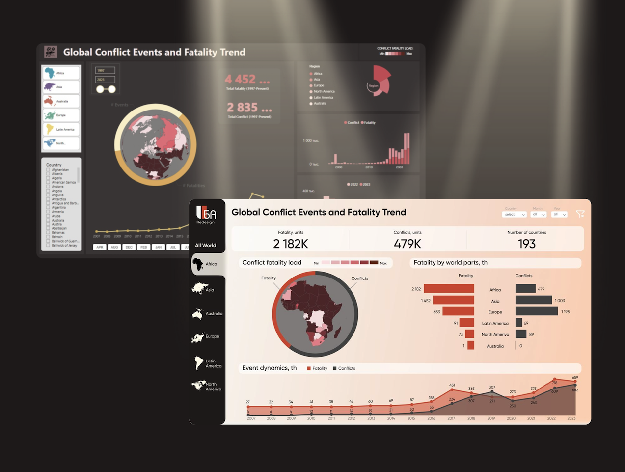
She chose a dashboard in Power BI authored by damtew, from the Data Stories Gallery, which caught her attention because of its bright and visually appealing central element—the world map.

Also, the captivating headline grabs the reader’s attention, engaging them to delve deeper into exploring the project.
Let’s take a look at Christina’s main analysis of this dashboard and its description:
- At first glance, the dashboard features a pleasant color palette used in the charts, slicers, and other visual elements.
- The dashboard has a fairly classic structure: a title, summary cards, slicers, and the workspace.
- The workspace itself consists of classic charts such as line charts, grouped histograms, stacked histograms, as well as some less traditional elements like a “Sunburst” style chart and a ring chart describing an interactive map icon.
The dashboard is titled “Trend of Global Conflict Events and Mortality.” In the process of working with the dashboard, you can obtain the following information:
- The intensity of fatal conflict events worldwide from 1997 to the present (in regions and countries with statistical data).
- The total number of fatalities and conflict events worldwide/regionally/nationally for any period from 1997 to the present.
- The dynamics of the number of conflict events and fatalities worldwide/regionally/nationally for any period from 1997 to the present.
- A comparison of the number of conflict events and fatalities for the years 2022 and 2023.
After a detailed description, Kristina highlighted the project’s advantages that appealed to her specifically:
1. The presence of a map and its color coding allows for a visual representation of the distribution and intensity of conflict hotspots and mortality rates across the globe. An interesting and visual representation of the relationship between conflict events and mortality is provided by a pie chart describing the map of the selected region, country, or the entire globe.

2. Visual representation of regional breakdown in the form of icons of different parts of the world + a breakdown by all countries of the world, where you can see indicators for each specific country if there is statistical data available. This solution looks very interesting.

3. Harmonious arrangement of dashboard elements + color scheme. Despite the fact that the dashboard does not meet all the canons of the classic dashboard structure, overall it effectively utilizes space and leaves a pleasant impression.

But Kristina also noted the drawbacks here; in even the most perfect project, there are always areas for growth, opportunities for improvement. And this is excellent practice for students!
Drawbacks
1. The positioning of the color legend is shifted to the top right corner, which makes it necessary to constantly refer to it and compare it with the map; this requires constantly searching for it visually. Additionally, there is a lack of segmentation in the digital expression, meaning it’s possible to determine where the mortality rate is higher or lower on the map, but it’s impossible to determine this in absolute terms.

2. Weak color segmentation: Angola and Namibia have color shades that are adjacent to each other, meaning they differ by only one tone. However, Angola’s death toll is 44,825 people, while Namibia’s is only 71 for the same period. This is a significant disparity in numbers, but the slight color difference may give the impression that these countries have comparable statistics, which is not the correct conclusion.

3. Different color codes for the same indicator on different charts: mortality on the circular diagram describing the map is shown in dark yellow color, while the same indicator on the average histogram on the right side of the dashboard is encoded in pink color.

4. Lack of chart titles, including the circular diagram describing the world map, which wastes the precious time of the “viewer” to immerse themselves in it and understand what the author meant. The maximum that can be found on the diagrams is the legend.

5. Alphabetical arrangement of the month-switching buttons below the mortality rate dynamics chart creates difficulties in perception and usage of this tool. A chronological arrangement of the buttons seems more intuitive.

6. The non-obvious choice of data visualization using a variation diagram between sunbeams and a circular one raises questions about whether there is color coding here in the context of intensity or if the colors correspond to a specific region. If so, there is a color legend nearby, but it is very misleading.

7. Another less effective, in my opinion, way of visualization is the stacked bar chart. The indicators of the number of conflict events and the level of mortality are very widely scattered due to the fact that the time range in which the graph is plotted can be very long, as a result, there is no way to interpret the results on the histogram over a long period of time, not even the functionality with the mouse cursor and the appearance of detailed information about the block helps, because the bars of the chart are catastrophically small in themselves, and considering that one column contains two categories, there is no way to hit the cursor to the right one.

8. The last but not least drawback concerns the arrangement of filters on the dashboard, which are separated “territorially”: the year filter is located in the upper central part, the country filter in the lower part on the left, and the month filter in the lower central part of the dashboard. As a result, to see the picture of what is happening in a specific country and specific time range, one needs to refer to filters scattered in different parts of the page.

Contentious Points
The dashboard completely lacks static data labels, the perception of the picture seems to be present, but rather in terms of ratios and proportions with a weak understanding of absolute values, although some charts display a scale with values, which helps to understand the numbers, but clearly not enough. I assume that the author was seeking true harmony between design, content, readability, and effective use of space. Perhaps the recipe should be sought in visualization methods.
Well, if you’re critiquing, then offer solutions.
I particularly enjoy this stage in student learning—after they start seeing problems in visualizations, they learn to formulate solutions and improvements! And this will be useful both in their personal projects and will improve the quality of collaborative work. So, Christina’s next steps were to formulate her suggestions for improving the dashboard and create an alternative version of the project, taking into account her recommendations!
Suggestions
Dashboard grid:
- Look for more traditional locations to place cards and legends with color coding and reformat their representation by removing unnecessary labels on the summary cards and adding segmentation indicators to the color characteristics accordingly.
- Allocate more horizontal space to the mortality rate trend graph to display data labels + on the same graph, you can show the dynamics of the number of conflict events. It is also worth working on color coding so that the same indicator has the same color code throughout the dashboard, rather than varying from chart to chart.
- Group all filters in one place for comfortable and quick adjustment, the most convenient place to move filters seems to be the upper right corner.
Diagrams:
- Add a card with the indicator “Number of countries involved in conflicts,” this indicator seems significant in the new realities, as 2023 has become a record-breaking year in 30 years for the number of conflicts worldwide according to the International Institute for Strategic Studies.
- Add names and units of measurement to all visualization elements without exception, including the world map.
- Add data labels or other means of identifying values.
And here is the result. The layout of Christina’s final improvement proposal, it is not assembled in Power BI, it is only a design project, but it is required for student work. Doing something similar with specific data in Power BI is already a technical matter! Many thanks to Christina for her work and an interesting case! Take a look at what we ended up with. The original project already looks quite interesting, but after such a redesign, its appearance has been greatly refreshed.

In conclusion! I truly hope that the Power BI community will become more active in sharing their cases, and that there will be more product diversification in the data visualization industry. I hope Power BI will provide strong competition to the excellent Tableau in terms of dashboard examples, competitions, and interesting case galleries!

Alex Kolokolov
Alex Kolokolov has been working in the business intelligence industry for the last 15 years. His passion is dashboard design and development. He is the founder of Data2Speak Inc., an agency that provides BI services and trainings. Alex is also the author of three books: Dashboards for Executives (2019), Make your Data Speak (2023) and Data Visualization with Microsoft Power BI (2024). He organized the international dataviz conference and the “Make Your Data Speak“ award.
- Alex Kolokolov

- Alex Kolokolov

- Alex Kolokolov

- Alex Kolokolov


