
Sometimes I am sad that infographics and dashboards are estranged from each other in the beautiful field of data visualization, even though they can enrich each other incredibly!
I would like to contribute to the data visualization community by sharing interesting examples of how beautiful infographics, data art, and visualizations can enhance business dashboards.
It’s a shame that many business dashboards are truly boring. Rare, beautiful creations may not always see the light of day, nor be appreciated for their true value due to commercial secrecy. But I am very glad that in the past year, business dashboards have attracted more attention. Not only from CEOs but also from skilled data viz people on social networks and at international competitions. For example, Information Is Beautiful now has a separate category for Business Analytics. Dashboards interest people, not only because of their figures and well-chosen indicators, but also for a pleasant and stylish design.
To educate students on visual beauty, who will be creating dashboards in the future, I send them on a search for inspiration in galleries of the best data viz projects from around the world. We mainly work with Power BI; but in the MS Power BI gallery, projects are mostly business-oriented and there isn’t much inspiration there. We look at the awe-inspiring gallery of selected works on Tableau Public where you can find many elegant and artistic examples of working with data. The tool itself is not as important as studying and researching approaches and techniques.
My goal is not only to enrich students with design ideas, improve their visual literacy, and learn interesting techniques, but also develop critical thinking. I ask them not just to admire other people’s projects, but to look for opportunities for improvement.
Here is an interesting case about my student Max, who is starting to build his career in data visualization. One of my assignments for him and other students was to find an interesting example to analyze in the Tableau Public gallery.
Among the many he explored, one stuck out to him by Marc Reid.
Max chose this dashboard which displays humanity’s flights into space. It starts from the beginning of flights on April 12, 1961 and runs through the end of 2020. This dashboard by Reid resonated with Max because of their mutual love of space as a topic to explore.
Let’s talk about this wonderful project more by checking its elements and attempting to make an improved version.
The round data visualization is made using a bar-chart, showing the duration of each flight. It is the primary and most beautiful element of this visualization.

The project also contains the total number of days spent in space, the total number of flights (bar chart), the ratio of men and women who have been in space, the number of successful dockings with space stations, spacecraft landings (ring chart), and the total number of missions per year (line chart).
Here are a few of the main points Max considered to be the project’s strongest:
- Visibility: You can immediately see the number and duration of flights into space. When hovering over the column, brief information about the flight is also displayed—who made it, duration and purpose of the flight, etc.
- Key cosmonautic points: The longest flight duration and other milestones of interest.
- Unusual design: A bar chart around the Earth. Wow! It is really eye-catching!
- Use of space: The elements made use of free space, as shown below.

There are a few elements which confused Max, what I consider growth points or places where the project can be improved:
- The main disadvantage is that the data does not change when choosing a category. For example, if the reader wants to see flights in which female astronauts participated. When selecting a category, the dashboard does not change in any way. This occurs throughout this dashboard. This includes the fact that it is also not possible to select astronauts from a specific country (there is a signature to the color palette, but these signatures are not clickable).

2. The flight density is very high and the overall dashboard is overloaded.
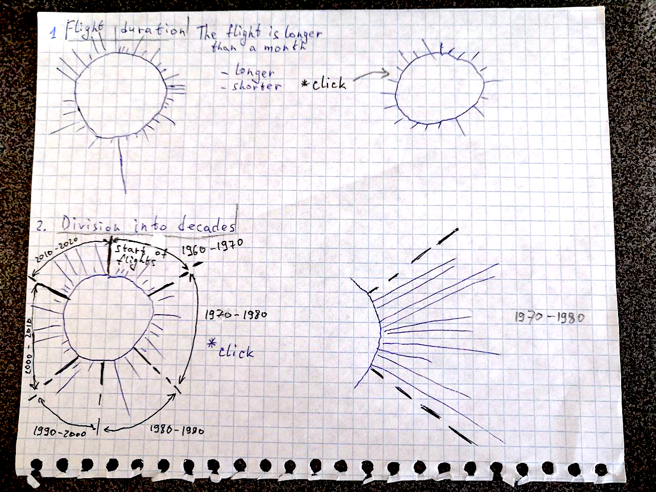
Criticism without specific improvement suggestions is not as valuable, so Max proposed techniques that would improve the visualization. He drew a sketch of his idea for improving this project:
- Add an additional selector if the flight is less or more than a month. When choosing a flight selector for less than a month, we remove long flights and zoom in for a more convenient study of information.
- Add a filter for decades. When you click on a specific decade, the size will increase.

3. Max thinks the color scheme could be better, too. At a high density, blue and red begin to merge. He would correct it for a combination of yellow-blue-green or yellow-red-green.
In conclusion, Max believes the project concept is really interesting and likes it a lot. I couldn’t agree more; such elements inspire both students and me! However, one of the main advantages of the dashboard is missing—the dynamic change of charts when choosing a certain category. But, I think there are some technical limitations which stop the author from making an interactive version. For example, the annotations could be broken by filtering, being a big part of storytelling in this great project.
Redesign
To complete this review, Max tried to make his own version inspired by this project. He changed the elements, which he considered weak. He found the whole experience very interesting! Let’s follow Max’s steps one by one:
First, let’s remember the classic dashboard layout. The levels on which we divide the information and how it is placed.
- At the very top is the high-level information—totals, expressed in KPI cards.
- The next level is the diagrams created based on data in terms of major and important categories, helping us answer the main questions of the dashboard.
- On the bottom level, there is information that helps display the details of the indicators in specific sections. This allows filtering to be useful.

Max tried to put the idea he had into a dashboard format, first by identifying some key indicators that, in his opinion, would be interesting for the user or reader.
Next, he tried to highlight the data that might interest the reader. Diagrams turned out to be easy to develop and already helped answer many questions. Now you can easily see how the leaders in the field have changed over time, the gender balance among astronauts, which countries have spent more time in space, and so on.
Max left more detailed information at the bottom—bar charts about flights by different countries, for example.
Max couldn’t make his idea for the modified data-art element for this dashboard on his own in Power BI. He used a package to make his dashboard. Based on his sketch, an image was made in Figma. In the future, this element can also be made interactive, but it will require more technical skills.

The final dashboard is an interesting product combining beautiful elements and practical ones. Once again, thank you to the wonderful Mark Reid for inspiration and his incredible projects!
For now, it’s only a mockup, but it’s designed to be interactive so interacting with any element that interests you can be filtered and affect the entire dashboard.
Overall, Max is happy with his project. I also think that it was an interesting task that was executed well. During this research, Max faced different tasks and challenges! What would we do in our dashboard world if we couldn’t be inspired and excited by beautiful data projects?
Max is sure his project could be even better and he is already ready to conquer new heights. I also see a couple of places for improvement here. What would you improve here? Share your opinion, it’s very important to me. After all, it is only through constant interaction and communication, the exchange of best practices from different data visualization fields that we can develop our industries.

Alex Kolokolov
Alex Kolokolov has been working in the business intelligence industry for the last 15 years. His passion is dashboard design and development. He is the founder of Data2Speak Inc., an agency that provides BI services and trainings. Alex is also the author of three books: Dashboards for Executives (2019), Make your Data Speak (2023) and Data Visualization with Microsoft Power BI (2024). He organized the international dataviz conference and the “Make Your Data Speak“ award.
- Alex Kolokolov

- Alex Kolokolov

- Alex Kolokolov

- Alex Kolokolov


