
What do you imagine W.E.B. Du Bois would think if he saw data visualization enthusiasts from around the world recreating his work more than a hundred years later? As for the lack of time travel, we cannot ask him, but I would guess that his lasting impact would make him proud.
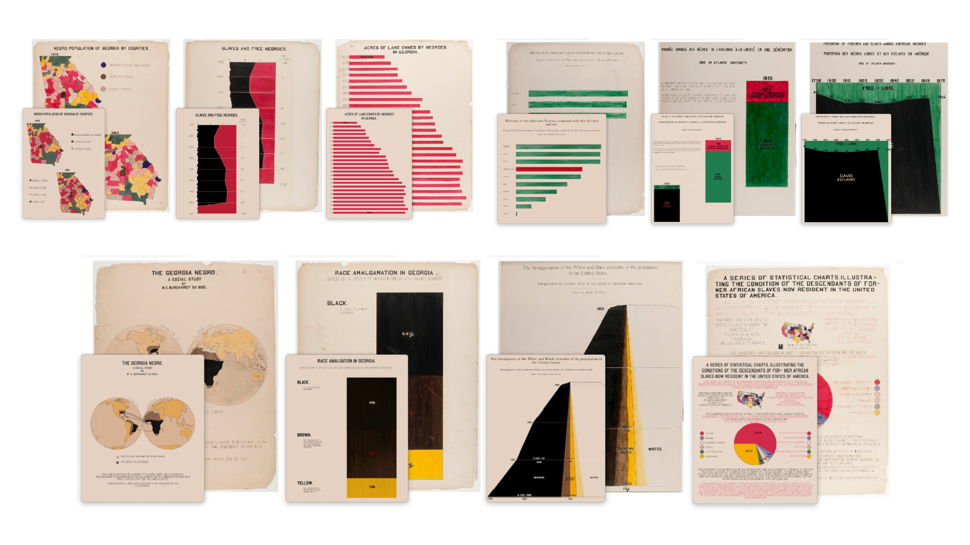
W.E.B. Du Bois was an American sociologist, historian, professor, and civil rights activist—and pioneer in the use of data visualization. He and his team at Atlanta University created over 60 data visualizations for the World’s Fair held in 1900 in Paris, France. The exhibit consisted of the mentioned visuals plus photographs and portraits of everyday African Americans as well as their intellectual or political leaders. The aim of the exhibition was to show the progress made by African Americans in the United States despite many barriers.

The Du Bois Challenge
More than 100 years later in 2021, Allen Hillery, Anthony Starks, and Sekou Tyler launched the “Du Bois Visualization Challenge” in order to celebrate the data visualization legacy of W.E.B. Du Bois with recreations of selected charts. In 2024, it was organized in collaboration with the Data Visualization Society, whenten Du Bois graphics were selected following the theme of colors in the Pan African flag: red, black, and green.

I was intrigued to take part in the challenge because I wanted to learn more about Du Bois’ work. I didn’t know anything about it and as a person from outside the US, knew only fragments of the African American perspective after the American Civil War. But also as a data visualization developer, I wanted to train my coding skills with clear time and scope constraints. With the analogy of a client project, I wanted to deliver the recreations as close to the original as possible using my tools of choice (D3.js and Svelte).
In the ten weeks of the challenge, I learned a lot. My understanding of history deepened by reading great articles, but it was from a technical perspective that I gained unique insights, especially regarding historical data visualizations. Here are three tips that I want to share and I hope that these will help you when recreating other historical graphics in the future.
Tipp 1: Extracting data points from an image
In historical data visualizations, the specific data and its source are often not as readily available as with modern vis. We can not just go ask the creator, can we? One of the challenge organizers, Anthony Starks, already prepared the vast majority of the necessary data for this challenge. Though when there are not enough labels on the chart to directly read the values, you need to find an alternative.
Fortunately, there are digitizer websites that help extract the values from the original image. One of them is PlotDigitizer, which I used to gather data values for Du Bois’ plate number 54 for week 6 of this year’s challenge. You upload your image, select the chart type, enter reference values, and then you can extract the missing values.

Tipp 2: Realizing a hand-drawn look
When we use modern tools or coding to create dataviz, the default result is often comprised of straight lines and uniform fills of certain shapes. You create a bar chart, set one hex color code as a fill color for each bar, and done. But such a “sanitized style” hardly resembles the hand-drawn originals, like the following bar chart for week 7 of this year’s challenge:

To create this brush-stroke effect with D3, I first created an image of the fill in Figma by overlaying green on a black pattern that looked like marker strokes. Then I created an SVG Pattern element that contained an SVG Image element with the mentioned exported fill image. Afterwards I set the fill attribute of each rectangle to reference the pattern. Additionally, I used the patternTransform attribute on the pattern element with a random number to achieve some variations of the brush strokes pattern between the bars (see code on Github for implementation details).

There are of course also other ways to accomplish this look, e.g. with existing libraries like RoughJS when using JavaScript. You can also find links to other participants’s work using different tools like Tableau, R with ggplot, or Python with Matplotlib in the link list below.
How about drawing the recreations in next year’s Du Bois challenge by hand?
Tipp 3: Becoming familiar with unfamiliar charts
Today’s tools quite easily enable us to create charts of various standard types, such as bar charts or line charts. These chart types are mostly chosen from a range of available options. You often have titles positioned on top, axes in specific locations, and so on.
In historical data visualization, the concept of such a typical chart setup had not yet been established. So while recreating them you can encounter a different approach. It broadens the horizon and makes one think about the pros and cons of some unconventional choices. What’s positive or negative about the choice of the map projection in plate 1?

Another example of a nice, unfamiliar detail is the emphasis on the scale being cut off in plate 12. Du Bois drew the chart like the paper was ripped off on the left side. (This was really fun to code with D3 for me.)

But something unfamiliar can also get overwhelming, so I’ll always try to break the chart setup down into its graphical components – lines, rectangles, etc.- and then reassemble them by coding each piece individually. This helps me to do more custom charts.
Final thoughts
I hope that these tips prove to be a bit useful for the next time you’ll try to create a historical dataviz and looking forward to seeing you take on the #DuBoisChallenge next year!
Here are some great resources on Du Bois and the challenge itself:
Regarding Du Bois and his work:
- “Tomorrow’s Promise – Revisiting Du Bois In A Modern Context” by Camaal Moten
- In-depth series by Jason Forrest on Nightingale
- Book “The Art of Insight” by Alberto Cairo, chapter 9 “Building Bridges” with Allen Hillary
- Book “BLACK LIVES 1900 – W.E.B. Du Bois at the Paris Exposition”
- Website of the “W.E.B. Du Bois Center” at the University of Massachusetts
Regarding the Du Bois Visualization challenge in 2024:
- Information and data for the challenge in 2024 in Anthony Starks Github Repository
- Recreations with Svelte & D3 by me (Kristin Baumann): Website & Github
- Recreations with R and ggplot by Molly Kuhs: Github
- Recreations with Python and Matplotlib by Erik Driessen: Blogpost
- Recreations with Tableau: Tableau Public
- Find more by searching for #duboischallenge2024 on your preferred social media channel

Kristin Baumann is a freelance data visualization developer specializing in creating custom web data visualizations, mostly with D3, React, and Svelte. She studied Computational Visualistics in Magdeburg, Germany and is currently based in Berlin.
- Kristin Baumann


