
One of the most powerful examples of data visualization was made 118 years ago by an all-black team led by W.E.B. Du Bois only 37 years after the end of Slavery in the United States.
While Du Bois’ legacy is cemented in American history, his data visualizations remain relatively unknown. I’m passionate about Du Bois’ story and have been discussing it via a series of articles through the lens of a UX Designer working in data visualization. My hope is that these posts inspire more academics, designers, and data visualization specialists to explore this work further in order to place the work into the proper historical significance it deserves.
This six-part series will cover many aspects of Du Bois’s exhibition, and links to all articles are at the end of each part. Be sure to check out the last one – there’s a big reveal!
Note: The word “Negro” will appear frequently in this series. It’s not a word I take lightly. It is the term Du Bois references throughout this phase of his career and I think it’s best to honor and contextualize his use of language for this article.
The Exhibit of American Negroes

“The Exhibit of American Negroes” at the Exposition Universelle of 1900 in Paris was created by activist and sociologist W. E. B. Du Bois, in collaboration with educator and social leader Booker T Washington, prominent black lawyer Thomas J. Callowayand students from historically black college Atlanta University.
In his remarkable 1968 Autobiography, Du Bois at the age of 90 recounts a lecture from a lifetime earlier in 1897. “The American Negro deserves study for the great end of advancing the cause of science in general. No such opportunity to watch and measure the history and development of a great race of men ever presented itself to the scholars of a modern nation. If they miss this opportunity — if they do the work in a slipshod, unsystematic manner — if they dally with the truth to humor the whims of the day, they do far more than hurt the good name of scientific truth the world over, they voluntarily decrease human knowledge…”
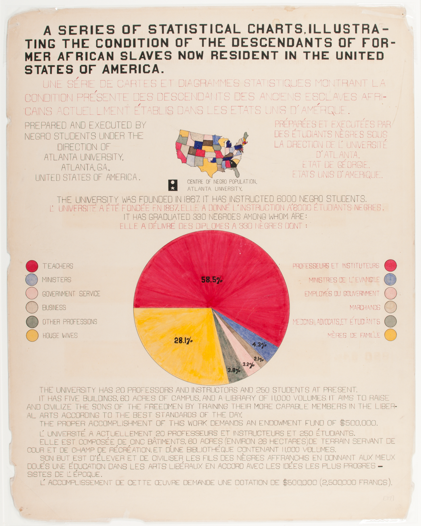
Du Bois describes the exhibition as “Thirty-two charts, 500 photographs, and numerous maps and plans form the basis of this exhibit. The charts are in two sets, one illustrating conditions in the entire United States and the other conditions in the typical State of Georgia”.The data visualizations in “The Exhibit of American Negroes” is therefore split into 2 sections: “A Series of Statistical Charts Illustrating the Condition of the Descendants of Former African Slaves Now in Residence in the United States of America” which focuses on the national view of the data, and a companion work done the same year called “The Georgia Negro”.

In the article “The American Negro at Paris” he writes: “It was a good idea to supplement these very general figures with a minute social study in a typical Southern State. It would hardly be suggested, in the light of recent history, that conditions in the State of Georgia are such as to give a rose-colored picture of the Negro; and yet Georgia, having the largest Negro population, is an excellent field of study.”
Du Bois continues in his Autobiography: “I wanted to set down its aim and method in some outstanding way which would bring my work to the thinking world. The great World’s Fair at Paris was being planned and I thought I might put my findings into plans, charts, and figures, so one might see what we were trying to accomplish.”
The resulting exhibition was more than just a scientific report. It was a targeted attempt to sway the world’s elite to acknowledge African Americans in an effort to influence cultural change in the USA from abroad. The charts in the exhibition are arranged to tell a story with data that presents a complex picture of a people, their struggle, and their perseverance despite more than a century of enslavement.
This is where I’d like to begin.

The above chart is a masterwork of data journalism. It’s hard to look at the chart above and not feel like you’ve been kicked in the gut. The mountainous black area punctuated by the word(s) SLAVES sits immovable under a green ribbon that opens to the right of the chart.
The story it tells is simple: for 76 years no less than 86% of all African Americans in the USA were enslaved. But like most charts, the subtleties might be easy to miss. The Emancipation Proclamation was signed on Jan 1, 1863, yet it takes an additional 7 years(and a Civil War) for the remaining 6,675,000 enslaved people to find their freedom.
The above is a breakout chart focusing just on ‘The Georgia Negro”. If one can visualize this chart rotated 90 degrees, this serves as a “double click” on the preceding chart above. It shows the percentage of free African Americans only in the state of Georgia, which at its greatest point was only 1.7% over a 73-year period.
Let’s look at the 1860 census to get some sense of scale. Of the total population of 1,057,286 people in Georgia, 462,198 were enslaved — 44% of the entire population.
Remember, the audience for the exposition were the elite leaders in science and business from Europe and the western world. Slavery in America was still very fresh in everyone’s mind. Du Bois knew a logical argument presented in scientific terms would provoke conversation and the brutally graphic truth of each of these charts would be impossible to deny.
Du Bois writes “… [the] exhibit which, more than most others in the building, is sociological in the larger sense of the term — that is, is an attempt to give, in as systematic and compact a form as possible, the history and present condition of a large group of human beings.” Notice the emphasis on the term ‘human beings’ consistently linked with ‘American Negro’. By acknowledging enslavement as a foundation for African Americans, he also establishes a baseline by which to show how far this large group of human beings has progressed.
In the charts below Du Bois focuses on population growth:

By reducing each chart to its essence, Du Bois adds successive arguments to the larger message. The above chart shows a fairly steady 68% — 88% population growth over a 140-year period.
As early as 1807 an Act Prohibiting the Importation of Slaves was promoted by President Thomas Jefferson which sought to block the flow of slaves into the southern states. Then, in 1820, slave trading became a capital offense, and as promising as that sounds, only 74 cases were raised, few captains were convicted and only one miserable bastard was actually executed.
The chart above is proof that the measures taken to end slaving in the mid-1800s were a failure. Du Bois understood that his cultured audience knew the events and politics more than the raw data he provides — the data itself was an incrimination.

The above chart shows the explosion of the overall US population from 1830 to 1890 with only a marginal rate of increase for the African American population in general. Despite a huge boom in European immigration, few African Americans immigrated to the US during this time. Natural population growth and a decrease in the mortality rate after the 1865 passing of the Thirteenth Amendment abolishing slavery were the likely causes of the increase.
That said, the overall size of the African American population was still massive, which Du Bois brilliantly compares against the entire populations of several European countries below.
In “The American Negro at Paris” Du Bois says “At a glance one can see the successive steps by which the 220,000 Negroes of 1750 had increased to 7,500,000 in 1890; their distribution throughout the different States a comparison of the size of the Negro population with European countries bringing out the striking fact that there are nearly half as many Negroes in the United States as Spaniards in Spain.”

By visualizing African American population growth as a small nation growing inside of the American silhouette, Du Bois elegantly crafts a complex argument. As the silhouette of the country grows, the African American population also grows, not at a faster rate but as a distinctly different entity.
This is not a line or bar chart to compare numbers. Du Bois’ visualizes the data in terms of distinct nations. When viewed alongside the preceding image showing a fully African American-populated United States in comparison to European countries, Du Bois clearly implies the existence of a separate Negro nation/state.

One of my favorites, the above chart not only shows the fluidity of race as applied to the term ‘Negro’ but also slyly asserts a sizable portion of the White population had ‘Negro blood’.
By crafting a dispassionate argument focused on the numbers Du Bois makes an argument an African American would be prevented from articulating verbally. The massive black area is a sleight of hand to distract from the not-so-subtle accusation on the right side of the chart.

Another “double click” into the Georgia demographic, a single stacked-bar chart puts the emphasis on the values of black and brown to create an 84% block. The blood-red “40%”, is a corporeal smear only semi-visible in the center block.
But like the preceding chart, the grouping of the dark values points away from the uncomfortable data showing that 56% majority of African Americans were of some mixed blood.

Despite all odds, the exhibit was extremely popular and was awarded two grand prizes, several gold and silver medals, and 2 honorable mentions.
The main Exposition Report also specifically mentions The Exhibit of American Negroes: “It is impossible to do justice to this exhibit in a few lines of descriptive matter. The material presented was not only of high scientific value, but was shown in the most graphic way. There was no better example at the Exposition of the appreciation of the Exposition idea that exhibits must be made attractive and interesting.” (volume 2, p.408–9)
The noted African American weekly newspaper The Appeal in October of 1900 said: “This is the first time in the history of exposition abroad that the Afro-American has ever taken so important and successful a part…proof that all classes of [the American] population are prosperous, progressive, and valuable citizens.”
Unfortunately, reporting of the exhibit and its success were largely ignored in America by the white Press. However, many ‘persons of eminence and character’ did recognize the effort including Frank Taussing of Harvard who wrote “in my judgment no better work is being done in the country, and no better opportunity is afforded for financial support on the part of those who wish to further the understanding of the Negro problem.”
This last statement eventually became part of the problem for Du Bois, and the uplifting change he sought did not manifest in his lifetime. A mix of politics, prejudice, raw emotion, and lack of financial support undermined Du Bois’s scientific work — which I cover in part 5 of this series. The next chapter, however, will continue looking at the data visualizations themselves and will cover more of the remaining charts focusing on education and occupation.
The six-part series:
W. E. B. Du Bois’ staggering Data Visualizations are as powerful today as they were in 1900 (this article)
An introduction to the 1900 Paris Exposition, and context for a few charts on history and population growth.
II. Data Journalism and the Scientific Study of “The Negro Problem”
Places this body of work within Du Bois’ larger sociological focus and continues the exploration of many of the charts from the exposition with a focus on education, literacy, and occupation.
III. Exploring the Craft and Design of W.E.B. Du Bois’ Data Visualizations
A detailed examination of how Du Bois drafted his charts, a consideration of this work as a precursor to modernism, and a discussion of his more artistic charts on land ownership and value.
IV. Style and Rich Detail: On Viewing an Original Du Bois Chart
Discoveries on viewing an original chart and further exploration of Du Bois’ more innovative designs dealing with occupation, business, and mortality.
V. Du Bois as Social Scientist and the Legacy of “The Exhibit of American Negroes”
Discusses Du Bois’s body of work and his frustrations with social science despite widespread attention.
VI. The Exhibition as a Whole: an Exciting Discovery
To close out the series I present a previously unknown chart from the series, and discuss the importance of understanding the sequence of the works.
This article originally appeared in Medium but in moving to NightingaleDVS.com, I edited the original text mostly to update some grammar and language substitutions, January 2023.

Jason Forrest is a data visualization designer and writer living in New York City. He is the director of the Data Visualization Lab for McKinsey and Company. In addition to being on the board of directors of the Data Visualization Society, he is also the editor-in-chief of Nightingale: The Journal of the Data Visualization Society. He writes about the intersection of culture and information design and is currently working on a book about pictorial statistics.
- Jason Forrest

- Jason Forrest

- Jason Forrest

- Jason Forrest


