
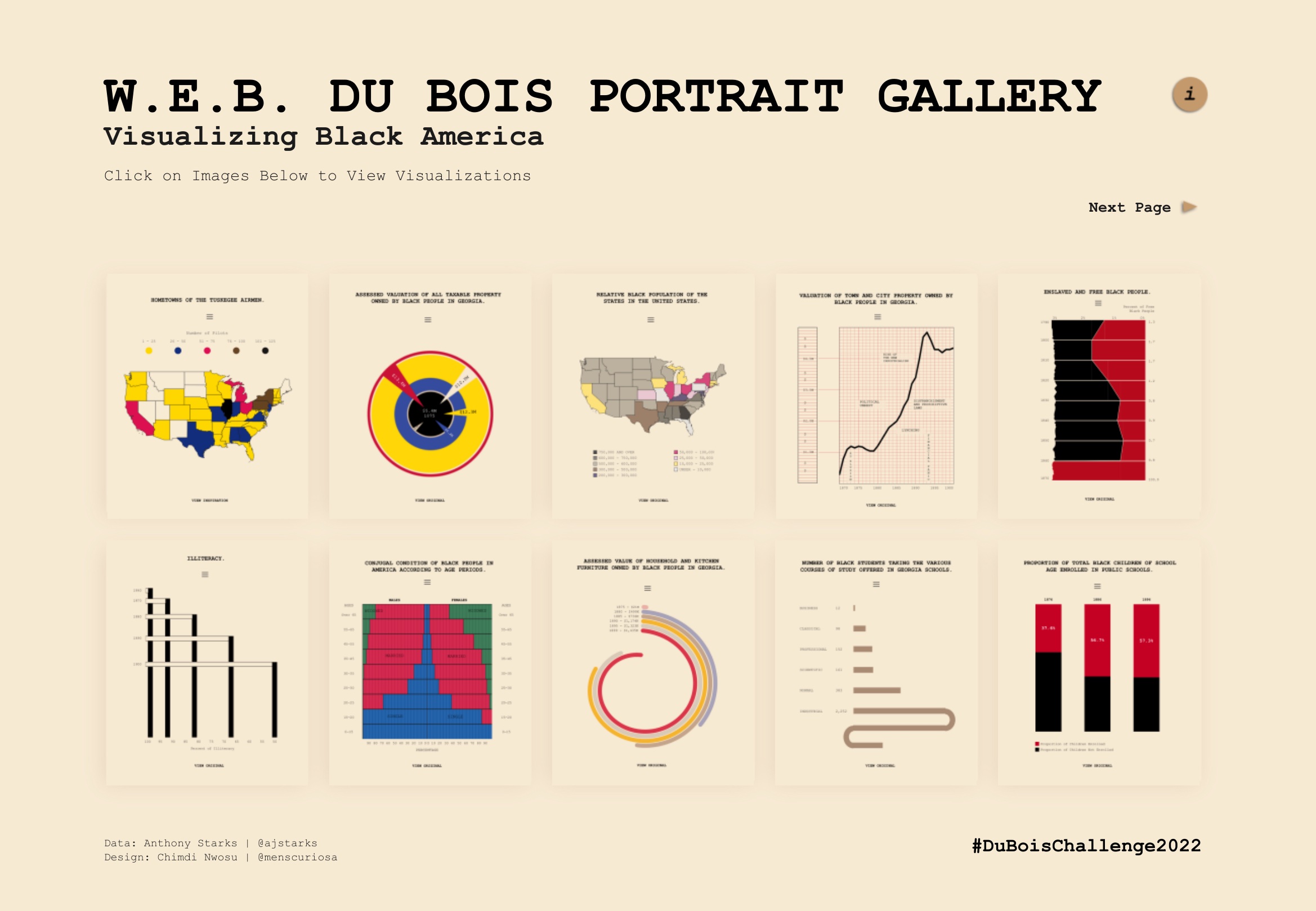
Chimdi Nwosu’s interactive visualization, the W.E.B. Du Bois Portrait Gallery, is a beautifully designed exploration of 20 re-created Du Bois charts. The gallery won Favorite Viz of the Year at the 2022 Tableau Conference. Check it out here and read about his inspiration and process below.
Inspiration
The W.E.B. Du Bois Portrait Gallery began as an attempt to participate in the 2022 #DuBoisChallenge. However, not long after I started working on it, it quickly became a broader exploration into W.E.B Du Bois and the incredible legacy left behind in his data visualization work. As a black man, I found that Du Bois’ depiction of the black experience post-slavery allowed me to explore that time in our history and see how it impacted us back then and even today. This was probably the most valuable part of this process for me.
The Du Bois Challenge
The Du Bois Challenge hosted by Anthony (AJ) Starks, Allen Hillery, and Sekou Tyler provides a platform for people to engage with and re-create Du Bois visualizations and share their work online. AJ wrote an excellent piece about this challenge, and I recommend you check it out here.
As an avid explorer in data viz, I was blown away by AJ’s gallery of Du Bois’ portraits. This year’s challenge provided ten portraits for us to recreate over time, but after attempting the first, I became curious about the second, the third, and the fourth. I realized I wouldn’t be staying within the limits of the challenge, but the work had already evolved into a personal journey for me.
Most of the visualizations I was re-creating were part of the American Negro exhibit from the 1900s. In my opinion, Du Bois was way ahead of the times in terms of data visualization.
Gallery Style Viz and Choosing the Gallery Portraits
I always knew I wanted to make multiple vizzes. My initial plan was to gradually release them over the timeline of the #DuBoisChallenge. However, as I spent time creating the vizzes and researching Du Bois, I encountered this gallery by North Carolina State University, which also features some of Du Bois’ portraits. After seeing that, I scrapped my idea of releasing multiple individual vizzes and decided instead to emulate their gallery-style layout. The convenience I experienced while interacting with the NC State gallery was something I wanted to offer to my audience.
From that point, it was simply a matter of choosing which vizzes to include in the gallery. There wasn’t any fancy selection process. I chose vizzes that intrigued me and were diverse in topic. In depicting the black experience, Du Bois charted population growth in the black community, the value of property/wealth, the journey to freedom after slavery, and more. My goal was to touch on as many of these topics as possible.
Processes, Tools, and Techniques
As many practitioners know, a big part of any data viz project is collecting data and gathering relevant information resources. AJ had already collected all the data and original portraits and made them available in his Github profile. This saved me a lot of time, and I’m grateful to him as it let me focus on the exploration.
The Du Bois Challenge features many entries made in R, Python, Power BI, and other tools, but not many Tableau entries. This was one of the main reasons that it felt great to represent Tableau this year. Specifically, I used Tableau to put together the charts; the second tool I used was Adobe Illustrator. As a fan of design, learning design tools has allowed me to take some of my visualizations to the next level, and it was only natural to incorporate one here. I used Illustrator for design aspects like the background/gallery layout and other minor things like annotations and making the shapes used in some visualizations.
Timeline and Challenges Faced
The time taken for each viz varied so much. Many of the bar charts and basic charts took 10-15 minutes, while others took much longer. Overall, I found the vizzes with many “hand-drawn” components and annotations took a lot longer because of the level of detail.
Here are some examples:
The easy stuff:


Stuff that took a bit more time:


From a dataviz perspective, some of those that took longer are simple in theory. For example, the viz on the left is a simple line chart, but the axes, annotations, etc., required building and bringing a lot of components into Tableau. Same with the one on the right—it’s a basic stacked bar chart, but the details required a lot of time. As a matter of fact, despite being very detailed, the re-creation on the right is still missing a few details from the original:

While the lines connecting the bars were a great addition to the original viz, I felt they didn’t provide much extra value to the chart. And honestly, I couldn’t find a practical way to add them, so I excluded them.
I made decisions like this throughout the visualization process, and they emphasized a certain aspect of Du Bois’ visualizations that stood out to me: the illusive simplicity of many of the Du Bois portraits.
There were many times where it was shocking to me how much effort it took to make some of the simpler-looking vizzes. I think we can attribute this to the particular tool I used—Tableau. I imagine that making some of these charts by hand may actually be easier.
Examples
Continuing with the example based on portrait 4 in my gallery (Plate 21 by Du Bois), here’s what it took:
Two sheets are used for the main view.

16 individual components are required to make the axis.

I created the annotations in Illustrator.

Thinking about it now, I wouldn’t refer to this aspect as a challenge, but more of a necessary exercise in finding creative ways to replicate.
Another aspect that required some thinking was deciding what to preserve from the originals and what to remove. As a fan of minimalism in visualization, I occasionally noticed corrections and omissions that I could make while building. My goal was to do so without compromising the work’s authenticity, while modernizing the look and feel.
Here are some examples:
1. The proportions of the original viz on the right were throwing me off, and I felt the proportions would be easier to compare if all the bars totaled 100%.


2. The original viz on the right has a number of details, like the right arrows at each category and lines connecting the bars. Though great additions, I wanted to modernize and clean up the viz, so I omitted both of these details.


3. This one was an easy decision for me, as it felt like the extra twists in the circle made it harder to compare the values of the proportions. I decided to build mine with no extra twists.


Conclusion
Creating the gallery was an informative process for me, and it was gratifying to see the reception to the viz within the data visualization community. I had an opportunity to present the viz at a Data + Diversity event, where we were able to dig into Du Bois’ history. The viz was also talked about at a Tableau Chicago TUG (Tableau User Group) event. At that point, I thought it was awesome to simply help raise awareness about W.E.B Du Bois and his great work.
However, in May 2022, during the Tableau Conference, the viz won Favorite Viz of the Year, and I have to admit that wasn’t something I anticipated. On that day, I had the conference playing in the background while I was working from home. When they announced the award, I just about fell out of my chair in shock. After being a part of the #datafam for a while and having been shown so much love already, I was floored and grateful that they had voted this viz as their favorite. I still have a lot of “thank you’s” in the tank, so here’s one more big thank you! to everyone who voted for it.
And, following this viz, I was invited to collaborate more on the Du Bois Challenge so you can look forward to that in the future!
Thanks for reading about my experience. You can check out the viz here.

Chimdi is a data visualization practitioner, and Tableau Public Ambassador that believes in leveraging data and design to create beautiful and impactful visualizations. As an avid explorer, he's keen on experimenting with different tools while exploring various topics to discover and share
insights from the world around us.
- Chimdi Nwosu


