
I identify as “new to data.” So, when I attended Tableau’s February Data + Diversity talk, I was totally sending out imposter syndrome vibes. In the Zoom chat, I made a bar chart joke to throw the others off my scent, while the rest worked on the obligatory metre-long chain of “Hello from [place name here]!” messages.
The talk was titled Data + Diversity: Exploring the Data Visualizations of W.E.B. Du Bois. Facilitated by writer and adjunct professor at Columbia University, Allen Hillery, the webinar explored the charts of W. E. B. Du Bois two ways: Jason Forrest brought us through a detailed history of Du Bois’ visualizations, from concept through development, and their presentation at the 1900s World’s Fair. In the second half, Anthony J. Starks took us through his efforts to digitally recreate some of the originals. This is my review of that webinar.
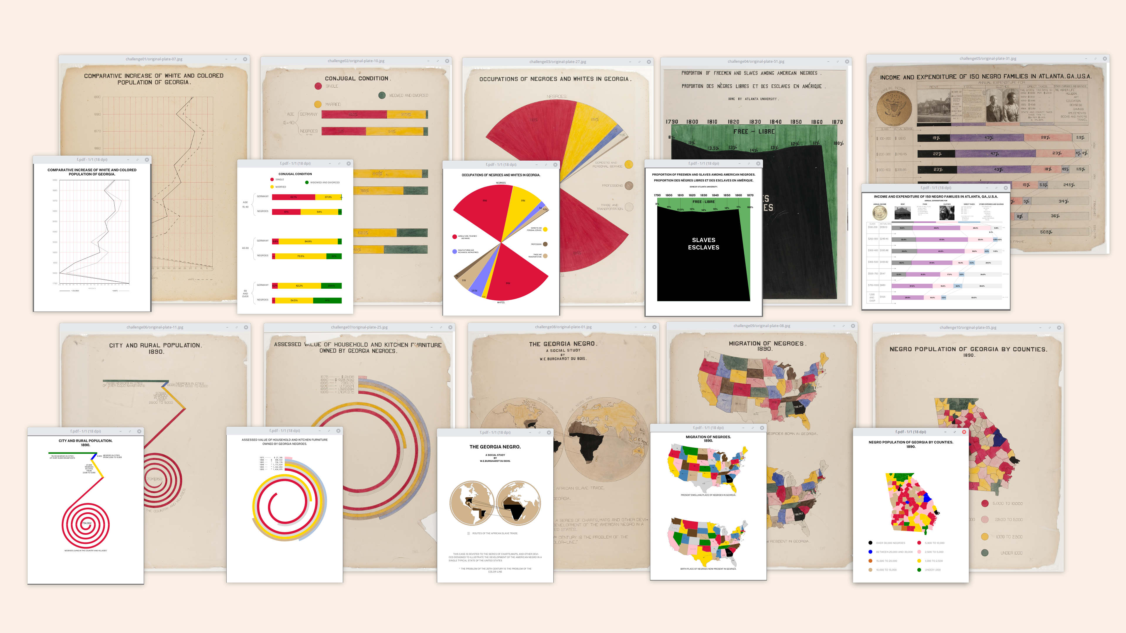
W. E. B. Du Bois was an African American sociologist, historian, and civil rights activist who lived during the turn of the 20th century. Jason’s presentation focused on his 1900 Paris World’s Fair Exhibition, titled The Exhibit of American Negroes.
I intended to leave the talk on in the background while I fought with a belligerent waffle chart. But as Jason took us through Du Bois’ work, slide-by-slide, my attention to my own work fell away.

It was my first exposure to Du Bois’ work. What I saw floored me. I saw graphs and charts, but none like I’ve ever made–each was hand-drawn, hand-painted. Without computer assistance, he made precise lines, sharp edges, and powerful points. And they kept coming. In all, we looked at over thirty different visualizations, each one depicting a different aspect of life as a Black American in the early 20th century. By the end of the webinar I was in shock. The clarity in Du Bois’ visualizations was devastating. Tears were rolling down my face.
I only had one thought in my head when it was over: what just happened?
For me, what happened was a layering of different contexts that, when combined, moved me like nothing before. First, was the context of the past: W. E. B. Du Bois’ original Paris exhibition as it was presented in 1900. Jason’s part of the presentation underlined how the impact of Du Bois’ work was reliant on the context in which it was originally presented. He went through Du Bois’ and his team’s painstaking effort to hand-collect, hand-illustrate, and exhibit life as a Black American at the turn of the 20th century. He described an ambitious struggle, a careful balance of time, money, prejudice, and people.
As Jason spoke, I must admit, I felt guilty. I was watching the presentation on a computer more powerful than what was used to send people to the moon – certainly more powerful than anything Du Bois had access to. It’s a humbling thing, that moment when you realize you’re taking something for granted.
The narrative Du Bois was trying to create was also ambitious. Jason explained that Du Bois was making a push to “…sway the world’s elite by upending the stereotypes and presenting a modern, successful, and educated people.” Equally disruptive was Du Bois’ method of visualization. Jason explained that Du Bois was one the first practitioners of interactive dataviz, as some of the charts invited visitors to touch and feel them. Jason’s own journey through W. E. B. Du Bois’s work brought him to the Library of Congress, where he was able to observe one of the original charts, allowing him to see the fingerprints and smudges left by exhibition attendees as they laid each on top of the other, to view information in layers.
Ambitious as it was, Du Bois’ message was not without challenge. Though he received a gold award in Paris, the message fell flat back in the United States. It would take until 1964 for America to pass the Civil Rights Act, which legislated the prohibition of discrimination on the basis of race, color, religion, sex, or national origin. Du Bois’ work fell into obscurity well before that, only being digitized in 2013. By the end of Jason’s presentation, it was clear to me that Du Bois tried to effect positive change by bringing the narrative of a burgeoning Black America to a new audience, but his message was ultimately stymied by the limited reach of the Paris exhibition.
Where Jason’s part of the presentation was an invitation to see the context of the past, Anthony Stark’s part of the presentation served as an invitation to apply the technological contexts of today to Du Bois’ work. Anthony recreated several of Du Bois’ original visualizations, going into detail on how he used decksh (pronounced “deckshell”), a Domain Specific Language (DSL) package to create charts and other visualizations as presentation slides using the Go language. With decksh, Anthony brought some of Du Bois’ hard copies into the digital era. He provided his datasets and code on github. He also invited us to share our recreations online. Anthony’s presentation made for a low-barrier way to accept that invitation to interact with the data in a way that appeals to today’s data practitioner.
Watching each presentation made me aware of the privilege of my own situation–I have access to resources Du Bois didn’t have: a computer, ease of access to information, self-publishing, and self-promotion capabilities as simple and as broad-reaching as a tweet. Basically, I have access to things Du Bois only wished for. Jason read a reflection from The Autobiography of W. E. B. Du Bois, where Du Bois states how he regretted failing to advertise his efforts: “I did the deed but failed to advertise it… in the long run Advertising without the Deed was the only lasting value.”
A lingering thought persisted in the back of my mind as I realized this: would the impact of Du Bois’ work be any different if he had the same access to technology and social reach as any one of us in today’s age?
It turned out that question was less hypothetical than I thought; Jason and Anthony made mention of the #DuBoisChallenge hashtag, and that people from all over the world were posting their recreations on Twitter. “What effect was Twitter having on the message of W. E. B. Du Bois,” was the question on my mind.
I found that the hashtag was introduced to Twitter in February at the same time as this presentation. This was no coincidence, as our facilitator, Allen Hillery, was also one of the people who started the hashtag. Curious to learn more about the origins of both, I asked Allen if he’d like to talk about the presentation and the #DuBoisChallenge. Here’s what he said.
Pearle: How did the Tableau talk originate?
Allen: Sekou Tyler and I are on Tableau’s Community Equity Task Force (CETF). This is a group that is committed to making sure that the Tableau Community is inclusive and recognizes opportunities for everyone to engage. For the Data and Diversity Talk, I proposed that we cover W.E.B. Du Bois as an intersection of Black History Month and data! W.E.B. Du Bois does not get enough credit for his contributions to the world of dataviz. It’s my aim for that to change. This is also inline with the spirit of the Tableau CETF – to ensure everyone has a voice. We started organizing speakers for the event and the rest is history!
Pearle: How do you think the Tableau talk went?
Allen: It went well! There were a lot of comments from the audience during the talk about how inspired they were from the presentations. There were also a good number of people who did not realize that Du Bois had done such work. We are all impressed about the level of intricacy behind the visualizations themselves including the spiral graph and wraparound bar charts. We had about 2,000 people who registered and over 1,200 people in attendance!
Pearle: What were your takeaways from that experience?
Allen: I was very humbled and proud by the experience. I pitched the idea and believed it would be awesome for everyone to explore. Getting all the amazing feedback on how everyone learned a lot about Du Bois and the data visualizations is immensely fulfilling. It is important to highlight him and widen the narrative of data visualization from a diversity point of view as well as application. Du Bois’s work had set the ground for sociology. He designed a framework to intrinsically measure and survey communities. The results of those surveys are represented in the visualizations.
Pearle: How did you and Sekou Tyler decide to put the #DuBoisChallenge on?
Allen: Sekou and I were chatting one weekend about doing something to honor W.E.B. Du Bois. His thought was for he and I to recreate Du Bois’ data visualizations and share them on Twitter. Thinking about community data projects like #MakeoverMonday, #TidyTuesday, and #WorkOutWednesday, I proposed we start a community hashtag where everyone could join in the fun!
Pearle: What impact did the #DuBoisChallenge have on the dataviz community?
Allen: The #DuBoisChallenge brought a lot of learning and collaboration. Many were challenged and excited in recreating DuBois’ visualizations. A lot of participants commented on how challenging some of them were, like the Du Bois spiral!

Pearle: What impact did the hashtag have on you?
Allen: I was able to work with some awesome people in the space to make this challenge happen. It’s been great to work with Sekou and Anthony. I learned so much about Du Bois and the historical context of his work. Discovering that someone who looked like me made such a huge impact on the data visualization field has given me a sense of pride and confidence in my data journey. It’s an honor and pleasure to get his work to be more of a household name in data cubicles.
As a data storyteller and someone who teaches the topic, I see Du Bois’s work having the perfect ingredients for a well-balanced story. He uses data, emotion and credibility seamlessly to show the resilience of Black Americans in a post-slavery/Jim Crow era. In spite of all the challenges Black Americans endured socially and legally, they were showing an increase in the basic fabrics of life. This included education, home ownership, and income.
Pearle: Did anything unexpected come from the hashtag?
Allen: When we started the challenge the intent was to engage the data visualization community. As the challenge progressed, we gained interest from the humanities fields. Another great surprise was hearing from the R community via #TidyTuesday. So we ended up collaborating with another hashtag!! Sekou, Anthony, and I didn’t expect the challenge to take off like it did. Sekou put together a dashboard to measure the engagement and reach of the challenge! We had 445 tweets around the challenge from February 2021 through May 2021. This sparked a follow up to the Du Bois challenge to see how the community would visualize the Twitter data!

Pearle: How did Anthony Starks get involved in the #DuBoisChallenge?
Allen: I met Anthony at a Data Visualization Society event. We got to talking and he mentioned his Du Bois project! Anthony has not only recreated all of the Du Bois visualizations, he built his OWN tool to help him do so. As Sekou and I were building out the requirements for the challenge, I knew I had to contact Anthony. Thankfully he said yes. We owe Anthony so much for making this challenge what it is! He provided the data source as well as picked out the visualizations we should have in the challenge.

Pearle: What will you always remember when you think about the #DuboisChallenge?
Allen: I will always remember the excitement and enthusiasm from the participants! I will remember the awesome people who either tweeted about the challenge or used their platforms to promote it. I will remember expanding our reach beyond the data visualization community and tapping into the humanities and sociology communities. We also have been able to talk at school events.
Pearle: What’s next for the #DuBoisChallenge?
Allen: The challenge has been going in so many great directions! As I mentioned, we have been able to talk to classes and user groups about diversity and data, social justice, and leveraging social media to amplify your message. Another great path we’re taking with the challenge is to build a course out of Du Bois’ visualizations.
Pearle: What would you tell a person who wanted to do more along the lines of the #DuBoisChallenge?
Allen: I would tell them to participate in the challenge and understand the historical context. I would also encourage people to make Du Bois and his work part of the data visualization narrative because he is. One last thing I challenge folks to help me with is to find out more about the team that helped Du Bois build the visualizations! I would love to learn more about Du Bois’s point person William Andrew Rogers!
Fast forward to today, and I’m still thinking about this webinar. Something enduring persists in my mind about what happened on that February morning. When it was over, I exited the online webinar silently while the chat was a blur with many “THANK YOU!!!” and “Goodbye from [insert state here]” messages. I took off my headphones and sat back in my chair in silence to reflect on what I had gathered along the way. I had pieces of context. These pieces–the history of the past, Du Bois’ sense of opportunity lost, and the promise of today’s technology–-they feel like the beginning of something, like a persistent nudge, early in the morning before the sun comes up. Some days it’s just too early and you roll over and go back to sleep. But some days you wake up, and that’s when you see small things change around you; the sky gets lighter, things get clearer, the birds start chirping.
Maybe that’s what this webinar is. It’s a gentle, but persistent, nudge to see. You don’t have to, of course. But if you do, maybe you’ll see things you might not have noticed before. And what you do with that knowledge can make a difference. At the end of the presentation, Jason Forrest left us with this thought: “If you know the past, you are inspired to leverage it to create positive change.” This webinar joins the idea of knowing the past with the tools of action in today’s digital world, and invites the audience to consider what positive change we can create when we use these tools to advertise–and amplify–the deed Du Bois started over 121 years ago.

Pearle Lundeen is a Business Analyst in the Higher Education sector in Vancouver, British Columbia, Canada. When she’s not leading or supporting business process improvements and transformations, Pearle's exploring her newfound passions: data, visualizations, and how they connect people.
- Pearle Lundeen


