
One of the most powerful examples of data visualization was made 118 years ago by an all-black team led by W.E.B. Du Bois only 37 years after the end of slavery in the United States. “The Exhibit of American Negroes” was a sociological display at the 1900 Exposition Universelle in Paris and was a collaboration by noted African-American sociologist W. E. B. Du Bois, educator and social leader Booker T Washington, prominent black lawyer Thomas J. Calloway and students from historically black college Atlanta University.
The word “Negro” will appear frequently in this series. It’s not a word I take lightly. It is the term Du Bois references throughout this phase of his career and I think it’s best to honor and contextualize his use of language for this article.
Data Journalism and the Scientific Study of “The Negro Problem”

The idea for the “The Exhibit of American Negroes” first came from Thomas Calloway, a classmate of Du Bois’ from Fisk University. In 1895, he wrote to over a hundred African-American leaders with a clear goal in mind. He begins by explaining the current European mindset:
“…the Europeans think of us as a mass of rapists, ready to attack every white woman exposed… The social and political economists of The Old World put down erroneous accounts… and not hearing the actual facts, reach conclusions which do us wrong… How shall we answer to these slander?”
Then Calloway lays out his pitch:
“To the Paris Exposition… thousands upon thousands will go… a well selected and prepared exhibit, representing the Negro’s development in his churches, his schools, his homes, his farms, his stories, his professions and pursuits in general will attract attention… and do a great and lasting good in convincing thinking people of the possibilities of the Negro.”
Calloway first consulted Du Bois and Booker T. Washington as they were already emerging leaders in the African-American community and along with Daniel Murray, the Assistant Librarian of Congress, a plan was crafted. After some political back and forth, the team was awarded $15,000 from the US Congress at the behest of President William McKinley — only four months before the opening of the exhibition. Du Bois was the obvious choice to lead the effort and he began the work on December 28, 1899. From then on the fingerprints of Du Bois are clearly evident, as outlined in the report of the Commissioner-general, February 29, 1901:

It was decided in advance to try to show ten things concerning the negroes in America since their emancipation: (1) Something of the negro’s history; (2) education of the race; (3) effects of education upon illiteracy; (4) effects of education upon occupation; (5) effects of education upon property; (6) the negro’s mental development as shown by the books, high class pamphlets, newspapers, and other periodicals written or edited by members of the race; (7) his mechanical genius as shown by patents granted to American negroes; (8) business and industrial development in general; (9) what the negro is doing for himself through his own separate church organizations, particularly in the work of education; (10) a general sociological study of the racial conditions in the United States.
The exhibition was designed to tell the story of an emerging people. It begins with socioeconomic data, then extends into the discussion of media and literature, then science, business and military excellence — all subjects in which African-American contributions were not yet recognized. Similarly, Du Bois systematically presents his data on three levels: national, state and local.
The data visualizations in “The Exhibit of American Negroes” are therefore split into two sections: “A Series of Statistical Charts Illustrating the Condition of the Descendants of Former African Slaves Now in Residence in the United States of America,” which focuses on the national view of the data, and a companion work done the same year called “The Georgia Negro”.
Before we continue exploring Du Bois data visualizations, let’s first understand why this amazing body of work was created.
“The Negro Problem”
The first African American to receive a doctorate from Harvard, Du Bois studied and traveled in Europe before ultimately settling in at the University of Philadelphia. Desperate to help the plight of the African-American population, he turned to social science in an attempt to collect the compelling evidence needed for cultural change.
In an 1897 lecture, Du Bois says: “The American Negro deserves study for the great end of advancing the cause of science in general. No such opportunity to watch and measure the history and development of a great race of men ever presented itself to the scholars of a modern nation… the development of the Negro Problem [was not] one problem, but rather a plexus of social problems, some new, some old, some simple, some complex…”
In his Autobiography, Du Bois states: “I proposed to study the [Negro] by historical investigation, statistical measurement and sociological interpretation.” David Levering Lewis, in his excellent Pulitzer-prize winning Biography, explains: “More than any other American Sociologist during the decade after 1898, Du Bois undertook for a time the working out of an authentic objectivity in social science… Du Bois strive to avoid apriorism, to generalize cautiously only after questionnaires, census records, government archives, cross-cultural data and the rest had been digested.”
In 1899, Du Bois published the watershed work “The Philadelphia Negro” which he compiled nearly by himself, personally conducting some 5000 interviews. Below is a spread from the book which shows some of his data visualizations; clearly focusing on the scientific presentation of the statistical data.

Considering the audience he was preparing for, Du Bois realized that something more than the reporting of statistical data was needed for the Paris Exposition. “I wanted to set down… in some outstanding way which would bring my work to notice by the thinking world.”
This was not a scientific attempt to present the data, but rather a compelling narrative to sway minds and influence social change. This was data journalism in 1900.
Later that year, in November of 1900, Du Bois wrote “The American Negro at Paris” for The American Monthly Review of Reviews which acts as a report of the exhibition as well as a summary of the events in Paris. “The history of the Negro is illustrated by charts and photographs; there is, for instance, a series of striking models of the progress of the colored people, beginning with the homeless freedman and ending with the modern brick schoolhouse and its teachers. There are charts of the increase of Negro population, the routes of the African slave-trade, the progress of emancipation, and the decreasing illiteracy.”
Let’s take a look at the charts. Here Du Bois explores education data:

The above vertical bar chart shows us a staggering 2479.5% increase in the enrollment of Negro children in school, beginning before the Civil War and ending a few years before the exhibition.

The chart begins at near-zero in 1860 as laws across the South forbade slaves to learn to read or write and made it a crime for others to teach them. During the Civil War, as the armies of the north swept through the south, the northern forces had to respond to the massive numbers of former slaves who escaped or were suddenly freed. It was decided that schools should be opened to prepare the growing ranks of free people. On July 23, 1863, the first school for freedpeople was established in North Carolina.
While it’s obvious to see the massive progress overall, the biggest eye-opener on the chart above is the 602% jump from 1870 to 1878. The cause was undoubtedly the creation of The Freedmen’s Bureau at the end of the Civil War. The Freedmen’s Bureau was a vast, rapidly-moving agency of early Reconstruction, assisting Freedmen in the South in many ways but most particularly by providing education. In just 5 years the group established more than 1000 schools. The bureau also was instrumental in founding such historically black colleges as Howard University in Washington, D.C., Fisk University in Nashville, TN, and Hampton University in Hampton, VA.

Likewise, as the above chart shows us, the jump from near total illiteracy in 1860 (three years before the Emancipation Proclamation) to only 50% illiteracy in 1900 feels like amazing progress. Unfortunately, this doesn’t tell the whole story, as the White illiteracy rate during the same period was 6.2% and total US illiteracy was 10.7%. Certainly, access to education was the key factor to the massive reduction, but the realities of the time are stark. The finality of the 1-word title speaks volumes.

In 2017 the amazing data journalist Mona Chalabi remarks, “…even as late as 1979, illiteracy among black Americans was still four times higher than it was for white Americans.” She then goes on to brilliantly update Du Bois’ charts with current data while trying to remain as faithful as possible to the originals. Her strong analysis of Du Bois’ work is well worth your time and her ability to re-contextualize his work with current data shows how profound American inequality remains today.
Aesthetically speaking, the chart above, “Illiteracy”, is extremely novel. It represents comparative and sequential values both on the X and Y-axis. While slightly more difficult to initially read, its black and white lines create a visual tension that draws the viewer in. By plotting each axis to meet in the middle, he presents a slope of corresponding points, effectively mixing the data and chart marks into a single visualization.
In the next chapter of this series, I’ll return to this work to discuss an amazing development I found while researching it. I don’t want to spoil the surprise just yet as that is another amazing story to be told.

Like other charts in the exhibition, this chart makes a direct comparison of the condition of American Negroes to several sovereign European countries. As you can plainly see from his blood-red highlight, the illiteracy rate sits in the middle of the group. One infers the surprise Du Bois himself felt when he discovered the similarities when he writes “[Negro] illiteracy is less than that of Russia, and only equal to that of Hungary”

By making the comparison of these illiteracy rates, Du Bois directly confronts the stereotype of the typical American Negro as an ignorant slave. The data shows they are comparable to the same class as a European. This was a bold gesture by 19th century standards for an African-American to present on the world stage when voices of color were noticeably absent. By presenting the statistical comparison Du Bois creates a shockingly effective argument that also sidesteps prejudice.
Many times in data visualization the numbers might be left off the chart entirely as they are in the chart above.
In his great 2013 book “Data Visualization, A Handbook for Data-Driven Design” Andy Kirk breaks the reading of any chart into three stages: Perceiving, Interpreting, and finally Comprehending. The first step, perceiving, is where I think most of Du Bois’ charts really succeed, as they are so strong visually and leave an immediate impression. Du Bois clearly understands the language of visualization. He expertly delineates only what is exactly needed in order to move his narrative along. Which is to say “Are we really so different than you?”

Graphically bold but not as immediately impactful, the above chart speaks to the need to show an overall positive message. Du Bois accentuates the positive trend by displaying the 39% rate of increase in all Negro children in schools as three stacked bars and only labeling the rate of increase. The remaining 42.71% of Negro children not in schools in 1896 are not omitted, but displayed as a black box; hidden in plain sight.
Yet this chart is actually inaccurate. Du Bois distorts the visualization by truncating the 1876 and 1886 bars to appear shorter than 1896 to exaggerate the trend. As each stacked bar represents a total of 100% they should all be the same height. This was something Du Bois was clearly aware of but opted to distort the progress in an effort to add to the overall positive message of the exhibit.

While doing my research I regularly skipped over the above chart as it’s less dynamic than many of the others. I had even started to see it as maybe a work in progress, or even incomplete — but I think I was wrong. I believe the space at the top of the chart was left intentionally blank. I think it is ghost data.
Unlike the previous “Proportion of Total Negro Children” chart where children not in school are represented by a black box, Negro teachers were so scarce, so under-educated, and so overwhelmed, that Du Bois lacked sufficient data and represented them as simply “missing”.
In 1911 Du Bois published The Negro Common School in association with his students at Atlanta University. Compiled over a 6-year period, this report explores Negro education issues on a national level as well as 17 individual states. While there are many records of Negro and Freedmen schools across the US, the data collected specifically on teachers is vague at best. In the open pages of the report he elaborates “by the census of 1890 over 25,000 colored teachers were reported, and in their hands practically the whole work of the public school system for Negroes rests. There has not hitherto been sufficient recognition of the immense labor and sacrifice involved in giving the colored race teachers of their own blood in a single generation.”
On the next page in the report, Du Bois lists the actual numbers. According to the 1890 census, the total number of Negro teachers in 1887 was 15,815 of a total African-American population of 7,470,040 or 0.0002% of the population. By any estimate that’s a fraction of what was needed.

A decade later in 1920, Loretta Funke, in the “The Journal of Negro History” writes of the shocking ratios of children to teachers in the page clipping to the left. She later goes on to recount the crude conditions present in 1909: “There were no desks and only a small fragment of a blackboard in one corner. The teacher showed signs of having very little education himself and used no methods whatsoever in teaching. There was only one whole book for the entire reading class.”

To underscore the steady progress in spite of horrible conditions, Du Bois shows four growing vertically aligned bubbles to represent the 31% increase in Negro teachers in Georgia in 11 years. Since the bottom bubble is the darkest, it attracts our eye first and weighs the chart down. The focus is therefore not the maturing color sequence, but the darkest bubble at the bottom of the page; implying other heavier circles to come. By ending the chart in 1897, one can imagine a Parisian attendee asking the question, “What is the current number of teachers now, Professor Du Bois?”
In 1911, Du Bois ends The Negro Common School with a terse but amazing statement: “The white schools are bad. The Negro schools are worse. The South is still poor, and worse than that, it is, to a vast degree ignorant. Race antagonism can only be stopped with intelligence.”
Du Bois then includes a series of charts linking the type of education with their eventual occupation:

Another chart from the “The Georgia Negro” series, Du Bois catalogs the courses of study for African-American students. The proportional numbers wind down the page until the “Industrial” category displays a massive “snake” at the bottom of the chart. A technique not uncommon at the time, the snake shows just how disproportionate this category is to the others. The numbers to the left are helpful, but this kind of visualization is meant to be easily perceived and quickly interpreted.
Du Bois then draws a line from the course of study to the eventual occupations.


The above two charts are essentially the same but on national and state levels. While not a true comparison to the horizontal bars at the top, the roll-up on the bottom shows just how insubstantial the aggregation of all skilled craftsmen, teachers and clergy are in comparison to those working in agriculture or unskilled labor.
Georgia skews even more disproportionally toward agricultural laborers than the national chart. Interestingly, Railroad employees slightly outnumber servants. Teachers, on both charts, find themselves at the bottom of the list reinforcing the charts we’ve seen above.
In the Georgia chart Du Bois adds a subtitle likely not out of place in 1900, but chilling by today’s standards: “Males over age 10”.
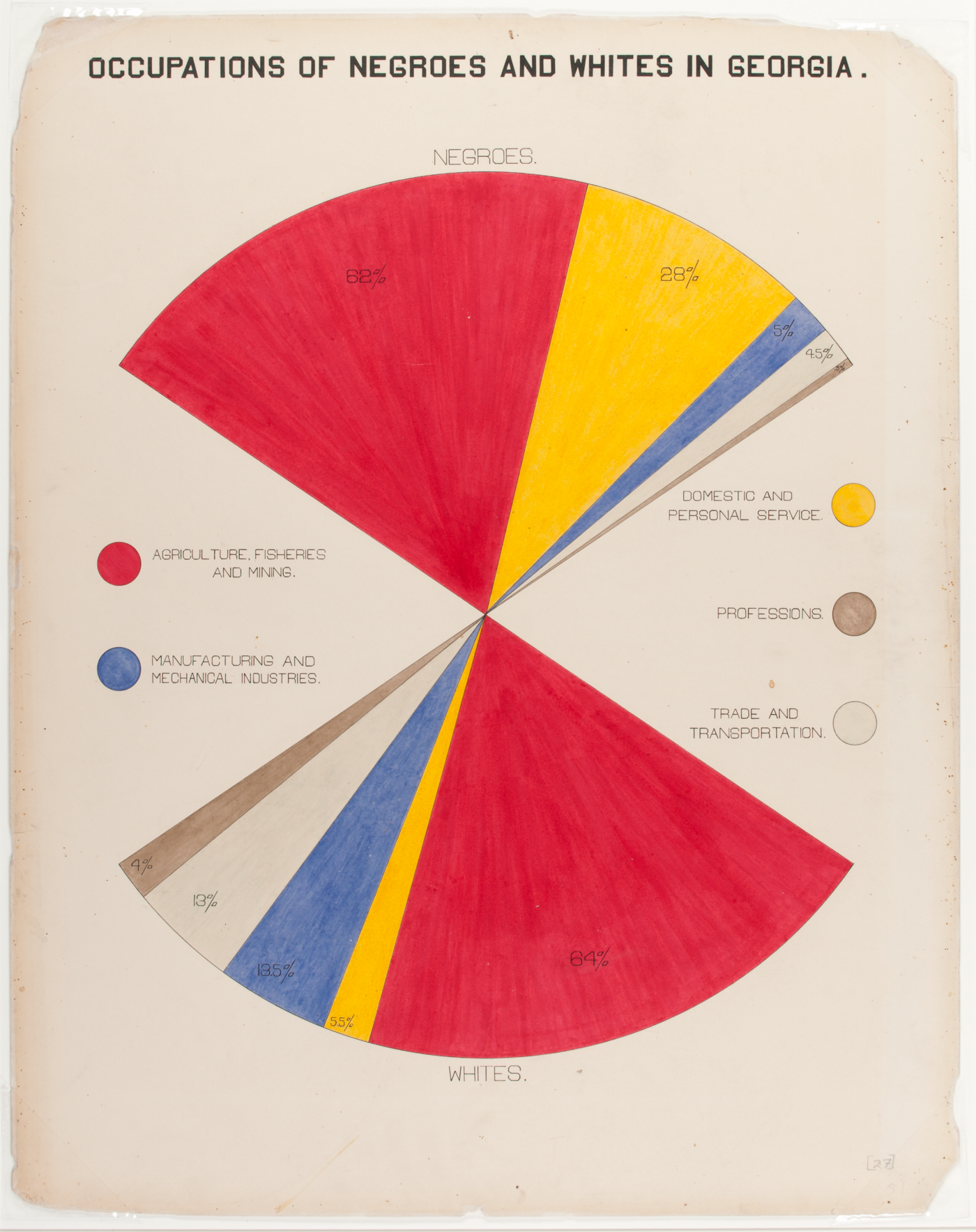
I’m closing this article with another masterwork and potentially the most well-known of this relatively unknown series. The chart above presents a dazzling near-symmetrical chart of Du Bois’ own design, where two mirrored fan charts display corresponding categories allowing the direct comparison across an event horizon that delineates the “color line”.

The legend applies equally to both groups, and the distribution of the occupations between the two groups is surprisingly similar. Negro farmers are only 2% lower than White farmers. Negroes have a considerably higher percentage of service occupations while Whites have considerably more Industrial and mechanical jobs, but they are displayed here as comparable units within a circular whole.
Seeing this, the words of Thomas Calloway again ring true: “…[to] do a great and lasting good in convincing thinking people of the possibilities of the Negro.” Despite the discrepancies, the overall progress is clear. The cruel baseline of slavery is not forgotten, but steadily – painfully – surmounted.
At the beginning of the article, I stated that the funds for the exhibition were only granted by Congress four months before the Paris Exposition began. This clearly stressed out Du Bois who had to compile the data as well as draft the charts with his students.
In his Autobiography, Du Bois recounts “I was threatened with nervous prostration before I was done and had little money left to buy passage to Paris, nor was there a cabin left for sale. But the exhibit would fail unless I was there. So at the last moment I bought passage in the steerage and went over and installed the work. It was an immediate success. It occupied a small room, perhaps 20 feet square but the room was always full. The American press, white and colored, was full of commendation and in the end, the exhibit received a Grand Prize, and I, as it’s author, a Gold medal.”
In the next chapter of this series I’ll pick up the story as Du Bois and his students begin the actual drafting of the charts as well as some aspects of statistical chart making at the time. I will also discuss the claims that Du Bois might have been a precursor to modernism (which is pretty exciting stuff). But the most interesting aspect of the next chapter will be the discussion of ten of his most innovative and unique charts.
View the entire set of charts and photographs from the 1900 Exposition directly from the Library of Congress: Search Results: “LOT 11931” – Prints & Photographs Online Catalog (Library of Congress)The Prints and Photographs Online Catalog (PPOC) contains catalog records and digital images representing a rich…www.loc.gov
Big thanks to Bhavna Devani, Tyler Curtis, Rachel Ramsay, and Jen Ray for the copy editing and detailed discussion!
The six-part series:
W. E. B. Du Bois’ staggering Data Visualizations are as powerful today as they were in 1900
An introduction to the 1900 Paris Exposition, and context for a few charts on history and population growth.
II. Data Journalism and the Scientific Study of “The Negro Problem” (this article)
Places this body of work within Du Bois’ larger sociological focus and continues the exploration of many of the charts from the exposition with a focus on education, literacy, and occupation.
III. Exploring the Craft and Design of W.E.B. Du Bois’ Data Visualizations
A detailed examination of how Du Bois drafted his charts, a consideration of this work as a precursor to modernism, and a discussion of his more artistic charts on land ownership and value.
IV. Style and Rich Detail: On Viewing an Original Du Bois Chart
Discoveries on viewing an original chart and further exploration of Du Bois’ more innovative designs dealing with occupation, business, and mortality.
V. Du Bois as Social Scientist and the Legacy of “The Exhibit of American Negroes”
Discusses Du Bois’s body of work and his frustrations with social science despite widespread attention.
VI. The Exhibition as a Whole: an Exciting Discovery
To close out the series I present a previously unknown chart from the series, and discuss the importance of understanding the sequence of the works.
This article originally appeared in Medium but in moving to NightingaleDVS.com, I edited the original text mostly to update some grammar and language substitutions, January 2023.

Jason Forrest is a data visualization designer and writer living in New York City. He is the director of the Data Visualization Lab for McKinsey and Company. In addition to being on the board of directors of the Data Visualization Society, he is also the editor-in-chief of Nightingale: The Journal of the Data Visualization Society. He writes about the intersection of culture and information design and is currently working on a book about pictorial statistics.
- Jason Forrest

- Jason Forrest

- Jason Forrest

- Jason Forrest


