
An all-black team led by W.E.B. Du Bois made one of the most powerful examples of data visualization 118 years ago, only 37 years after the end of Slavery in the United States.

Activist and sociologist W. E. B. Du Bois created “The Exhibit of American Negroes” at the Exposition Universelle of 1900 in Paris in collaboration with Booker T Washington, prominent black lawyer Thomas J. Calloway, the assistant librarian at the Library of Congress Daniel Murray, and students from historically black college Atlanta University.
While Du Bois’ legacy is cemented in American history, his data visualizations remain relatively unknown. I’m passionate about Du Bois’ story and have been discussing it via a series of articles through the lens of a UX Designer working in data visualization. My hope is that these posts inspire more academics, designers, and data visualization specialists to explore this work further in order to place the work into the proper historical significance it deserves.
The word “Negro” will appear frequently in this series. It’s not a word I take lightly. It is the term Du Bois references throughout this phase of his career and I think it’s best to honor and contextualize his use of language for this article.
Viewing an original Du Bois hand-drawn chart
This research project has been a rich and surprising journey. It began with the discovery of the exhibition, exploring the historic details of each chart, then meeting other researchers and designers who have also found passion in exploring this work.
Along the way, I learned that the original works were too fragile to view. As my research intensified, so did my questions, and I found myself in contact with the Library of Congress, Prints & Photographs Division. After six weeks of correspondence with the LoC librarians, I was permitted a very special exception to view only one of the Du Bois original charts in person. I chose a chart I had never researched before, a chart that stands out from all the others and acts in many ways as a sort of key to the entire series in the exhibition.

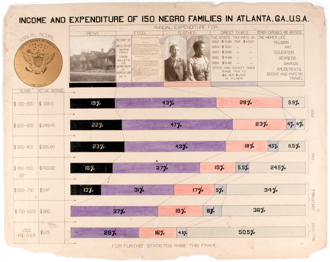
As you can tell, this image is different from the rest of the 60-ish charts for a few reasons. It is one of only five horizontal formatted charts and the only one that uses mixed media including pasted photographs and gold leaf. It is the only chart to have been colored using some sort of crayon, so it has a different color scheme than the rest of the works. But most importantly, Du Bois uses this chart to explain — and personify — his population.

Part of the “Georgia Negro” series, the chart displays the demographic information for the Negro population of Georgia and outlines the economic groups by income from “poor” ($100 — $300 a month) to the “well-to-do” ($1000 and over).
The top row features a snapshot of a “well-to-do” family across the top of the chart. Each section — rent, food, clothing, taxes, and savings — is mapped to a color, which then flows down to each stacked bar as they run down the page. This brilliantly illustrates the percentage of each group’s monthly spending. The color of each category in the legend ranges from black (rent) to clear (savings) showing the impact on each of the income groups.
This chart is one of the most complex in the series and is filled with details such as the scientific description of the average diet (split by animal and vegetable), photographic examples of the dress of a young man and woman, tax bracket descriptions, and even a gold-leafed illustration of a dollar coin. If the illustration of the eagle is a bit simplistic, the overall line work of the chart more than makes up for it with delicate arrows and curves that defy the crudeness of the tools used to draft them.

Another surprise was how large the chart was — 27″ x 22″. Du Bois and his team of students set out to draft this work knowing that it would be easier to standardize drawn elements that were larger and more easily measured. The large size of each chart was likely determined so they could be drafted with precision, as each line and object relate in size to the hand and pen. The drafting would, therefore, benefit from a gestural line (drawn with the arm) rather than a dexterous one (drawn from the hand) and be easier to read from a few feet away.

Another important aspect of this chart was its importance in the exhibition design. Only a few of the charts were framed — as most of the displayed works are photos of notable African-American leaders and displays from historically black colleges. Indeed most of the exhibition was dedicated to the roughly 500 photographs Du Bois and team had assembled to present the radically progressive representation of African-Americans that had never been seen on the world stage.
As David Levering Lewis outlines in the book A Small Nation of People, which focuses on the photographs in the exhibition: “[Du Bois] designed his exhibit to subvert conventional perceptions of the American Negro by presenting to the patronizing curiosity of white spectators a racial universe that was the mirror image of their own uncomprehending, oppressive white world… but the display offered much more, he explained. ‘ Beneath all this is a carefully thought-out plan.’ ”
Since the chart we’re discussing is more decorative and includes photos it acts as a bridge to the rest of the statistical charts. In fact, this work is not just the “key” to the entire series, it is also the first chart the exhibition audience would have interacted with, as it was the first chart on a stack of works — as visible in the original documentation:

Additionally, the bottom of the chart is clearly labeled, “For Further Statistics Raise This Frame”, so this chart was always planned to be the “first” of the statistical graphics.

I’ll argue that Du Bois is actually among the first designers to consider their visualizations to be “interactive”. Since the charts were crafted to be handled and they were sequenced to expose new layers of data in each subsequent work, Du Bois clearly intended for each work to be viewed within the construct of his study. Since most of the charts show similar types of data across international, national and state views. It’s likely that a jump from one chart to another was synonymous in Du Bois’ time to a “double-click” in ours.
The last insight I have to share was only possible because I had the opportunity to see the original document. As previously noted, the works are extremely fragile. Once the Library of Congress digitized the works, they placed them in a highly controlled environment and severely restricted the handling of these works to an absolute minimum. The works are literally crumbling.

At the left one can see a number of scratches on the surface of the chart. Since it was placed on the top of the stack in the exhibition, I think these scratches are from the actual fingernails of the patrons when they handled the boards. The indentations seen in the image are certainly the same size and curve of a fingernail. Discovering the visible evidence of the human touch from 19th-century hands was certainly exhilarating and reinforced the age of these amazing works.
Visually exciting and unusual charts by design
As we’ve been discussing throughout this series, the simplicity of these hand-made charts resonates so strongly with our modern aesthetics and preoccupation with data. Legendary designer Michael Bierut, on his podcast with Jessica Helfand, says of Du Bois’ work:
“A stunning revelation. I had no idea this work existed and I still can’t believe it exists.”
Let’s continue our look into some of Du Bois’ most unique and visually exciting charts in the series.

The above is a completely unique variation on the pie chart by Du Bois. The circle is split into six categories representing different types of occupations. Each slice of the pie is then divided to show the percentage of Negro to White workers for that occupation. The sections are separated by red lines and each white slice is slightly differentiated by thin lines radiating around the center.

By introducing direct comparisons inside each slice, Du Bois twists the conventional understanding of the pie chart. Traditionally, the pie chart equals 100% and its slices represent the proportions of the whole. In Du Bois’ version, the six slices represent 100% of 5 different categories, with the sixth representing the total of all five. While the logic seems complex, the ability to compare categories and relationships between Negro and White workers is actually quite easy to understand.
While much maligned today, the pie chart was very popular in the 19th century. Invented by William Playfair in 1802, the circular chart could be seen across European and American scientific work with regular innovations taking the form of sunbursts, fan charts, and other types of experiments which can be seen in the extraordinary “Book of Circles” by Manuel Lima.
While the design of the chart is unique, the draftsmanship is equally elegant. The crisp line work, circular graphic labels, thin red highlights, and subtle arrowheads all display a mastery of craft that begs to be compared to the fine arts. In fact, the chart above has a similar feeling to a Sol LeWitt artwork from 1973 in the collection of the Museum of Modern Art. Du Bois likely regarded the radiating lines as a means to differentiate each category, but minimalist artists would explore the same graphic elements for their visual rhythm and spiritual connotations sixty years later.

One of the more complex-looking charts in the exhibit, the above is actually quite easy to read. It displays the marital status of men and women from birth to 65+. A central axis runs down the center of the page, with the data for men and women spreading out from the center into three types: Single (blue), Married (red), and Widowed (green).
This is another chart where we can see Du Bois the sociologist at work. In his landmark book “The Philadelphia Negro” from the previous year (1899), Du Bois describes the same type of data, providing some interesting context for the chart above:
“…the number of married women, too, is small, while the large number of widowed and separated indicates widespread and early breaking up of family life. The number of single women is probably lessened by unfortunate girls, and increased somewhat by deserted wives who report themselves as single…

The lax moral habits of the slave regime still show themselves in a large amount of cohabitation without marriage. In the slum districts, there are many such families, which remain together years and are in effect common law marriages. Some of these connections are broken by whim or desire, although in many cases they are permanent unions.”
Interestingly enough, one of the few existing sources of statistical data pertaining to the African-American population that Du Bois references in “The Philadelphia Negro” is the “Statistical Atlas of the United States” by Henry Gannett of the United States Geological Survey. A master of the statistical chart, Gannett features a chart on the conjugal condition by age in the 1890 version of his Statistical Atlas. Since Du Bois clearly respected Gannett’s work, and because he knew other scientifically minded Europeans would also know Gannett’s work, it makes sense that he crafted a similar version using a known method of visualization for his own demographic.

The above chart is another original Du Bois design, this one slightly more enigmatic. At first, I thought it might be a sort of Marimekko Chart, but I realized this chart has no scale and only shows relationships between the categories by proportional areas.
Each of the rectangles in the chart represents the estimated capital of Negro Businessmen in the United States based on total capital of $8,784,637. Since there are no numbers on each shape, this chart is designed only to show simple comparisons. Negro-owned Grocers and General Merchants are the largest types of businesses by far and the smallest are Negro-owned Banks and Building and Loan Associations, both colored bright red for emphasis.

Du Bois was especially interested in studying African-American businesses at this time in his life. Less than a year before the Paris exposition, Du Bois hosted the Fourth Atlanta University Conference on the subject of “The Negro In Business” — the first time the subject had been systematically studied in the United States. As Eugene F. Provenzo outlines in his great book on the exhibition, Du Bois “sent ‘schedules’ of questions to approximately fifty co-researchers to administer in local communities across the south… Du Bois wanted to know different types of business ventures that Blacks undertook, ‘the order of their appearance, their measure of success and the capital invested in them.”
A total of 200 businessmen sent in detailed accounts, some of which are included in the exhibition. One of them was Mr. C.C. Dodson of Knoxville, Tennessee who described his experience: “With close attention to business, by observing frugality, and by manifesting a disposition to please my patrons with courteous treatment and efficient work I have succeeded so my critics say ‘well’… As regards to the second question, it is rather difficult to tell how a white man really regards a Negro, especially when there is something to be gained to the former from the latter. A white man has a remarkable power of self concealment. Those whom I deal treat me well. Those whom I do not deal with do not molest me. I don’t know how they regard me.”
What’s important to remember is that across the charts, as well as the collected photographs, records and documentation, Du Bois continues to build and cross-reference the story of an emerging people.

This chart represents just how few African-Americans were actually classified as ‘Almshouse Paupers’. Almshouses were tax-supported residences where people were required to go if they could not support themselves — a sort of catch-all “poorhouse” which might also include a number of elderly, children, and the “feeble-minded”.
By focusing on this demographic Du Bois seeks to usurp racist assumptions. The 2-part chart novelly shows the proportion of 88 Negro paupers (the tiny red section) to every 100,000 Negros ( the huge brown area)— only .09 % of the total population. Then, at the bottom of the page, he breaks that population numbers into two semi-equal areas representing gender.
While Du Bois presents data that rejects European presumptions, it is likely he was reporting the official numbers of African-Americans in state-owned institutions. This doesn’t tell the whole story. Many African-Americans, including the lowest socioeconomic groups, rejected the systems created by White society and found support from their own community.

Iris Carlton-Laney, in her fantastic 1989 paper, explores 19th-century “Old-houses” and outlines the problem: “…Black social welfare was not a priority particularly in the South where segregated institutions were prevalent. As Blacks observed and experienced such racial injustices, the need to develop their own social services was reinforced.”
Most African-Americans were supported by Black churches, women’s organizations, secret orders, and fraternities. Carlton-Laney continues: “Next to Black churches, the secret societies had the longest history of any voluntary organizations… These organizations which were secret in procedure yet benevolent in purpose, offered opportunities for Black men and women to manage their own affairs and to rise to leadership positions-opportunities not afforded them in the larger society…. Blacks, motivated by the fear of almshouses and pauper burials, nonetheless, made financial familial sacrifices to join ‘beneficial societies.’ Membership in these societies offered some measure of psychological peace and satisfaction.”

This work is a unique piece in the series as it doesn’t communicate any statistical data beyond the written information. It belonged to the second set of charts in the series focusing on data on a national level and is depicted by a rectangle split diagonally into four parts showing the value of taxpayer property in three states plus the total value of all three: $34,893,684.
This infographic was originally hung on the top left wall in the exhibit and likely served two purposes: first, to underscore the financial scale of African-Americans in terms of millions of US dollars, and second, to give that value some visual weight in the booth.
To get some concept of the financial scale, if we look at the Bureau of Labor Statistics consumer price index, $34,000,000 in 1900 is equivalent in purchasing power to $992,152,380.95 in 2017. Reporting such a massive sum was designed to shake the racist assumptions of African-Americans as ‘Negro savages’. As historian and Du Bois biographer David Levering Lewis says in his essay in A Small Nation Of People: “the representative Negroes — of the educated, the prosperous, the phenotypically advantaged — are cynosures of all the characteristics and virtues of which most whites, either in ignorance or from bigotry, believed most blacks to be devoid.”

A typical example can be seen in the satirical magazine Puck which published “Darkies’ Day at the Fair”. Shawn Michelle Smith examines this drawing in her book Photography on the Color Line: “Africans and African-Americans alike, despite the extreme distinction in nation, ethnicity, and culture, all become the same Sambo types — all of them have huge white lips of the American minstrelsy, and all of them are waiting for watermelon. The Puck cartoon demonstrates how the scientific “facts” of eugenicists and biological racialists and the racist caricatures of white supremacists mutually reinforced one another…”
Du Bois places this striking graphic to loom above the exhibit — a testament to the economic gains African-Americans were able to achieve in spite of systematic prejudice and economic repression.
A lifetime later in 1963, Ralph McGill, the anti-segregationist editor, and publisher of the Atlanta Constitution newspaper, traveled to Ghana to meet Du Bois in person. He brilliantly captures the ethereal mood of his meeting with Du Bois shortly before his death; a frail expatriate, razor-sharp and angry.

“Until one met him he was myth grown out of some seventy-five years of the often turbulent and tragic history of the South’s and the nation’s trauma of race.” McGill recounts how Du Bois begins the conversation with a sobering story:
“…Walking to [the Atlanta Constitution’s] office, I passed by a grocery store that had on display out front the drying fingers of a recently lynched Negro.’
He fell silent. No one else said anything. Outside the windows of his spacious house, provided by the government, in the old residential section of Ghana, there was a sound of children at play. A breath of air blew in past the flowering shrubs near the windows.”
He was speaking of the brutal lynching of Sam Hose who was accused of killing his landlord and raping the landlord’s wife. Hose was mutilated by a group of about 500 people before being tied to a tree and burned alive. The mob then cut off pieces of his dead body as souvenirs and sent them to businesses across the state for public viewing. While walking to the Atlanta Constitution office to submit a statement about the increase of African-American lynchings, Du Bois actually chanced upon Hose’s knuckles displayed in a local Atlanta store.
The fact that this memory was so present in Du Bois mind at the end of his life underscores its importance as he begins to question his scientific research. He states in his 1968 Autobiography, “Two considerations thereafter broke in upon my work and eventually disrupted it: first, one could not be a calm, cool, and detached scientist while Negroes were lynched, murdered, and starved; and secondly, there was no such definite demand for scientific work of the sort I was doing…”
In the next article, I’ll discuss the legacy of Du Bois’ data visualizations and explore some reasons why they remain lesser known. Shortly thereafter I’ll publish the last piece in the series that outlines all the charts in order plus discusses an extremely exciting discovery that I’ve made. But again, no spoilers yet. This six-part series will cover:
The six-part series:
W. E. B. Du Bois’ staggering Data Visualizations are as powerful today as they were in 1900
An introduction to the 1900 Paris Exposition, and context for a few charts on history and population growth.
II. Data Journalism and the Scientific Study of “The Negro Problem”
Places this body of work within Du Bois’ larger sociological focus and continues the exploration of many of the charts from the exposition with a focus on education, literacy, and occupation.
III. Exploring the Craft and Design of W.E.B. Du Bois’ Data Visualizations
A detailed examination of how Du Bois drafted his charts, a consideration of this work as a precursor to modernism, and a discussion of his more artistic charts on land ownership and value.
IV. Style and Rich Detail: On Viewing an Original Du Bois Chart
Discoveries on viewing an original chart and further exploration of Du Bois’ more innovative designs dealing with occupation, business, and mortality.
V. Du Bois as Social Scientist and the Legacy of “The Exhibit of American Negroes”
Discusses Du Bois’s body of work and his frustrations with social science despite widespread attention.
VI. The Exhibition as a Whole: an Exciting Discovery
To close out the series I present a previously unknown chart from the series, and discuss the importance of understanding the sequence of the works.
This article originally appeared in Medium but in moving to NightingaleDVS.com, I edited the original text mostly to update some grammar and language substitutions, January 2023.

Jason Forrest is a data visualization designer and writer living in New York City. He is the director of the Data Visualization Lab for McKinsey and Company. In addition to being on the board of directors of the Data Visualization Society, he is also the editor-in-chief of Nightingale: The Journal of the Data Visualization Society. He writes about the intersection of culture and information design and is currently working on a book about pictorial statistics.
- Jason Forrest

- Jason Forrest

- Jason Forrest

- Jason Forrest


