

PART 3: Web 2.0 — The rise of user-generated content and interactivity, approx. 2004–2014
Interactive data visualization is an essential component in the current state of our web. But like everything else, it must evolve to keep pace with technological and societal progress. As our world becomes increasingly data-driven and technologies like AI, the Metaverse, and the decentralized web gain momentum, pushing interactive data visualization to the next level is crucial. In this article series, we explore the drivers of the evolution of interactive data visualization over the past decades and the challenges ahead.
The start of connected and fully interactive internet
The web 2.0 movement in 2004 became an inflection point on how we interact with the web. We went from being information consumers to becoming active online participants, sharing our opinions and reacting to content. This was only possible by new browser technologies that introduced interactivity combined with the rise of social media platforms like Facebook, YouTube, or Twitter that placed users in a more active online role.
Computers became more affordable, the internet attracted more users, and so did social platforms.
In addition to becoming more social, the web also became more sophisticated. The interactivity that was possible thanks to new ways of web development, including new JavaScript frameworks, allowed users to explore online resources that helped them understand the world, including real world challenges that we needed to address with urgency.

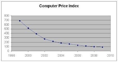
The available data, javascript frameworks and browser plug-ins like Flash, let any user interact with large datasets and distill their own stories, enabling them to create their own perspectives on any topic. New online data visualization tools like Google Maps, Visual Thesaurus, and Gapminder were released and quickly became popular. These portals and their underlying data led to the development of new tools. News websites added interactivity to weather reports or election results, and started to include the first interactive graphs to articles. We also kept testing new abilities to interact with huge datasets.
Interactivity did not only improve thanks to out better understanding on how to make engaging with online visual data more intuitive, it also improved as more complex Javascript libraries, like D3.js or Highcharts became available. These libraries allowed for more elaborate interactions and more sophisticated visuals that could make users want to explore further.
During this time, we also saw improvements in the way we create better online experiences around geospatial data. OpenStreetMap appeared in 2004 as an open and community-built geographic database that provides quality and regularly-updated data for basemaps and data layers that can be used in webmaps. Better and more available data together with new online services like Mapbox allowed the building and integration of performant webmaps into websites and apps.
Interaction conventions
In the early days of the internet, interface exploration and experimentation led us to eventually come up with conventions of how to build user-friendly websites. A similar process occurred in the 2000s with interactive data visualization. Over time, we were able to identify the most intuitive ways of interacting with data visualization, and users familiarized themselves with these new gestures: hover on a bar chart or scatter plot to display the y-value in a tooltip, click and drag to pan on a map, scroll to continuously zoom in and out, or double-click to zoom in in steps. And while we continued to define and respect these rules, we also discovered that we could break them in more experimental and playful visualizations.

Outside of the web browser, we kept testing new hardware setups to navigate data, some of those inspired by movies released in the 90s and early 2000s.


Rapid increase of data
At the same time, we saw how data availability greatly improved. Firstly, by releasing public datasets and making them readily available. After that, by private parties and internet users that started sharing their own datasets and linked them to other existing datasets. Finally, a more active internet resulted in vast amounts of user data that quickly became valuable and attractive to many parties.

The collection of vast amounts of quickly generated data from multiple sources brought us the buzzword “Big Data”. This challenged the ways we could store, process and analyze information, and we also started working on making it more accessible and interesting for all users.

This led to the ability of many to extend their existing datasets with other datasets to enhance their analysis with more measurements from more locations, more groups and historical data. More data became available with greater quality and granularity.

‘Data porn’
With the vast amounts of data available, technologists, data analysts and designers explored new interactive ways of providing insights from these huge datasets. This led to all kinds of graphic and data rich visualizations that eventually would also lead to a massive increase in popularity of data visualization. Some started to phrase these extremely data rich depictions as ‘data porn’, where for some it was not anymore about conveying information, but about creating something that was purely there for aesthetic reasons.
New devices
With the new technology, improved interaction, and greater data collection and availability, online interactive data visualization became a powerful tool to track the world around us and all the changes that were occurring in the digital world. The new wave of interactive data visualization broke out of the boundaries of technical or specialized fields, and became a concept that the general public could engage and work with. Eventually, interactive data visualization went mainstream.

This interactive data visualization hype followed a major breakthrough in the history of communications. The release of the first iPhone in 2007 was very positively and quickly received by the public as an improved model of other commercially available smartphones, with a touchscreen with double the resolution of other models that allowed multitouch and with access to the web similar to that of desktop computers. Smartphones only became more powerful, functional, affordable, and widely adopted since then.

Personal data collection
These new ‘smart’-phones also became personal data collection devices. With all the sensors embedded in them we could, for example, keep track of our running & cycling exercises, and also check our heart rate daily. It introduced a way for us to gather a lot of new data that was just about ourselves. Adding to this, we could continuously exchange and enrich this data through the day (due to the smartphones’ ability to continuously connect to the internet), and data visualization became a new relevant way for users to decide what to do and adjust their behavior.

Quantified self and playful data
With the power of smartphones and other data collection devices, our urge to keep track of our habits grew, and also the quantified self movement attracted a bigger crowd. Data collection was no longer a thing for just business people and scientists, but also for the general public. We even started to see the joy in collecting personal data and manipulating these collections, often with playful results.

Small touchscreens
With the new smartphones, screens reduced their size, and we started interacting with touchscreens. “Clicking” became “tapping”, and icons gained more importance and significance as reduced space needed them to become more intuitive.
Touchscreens made user interfaces more flexible, and with more gadgets that could communicate among them, user experience became device agnostic, jumping between smartphone to desktop and, in the end, smart TVs. Everything became connected, creating one big connected digital universe.
In just a decade, the number of global internet users grew threefold, and passed the 2 billion mark. We experienced by this time how user adoption was not only a response to improved technologies that allowed users to share their opinions, but also to new intuitive and user-friendly interfaces and devices like smartphones that eventually became more affordable. In addition to this, network connectivity went wireless and saw its speed and global coverage greatly improved.
2010–2014 future visions: If you look to future visions movies produced by HP, Intel, Microsoft and Nokia in this era everything becomes a screen, everything is connected and everything can become content that is published somewhere. What is remarkable is that these kind of movies also don’t predict the future of 20 years ahead, instead, they imagined a future that was just a few years ahead.

Movies about the future also showed interfaces and visualizations that are very close to what was already feasible to produce (only the widespread transparent screens we did not manage to make ubiquitous yet). To some extent it is even using the retro visual language and low-tech display techniques we saw in old movies.
Using all data
In this era, we were growing more and more connected and our internet engagement started being translated into datasets that reflected our personal online habits, years before we questioned and regulated its implications. Back then, connectivity data was intriguing and made us curious about our collective habits, and made us want to bring physical and digital spaces much closer. For example, we visualized how Amsterdam celebrated the 2007 New Year’s Eve through changes in the volume of text messages over space and time. This visualization later led to the questioning of the use of consumer data and; in fact, the disclosure of personal data in the telecommunications sector would have been more restricted a few years later. Also with the introduction of the Google Glass the question rose if a device that can see everything your eyes can see should be allowed to continuously record camera footage of its surroundings, particularly in public spaces.

Eventually there was more legislative action that strengthened data privacy laws and favored transparency and accountability; but users continue to demand protection. These demands for privacy and transparency, combined with improved technical developments as well as machine learning and artificial intelligence analysis, contributed to a new shift in the web.
CLEVER°FRANKE is a data design and technology consultancy that creates data-driven experiences. We pioneer through data, design, and technology to unravel complexity and help people make sense of the world around them. C°F's work results in data-driven web products, installations, visual identities, data design systems, and visions for global operating clients like Google, Warner Music Group, and the United Nations.
- CLEVER°FRANKE

- CLEVER°FRANKE

- CLEVER°FRANKE

- CLEVER°FRANKE


