
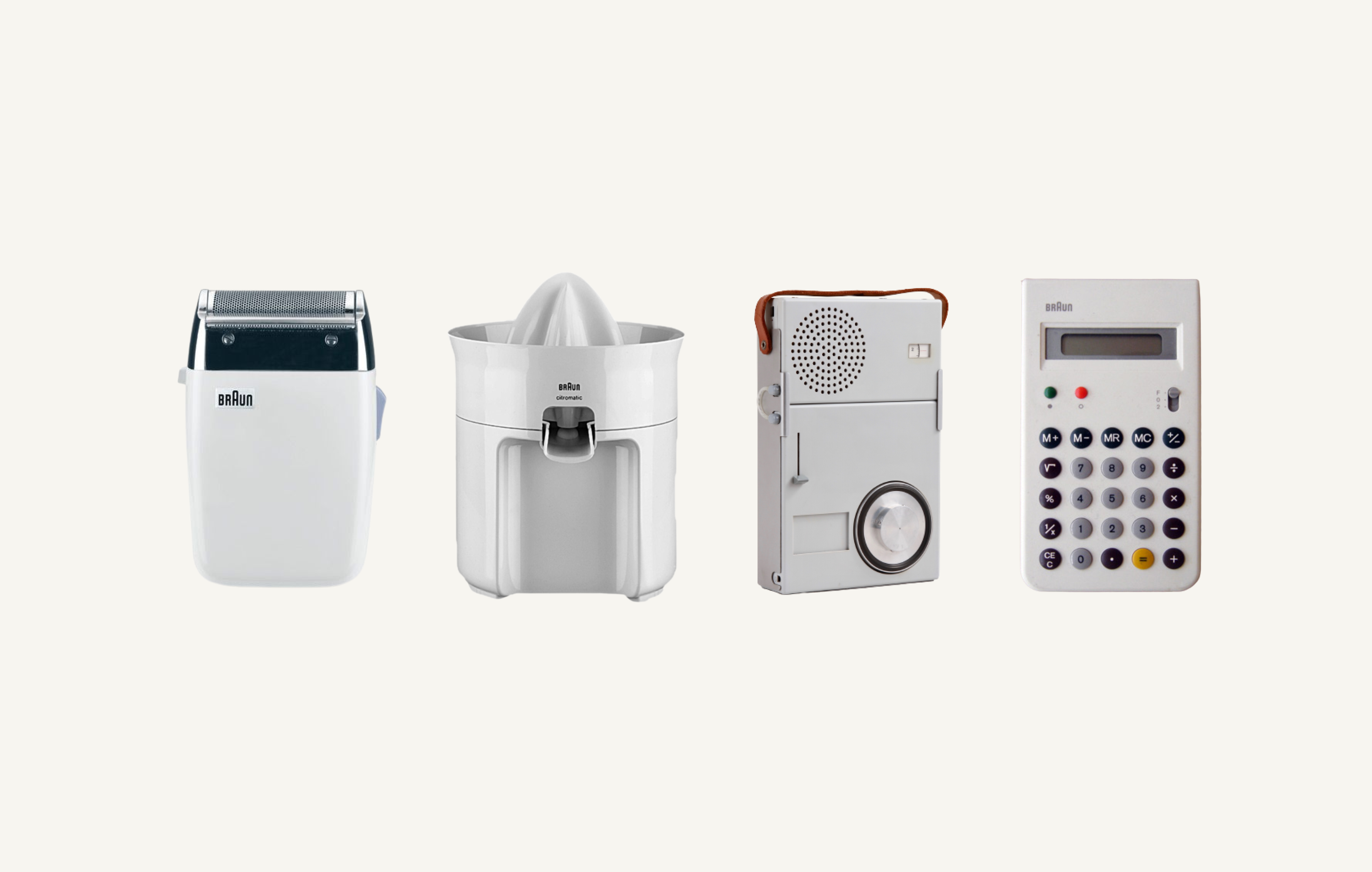
If you grew up anywhere between 1950 and 1995, chances are you have had a Braun radio, turntable, clock, or other appliance in your household designed by Dieter Rams and his team. Looking back at these designs now, I’ve really come to appreciate the thoughtfulness that went into all the different design choices he made. Not to make something more beautiful, but to make it better. And that’s a thought process I see coming back more and more as organizations are scaling their digital products both internally and externally.
Rams describes product design as the total configuration of a product: form, color, material, and construction, which I believe is very similar to things you should pay attention to when designing a dashboard. If you want people to actually use and get value from your dashboard, remember Ram’s words: “Good design is as little design as possible.”
For me that’s what the art of design is all about—it’s basically eliminating the need for a user manual. That means removing all the clutter and noise. You only have a few seconds to grab the user’s attention and inform them of what the product can do for them. So the choices you make when putting it together—whether an appliance or a business dashboard—they do matter.
When Rams set out to write up his ideas around what qualifies as good design, those principles were never meant to be absolute. I believe when he put them into words they were always meant to be updated, but personally I don’t think they have. I believe the times we live in now are very similar to when he wrote them initially. In a world where everything is moving so fast, we are increasingly getting rid of excess and visual clutter, and that’s why I believe his principles (with some fine-tuning) are still very much relevant today.
Here are Rams’s 10 principles of design, and my thoughts on how they apply to dashboards, adapted from my 2021 presentation on the subject, which is available to watch on YouTube.

1. Good design is innovative
Design shouldn’t create novelty just for the sake of it, but to improve the functionality of a product. And while technology certainly plays a role in that, I don’t believe it’s technology alone that drives innovation in how we design better business dashboards.
We tend to get lost in trying out all the new features of our just-launched BI tool simply to create the next thing. But at the end of the day, those new things don’t always serve your users or give them a better experience; so in that sense they become redundant and almost irrelevant.
My advice here would be to stick to the core functionality of your BI tool, and always test the new and improved version of your dashboard against the simpler one to see if your new solution doesn’t add too much complexity for your audience. In my experience, most of the time the new features are about solving a technical problem for the developer but don’t always keep the user experience in mind.
So how do you innovate without cluttering? It’s usually the simple things that are the most impactful. It could be something as simple as more effective chart headers to guide your user instead of complex overlays to explain how to navigate your dashboard.

2. Good design makes a product useful
A highly functional product ignores anything that doesn’t serve a purpose and works against that product’s own usefulness.
When I think about how this translates to the design of a business dashboard, I think about how you can optimize its utility. And by that, I mean not adding anything that doesn’t serve a real purpose. Make your dashboard easy for your users to interact with so that they’ll actually remember the experience and want to come back. If the first time they interact with your product they don’t derive immediate value from the experience, you’ve completely missed the mark.
3. Good design is aesthetic
And I’m not talking about making things “pretty” here.
The aesthetic quality of a product (and, by extension, its fascination) plays a role in how we perceive something to be useful or not. And while you could argue that this is very much subjective, it doesn’t take a genius to appreciate that a dashboard that is overcrowded and confusing is going to get onto people’s nerves and not hold their attention for the time that we need it to to be able to draw them in.
You want to cut down on the cognitive load by being purposeful in your choice of visual elements like colour and fonts. Don’t go for what’s cool and new, but be neutral and focused instead.
4. Good design makes a product understandable
This is where we get into how design can clarify the structure of a product. Good design makes it self-explanatory.
When I think about putting together a dashboard, I spend a considerable amount of time thinking through the structure and how I’m going to lay out all of the different pieces so that it becomes almost self-explanatory and I don’t need to write detailed instructions for how the user should interact with the dashboard to gain the desired insights.
Read more in Nightingale: Honing Your Skills in Data Visualization as a Designer
The choices that you make should all be aimed at limiting your user’s frustration so that they can actually enjoy the experience and come back for more.
And this is how you drive enablement, by the way, by making it easy and seamless for your user to understand the WIFM, or “What’s in It For Me.”
5. Good design is unobtrusive
Being unobtrusive means not attracting attention to yourself in the sense that your dashboards shouldn’t be decorative objects or works of art; they should leave ample space for the user to explore.
When I think about how the unobtrusive principle translates to the business dashboard design, I consider strategies like leaving sufficient white space so users can explore without getting overwhelmed by redundant details.
6. Good design is honest
Meaning, it doesn’t mislead the user into thinking a product is something that it’s not; it should not attempt to try and manipulate or deceive.
A dashboard shouldn’t lie in the sense that we, as designers, shouldn’t manipulate certain elements so the visual better fits our narrative. Also, think about how you can add sufficient context so your user is clear on what they are viewing and trust the data they are processing.
If you’re in the business of visualising data, I’m sure you can come up with plenty of examples of what not to do, like cutting off the vertical axis on your bar chart, for example, or writing a chart headline that doesn’t support the data.
7. Good design is long-lasting
I think there are different ways of interpreting this principle. In the world of product design it is more about creating something long lasting versus trendy and fashionable—something that will stand the test of time.
We should treat dashboards more like products. A lot of the time we tend to create things that serve a singular purpose and then someone else comes along and creates a slightly different version, and then again, and again. This is how we end up with a lot of clutter when we could have easily designed a single product had we invested more time in the scoping of the initial dashboard design. One key to making a dashboard that lasts is to involve all the different stakeholders in the process.
8. Good design is thorough down to the last detail
I really like the explanation from Rams’s book, Less But Better, so I’m going to quote directly from it:.
“Thoroughness and accuracy in design are expressions of respect—for the product and its functions as well as the user.”
Don’t leave things to chance, but think through how all the choices you’re making about your dashboard design will help the user have a better experience. At the end of the day, it’s really about them and not about you.
9. Good design is environmentally friendly
You could ask yourself, what does the design of digital products have to do with the environment? It may not be as obvious as the whole print-versus-digital discussion, but there are things you can do when designing to reduce your digital carbon footprint.
I know a lot of people (including myself, until recently) may not be aware of this, but the transfer of data actually requires electricity which in turn creates carbon emissions which impacts our environment. According to an article on digital sustainability (which I recommend you check out), the internet is responsible for 3.5% of CO2 emissions per year, which equals the number for the airline industry.
By being mindful about things like where you store your data and using more weightless content (meaning less images, icons, video content, etc.), you can make a real impact.
10. Good design is as little design as possible
It’s less, but better.
A well designed dashboard lets your users focus on what’s important by cutting out all the non-essentials. It’s something people actually want to use and see more of. I very much believe that one good design can drive engagement for the other content you’ll be creating, so being thoughtful can really make a difference with driving overall engagement.
For more inspiration and resources on all things Dieter Rams, check out this list of resources I curated as I was doing my research to prepare for my initial talk that inspired me to write this article.


Marian Eerens
Marian Eerens is passionateabout creating experiences and leveraging data and technology to drive change and make a real impact. She’s currently the Global Manager for Data Literacy at Randstad Sourceright and is part of the education team at Viz For Social Good, aglobal non-profit connecting data enthusiasts with mission-driven organizations to create social change through data visualization.
- Marian Eerens


