
I want to discuss the topic of a very tangible and physical constraint – the format of dashboard consumption.
In the realm of data visualization, especially within the field of business analytics, we extensively discuss dashboards and their internal content – encompassing style, design, colors, and chart selection. We are mindful of the product’s audience and use frequency.
But what a technical specialist should never forget is what the dashboard format needs to be for the client. Because this impacts all the design decisions the developer will have to make.
Will your dashboard be viewed on a mobile device? Will it be displayed on a television in the hallway? Will it be showcased in a vast auditorium during a quarterly meeting? Or will it be printed on a black-and-white printer and handed to the top executive?
Here, the dashboard designer starts to break a sweat…
- What do you mean, black and white printing? The colors won’t be distinguishable!
- What do you mean, a conference hall? We’ll need a huge font size!
- What do you mean, displaying it on a TV in the lobby? But what about my incredibly advanced interactive with built-in mouse-hover tutorials?!
Can you imagine if this information reached the developer at the end of the development process? Someone might have thought it wasn’t important because the product is digital. Yet, the amount of additional work that could land on the developer’s plate is substantial. Or worse yet, the client might simply not use the dashboard later on because, despite containing great information and having a nice design, the product is delivered in an inconvenient format. And only tech-savvy folks would bother opening it on a computer once a month. Hello, graveyard of dashboards!
To be mentally prepared for these issues, let’s explore all possible dashboard consumption scenarios and their limitations. Then, let’s consider ways to tailor the dashboard to specific formats.
1. Computer monitor or laptop screen

This is the most common use of dashboards among office workers – after all, they all have workstations or work laptops.
So, the only thing you should worry about here is the variety of screen sizes among employees. Kindly request the system administrators or office equipment specialists to provide you with data about the monitors of your future users. Perhaps the company follows a unified standard, or maybe each department has its own specifics. In any case, you’ll need to test your dashboard for different screen sizes to ensure there are no issues.
2. Smartphone

Here it’s almost like a computer, but with some limitations. Make sure your layout for the phone works optimally, and elements are arranged in order of importance — users might not scroll all the way to the end.
- Check the screen size: If you know the required format (phone model), that’s great, but it’s still worth testing on other popular models.
- Interactivity will be limited: Ensure there’s not too much of it, that the buttons are large, and that all the text fits nicely, without getting truncated.
- Fonts are not straightforward: On one hand, we don’t want to strain people’s eyes; on the other hand, text labels might not fit and get cut off or disappear. You’ll need to find a balance. Use concise category names, and abbreviate where you can.
You can read more about dashboards in mobile format in my article Mobile Dashboards: Small Screens, Big Decisions.
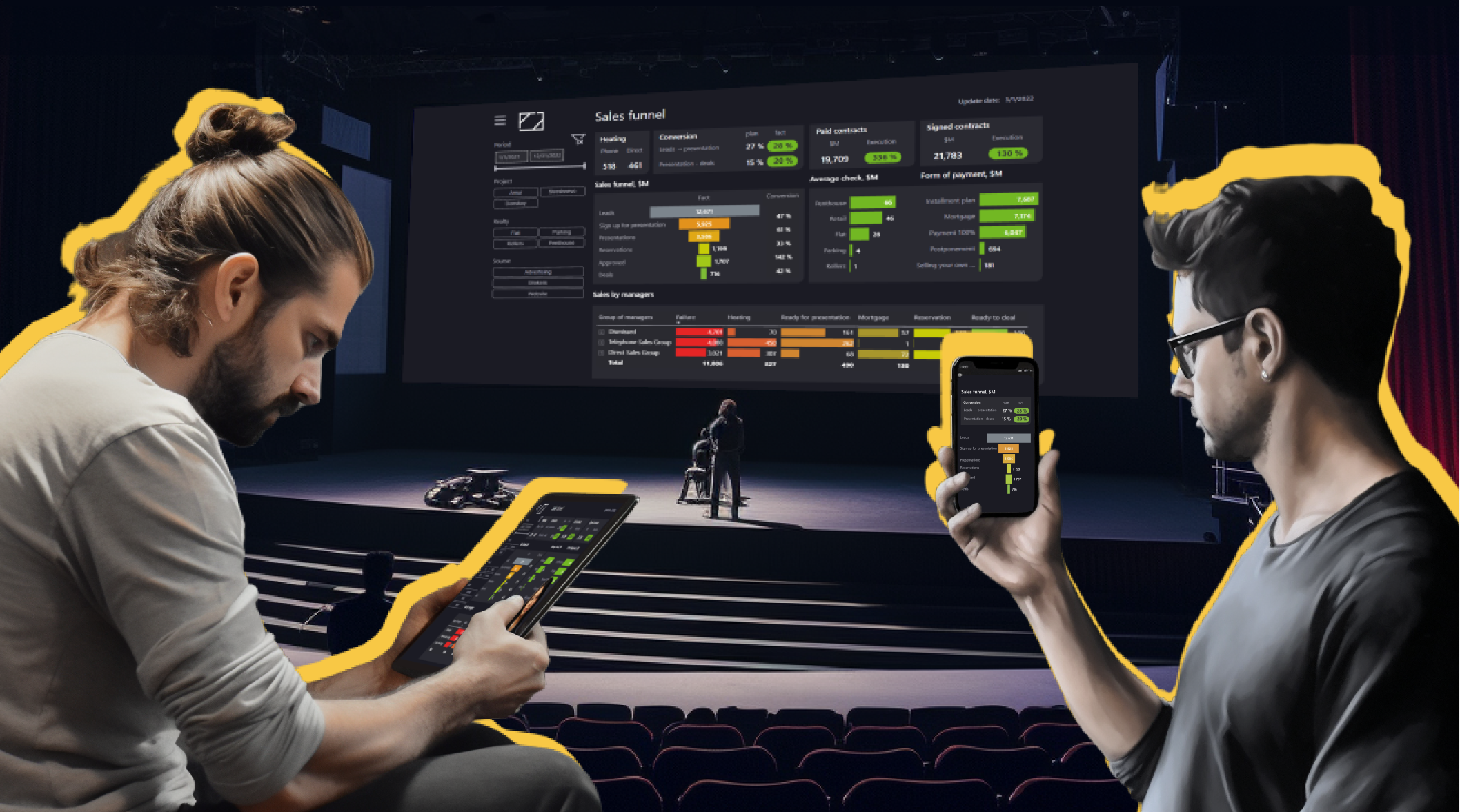
3. TV in the lobby
Not all dashboards are created for internal purposes; sometimes, management is eager to showcase their excellent metrics to clients. Consider whether your product is prepared for such presentations and can assist in this regard.
- If possible, find out the monitor screen size and test whether the dashboard looks good at that resolution. Ensure everything is visible and fits neatly.
- It’s important to use large fonts because televisions are rarely viewed up close. Don’t make people squint.
- You might need to set up auto-refresh or clarify which method or software is used for displaying your dashboard to ensure the data is up to date on the screen.
- If a dashboard is designed specifically for a TV and won’t be used elsewhere, consider a more vibrant and captivating design, but please spare us the over-the-top special effects!
- Of course, nobody will be there to guide the casual viewer on how to interpret the data on the screen correctly. Make sure everything is clear to the general audience. Avoid using complex abbreviations and ambiguous variables.
Interactive screens are a different story altogether. Viewers can approach and interact with a touch screen to explore what interests them. Ensure your interface is as simple as possible, so users won’t be confused by unfamiliar symbols and icons. Make sure the dashboard reverts to a default state after a user is done interacting, just in case they wander off without returning to the main screen.
4. Screen in the auditorium

This format differs from TV in that it’s usually viewed by people who are more familiar with the subject. Some level of interactivity is possible here if the presenter desires. You might also introduce the audience to the dashboard’s specifics, explaining how to read it. However, time constraints or limited presentation skills may hinder your ability to do this. It would be great if your dashboard could speak for itself. You also should prepare for the most basic scenario: your dashboard could be inserted into a presentation as a static image.
Pay attention to the screen size and shape. If the screen or the presentation slides are different dimensions than the dashboard, then your product might not be easily visible, even if you’ve increased font sizes, as mentioned earlier.
Pro hack from my team: If you’re preparing a dashboard for a projector, then can you can, within your BI tool, overlay a white rectangle with 30% transparency on your dashboard. Test if you can still see the content on the dashboard, and adjust the design contrast accordingly. (Don’t forget to remove the rectangle.)
5. E-mail report distribution

Most often, this involves a PDF file sent regularly or under specific conditions to all interested parties. Your audience for this static product could be a large number of people (which you may not know in advance).
Regarding specifics and limitations:
- Interactivity may not be used at all.
- Since the email may be distributed to a large audience, ensure your product is comprehensible without needing separate training.
Yes, your report might be printed – see the next section.
6. Printing in color and black-and-white formats

It’s not always apparent to a developer that their product might be printed on a printer, but many managers, even in our progressive era, still prefer paper. Plus, during meetings, it’s sometimes convenient to make notes on this piece of paper.
What limitations should be considered here?
- Forget about interactivity. If you’ve discovered that printing is common among your audience, ensure that your dashboard remains informative even if there are no buttons. The default view should also be useful to the user since that’s what they’ll likely print most often.
- Consider grayscale. For color printing, this isn’t as critical, but you never know on which printer your dashboard might be printed. Therefore, ensure that the colors in your dashboard have enough contrast to avoid merging into a gray blur when printed in black and white.
- Test paper sizes. Checking the format is relatively simple; most likely, printing will be done on A4 (letter) or A3 (tabloid) paper.
- Make it self-explanatory. It’s difficult to train people or offer help if they’re stuck when you can’t rely on pop-up interactivity or instruction links. Make sure that the essential data required for dashboard use is explicitly visible on the paper and won’t get lost or trimmed during printing.
7. Newspaper (what?)
Yes, it’s atypical, but some companies still produce internal newspapers on paper, and if your dashboard becomes part of these publications, it’s worth thinking ahead about the format, whether anything needs to be done with the color palette, and whether everything will be described and laid out correctly there. Forget about interactivity; training might be reduced to a few lines of text description. The key is to pay attention to colors and fonts for accessibility and legibility.
8. Printout on the wall (ha! ha!)
Not everyone is into trendy interactive screens or digital walls. Sometimes, your dashboard lives its own life, and that life is full of challenges! Your product might end up being printed on several A4 sheets (yes, indeed) and taped together with tape or pinned to the wall. Mm-m-m-m! The Progress! Should this happen, refer back to all the complexities of large screens and printouts.
To make it easier to see the differences in these options, I’ve compiled them for you in the table below.

What if… you have twins?!
It’s already quite challenging…
And now let’s consider a situation where the rules of the game become even more complex: A dashboard is needed for two formats at once! And the client is not willing to pay for developing two different dashboards with the same content.
I believe you can easily imagine all these combinations: Mostly, the dashboard is viewed on a computer, but once a week, a printout is taken to the big boss. Or once a quarter, a screenshot is made for the quarterly meeting. And so on…
The caravan moves at the speed of its slowest member, so it’s better to consider all possible limitations in the main product, so as not to create multiple versions. After all, each version will need to be maintained and updated separately, which requires twice as many resources.
In some cases, it really is worth creating two separate dashboards (but remember about their individual maintenance needs). Remember to ask clients about all the ways in which they may plan to use the dashboard you create, and make sure your contract protects your dashboard from incorrect usage.
And if the company uses three types of formats — then I’ll wish you good luck — just consider EVERYTHING.
What formats have I forgotten or not taken into account? Write to me about your complex situations with dashboard consumption!
Editor’s note: The first image in this story is made with Midjourney, using a dashboard by Alex Kolokolov. All other images made with Figma.

Alex Kolokolov
Alex Kolokolov has been working in the business intelligence industry for the last 15 years. His passion is dashboard design and development. He is the founder of Data2Speak Inc., an agency that provides BI services and trainings. Alex is also the author of three books: Dashboards for Executives (2019), Make your Data Speak (2023) and Data Visualization with Microsoft Power BI (2024). He organized the international dataviz conference and the “Make Your Data Speak“ award.
- Alex Kolokolov

- Alex Kolokolov

- Alex Kolokolov

- Alex Kolokolov


