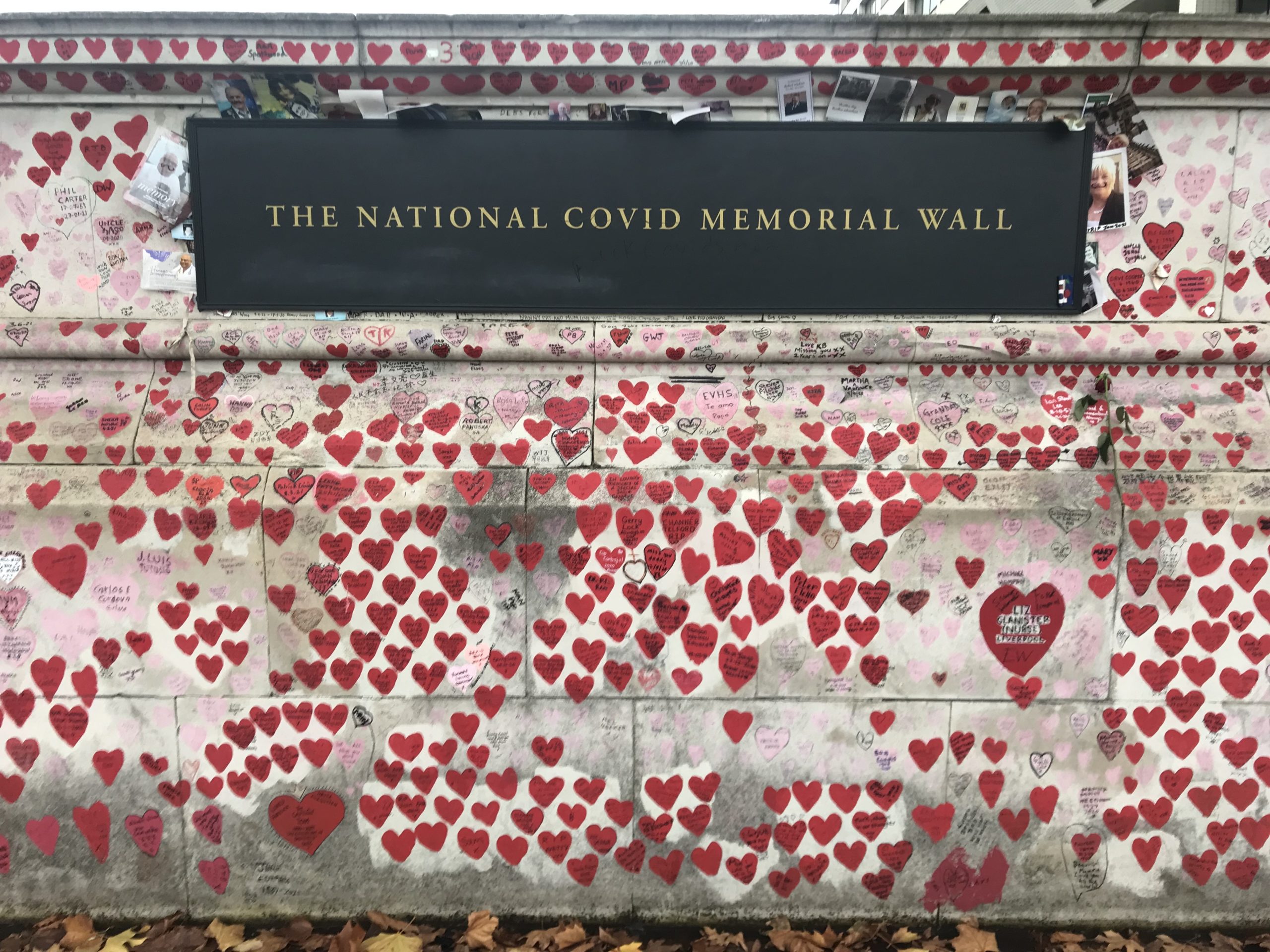
The National Covid Memorial Wall, overlooking the River Thames in central London, consists of more than 200,000 red and pink hearts, representing the UK’s COVID-19 death toll. It runs along the riverside footpath between two institutions at the centre of the nation’s pandemic response: behind the wall is a National Health Service hospital; directly across the river are the UK’s Houses of Parliament.
Organised by a campaign group called COVID-19 Bereaved Families for Justice, the previously blank two-metre high wall was hand-painted in March 2021. Despite never being officially sanctioned and a permanent status remaining uncertain, volunteers continue to maintain the mural today. Personal messages written inside many of the hearts pay tribute to loved ones.

Symbolising each individual death separately echoes approaches used elsewhere, which have represented lives lost with flags, chairs, wooden crosses, felt roses and origami triangles. However, a distinctive feature of the National Covid Memorial Wall is that the painted hearts occupy one linear surface, rather than being distributed throughout an open space. Limited scope for viewing at a distance means one encounters this visualisation by walking its length, each heart gradually becoming visible. Importantly, experiencing its full extent takes much longer than viewing a typical COVID-19 chart. The prevailing effect is a profound sense of the magnitude of the number who died.
The notion of a massive number might arise from the considerable time taken to walk the length of the wall (half a kilometre). Disbelief about the duration of this journey ensues as one’s expectations about its extent are violated. Attending to names and messages forces a slower walking pace, extending the duration even more. This acute sense of time passing heightens one’s experience, contributing to the overall impression of a very large number.

Other effective visualisations also exploit their audience’s time to convey large magnitudes. In Wealth, Shown to Scale by Matt Korostoff, each pixel represents $1,000. Consequently, Jeff Bezos’ staggering riches occupy a vast amount of graphical real-estate. However, a computer screen can only show a tiny proportion of these pixels at a time. Therefore, a complete viewing requires lots of scrolling. Again, the sense of considerable time passing substantiates the enormity of this multi-billion dollar figure. The laboured progress of the scroll bar on its protracted voyage across the screen only adds to the effect.
It’s easy to overlook temporal aspects of visualisations when visual aspects are more conspicuous. The National Covid Memorial Wall’s essential representational mapping, where one heart symbolises one life lost, is salient and easily understood. One might assume that this visible encoding is the only way the mural conveys its striking statistic. The invisible passage of time, on the other hand, is not perceived immediately, but experienced cumulatively. This makes its powerful contribution harder to recognise.

More generally, we’re often guilty of jumping to incorrect conclusions about how people experience visualisations. Robert Kosara’s empirical research illustrates this issue by shattering preconceptions about pie charts. Whilst many assume that people gauge the angle of each pie slice, they actually tend to gauge the area of each pie slice. The professed channels for representing numbers aren’t necessarily the true modes of communication. This results in misunderstandings about how visualisations work, and what makes them effective.
Conversely, open-mindedness about how people might experience data can generate fresh perspectives on data communication and reveal new approaches for conveying large numbers. The National Covid Memorial Wall illustrates how this can go beyond the visual dimension. A sense of time passing, heightened by physical exertion and exposure to emotional stimuli, makes the six-digit death toll seem less abstract, conveying its true scale. Even seemingly simple representations can communicate in unexpected ways.

Duncan Bradley
Duncan Bradley is a PhD student at the University of Manchester. His research is concerned with effective and trustworthy communication of data. He uses techniques from experimental psychology to understand how people form impressions of numbers presented in data visualisations.


