
The International Union for Conservation of Nature (IUCN) launched a number of different projects aiming to protect wildlife. One of these efforts led to a high-quality global geospatial database containing the habitats of more than 100,000 species. In this article, I explore how species of the mammal class are related to each other based on their shared habitats. To achieve this, I combined a handful of tools from geospatial analytics and network science to transform the geographical areas of habitats into a relational graph of animal species.
Sharp focus on a huge database
The IUCN’s Red List of threatened species database contains about 150,300 species, with geospatial information about habitats attributed to more than 123,600 of them. In this work, I focused on a smaller subset—the global database of terrestrial mammals that consists of 12,457 records. This mammal-habitat database is based on around four hundred different sources and contains 5,636 species identified by their binomial names, registered between 2008 and 2021. Furthermore, the database includes detailed taxonomic information, such as the order, family, genus, and subspecies. A major strength of the database is that it includes detailed geospatial information on habitats, which is illustrated in Figure 1.

Building the cohabitation network
Network science provides powerful tools to study, analyze, and visualize complex, interconnected systems. Such complex and highly interconnected systems are common in biology. Just think of processes in molecular biology, food webs or habitats illustrated in Figure 1. Sticking to the latter example, even if we only have three species, their habitat patches show overlap in various ways. If we would keep adding more species, the overlaps would increase exponentially fast!
This is exactly the main motivation behind building the cohabitation network of animals. In this network view, each node corresponds to one species of land mammals and two nodes are linked if the habitats of the corresponding species have significant overlaps. This definition led to a co-habitat network of 5,286 nodes and 62,385 edges.
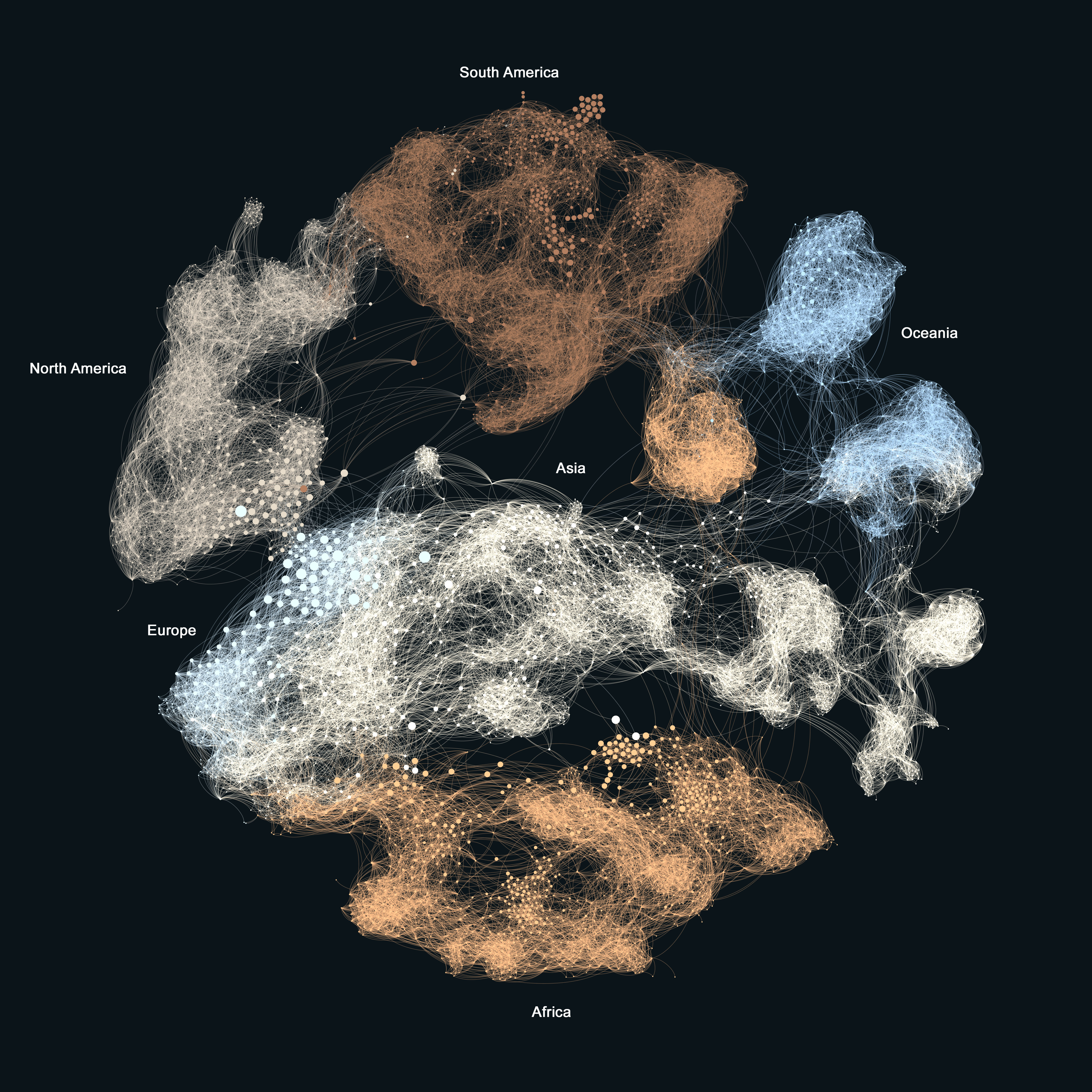
Then I visualized the network using a peculiar color encoding between species and their habitats. First, I determined the largest habitat patch for each species and coloured the species’ node based on the country the biggest section of that habitat falls into. Second, to create the country-level color map I picked the primary color of those countries’ flags. This is illustrated in Figure 2.

Following a similar logic, I created the same network but with colors that represented the continents, as show in Figure 3.

Reading the cohabitation network
By comparing the color encodings of Figures 2 and 3, we can see that the network’s clustering structure has two layers. The country-level coloring shows how neighbouring countries connect—usually with many ties, without very straight boundaries between them. This implies the plausible fact that while country borders come and go, wild animal habitats don’t stop at the borders. Instead, species are more likely to be separated by physical boundaries, which is evident at the continent level. Consequently, these larger, continent-level clusters usually overlap due to species that managed to populate large areas of the world, such as house mice, hares, and red foxes.
Applications for network analysis in biology and policy
Studying the cohabitation patterns of different species is an old and important topic of biology. In this article, I demonstrated how introducing new ways of network analysis has great potential in biology. For instance, this example highlights the key species which connect different communities of animals, allowing researchers to capture questions related to habitat evolution, disease spreading, and even the effect invasive species have on indigenous habitats.
By extending the network node properties to include the endangerment status, the toolset of network science could open the doors for more data-driven wildlife protection policy planning.
To illustrate this, just think of the butterfly effect: in complex, interlinked, and sensitive systems, even small, localized changes can quickly propagate through the entire system causing unexpected changes, even damages. In the topic of this article, the butterfly effect translates into the challenges of a localized intervention such as targeting specific species, without modeling the possible outcomes at the level of the whole surrounding ecosystem.

With a background in physics and biophysics, I earned my PhD in network and data science in 2020. I studied and researched at the Eötvös Loránd University and the Central European University in Budapest, at the Barabási Lab in Boston, and the Bell Labs in Cambridge. I am currently the chief data scientist of Datapolis, a research affiliate at the Central European University, a senior data scientist at Maven7, and a data science expert of the European Commission.
- Milán Janosov

- Milán Janosov

- Milán Janosov

- Milán Janosov


