
Every year the Data Visualization Society (DVS) conducts a huge survey called the State of the Industry—collecting a rich array of data that paints a picture of the data visualization industry today: who is in it, what exactly do they do, and how do they do it?
As a relatively new member of this industry, I found myself very interested in the insights that could be gleaned from this survey. Who are my peers, how do they work, and what can I learn from them? I decided to participate in the State of the Industry (SOTI) visualization challenge to see what I could discover, and what I could reveal to others about the world we work in.
Finding a story in the data
The survey covers a lot of ground and the data available is immense. My first step was to get familiar with the data, understand how it was structured, and the topics covered. I started by watching very helpful tutorials that the DVS had kindly put together, to help data visualization practitioners like me get oriented. Once I had a handle on the scope of the data, I began digging deeper into the data itself, trying to see what trends may be emerging—what story was the data trying to tell me? Was there a story here that hasn’t been told before?
As one might guess, the answer is “yes”. There are a multitude of stories, and many that have not been told before. Now they had to start competing for my attention and interest; which story would get a chance to be told? This is the part of the process where the practitioner’s interests influence the direction of the project.
Is there a gender pay gap in the dataviz industry?

I have always been passionate about gender equity, particularly when it comes to access and resources, and especially in a STEM (Science, Technology, Engineering, and Math) field—where there can often be huge gaps in equity or participation. For many years, I had wanted to be able to visualize pay inequities—to investigate how they break down for an individual, not just across an industry or society. Unfortunately, this kind of salary data can be difficult to come by, so I had not been able to see that vision come to fruition. When I realized that individual salary data was included in the DVS SOTI survey, an old inspiration came bursting forth—an opportunity to finally actualize that ambition had presented itself.
But how could I represent and tell this story in an interesting, and accurate way?
Digging into the data
My first step was to isolate the salary and gender data, and extract that from the survey. I got that data into an Observable notebook and started exploring it with some rudimentary charts, in order to investigate and see which trends would emerge. It quickly became clear to me that there were other factors that could possibly influence the pay a survey respondent receives. Some of those factors include location, level of education or years experience, all of which I had access to as well. I grabbed that data and started investigating those breakdowns as well.

After doing some initial exploration I was lucky enough to be able to consult my coworker and the Creative Director at the firm where I work—a data visualization design studio called TWO-N Inc, for an additional perspective. Drawing on his advice, I briefly explored the salary trends over time, investigating who was entering the industry, and whether pay was shifting and trending to be more or less gender equitable over time. Ultimately, I concluded I didn’t have significant enough year over year data to draw interesting or accurate conclusions about specific gender trends over time. But this is definitely something that may be interesting to do in the future, as the SOTI challenge’s longitudinal dataset becomes more robust!

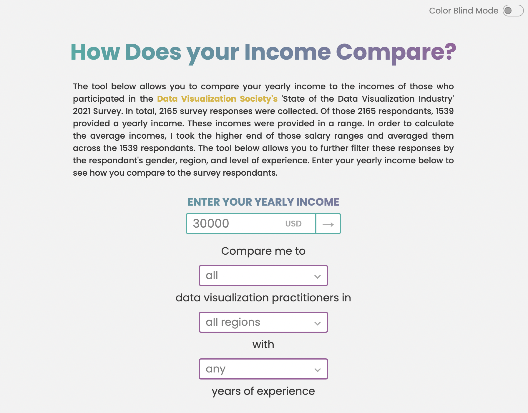
After consulting with my coworker and some further data exploration, I refined my idea. I found I didn’t quite have a robust enough set of data to draw conclusions about a gender pay gap across the industry, so I decided to create a tool that allows any user to compare their own salary to other survey respondents who may match some of their attributes, like gender and location. I had to consider the fact that some filter combinations would not produce many results, which could lead to somewhat skewed conclusions.

Presenting the data in a way that maintained fidelity to it was a challenge. For example, there were not that many self-described gender people in the dataset, but I wanted to be inclusive of all genders. So instead of excluding filter combinations that could lead to a low sample size, I decided to display the resulting sample size prominently, so users could investigate the data but draw their own conclusions. Another significant consideration I had to make was whether to include respondents who do not have a yearly salary, but instead an hourly salary. I considered transforming the hourly salary to a yearly salary, at 40 hours a week, but eventually decided for the sake of fidelity to the data to only include respondents who had reported a yearly salary.
Getting visual
After deciding which data points to include, I began to sketch out my initial dataviz components. I considered the story I wanted to tell;what did I want the user to learn? In my experience, the way a pay gap is traditionally presented is not that compelling. A percentage doesn’t paint the full picture of lost time, and lost earnings over a lifetime, and the long term and compounded inequity in time and wealth a pay gap can lead to. As Jessica Nordell explores in her research and recent book—The End of Bias—seemingly small percentages of bias can add up to large inequities over many years. I wanted to find a way to visualize a similar story in my piece. A 10 percent pay gap might not feel like much today, but over a lifetime, the loss of wealth accumulated from this gap could be enormous.

In order to illustrate this I needed to include dataviz components that helped me paint a more explicit picture of the consequences of a pay gap. I knew I wanted to start with a traditional percentage comparison, and then move on to an explicit depiction of that comparison in terms of days worked per year, and wealth accumulated or lost over a lifetime.

When considering my components, I also thought about accessibility and clarity, so I ultimately decided to mostly use traditional dataviz components, and to focus more on the clarity of the tool, than the artistry of the visualization components. I also wanted to make sure the tool was accessible, so I spent a significant amount of time creating a color-blind mode and made sure the page was tab-able for keyboard users.
The final product
Once my components were sketched out in an Observable notebook, I moved my project into a folder and began building in earnest. I built my project using vanilla Javascript and D3.js. After many iterations that included both some challenging work to convert pay gap percentages to work days, and multiple rounds of redesign (choosing different colors or layouts), I was ready to submit my piece to my teammates for review. After collecting some design feedback from my lovely teammates, I finally had to decide that the piece was finished “enough” (in this kind of work, that can be the most challenging step!), and submitted my piece to the SOTI competition. Now it is out in the world—ready to be useful to anyone who wants to see how their salary compares to others who completed the survey, and what that means for them in terms of their precious time, and their cumulative wealth over the course of their career.
So what?
After this weeks-long journey getting very familiar with the data, and using the tool I built to explore it, I concluded that, yes, there is a gender pay gap in the dataviz industry. However, it is hard to pinpoint the cause of the gap, as there are extenuating circumstances that affect pay such as location, education, and years of experience. I noticed that, especially in the U.S., Canada, and Europe, as years of experience increased, the sample got less gender diverse, leaning heavily towards males. This higher level of experience correlated with higher salaries. It did seem that the cohort with less experience, those who are new to the industry, was more gender diverse, with males sometimes in the slight minority. Among that cohort, the gender pay gap was much less or even reversed.
Does this give hope for the future—perhaps we are moving in a more equitable direction both in terms of industry representation and compensation? Or, are we observing the familiar trend in which gender parity increases with seniority—more women, non-binary, and other self-described gender individuals drop out, or don’t receive opportunities to advance, leaving the more senior pool to continue to skew male, even though the junior pool skews the opposite? If women and non-binary people aren’t reaching the positions where they become among the highest earners, then we are enshrining the pay gap in the industry permanently.
I don’t have the answers, nor enough data to try to find them. But for now, one can use the tool to see where one stands among one’s peers, and hopefully use it to advocate for themselves. If we can do that, then perhaps we can write a different destiny for the dataviz industry—one where gender parity doesn’t decrease with seniority, and equity moves up through the ranks.

Mia Szarvas is an award-winning data visualization practitioner living and working in New York City. She enjoys utilizing the intersection of art and data to tell important and compelling stories. She currently works as a Data Visualization Designer and Developer at Two-N, Inc., and holds a B.S. in Conservation and Resource Studies from UC Berkeley as well as an M.B.A.
- Mia Szarvas


