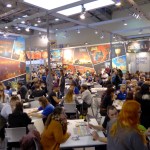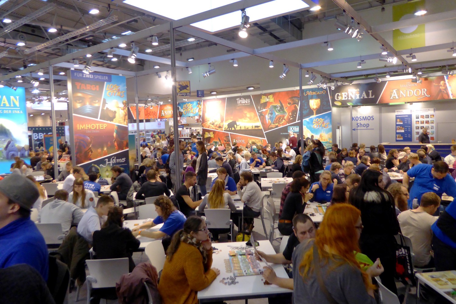
Recently I visited the biggest trade fair for board games in the world. The Internationale Spieltage (Spiel) takes place annually in my current hometown of Essen in Germany. In 2019, a total of 1,200 companies from 53 countries presented their games in an area of 86.000 square meters. 209,000 visitors came to see the fair. Many board games can be played and bought on site.
Looking at the wide range of contemporary board games presented there, I couldn’t help noticing how much board games have in common with data visualizations. In fact, at their core, all board games are data visualizations. Data and information are visualized as pieces of different colors and shapes (called meeples) placed on boards specifying coordinate systems. The rules of the game determine how the current situation of the data can be transformed into a more desirable state.

Board game players are willing to pay 30–50 € for standard games, and well over 100 € for elaborate expert games. Players spend hours and hours poring over these visual representations of data. That is a degree of user engagement that would be great to also achieve for data visualizations.
The good news is that many of the elements that make board games so engaging, fun, and accessible, are equally applicable to data visualizations. In the following, I will discuss a few such points. Board games use easily readable data encodings, use overarching plots and metaphors, have graphic design that fits the topic, and represent the data in physical form.
Board games tend to use easily readable encodings of data. Categorical data is usually encoded via color hue and shape. This goes, for example, for the different kinds of meeples controlled by each player. Numerical data is usually encoded via location among common axis, number of elements, and size of elements. Board games seldom include more difficult to discern encodings like shades of a color hue (light to dark) or orientation. Using them would quickly result in misreadings and confusion.

The table shows the encodings used in traditional and contemporary board games. The game of Go uses the simplest encoding with black and white stones (interpreted as categorical color hues here although factually color shades) placed on a grid (position). Modern games very seldom use further encodings beyond those already used in the game of Monopoly, first patented in 1904.

In data visualization, if the intention is to get information clearly across, easily readable encodings should likewise be used. The experimental encodings of data art play a very important role in extending the boundaries of the genre. But for many, such elaborate encodings pose a barrier to understanding. I personally have to admit to often skipping elaborate data art if it is too tiring to decode.
Board games make use of overarching plots and metaphors to integrate masses of complicated information. Typical settings of board games include medieval trade, fantasy adventure, armed conflict, and science fiction exploration. The setting provides the information encoded on the board with an easy to understand and memorize mental model. Entirely abstract board games are much rarer. Chess is the most popular abstract strategic board game in the western world. In 1924, Bauhaus designer Josef Hartwig created suitable abstract pieces for the game. The forms reflected the movements of the pieces. These did not catch on. Today, chess still uses the metaphor of two armies with knights and bishops maneuvering against each other to kill the other’s king. The human brain craves tangible plots and metaphors.


Over the last few years in data visualization design, there has been a strong trend to move from presenting rational arguments towards telling emotionally involving stories. This was especially initiated by Cole Nussbaumer Knaflic’s 2015 book “Storytelling with Data.” Narratives integrate lots of individual data visualizations into a whole to make a clear point. The narrative also makes individual facts much more memorable. A good story usually consists of a three-part structure with introduction, conflict, and resolution of conflict.
Board game publishers go long ways to make the graphic design fit the topic. Often the general mechanism and layout of board games are designed by one person (the board game designer/author), and the final illustrations done by a professional illustrator, who sometimes remains unnamed. Illustrations, color palettes, and fonts are chosen to reflect the content.
A wide range of illustration styles are used from rational flat infographics to realistic and very artistic styles. Photographs are rarely used as image material in board games. One reason could be that the use of somewhat abstract illustrations and icons makes it easier to remain in a mental state of imagining and abstract reasoning. In Germany, there is even an award solely for the visual design of board games, the Graf Ludo. If something is beautifully designed we are much more willing to invest time understanding and engaging with it.


Data visualizations can equally be made more enjoyable by using a graphic design language that fits the topic. Header fonts can be chosen to go along with the topic. Color schemes can set the general mood of a visualization. Integrated illustrations and icons can serve decorative purposes. Many good examples of this can be found in the Tableau Ironviz qualifier Dashboards (not in the quickly prepared finals).
Part of the fun of playing board games is to have tangible objects before you. The quality of the game material plays a big role in the enjoyment of a game. Usually, cardboard, wood, and plastic are used. It is nice to touch and literally walk around visual representations of information.

Most data visualizations are pure digital products for the screen. But for workshops, showrooms, and conferences it can be worthwhile to bring a visualization into the physical world. A low-level method is to print a (static) data visualization out as a large poster. Today, there are many possibilities of turning digital graphics into physical objects by 3D printing plastic, laser cutting plywood, or laser engraving on plastic, metal, or glass. If one is willing to put in some manual work, the possibilities are endless.
In this article, I have demonstrated how many elements that make board games so engaging can also be applied to data visualizations. The points discussed in this article are the use of easily readable data encodings, the use of overarching plots and metaphors, the use of a fitting graphic design, and the physicalization of the visualization. These are the more static aspects of board games. Further discussions would be warranted for the social aspects, the interactivity (think interface design), and the gratification and rewards integrated in board games (think gamification).


After a long day, I left the board game trade fair with lots of new ideas and inspirations. To me, it is clear that data visualization designers can learn quite a few tricks from board game designers and illustrators. But the inverse also holds true. I’ve seen quite a few board games that could have been improved with basic data visualization know-how. And it makes me think: “How would a board game look that was designed from the ground up by a data visualization designer?”
Freelance Data Visualization Developer from Essen, Germany https://dataviz-jwirges.de
- Johannes Wirges