
Ever wondered what consumes a visual journalist’s day? I tracked every hour of a typical project to uncover the biggest time drains and share insights on how to speed things up.
Visual journalism is slow—at least it seems so, compared with written journalism. While many written pieces take a day or two, visual stories can easily take weeks to produce. Meanwhile the news cycle is advancing a few rounds. By tracking the time on a sample project, three time sinks can be identified that contribute to the slower pace of visual journalism:
- Research takes longer than in written journalism
- It involves many more tools
- Visual journalists are also designers
A typical project
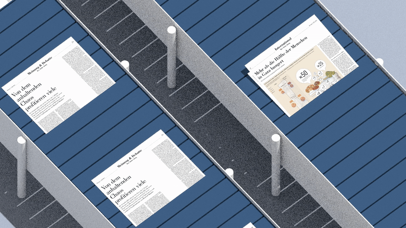
The examined specimen is a piece on the cramped living conditions in the Gaza strip. Its main visual is a 3D-illustration of rooms filled with people. This chart contrasts the living space for a typical Swiss person to the space available to someone living in Gaza. This centerpiece is complemented with a map showing what proportion of buildings are still intact, and how the South is filling up due to people fleeing. From pitch to publication, it took two weeks.
This piece is a perfect example for our experiment: the result is fairly standard for visual journalism, but uncharacteristically, it was mostly done by a single person. That made it easier to pinpoint where the time was spent. The two-week timesheet looks like this:

Research and analysis took up most of the time—four days in total. Out of ten days, I only spent seven working on this project. During the remaining three days, I worked on other projects, administrative tasks and an in-house training. Design and graphics production took two days, and the text just about a day.
Time sink 1: Research takes longer
Research is by far the most laborious part when producing a visual piece. Such articles inherently require more research than most texts to tell the story right. Take just one detail: it takes 10 seconds to write that, “people from north of the Gaza strip have fled to the South.” But it takes an hour to find out that the border that separates north and south is in the Wadi Gaza wetlands, and then even longer to find the geodata to show this on a map. Researching just a few such details quickly amounts to a day’s work. Simply because you want to show something rather than tell it.

Even after locating the right information, it is often not in the right form to compare it with other pieces of information. In the Gaza example, I had estimates on the number of destroyed buildings. But what I was really looking for was the amount of destroyed living space. An apartment building in Gaza city represents a bigger loss of living space than a farmhouse outside of Rafah. So I had to make some educated guesses based on district population numbers. But to find and combine these numbers with the data on destroyed buildings took even more time. This is how I ended up taking four days just for research and analysis.
One way to speed up this work is through specialization. When journalists focus on the same topics for a while, they become familiar with the sources and data. This happened during the COVID-19 pandemic with data journalists. As they worked with the same datasets over and over, their productivity increased. Visual journalists, however, are usually few in number and often remain generalists, unlike other journalists who typically cover a limited range of topics or beats.
Another strategy is to advocate for more open data. We can lobby governments, organizations, scientists, and companies to provide more information and make it more accessible. This doesn’t just mean numbers—plans for machines or architectural models are just as valuable and often even harder to obtain.
Time sinks 2 and 3: Tools and redesign
To create the main chart, I used three tools. First, I modeled the rooms and figures in Blender. Then, I exported these models to Figma to add labels and create variations for different device sizes. Finally, I uploaded everything into Q, a graphics production tool integrated with our CMS.

While exporting graphics between tools only takes a few seconds, these seconds add up as we make changes and iterate. This is especially true when we experiment with new representations, like the dot density plot turned room filled with people. A lot of iteration happened to decide on camera angles, colors and the figure poses. And with each iteration, the chart has to pass through all of the tools before we can see the final result.
For more established charts, like the map of the Gaza Strip, the process is shorter. We’ve done the map multiple times and many design choices are settled: the shades of gray for buildings, the width of roads and rivers, etc. So, the first remedy for a complex toolchain and eternal redesigns is standardization. At NZZ, we use a style guide and share templates to reduce the number of design decisions needed.
A more challenging, but also more exciting improvement would be better integration between design tools. Something similar to the live reload feature commonly found in HTML editors or interactive notebooks. If any researcher is up for the challenge, I’d be happy to talk!
What about division of work?
Work is often split between writing and graphics production. However, the timesheet shows that only one of seven days was spent writing. This highlights a common frustration: writers finish their half of the work and must wait for graphics to catch up.
A more effective approach is to split the research tasks among multiple people. After all, these take most of the time. Anecdotal evidence from our newsroom shows that this speeds up the process. However, research for visual pieces is different from that for written pieces, as visual pieces often require specific details that are unnecessary for the text. For example, researching that “people in northern Gaza fled to the South” is different from researching geodata indicating the border of the two. Therefore, not all journalists can immediately contribute research for visual pieces; it requires some training and experience in working together.
Conclusion
In summary, I propose five ways to speed up the production of visual pieces:
- Specialization: Visual journalists should have areas of expertise, especially for major events like COVID-19, the war in Ukraine, or the conflict in the Gaza Strip.
- Advocate for Open Data: Lobby for more open data, particularly non-numeric data such as airplane blueprints or architectural models.
- Use Templates and Style Guides: Implement templates and a consistent style guide to streamline production.
- Optimize Workflows: Develop workflows that better integrate various design tools and make iteration faster.
- Train Journalists: Educate other journalists on how to conduct research for visual pieces.
These improvements can make visual journalism more responsive to current events. However, even with these changes, it is unlikely to reach the speed of written journalism. This list is definitely far from conclusive and I’m happy to read your thoughts and experiences.

Jonas Oesch
I’m a visual journalist at the Swiss daily newspaper NZZ. Fueled by a love of learning, I tackle complex topics and distill them into clear, elegant visual stories–at least, that’s the aim. Outside the newsroom, I teach and research data visualization at different Swiss universities, bridging practice and theory.


