
When The New York Times’s visual story How the Virus Got Out published, the two circles of data journalists Youyou Zhou is a member of reacted differently. On Twitter, her U.S. data journalism community praised the work as the golden standard of visual storytelling. Elsewhere, “my friends working in the data journalism space in China weren’t happy with it,” Zhou told me.
The project is part of a growing body of urgent visualization work in response to the COVID-19 pandemic. Zhou has worked as a data journalist for about six years, and can’t remember a time when data and visual journalism played such an important and consequential role. “For every piece, the stakes are higher,” she said.
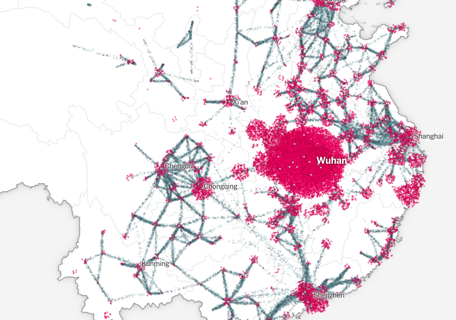
For Zhou, the NYT visual story exemplifies the stakes and complexity of this moment. The piece visualizes air traffic data and traces a number of known COVID-19 cases to show that travelers carrying the virus from China got to the U.S. well before President Donald Trump implemented the travel ban.

Yet the piece came out around when Trump started calling the coronavirus the “Chinese virus.” The European travel ban had been erected a week before. Positive cases and deaths were increasing daily. Conspiracists posited that the virus was man-made in a lab in China. Anti-China and anti-Asian sentiments were brewing.
This context led to very different receptions to the piece in different circles of data journalism. Many of Zhou’s Chinese journalist friends considered some of the design choices to be insensitive and felt that the reporting and framing essentially backed up Trump’s claim. But the strong visuals left a different impression on Zhou’s friends in the U.S. In addition to praising the quality of the presentation, they got the message: The travel ban came too late to prevent the spread of the virus. The administration should take the blame.
Zhou has been tracking and visualizing data related to migrant communities, global mobility, and immigration policies around the world for years now, most recently at Quartz. She has produced award-winning visual stories on domestic and international news. In another example of crisis data reporting, Zhou built a database of deaths from Hurricane Maria with reporters from The Associated Press and Centro de Periodismo Investigativo and visualized how government inaction led to continued deaths long after the disaster.

I was fortunate to get to speak with her about her extensive experience, unique background, and her perspective on data and visual journalism during the pandemic as a journalist from China based in the U.S.

What were the main critiques you heard about the “How the Virus Got Out” visual story?
My data journalist friends in China had been reporting on the pandemic for two months when the piece came out in late March. It wasn’t news to them that the virus spread from China abroad. So when they saw the story, they noticed the design choices and questioned the motives behind it rather than focusing on the information.
One criticism is the use of color. The piece used saturated red to represent people carrying the virus, a typical choice under normal times, but can be seen as dehumanizing now. Also, the number of travelers is much bigger than those carrying the virus. Using particles of similar sizes to represent travelers and positive cases exaggerated the latter. They warned that these design choices would lead to biased conclusions.
The visual provided support for terms like “Chinese virus” and “Wuhan virus” and they worried it would lead to discrimination toward a geographical location and groups of people. They wished The Times had exercised more caution producing the story.
Why do you think two groups of people reading the same visual journalism piece could leave with completely different takeaways?
Despite the same data and visual presentation, the piece triggered people differently. The same data can be used to back the argument that China should take the blame as well as that the US did a poor job in preventing it. Data alone is perhaps neutral and objective, but when we decide what to show and how to show it, data can quickly be weaponized to serve a particular narrative. We have seen this happen again and again during the pandemic.
It made me realize that we need to be more careful in our choices of selecting, analyzing, and presenting data. Even though the majority of the target readers are fine with a story, it should not be framed in a way that harms vulnerable populations. I don’t think it’s the intention of the creators to incite racism or hatred. But impactful stories may lead to unintentional consequences.
It’s a delicate balance between presenting information and nudging readers toward one conclusion or another.

I think it’s a journalist’s responsibility to distill massive data into digestible narratives. Leaving information as is wouldn’t do it. As for this piece, I think The Times did an amazing job packing so much information into such a compelling scrolling experience. Unlike other popular means of presenting data on travelers, the smooth animation of particles really gives the audience an intuitive understanding of the initial spread of the virus. It’s an undeniable piece of art with stunning technical details. I feel like the creators focused more on that, didn’t try to nudge readers one way or another, and pretty much left the information as is.
You mentioned this is a recurring problem during the pandemic. Why so?
We are faced with an invisible virus. Everyone wants to have concrete information that they can take a hold of. We want to know why it happened, what we should do. Data — as many problems as they have — calm people down. Data and visual stories become traffic drivers! Stories that back or challenge people’s existing beliefs, especially on controversial topics, get tons of clicks.
One popular type of charts I’m sure everyone has seen is a good example: for a while, charts that tracked the trajectory of COVID-19 cases by country popped all over social media. They were usually in colorful spaghetti lines with a logged y-axis. It left people with the impression that countries were competing with one another to “flatten the curve.” One could easily call out winners and losers. But the reality is much more nuanced: jurisdictions used different methodologies to report cases and had different testing capacities. Comparing case or death numbers across countries in most circumstances was inaccurate and irresponsible. One might’ve wished that these charts would lead to “losing” countries learning from “winning” countries their “winning” strategies. Instead, these visuals inspired policies like travel restrictions. But people loved these charts! Seeing ourselves in a competition is exciting. Data journalism feeds people’s emotional needs. Perhaps to certain extent, we data journalists are complicit in some of the racist and xenophobic sentiments that have arisen from this information.Ten Considerations Before you Create another Chart about COVID-19To sum it up — #vizresponsibly; which may mean not publishing your visualizations in the public domain at all.medium.com
There must be some examples of good uses of data and visuals during this crisis?
Absolutely. As we wanted to understand how it happened, what we could do now, a lot of it has to be explained with scientific knowledge that the public does not have. Visual journalism helps digest complex information into compelling visuals. It feels old now, but — the iconic image of “flattening the curve” effectively conveys the message that social distancing isn’t about reducing cases, but about saving lives by keeping case numbers below the capacity of the healthcare system. The image democratized the knowledge epidemiologists had had for years, and helped build support for social distancing.
How have past projects you’ve worked on prepared you for visualizing the COVID-19 crisis? What have been the greatest challenges for you, or things you felt less prepared for?
I think this is truly a special moment for data journalists because data all of a sudden became so interesting to people who hadn’t felt that way before. From admin data of regular releases to personal data owned by private companies, you pick a dataset and you get an abnormal chart, a news story.
I’d been tracking data related to immigration and global migration, which became a huge area of focus in this pandemic because of the travel restrictions and changes in immigration policies. The leads and datasets I have followed became a source of new stories. When the U.S. unemployment figures came out, I wrote a story on the outsized impact on the immigrant community by analyzing occupations of immigrants using data from the Census American Community Survey. There’s a cool dataset on how many countries one has visa-free access to based on their passports. I visualized the impact of the pandemic on the power of passports (more powerful passports got hurt more). In another story, migrants losing jobs in high-income countries send back home less money, resulting in a drop in remittance income (and GDP from external transfers) in low-income countries.


The rapid news development is both a blessing and a huge challenge for data journalists, though, because it takes time to collect, analyze and produce a visually compelling story. Most of the data in the field of immigration and migration aren’t timely. They are collected by national governments and released at a monthly, quarterly, or even yearly schedule with at least a few months of lag time. Data from private institutions come with their own biases and privacy concerns. It happened a few times that I had an anecdotal story, but there wasn’t enough data yet to back up my observation.
Will the pandemic change the way data journalists work going forward?
One key thing the pandemic taught all of us is that we need to have empathy working with data. This crisis has reminded us that now when we work with numbers, we need to be aware of the humans behind, be it positive cases, death counts, immigrants, healthcare workers, or unemployment figures. They are very likely someone close to us. These humans will be impacted by the decisions we make related to the data. There might even be immediate policy responses. When the Times set a thousand names in small types on the front page to represent the 100,000 COVID-19 related deaths in the U.S., it felt personal and emotional. Rich and dramatic data points have emerged from the pandemic and can help shape public perceptions in important ways. What sets apart the great work from the good ones is the ability to empathize and humanize.
- Isaac Levy-Rubinett


