
This week marks the end of the United Nations Climate Change Conference (COP26), which is being billed as “the world’s best last chance to get runaway climate change under control.” What role does dataviz play in making the most of this “best last chance”? To answer that question, I went behind the scenes with the team that created the graphics in what is arguably the most authoritative source for up-to-date climate science: the reports of the Intergovernmental Panel on Climate Change (IPCC). The most recent report, the Summary for Policymakers (SPM) of the Working Group I contribution to the Sixth Assessment Report (AR6), was released in August 2021 and summarizes the state of the research on the physical science of climate change.
These reports, each of which takes years for teams of scientists to develop, provide an overview of the current state of climate science. They are a go-to reference for policymakers to make science-informed decisions that tackle climate change. The 2021 IPCC report details global changes that illustrate exactly how worried we should be about our future and how responsible we humans are for that situation. (Spoiler alert: pretty worried, and pretty responsible.)
But, despite representing the latest knowledge in climate science, the IPCC reports have not historically been recognized for the quality of their graphics. Critics of previous reports have pointed to dense scientific figures that often necessitate subject area expertise to parse. While likely effective for scientist-to-scientist communication, these figures did not consistently embrace best practices in dataviz, limiting their effectiveness as communication tools for broader audiences.
That changed with the most recent report.

The 2021 SPM includes a suite of beautiful, intuitively designed data graphics. They are clearer, cleaner, more approachable, and more consistent in style than in previous reports. Moreover, they are making an impact: versions of these graphics were shared by global news media during the summer of 2021 and were a key tool for advancing discussions about the climate crisis.
So when I stumbled across this tweet from climate scientist Ed Hawkins, who is himself known for creating iconic and approachable climate visuals like the Warming Stripes, I was immediately intrigued and reached out to the individuals he named to ask about their design process and philosophy.
As it turns out, the impact of the AR6 graphics is the result of a multi-year effort to implement a human-centered “co-design” approach to the dataviz process.
What follows is a distillation of my communications with four members of the core design team:
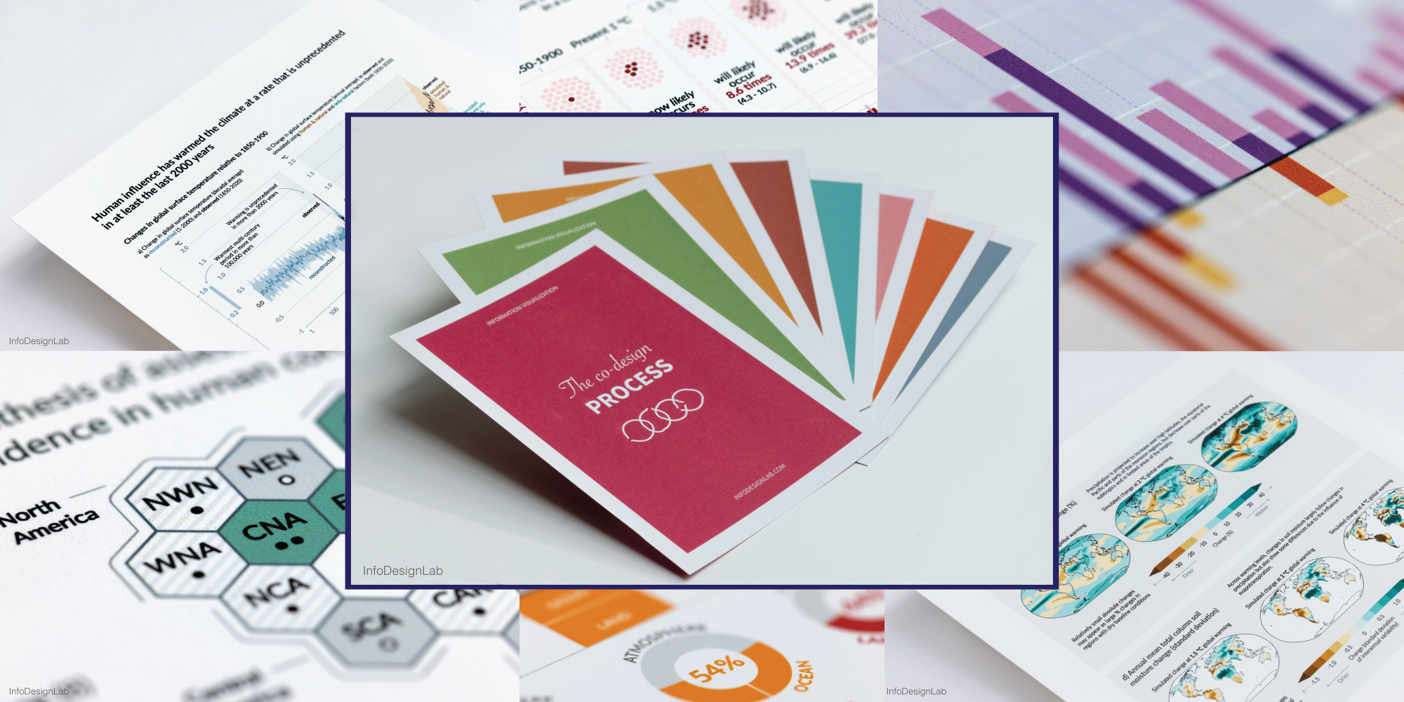
- Angela Morelli and Tom Johansen, co-founders of InfoDesignLab, who developed and led the co-design process, including drafting the visualizations that appear in the SPM
- Melissa Gomis, Senior Science Officer at IPCC, who served as a liaison between the InfoDesignLab team and the AR6 chapter authors, while also providing a style guide and individualized feedback on visualizations to the authors
- Jordan Harold, an applied cognitive psychologist at the Tyndall Centre for Climate Change Research, who contributed to the development of evidence-based best practices and led user testing of the AR6 visualizations
Overview of the co-design process
When I first reached out to the team, I asked if they would share background on the IPCC data visualization design process. “Co-design process,” they corrected me, emphasizing the close collaboration between information designers, content experts (the scientists who author each report chapter), cognitive scientists, the target audience for the report (global policymakers), and other stakeholders. The co-design process itself, they pointed out, is the result of multiple iterations—it has been used in some form for three IPCC reports: the 2018 Special Report on Global Warming of 1.5 °C; the 2020 Special Report on Climate Change and Land; and now, the most recent report, the Working Group I contribution to the AR6. The process has been refined each time based on lessons learned during work on the previous reports.
“The way we collectively managed to push for a really participatory and human-centered approach for the AR6 report—I’m extremely proud of that. It’s a very tangible change from previous reports.” – Angela Morelli
At a high level, the AR6 process worked like this (note: the core design team published a detailed account of the co-design process used to develop the IPCC graphics in the journal Climatic Change last week; read it here):
- Each figure in the SPM was developed by a distinct group that initially included the core design team plus a subset of chapter authors; as the report moved closer to finalization, this group grew in order to make sure the suite of figures in the SPM worked well together to advance the desired narrative.
- The primary audience for the SPM – and the visualizations within – is policymakers: specifically, hundreds of delegates from 195 UN member countries.
- The co-design process began with research and study, with the design team reading the draft report to understand the science, organize the content, and identify questions.
- The design team then conducted in-depth interviews with country representatives from all regions of the world to understand the policymakers’ needs, preferences, and anticipated use of the visualizations.
- In meetings facilitated by InfoDesignLab, the chapter authors suggested figures (for example, those already created for the full report) as candidates to include in the SPM; the suggested figures were the starting point for the co-design process. Because the co-design process began while the text of the SPM was still being written, the visualizations and the text evolved in parallel. These initial meetings were largely about coming to a common understanding of what to visualize: the content, variables, and themes to illustrate in each figure.
- Together, the co-design team then began to think about how to visualize each figure through an iterative cycle of prototyping, dialogue, and revision. As the SPM text evolved and approached finalization, so too did the visualizations.
- Draft visualizations went through multiple rounds of review by the authors and policymakers, including formal comment periods and a survey to evaluate how the figures were perceived in terms of clarity, accessibility, and usability.
- Ultimately, the figures were discussed in detail and revised in real time at IPCC’s final approval session, which included the chapter authors, country delegates, and the core design team.
Altogether, the process spanned nearly 18 months, from initial in-depth interviews in February 2020 to final approval in July 2021.
“For the first two IPCC reports that we worked on, the drafting time was much shorter. The co-design of figures was unprecedented at the time. [For the AR6] it was really about understanding, trying to get into the shoes of the people that would use the figures before ever starting the design process.” – Melissa Gomis
The following sections elaborate on key insights from the co-design process.

Start with intent
One of the central components of the co-design process was for the authors to agree early on the “intent” for each figure, or a plain-language, headline sentence summarizing the figure’s main message. Although figure intents continued to evolve throughout the design and report development process, starting with the intent helped achieve two key benefits:
- It gave the chapter authors and the design team a shared understanding of the goal of the visualization.
- It provided a benchmark for evaluating the effectiveness of each figure at communicating its intended message.
“Don’t think about the visual before knowing what you want to communicate. First, write down your message in one sentence: what do you want to communicate with your data? Then construct your visual and your visual narrative and all the elements you decide to put in your figure based on that intent.” – Melissa Gomis

The stronger focus on figure intent for the AR6 came about, in part, because of challenges during the design process for previous IPCC reports. As one example, Tom recounted the frustration realized during the process of developing the 1.5ºC report that one country was consistently misunderstanding the intent of a particular figure, even as the working group continued debating colors and formats. Since then, InfoDesignLab revised the co-design process to focus more heavily on developing figure intent. The chapter authors have now had several years of exposure to that idea, and as a result, they often independently referred back to figure intent when debating design decisions.
This focus on intent was particularly important because the policymakers who are the target audience, while well-versed in climate science, are not content experts and often need to communicate complex information from the IPCC reports to broader audiences that include government ministers, businesses, and citizens. The policymakers, therefore, still benefit from plain-language interpretations of the complex and often nuanced science underlying the report figures.
“If you are creating a visualization to be a decision-making tool, you have to build in a reflective moment; you have to build up the narrative. It’s only through reflection that you can achieve knowledge and action and change.” – Tom Johansen
“Sometimes we have to unpack the science in a way that scientists would not because everything is so tacit in their minds that ours has to be the voice of beginners. We try to unpack everything before we get to figure intent and prototypes.” – Angela Morelli


Embrace best practices
Once the intent of a figure was clear, the next step was to develop a prototype. In contrast to previous IPCC reports, the figures of the AR6 moved away from the visually dense style of scientific journals and towards something cleaner and more approachable. The Tyndall Centre advocated for this shift based on their research into cognitive psychology and good dataviz practice—which is encapsulated in their ‘MADE’ principle for designing effective scientific visuals. The MADE principle defines effective visuals as ones that consider:
- Message: Does the visual communicate a clear message?
- Audience: Is the visual appropriate for the intended audience(s)?
- Design: Does the visual use evidence-based design principles?
- Evaluation: Has the visual been tested with the audience(s)?
To help scientific visualizations achieve these goals, the Tyndall Centre recommends following 12 design guidelines that should be familiar to most dataviz practitioners—things like “Identify your main message,” and “Build-up information to provide visual structure.”
“IPCC authors are extremely busy, so we needed a way to make the core principles memorable, hence the ‘MADE’ acronym. Of course the principle doesn’t just apply to climate change information—it could be used with scientific data visualizations in any discipline.” – Jordan Harold


Use unconventional chart types carefully
One insight from the Tyndall Centre’s research on best practices is that familiar chart types are generally easier for people to understand, even if unconventional chart types may grab more attention. Policymakers also like to see similar charts in every IPCC report so that they can easily evaluate changes over time. As a result, the design team generally considered conventional chart types to be the starting point, with decisions to use unconventional charts guided by the message the chart intended to convey.
For example, one of the most striking visualizations in the SPM is an unconventional hexagon tile map showing changing climate risks across the world. Jordan described the thought process behind this choice of map:
“The message that authors wanted to convey was that climate change is affecting every inhabited region of the world. The hexagons give each region equal representation and support the message. When we user tested the hexagons, some people didn’t realize straight away that it represented a world map, but many people saw the benefits in terms of communication. Hence, the choice to go with hexagons was an informed one, acknowledging the fine balance between these aspects.” – Jordan Harold

Engage your audience
One of the benefits of identifying the intent of the figure early on is that you have a benchmark to evaluate its effectiveness with your target audience. The AR6 visualizations achieved this goal through in-depth interviews with policymakers, a user testing survey developed by the Tyndall Centre, and IPCC’s formal comment process. (That comment process can yield tens of thousands of comments, each of which requires a response!)
The results of user testing activities influenced both the form and aesthetics of the visualizations. For example, one consideration that emerged during initial interviews was the need to create visuals that the policymakers could easily explain to different audiences and re-use in presentations or online. The user testing survey focused on eliciting more detailed feedback on the draft visualizations through both open- and closed-ended questions. Because the drafts of the IPCC reports are confidential and the figures could not be tested with broader audiences, this feedback was critical.
“We had applied the MADE principle to re-design previously published IPCC data visuals and tested those with wider audiences, which gave us confidence in our approach. Critically, we tested actual comprehension, rather than just people’s views—people sometimes say they like a data visual from its aesthetics but then struggle to understand the message or misinterpret the information.” – Jordan Harold
“User testing helped during the report approval process because the policymakers were already involved – more than in past reports – so the figures didn’t change much during approval. We had done a lot of the work already, integrating the users’ needs.” – Melissa Gomis


Choose tools to support the process
According to InfoDesignLab, 80 percent of the design process is “process, process, process!”; the rest is visual design work. That 80 percent of “process” includes everything from exchanging and understanding the data, to identifying the figure intent, to creating basic visualizations to aid understanding.
This sort of back-to-the-basics process does not require sophisticated tools but does require careful facilitation. Over the past 15 years, InfoDesignLab has developed and refined a “toolkit” of facilitation tools central to the co-design process. This toolkit includes figure intent, but also considerations such as visual narrative, storytelling, and user adoption.
“As information designers our goal is to communicate useful and meaningful information to our readers. We do that by leaning on our experience, research, collaboration, and our toolkit. These tools are powerful—because they help us facilitate the process, and also because they turn into a learning journey for our clients.” – InfoDesignLab

InfoDesignLab noted that most of their initial data work and basic visualizations happen in Excel, although they may use other tools depending on the scientists’ preferences. As they start creating draft visualizations, they sketch and build wireframes with a variety of tools—Excel, Keynote, Google Slides, Illustrator, and even good ol’ pen and paper. Importantly, though, the InfoDesignLab team creates slidebooks that record the history of every figure to facilitate evaluation and revisions.
“Recording the history of the figures has been one of the most powerful design tools in the co-design process, because you can have 10 teams of 25 scientists, plus co-chairs and other working groups that come in and out. One figure in particular had 160 slides—the number of visual ideas that are generated for a figure can be incredible.” – Angela Morelli
Moreover, the tools used need to align with the user’s needs. For the IPCC visualizations, policymakers were clear that they needed graphics that could be used in different contexts—for example, in presentations as well as on paper. To facilitate this for the AR6, the co-design team shifted away from the full-page infographics of previous reports to paneled images with fewer text annotations that could be shown as stand-alone charts in a presentation. But, knowing what their audience needed, they made some sacrifices—notably, the visualizations do not work well on mobile.
“The one thing that we didn’t manage is to optimize the visualizations for mobile, but you cannot do everything. We had to make them work in the PDF for print, and in PowerPoint, so we had to make some choices.” – Melissa Gomis

Advice for aspiring information designers
Although IPCC follows a prescribed co-design process, much of that process can be applied to other data visualization work. The primary difference between the IPCC work and other projects, InfoDesignLab explained, is the magnitude of the effort. The key questions to ask clients and partners are universal:
- What are we trying to achieve with this visualization? (What is the intent of the figure?)
- Who is it for?
The answers to these questions will be different for every figure, so the process of creating those figures – including, often, the tools used – must be different as well. Each one should be thought of as a project in and of itself. (You can read more about the philosophy behind InfoDesignLab’s co-design process in this 2019 article.)

So, what advice can we take from the IPCC co-design process and core design team?
“There’s sometimes a bit of a challenge in that people have their own views and personal experiences when interpreting a data visual. When you become so close to the design process it can become difficult to look at a visual from the perspective of a fresh reader looking at it for the first time – in psychology we call this the curse of knowledge! User testing really helps to complement the process.” – Jordan Harold
—
“You’re not designing figures for yourself; you’re designing them to communicate something to someone else, to another person with their own prior knowledge and abilities. You cannot infer what they know. You think people will get it, but you don’t realize that you’re a step ahead of some of your audience. Whenever you prepare a figure, test it on someone else.” – Melissa Gomis
—
“Dive in; try things; mess up! Don’t just think about visualizing data; start doing it. Know that, in the end, the data you are visualizing are often about people, even if you’re visualizing CO2 or sea level; understand the weight of that, but then just take courses, mess up, try again.” – Tom Johansen
—
“Stop sometimes and ask yourself why you’re doing what you’re doing. The answer doesn’t have to be, ‘Because I want to change the world’; it can also be, ‘Because I want to have fun’; or ‘I want to explore visually’; or ‘I love aesthetics.’ Reflecting on why we are using design gives so much clarity on what we want to achieve.” – Angela Morelli
For more information on the IPCC co-design process and data visualization best practices:
- “Co-designing engaging and accessible data visualisations: a case study of the IPCC reports” (2021): https://link.springer.com/article/10.1007/s10584-021-03171-4
- “Designing for Tuesday” (2019): https://medium.com/infodesignlabposts/designing-for-tuesday-e82d2f184447
- “IPCC Visual Style Guide for Authors” (2018): https://www.ipcc.ch/site/assets/uploads/2019/04/IPCC-visual-style-guide.pdf
- “Enhancing the accessibility of climate change data visuals: Recommendations to the IPCC and guidance for researchers.” (2017): http://guidance.climatesciencecognition.com/
Claire Santoro is an information designer with a passion for energy and sustainability. For 10 years, Claire has worked with governmental agencies, non-profit organizations, and higher education to accelerate climate action by communicating complex information in an engaging, approachable way. Claire holds an M.S. in environmental science from the University of Michigan.
- Claire Santorohttps://nightingaledvs.com/author/clairesantoro/

- Claire Santorohttps://nightingaledvs.com/author/clairesantoro/

- Claire Santorohttps://nightingaledvs.com/author/clairesantoro/

- Claire Santorohttps://nightingaledvs.com/author/clairesantoro/


