
Recently, I had the chance to interview Kenneth Field about his newly published book, Thematic Mapping: 101 Inspiring Ways to Visualise Empirical Data. Kenneth is a self-described ‘cartonerd’ who loves everything about maps – making them, writing about them, talking about them, teaching others about them and sharing his opinion on them. He is also a blogger, keynote speaker, and author of the best-selling book Cartography.
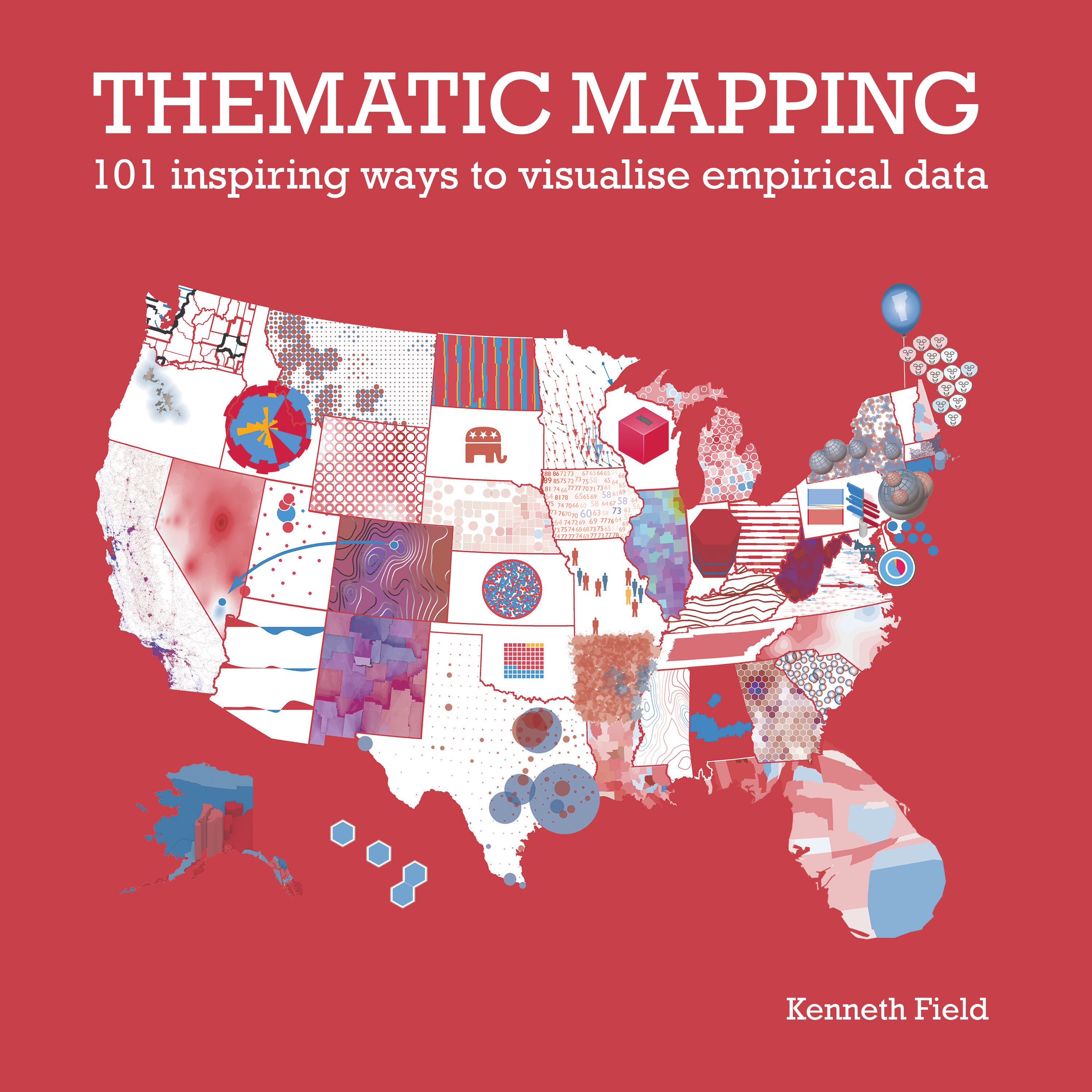
Kenneth’s new book Thematic Mapping: 101 Inspiring Ways to Visualise Empirical Data is currently available for purchase as an e-book.
The conversation has been summarised below.
Oscar So: Where did the idea for Thematic Mapping come from? What lessons have you learnt or imparted from your first book into this one?
Kenneth Field: That’s an interesting question, and one I have written up as part of the preface in the book.
Sometime in early 2018, Alberto Cairo, who is a great information designer in his own right, visited and I was showing him the draft of Cartography. His first question to me was, “What are you going to write for your second book?” I really had not thought about that because I had spent so long writing the first book, and I thought I put everything I learnt into it.
But, something I have been doing at Esri ever since I started working there is making maps with election data, partly for my own interest, but also to generate a collection of maps for teaching. I am interested in taking a single dataset and representing it in multiple ways. Electoral data tends to pique people’s interest in a way that maps of tourism statistics, for instance, do not. I rifle through 20 of these maps at workshops to show people that you do not have to use a choropleth map or a proportional symbol map, but can instead try to do something a little inventive or experimental.
At some point I realized: there is a book here. Why not turn a gallery of 30+ maps into a book where you go through the same tutorial process? I already had 30 maps built, but I figured I’d better make more than 30 or the book would not be very long. I decided on 100, and then because 100 is too nice a number, I decided to make it 101. Surprisingly, it was pretty easy to make 70-80 maps!
So the intent of the book is to create a glossary of map techniques, where the dataset is static. This allows you to look at the way a specific technique changes the message of the dataset. It is not a new idea, though. Jacques Bertin did something similar in Semiology of Graphics. He made 100 maps of France using three pieces of information, which I reference in the book. It is important to reference what has gone before, but maybe by redoing it for a new audience it is timely?
OS: Why did you choose to use the 2016 US election dataset?
KF: Well, there are practical reasons. I started talking about this book back in mid-to-late 2018, and I already had 30-to-35 maps in a fairly advanced state of production. The practicality of having some of the work done helped because it gave me a good starting point.
Secondly, as I said earlier, when you are using a single dataset, it needs to make people want to look at the maps. I think maps of elections are interesting to people because they provide us with a snapshot of a particular point in time. They change every four years in the US and, four-to-five years in the UK. Sometimes the shift in results is insignificant from year to year, and sometimes it is hugely significant. So, that was it—practical reasons, plus I think the dataset has a good chance of being of interest to a wide audience.
OS: Some map techniques, like choropleths, cartograms, and proportional symbols, are commonplace for election maps. Were there other techniques that surprised or intrigued you?
KF: I am not sure that there was anything that surprised me, but in general I think that techniques that are not so commonplace get less attention partly because they are harder to construct and partly because they are harder to read. Normally, you want someone to look at a map and be able to interpret and understand the message easily. There are a few maps in the book that are challenging, and people will have to spend quite a bit of time with them to understand the message. I am not saying that is a bad thing, but it depends on your goal. Are you making a map for a poster? Are you making a map for a statistical report? Are you making a map to persuade? Are you making a map for the front page of a newspaper’s website or page 48 of a print newspaper? These are all variables that will affect the techniques you use.
In the book, I tried to recreate maybe half-a-dozen of some really good maps we have seen in the media over the last decade. There is a famous one in the Washington Post where they use mountain symbology and vary the width of the base, the height of the peak, the color and line thickness.

I’ve also included a modified version of Tim Wallace’s Islands of the US. I riffed on that idea and created something along the same lines.

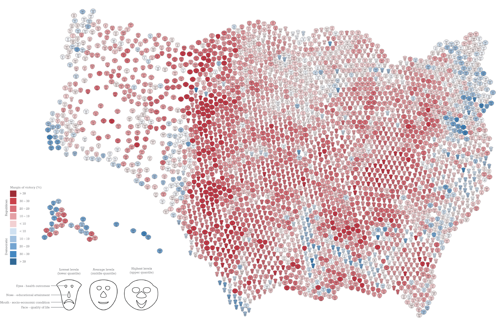
In total, I’ve created a collection of old standards plus a few modern classics, as well as some maps that are not used often. There are Chernoff face maps in there, and Dorling Cartograms, and Dorling Cartograms with Chernoff faces (see below). There are 3,000+ counties and they each have a mini Chernoff face, but it is a Dorling cartogram as well. It is quite the bizarre looking thing! Now, is it useful? I do not know—it looks interesting, but may not have practical value. What I have tried to do, though, is share my editorial thinking and process. So in the book you will see my notes and annotations highlighting certain aspects of each map.
What I tried to do is exhibit the thinking behind each technique and what that technique means for the dataset that is being mapped.


OS: For those of us who are well versed in cartography, how does your book build on existing thematic mapping knowledge established by classics such as Thematic Cartography and Geovisualization by Slocum, Howard, Kessler and McMaster and Cartography: Thematic Map Design by Dent. What avenues does your book build on that these books have not?
KF: Those two books are both great books; I have used them for years. I would suggest that both of those are more similar to my first book, Cartography. They dive deeply into cartography in a conceptual way, including theory and cognitive background. What I have tried to do with my second book, Thematic Mapping is get away from that and provide a glossary of practical examples.
Some people used to ask me about election maps: “Which map should I choose?” Well, I cannot tell you that because it depends on what message you want to impart. But you could flick through my book and stumble across a map and say, “Oh I want to make a map that looks like that.” The write-up of that particular map will give you a broad idea of when to use that type of map, why it works, and why it may not always work. But this book does not go into detail about the How To’s, the principles of symbology, and stuff like that. People can buy my first book for that — and maybe the other two you mentioned as well — and then see this second book as a practical implementation of those concepts.
OS: Any final words of wisdom you want to share with the readers?
KF: Yeah, go buy the book! If you want to reach out, I am on Twitter; my DMs are open.
As for words of wisdom? I think they are all in the two books I have written! But ultimately, enjoy what you do, have fun with cartography, and do not be afraid to pick up a phone and talk to people because the cartography community is actually quite friendly and helpful. We may not always agree, but if you can have a disagreement about a visualization and still go for a coffee or beer with that person, that is professional respect. That is when you can really talk about a map or discuss the techniques you have used.
–To learn more or purchase ‘Thematic Mapping: 101 ways to visualise empirical data,’ be sure to check out the book page.

Oscar So is a spatial analyst at GHD Digital. You can find him thinking and developing ways to integrate young professionals into the mapping industry, choosing between what questions he will ask at the next industry presentation, or eating a burger upside down. Yes, he really does eat every burger upside down and it is a sight to behold.
- Oscar So


