
Data visualizations use symbols as a tool to represent a subject. They interpret, simplify, and synthesize – often in a manner detached from the physical source of information. However, Acnephobic deals with acne positivity, a social media-based movement that aims to give visibility to those subjugated by politics of shame and consequential invisibility. As an information designer, can I develop a practice that returns to the human substrate of data, without losing the gains of synthetic thinking? Can I stop hiding humans behind numbers and show their faces within a meaningful perspective?
In order to work out a feminist and humane practice, I used Zoë Sadokierski’s contextual portfolio [1]. The scholar describes this as an academic instrument for Research through Design, since it situates “design artifacts alongside key insights from primary research, innovative design processes, and self and peer critique, in order to explicitly frame contributions to scholarly knowledge.” Inspired by the work of Giorgia Lupi and Catherine D’Ignazio, Acnephobic is a data story about my experience with the acne-positive movement, filtered through the lens by which I perceived reality. In an effort to be as objective as possible (and it is impossible), the project embraces subjectivity: abandoning statistical truth. This is a starting point for reflection, debate, and further inquiry.
Skin positivity
It has been scientifically proven that body perfect ideals have negative impacts on body images and behaviors, leading to problems such as social anxiety and discrimination for those who do not happen to be classically beautiful. [2, 3, 4] On the other hand, body positivity is based on the proven fact that self-compassion is a great tactic for coping with the detrimental effects of body shame. [5]
As Jessica Cwynar-Horta describes, acne positivity has arisen as a natural sequel to body positivity. [6] Different from what it may seem, the latter is not an attitude of self-acceptance regarding the whole body, but it fights against fatphobia and for the representation of fat people in the mediasphere. Skin positivity, as well as the more specific, but more popular, acne positivity, battles against the univocal Western patriarchal canon of beauty that subjugates the female body. Indeed, using feminist terminology, the male gaze operates a form of control that forces those who do not resemble the canon to live in a state of anxiety and inferiority. In other words, there is a societal pressure that manifests in depilation, cosmetics, plastic surgery, fitness culture, skin-whitening, food disorders, and body dysphoria: Capitalism has the art of transforming female insecurities into profits.
Currently, the main vehicle of these movements is not mass protests anymore, but social media, especially visual-oriented platforms such as Instagram and TikTok. Networked vanity is the ability to create a network of strangers united in the name of the same cause through the exhibition of their non-normative body. [7] Hashtags like #bodypositivity or #acnepositive are crucial for building these networks. These movements are indeed gaining success and already the companies are making pioneering advertising according to the new set of values [7]: entrepreneurship does not waste time when embracing new, more profitable ideals.
When the design task is not formulated by a client, but self-determined, the designer must have enough motivation to pursue it. One way might be a certain degree of personal involvement. I decided to realize a project about acne positivity since skin imperfections have been a cause of personal uneasiness for many years. As an information designer, I felt that visualizing data about this theme could result in a useful tool for addressing the normative politics of shame around this topic.

Affirmative design
Conducting mainstream data journalism
In the beginning, I thought that the crucial aspect of the project would be the tone of voice. Acne positivity and, body positivity more generally, are mostly about sensitivity. The dataviz must consequently be far from aseptic and set the reader in the right mood. When the aim is to create awareness around this topic, the key is the public’s emotions. No pity and no compassion, but the design and the texts should convey the pride and the joie de vivre that the activists themselves broadcast, all framed within a critical analytical perspective.
Without much reflection, I wanted to conduct a quantitative journalistic inquiry around the subject, scraping data from the most popular social media, associated with the most used hashtags, in order to compare findings by geography. As Francesco Franchi argues in Designing News, visual journalism is indeed a crucial force in the news industry. [8] However, it seems there is a silent imperative that data appropriate for newspapers and magazines must be big.

Data humanism
The benefits of manual data collection and a design question
The turning point was when I realized that scraping data from social media is far from being an easy (and sometimes even legal) task. Facebook, Instagram, and TikTok thwart this practice. Only Twitter enables scraping, but, since it is the least visually-oriented social medium, body and acne positivity movements have not spread much on this platform. I needed to find a different approach.
My only alternative for collecting data about acne positivity on social media was to scrape manually, post after post. The immediate consequence of this process was the reduction in the scale of the project to a more qualitative analysis of the first 51 videos that TikTok returns after searching for #acnepositivity. I chose TikTok because its search results are not personalized based on the user’s profile of online behavior, in order to get a certain degree of universality within the subjectivity of the data collection experience. Then, I selected this hashtag since it was the most popular among the others used within the phenomenon. Indeed, it topped 56.9M views (06.05.2021), compared to 48.7M of #skinpositivity, 1.8M of #acnepositive and 1.2M of #skinpositive.
This choice meant that the statistical relevance of the project was lost. However, Acnephobic is a data story whose aim is to provide visibility to acne-positive activists, not through a complete distant overview of the topic, but via a different kind of truth–one that comes out of my personal experience.
This attitude towards data collection is a fundamental part of data humanism. Giorgia Lupi asserts that information design should “question the impersonality of a merely technical approach to data and to begin designing ways to connect numbers to what they really stand for knowledge, behaviors, people.” [9] To do so, it is necessary to personally capture, analyze, and display data, entering and understanding them. For obvious reasons, the data acquired this way are small, subjective, and imperfect, but this does not undermine their validity according to the main purpose of depicting human complexities.
I drew a useful connection to critical design. As Anthony Dunne and Fiona Raby describe, this discipline focuses on conventions to be subverted, expressing alternative values. [10] The critical design does not aim to find answers, but carefully crafts questions to stimulate discussion and debate. While in assertive design the insightful reflection is typically positioned as an endpoint, in critical design it occurs within design processes themselves. Paola Antonelli claims that such designs do not often manifest in “useful objects, but rather to food for thought whose usefulness is revealed by its ability to help others prevent and direct future outcomes.” [11] Narrating a story, based on records and analysis of a personal experience, subverts mainstream assertive practices of information design and leaves the reader with some food for thought and starting points for further inquiry.
Small data, framed by these critical practices, helped me to better prioritize within my design process. Since the subject matter is a movement that fights for visibility of those living under the politics of shame and consequent invisibility, the design does not need to be representative. Activists are protesting for some room within the mediasphere and, in the same way, Acnephobic should not hide them behind some oblique geometry. With all of this in mind, I formulated my design question:
Can information design exist without hiding humans behind symbols?*
*(and still be useful)
Indeed, reducing and simplifying complex information into simple visual forms is a mental process that is crucial to comprehension: this way of processing and presenting information should not be daemonized. However, information design now to overcome the limits of this modernistic approach: from the data-ink ratio by Edward Tufte, we shall move to a more humane complexity-oriented depiction of reality.
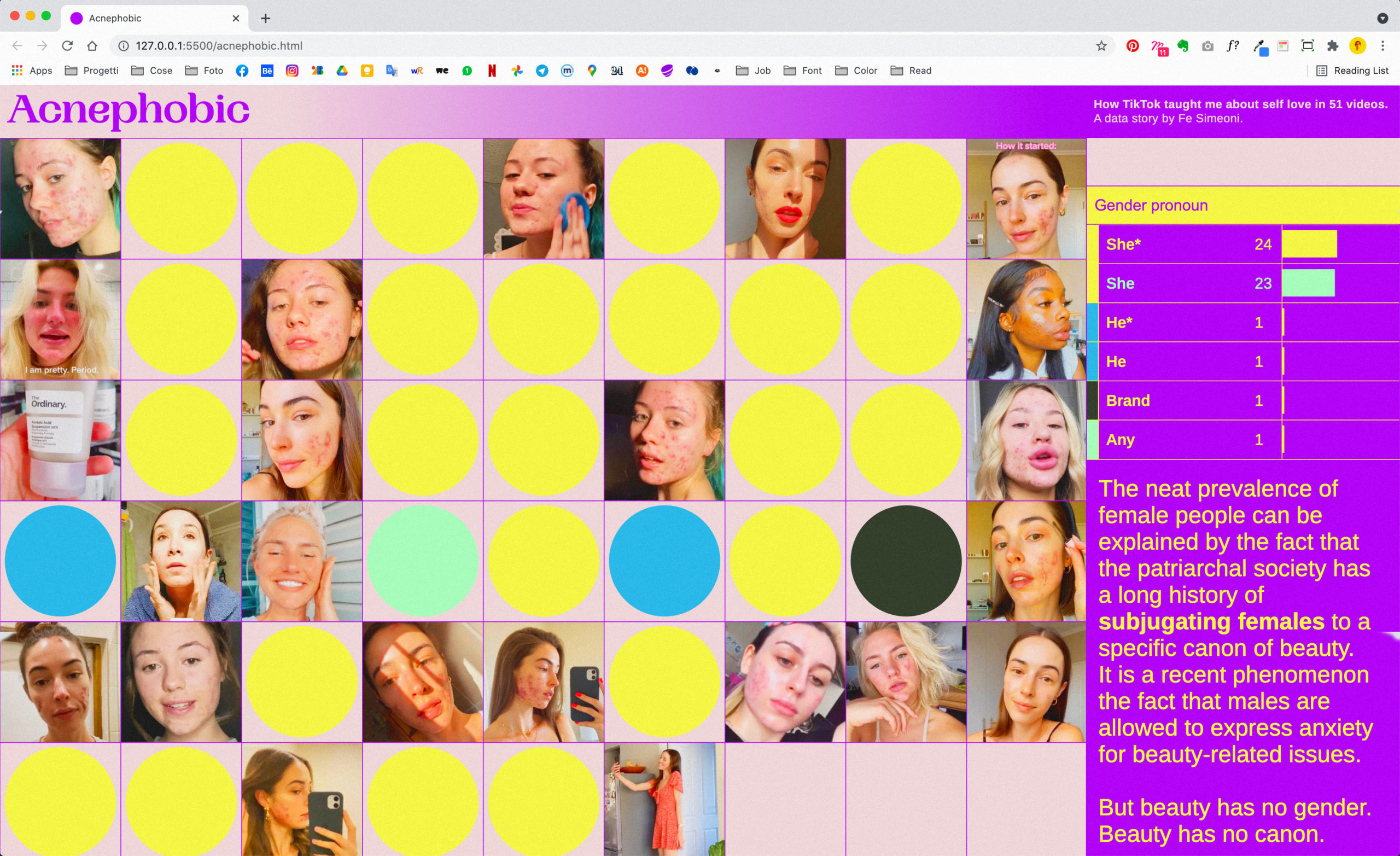
With the motto “People first, data second” in mind, I settled on a design concept for Acnephobic comprised the faces of the activists. I arranged the individual portraits into a grid, allowing the maximum possible visibility for each. Hovering on every face allows the reader to review the information scraped from each TikTok video. Second, I preserved the benefits of traditional information design by using a sidebar with histograms to sum all the data contained “in and behind” the grid. I used colored circles on the faces to connect the information from each portrait to the sums. The overview did not eliminate the single, and the single did not impede the general.
I chose a color palette that signified alignment with this feminist project, for it also fights for liberation from a Western patriarchal univocal canon of beauty. I replaced the normativity of black-and-white design with the rich possibilities of free, bright colors. Furthermore, since Feminism challenges gender stereotypes, the colors selected for the categories in every parameter do not stick to stereotyped associations, such as female → pink, Africa → black, or make-up → violet. This choice makes the infographics slower to be understood. However, it challenges the visual culture of the reader when he/she becomes aware that we are surrounded by strict implicit rules that few dare to break.

A feminist process
Deeper knowledge inspires a more sensible design
The drastic reduction in the size of the data allowed me to perform more in-depth content analysis. I could view, categorize, and analyze every post in infinite ways, without the technical limitations common in automation processes. For example, it is possible to categorize thousands of videos according to their location in an automatic way, but algorithms cannot effectively classify videos for their message or tone. These tasks require the understanding and empathy of human-computer interaction (HCI).
This non-automated workflow was laborious. Spending time with data-generating humans differed from acknowledging a phenomenon from the sum of numerical parts in a spreadsheet: it is a physical sensation that allowed me to enter into the subject matter, gain human sensibility, question my data collecting and processing, find otherwise-hidden narrations, and ultimately develop an appropriate design.
Indeed, Catherine D’Ignazio warns about the charm of those data visualizations that mesmerize the reader with their God-like view from above the depicted phenomenon. [12] Here the author’s body is distant, for it is excluded from the narration of facts that shine with supposed objectivity. The omission of the context projects an aura of absoluteness. She then uses the concept of situated knowledge from Donna Haraway to explain that data are always a subjective interpretation and manipulation of reality. Information is always embodied.
With Lauren Klein, D’Ignazio lists a series of recommendations for a feminist data visualization practice. [13] Like in critical design, the focus is often moved from the output to the process (and the metadata are rematched). Like in data humanism, the social-historical and rhetorical context and humane authorship are prioritized over the modernistic and technology-driven design. Here is their list:
- Rethink binaries
- Embrace pluralism
- Examine power and aspire to empowerment
- Consider context
- Legitimize embodiment and affect
- Make labor visible
I did not formulate the parameters and their categories beforehand. I worked them out heuristically along the way whenever I felt the emergence of questions and disproportions that could have something to tell. As a result, certain categorizations were deliberately subjective. However, the perspective provided by the feminist theory, combined with the deeper, personal knowledge of the human substratum the data derive from, transformed my awareness and also informed my design.
For example, it is not mathematical to determine whether a person has light, middle or dark skin, especially basing the observation on a TikTok video that has probably been subjected to some filters. Though, at the same time, it is undoubtedly clear that the posts I examined portrayed an absolute majority of white faces. Secondly, the message of every video can be easily debated if it is mainly a critique against the mainstream ideology of beauty, a compassionate mood booster, a makeup tutorial, or a combination of all. Thirdly, I had to make a sex assumption when not specified in the bio, based on the stereotypical appearance of male and female people.
The categorization according to sex/gender, skin tone, and geography highlighted external, bigger phenomena in an intersectional perspective. Kimberlé Crenshaw points out that “the problem with identity politics is not that it fails to transcend differences […] but rather the opposite – that frequently conflates or ignores intragroup differences.” As an example, acne is unquestionably more visible on pale skin, but this is not an explanation for the absolute minority of dark-skinned activists. Many assumptions can be made: is it because the Western canon of beauty has always excluded the black body? But what is it like to be a black person with acne? Or, changing perspective, maybe TikTok’s algorithm is biased. Maybe it is easier to be a white activist on social media rather than a black activist.
Indeed, the data collected are not relevant to the acne-positive “movement” per se. Since they are a result of TikTok’s algorithmic processing, these data denounce the mechanics, politics, and biases of the algorithm itself (then filtered by my own biases). In other words, Acnephobic is not a study on the acne positive movement, rather on how a social medium processes and presents a social phenomenon.

Collective checks
Starting a dialogue with peers and the data sources
When Zoë Sadokierski described the critical journal and the contextual portfolio [1], a crucial moment is the experiment log. Here, the designer exposes the prototype to others (or even to the public) in order to get confirmations or denials regarding its effectiveness within the theoretical frameworks described in the contextual portfolio. As D’Ignazio also points out, multiple points of view, collaboration, and communication with other designers and non-experts are useful tools for feminist design practice. During the previous three steps, I discussed and tested Acnephobic’s ideas and design choices with my colleagues and Studio: Information professors at Aalto University of Espoo (Finland). Apart from some technical suggestions, the consistent feedback was that assuming the sex/gender parameter was a problem.
I could not explicitly elicit this categorization. At first sight, it was evident that the overwhelming majority of activists were female people. This could be explained by the long history of patriarchal societies to subjugate females to a specific canon of beauty. Whereas, it is a recent phenomenon that some males feel safe enough to express anxiety about beauty-related issues. Compared to sex, gender is a more relevant datum within this discourse, but only a minority of the screened activists declared their own. The most obvious solution to this problem was then to assume sex.
If, after the spreading of the queer movement, gender assumption has become a problematic issue, the recognition of intersex people adds further challenges for the sex assumption. As Judith Butler describes, “the norms that govern idealized human anatomy thus work to produce a differential sense of who is human and who is not, which lives are livable, and which are not.” [15] As a result, any type of assumption deviates from data feminist practice. Both intersex and transsexual/transgender movements claim that gender and sex ought to be established through assignment or choice, but non-coercively.
Since Acnephobic dealt not with numbers, but with people, I addressed this challenge by asking activists directly via Instagram message chat. I chose to display the pronouns rather than gender because the latter can be a difficult private question. As Butler argues, gender is not necessarily static, is performative within certain constraints. On the other hand, if gender can be an open question, pronouns are more manageable since they are used to deal with personal identity in the public sphere. Furthermore, I factored this into my design choices to raise awareness among readers of the importance of including explicit pronouns as a normal behavioral practice within social media.
However, not every activist replied to my messages. The data I collected were consequently imperfect. Data humanist theory prescribes to give value to imperfection since it is an opportunity for the reader to find insight in the metadata. Indeed, declaring the assumed gender sheds light both on the collection process and on the mental operation that we subconsciously undertake.

Conclusion
The overview map and the critical journal methodologies suggested by Sadokierski proved to be crucial tools for framing information design practices within thinking systems, such as feminism, intersectionality, and data humanism, always pressure tested by external commentary. Applying these principles has helped me to develop a more aware and respectful practice and outcome. Furthermore, Acnephobic evolved into an opportunity for alternative visual journalistic approaches, that can offer insight not only through big data inquiries but also through subjective personal stories and contemplating a different kind of truth.
References
- Z Sadokierski, “Critical Journal / Contextual Portfolio: A framework for documenting and disseminating RtD as scholarly research,” Proceedings of the 4th Biennial Research Through Design Conference, Delft and Rotterdam (19-22 March 2019)
- H Dittmar, “How do ‘Body Perfect’ Ideals in the Media have a Negative Impact on Body Image and Behaviors?,” University of Sussex, UK (2009)
- B Dréno, J Tan, S Kang, MJ Rueda, V Torres Lozada, V Bettoli, AM Layton, “How People with Facial Acne Scars are Perceived in Society,” Dermatol Ther (2016)
- H Tissera, L Gazzard Kerr, EN Carlson, LJ Human, “Social Anxiety and Liking: Towards Understanding the Role of Metaperceptions in First Impressions,” Journal of Personality and Social Psychology (2020)
- K Sick, E Pila, A Nesbitt, CM Sabiston, “Does Self-Compassion Buffer the Detrimental Effect of Body Shame on Depressive Symptoms?,” Western University, London, Canada + University of Toronto, Canada (2019)
- J Cwynar–Horta, “Documenting Femininity: Body Positivity and Female Empowerment on Instagram,” York University, Canada (2016)
- F Franchi, Designing News: Changing the World of Editorial Design and Information Graphics (Berlin: Die Gestalten Verlag, 2013)
- G Lupi, “Data Humanism: The Revolutionary Future of Data Visualization,” PrintMag (30 January 2017)
- A Dunne, F Raby, Design noir: The Secret Life of Electronic Objects (London: Birkhäuser, 2001)
- P Antonelli, “Critical Design,” Domus 949 (31 August 2011)
- D Carbado, K Crenshaw, V Mays, B Tomlinson, “Intersectionality: Mapping the Movements of a Theory,” Du Bois Review, 10 (2013)
- C D’Ignazio, L Klein, “Feminist Data Visualization,” Academia (2016)
- C D’Ignazio, “Feminist Data Visualization,” interview by E Bertini and M Stefaner, Data Stories (23 November 2017)
- J Butler, “Introduction: Acting in Concert,” Undoing Gender (London: Routledge, 2004)

Fe Simeoni is an information designer. They are currently pursuing a PhD in computer science at the Free University of Bozen-Bolzano, while collaborating with the Institute for Minority Rights and the Centre for Autonomy Experience at Eurac Research (Bozen-Bolzano, Italy).
- Fe Simeoni

- Fe Simeoni

- Fe Simeoni


