
Manuel Lima is one of the most prominent figures of data visualization since the publication of Visual Complexity (Lima 2011). In this conversation, Manuel Lima traces back the origin of data visualization to Ars Memorativa, an ancient mnemonic technique to organize information and facilitate its recall. Going back to the origins is an obsession that brought him to collect and arrange into books images of information design from both physical and digital archives. By doing this, Manuel Lima tackled issues related to digital objects and their creation, use, and preservation, with a point of view capable of combining the passion for visualizing information and the profession of UX designer.
This conversation, which took place between Lisbon and Milan on Wednesday 28 July 2021, comes from a blurb that Manuel Lima wrote for Mapping Affinities (Rodighiero 2021). The discussion is part of the project From Data to Wisdom, and is supported by Fundação para a Ciência e a Tecnologia through the grant POCI-01-0145-FEDER-029717 and the Swiss National Science Foundation through the grant 194442. This text, originally created for the forthcoming book From Data to Wisdom (Higuera Rubio et al. 2022), is published as a preview for Nightingale, the journal of the Data Visualization Society.
Dario Rodighiero: Dear Manuel, I would like to start the interview with a very simple question: how did it all start? When did you fall in love with data visualization?
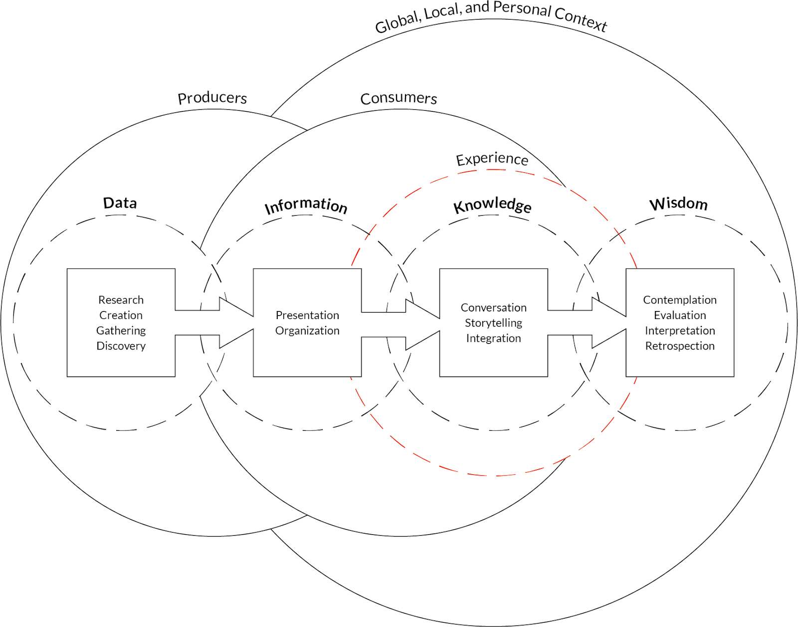
Manuel Lima: My love of data visualization started during my Master of Fine Arts at Parsons School of Design in New York, it was a two-year program. During that period, a teacher of mine gave a lecture on information architecture. He presented this diagram called the Understanding Spectrum (Shedroff [1994] 1999), which basically shows how data leads into information, information into knowledge, and knowledge ultimately into wisdom (see Figure 1). Even though my background is actually in industrial design and product design — I’m familiar with Politecnico di Milano, which is a great school for industrial design, amongst other fields — so in building physical things, I was just super interested in being part of the process of bridging information and knowledge. That’s the key challenge, arguably one of the most critical challenges of the century. Then, I immediately started planning different projects, already thinking about data visualization in an attempt to make sense and visualize systems.
I remember doing this project on visualizing both a computer virus and a human virus, which is now an urgent topic for all of us due to COVID-19. I got really into epidemiology and the dreaded diseases. I was fascinated by how the spread of a computer virus is actually similar to a human virus, contaminating hubs like within a network. I remember I was reading Albert Barabasi’s book Linked (Barabási 2002), and Steven Johnson’s Emergence (Johnson 2001). This slowly got me into networks, and I became obsessed with these structures.
And for my thesis, I was trying to build up this visualization tool to understand how information spreads within blogs. This was 15 years ago and blogs were very recent. Blogs were just coming out and everyone was saying, “It’s the end of the media as we know it.” But I was really more interested in how blogs themselves became a social laboratory for investigation, which is something that social scientists have been trying to do for ages. Today we have this perfect lab to understand how information spreads from point A to point B, which people are ‘contaminated’ by this information, and what’s the overall pattern of dissemination.
When I was doing this research for my thesis, I started collecting examples of network visualization, which intrigued me because they underlie the structure of the blogosphere and the world. My obsessive-compulsive nature was pushing me to collect examples not just from that specific domain, but also from everything: from biological networks, computer systems, and social networks. That was really the genesis. Once I graduated, I felt the body of research was too good to keep to myself, and that’s how the book started. As I was collecting some of those examples on visual complexity, I realized this would be a great book because there are several examples that are actually, unfortunately, disappearing. And the book was serving multiple purposes — I think I published Visual Complexity (Lima 2011) five years after the website — but one reason was to preserve digital maps for future generations because many of them are disappearing. Visual Complexity is a way of preserving some of that content.
Then, my curiosity about the origin of things prompted me to write my two other books. I was always trying to see who was the first person to think about network diagrams or create a network diagram, and that led me to investigate tree diagrams, which are the topic of my second book, the Book of Trees (Lima 2014). The same mental process of going back to the origins, in trying to understand the very first diagrams that humans created, inspired me to write about the circle (Lima 2017).
Dario: This is truly beautiful. By looking for the origin of data visualization you moved from contemporary to ancient visuals. Is there a specific reason that led you to investigate the past, especially the Middle Ages?
Manuel: I think that in the Book of Trees and the Book of Circles there’s an implicit attempt to demystify the idea that we are at the clinical stage of civilization, and data visualization is a brand new thing that has emerged in the last hundred years as if nothing has happened before. I hope my two books displace this misconception because it’s simply not true. We have been doing this for centuries, if not millennia. Now we just have better tools and more data, but the challenge is still the same: it’s to make the invisible visible and to find even patterns in information.
Even the sense of being overwhelmed with information, which is such a common thing today, it’s also not completely new. There’s a book titled Too Much to Know (Blair 2010) that I absolutely love because it details the anxiety that medieval people were facing with this avalanche of information coming from ancient Rome and Greece. There was all this incredible explosion of content, and people had to make sense of it. Then, there were also developments in printing that increased book production. There is this sense that we were creating so much knowledge, so much information that it was impossible for any single human to digest. There was a similar type of anxiety as we have today with big data, that there’s too much information out there.
Dario: I would ask you to develop this point. If this overwhelming information already existed in the past, it means that information design is a pretty old practice. Did you finally find its origins?
Manuel: I always go back to what is known as Ars Memorativa, which is also called the Art of Memory in English. Ars Memorativa is a set of mnemonic techniques used by schoolers back then — most of them religious because that was the nature of knowledge — to memorize information and recall it at later times. And I do think that Ars Memorativa is the genesis of information design.
Since Ancient Greece, the great thinkers of the past have defined a lot of critical design principles that, even today, are still used and embraced by interaction design, UX design, and information design. Ideas like the chunks or hierarchy were defined during the Ars Memorativa movement.
It was during this time, when this avalanche of information was coming from ancient Rome and Greece, that some people realized that visual communication and diagrammatic communication were notable ways to deal with this data. There were outliers, a few people who wanted to have all the information in a diagrammatic form because it was just easier to consume. They were intentional about their goals: diagrams were meant not to accompany the text but to replace it altogether. So I think that was really the birth of Ars Memorativa that shaped information design as we know it today, and this was roughly nine centuries ago.
Dario: You told us that you studied industrial design and UX design, but information design was totally new when you started to explore it. I know that a lot of designers like you and I did this transition easily. So one of my questions is what is the relation between user experience design and information design?
Manuel: I run into this question all the time. Even looking back, I think my professional life was divided into two parallel tracks. On the one hand, I was doing research, lectures, and teaching related to data visualization and information design. On the other hand, my 9:00-5:00 job was working for big companies like Google and Microsoft on interaction design and UX design. Though they were parallel tracks, I have always felt that they were pretty connected. User experience design and data visualization are interconnected through interaction. One thing that really differentiates modern-day information design is the requirement of interactive design. Otherwise, we are falling into our traditional graphic design on paper. Once you embrace interaction, once you’re creating digital experiences that allow you to interact, filter, and drill down different aspects of visualization. Inevitably, you enter the domain of interaction design and user experience, which is all about understanding the flow, usability, accessibility, and things of that nature. There’s a huge overlap. Interaction is the glue between user experience design and data visualization.
Dario: I’m sure that you know the work of the philosopher Raymond Llull for many reasons, including your Iberian origin. Something that struck me about Llull, in addition to his capacity to excel in diagrammatic communication, was his initiative to send books all around Europe to get visibility. Manuel, I have the impression that your books reached a lot of readers. Has to be an author changed your life?
Manuel: It’s always hard to pinpoint the causality of certain things in your life. Of course, my books definitely led to more lectures, more invitations for events, and speaking arrangements. I think that the TED talk was through The Book of Trees. One of the recruiters for TED saw the book and invited me to give a lecture.
One inevitable effect was more speaking engagements, for sure. First of all, it’s almost a compulsion to just put it out. I’m living with this thing, and I have to put it out. I cannot live with myself if I just don’t put this thing out into the world. There is this sense that other writers have also conveyed, the same sense of a need. But for me, the second thing is really touching people. What happens when you write a book like that is that you touch other people without even getting to know them. That’s really the main reason why I do it. I love when I get an email or a message, or a LinkedIn post of someone saying, “I read this book and it changed my life,” or “I changed careers because of this book.” It’s fun. Due to the nature of the work that I end up doing in places like Google, Microsoft, it’s really ephemeral. I like the digital environment. It’s always changing. If I look back, there’s really nothing I can show my kids. Whatever software I created has been replaced, it’s already long gone. The books are at least one way of lasting a little bit longer, of keeping something that will hopefully outlast me, and that future generations can consume it.
Dario: It’s the second time you touched on this idea of preserving digital artifacts. I totally agree with you when you say that today printed material lasts longer than digital. Librarians have the same perspective on it. What are your concerns about the life of digital objects?
Manuel: It’s a huge problem, Dario. It’s really something that more of us should be worried about if we care about culture and preservation for the future. Many of our current digital creations are just vanishing as we speak.
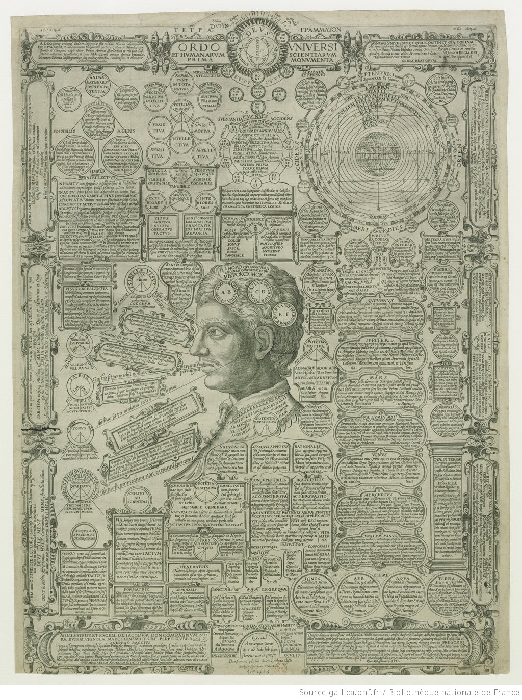
When I was doing research for Visual Complexity, it was easier to find a medieval illustration created eight centuries ago than a digital execution created 10 or 20 years ago. The reasons are really multifaceted. Sometimes the plugin doesn’t work anymore; Adobe Flash doesn’t exist anymore, it was abandoned. You have to assume that the authors or the companies still exist, and they are diligently keeping the image or the code somewhere. It’s not on a server anymore, it’s probably on a local drive, who knows? These digital objects just keep on vanishing. They keep on deteriorating, and we are losing them. And not to mention, there are few cases where you even still have images, but the resolution is so tiny. Do you remember how images back then were? They were so tiny that they could not even be included in books.
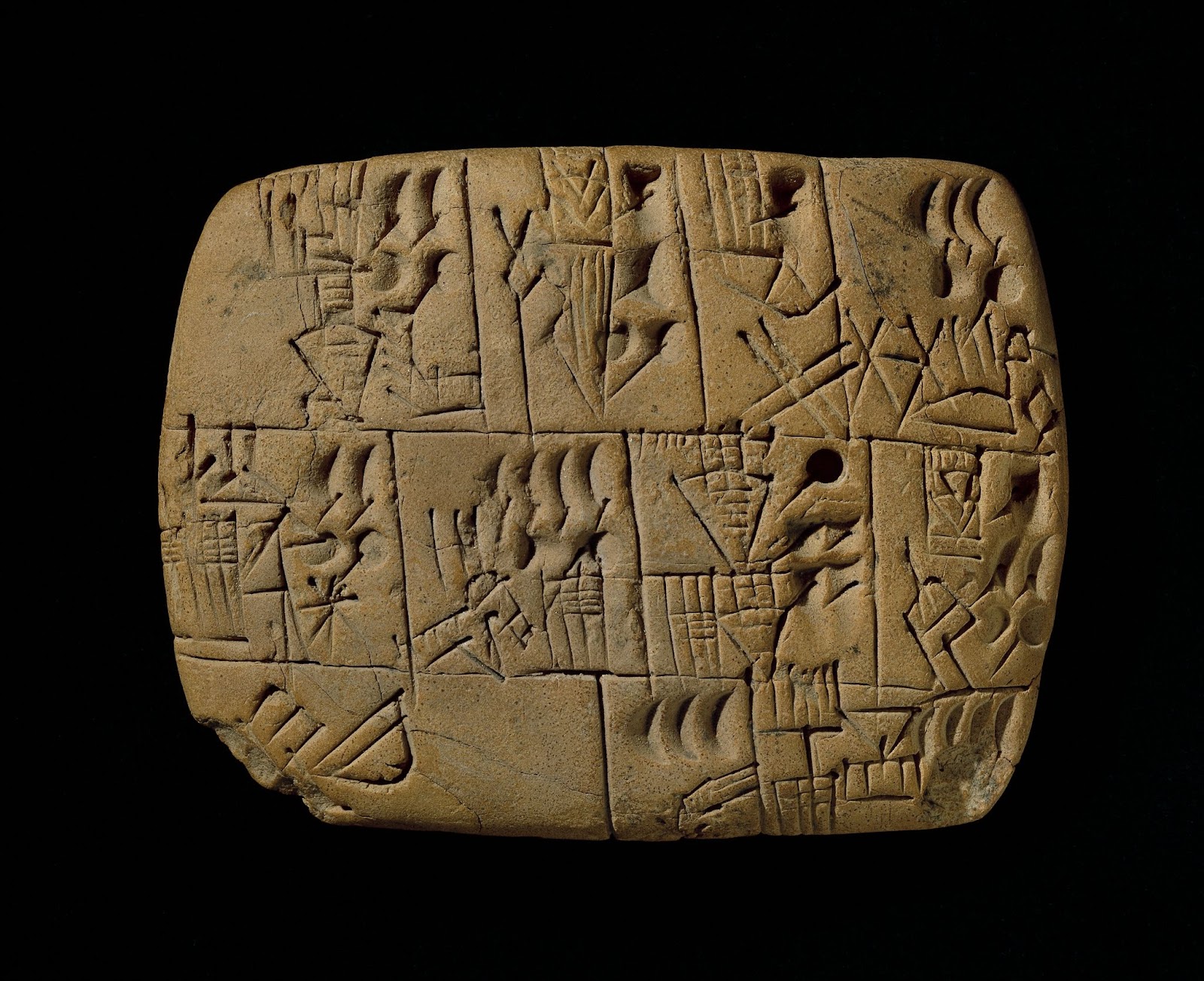
There’s this notion that the digital will save us. It’s really dangerous because we don’t realize how ephemeral the digital really is–how unsafe it is. It’s prone to every type of attack. We are seeing this all over the world today. Digital is no guarantee of preservation. It’s likely there’s less of a guarantee of preservation than paper or stone. When I go to the British Museum, I see incredible examples of preservation in cuneiform texts from Babylonian tablets dating 5,000 years old. Some papers don’t even last that long. Do you really think today that we can look back in eight centuries and see anything done today using our digital tools? I have strong doubts about that.
Dario: I totally agree with that. My master thesis project, which is relatively recent, was created with Flash and I can’t open it anymore. I preserved the code and some screenshots in my cloud storage.
Tell me about your new book, and I think this may be a good ending for this conversation. Can you talk a little bit about this project?
Manuel: Yeah, I can. It’s going to be different. My visual phase has ended. This book likely will not have a single image. It’s going to be more focused on design; it’s more about the responsibility of design in this new world. The book is going to cover ethics, environmental responsibility, social responsibility, and things like that. It’s going to be around nine chapters, and each chapter is meant to demystify a preconceived idea that we might have about design.
Dario: Is this connected to your recent change of life? I know that you moved back to your home country after having spent a considerable amount of time abroad.
Manuel: It is. I spent the last 10 years in New York and the last 20 years outside of Portugal, where I’m from originally, and it’s been quite a journey. We have two small daughters, Chloe and Caniba, and it was at some point in the midst of COVID-19. It was crazy to see New York City just closed. We were locked in a two-bedroom apartment with two children screaming and the schools were closed. It was just too much, and I realized it was time to go. We came to Lisbon in June last year, and we had an amazing summer. Portugal back then was completely open, it was almost like life was normal. That was really, really good.
I have mixed feelings. New York City will always be a city that we love. And now we actually have dual citizenship. So I’m Portuguese-American. I’m sure it’s always going to be part of our lives. But so far, Lisbon is really fun: the weather, the food, the beaches, it’s hard to beat. I’m expecting a visit soon, Dario.
Dario: Sure, with great pleasure. Yes, I totally understand your choice, and it was the same for me. Coming back is sort of beautiful, even if things have changed.
I look forward to your book next year and hope there will be time to meet you in person. It has been a pleasure.
Bibliography
Barabási, Albert-László. 2002. Linked: The New Science of Networks. Cambridge, MA: Perseus Pub.
Blair, Ann. 2010. Too Much to Know: Managing Scholarly Information before the Modern Age. New Haven, CT: Yale University Press.
The British Museum. 3000 BCE. “Tablet Recording the Allocation of Beer.” British Museum Images. https://www.britishmuseum.org/collection/object/W_1989-0130-4.
Johnson, Steven. 2001. Emergence: The Connected Lives of Ants, Brains, Cities, and Software. New York: Scribner.
Higuera Rubio, José, Alberto Romele, Dario Rodighiero, and Celeste Pedro, eds. 2022. From Wisdom to Data: Philosophical Atlas on the Visual Representations of Knowledge. Transversal. University Porto Press.
Hubertus, Adrianus Graveur. 1585. “Ordo Universi et Humanarum Scientiarum Prima Monumenta” Gallica. Accessed August 12, 2021. https://gallica.bnf.fr/ark:/12148/btv1b55002353x.
Lima, Manuel. 2011. Visual Complexity: Mapping Patterns of Information. New York: Princeton Architectural Press.
Lima, Manuel. 2014. The Book of Trees: Visualizing Branches of Knowledge. New York: Princeton Architectural Press.
Lima, Manuel. 2017. The Book of Circles: Visualizing Spheres of Knowledge. New York: Princeton Architectural Press.
Rodighiero, Dario. 2021. Mapping Affinities: Democratizing Data Visualization. Open-Access English edition. Geneva: Métis Presses. https://nrs.harvard.edu/URN-3:HUL.INSTREPOS:37368046.
Shedroff, Nathan. (1994) 1999. “Information Interaction Design: A Unified Field Theory of Design.” In Information Design, edited by Robert Jacobson. Cambridge, MA: MIT Press.

Dario is an Assistant Professor of Sciences and Technology Studies at the University of Groningen, and a faculty associate at Harvard University. His research is rooted in design, data, and humanities; focusing on the mapping of science and more broadly on digital archives of cultural institutions. With Metis Press, in 2021 he authored Mapping Affinities — a book about charting scientific communities from a design-driven, ethical thinking.
- Dario Rodighiero

- Dario Rodighiero

- Dario Rodighiero

- Dario Rodighiero


