
Recently, I had the opportunity to moderate a discussion among Data Visualization Society members about injecting creativity into client-based work. I have always admired those dataviz designers who can create vibrant, purposeful visualizations without compromising their messages.
Familiarity versus unconventionality
There are those who expect data visualizations to be intuitive, able to be processed at a glance. This school of thought maintains that visualization techniques that require time to learn lose the audience or result in inertia. This thinking has contributed to the popularity of forms like lines, bars, and scatter plots. These mainstay charts are familiar to both designers and most audiences. They’re often the default charting methods in Excel and Tableau. They do their jobs well. Their familiarity means they can be quickly digested by audiences and serve as trusted conduits for your data insights. Most audiences with even marginal data literacy know how to read a line chart and parse out the information they need. And, in many environments, these charts are expected in dashboard constructions and presentations. Thus, deviating from these “standard” forms can cause tension between data visualizers anxious to demonstrate the breadth of their skills and client demands.
On the other hand, while these standard charts are comforting for their familiarity and ability to present data clearly, they can look a bit dreary and feel detached. This point is all too evident on my local COVID-19 dashboard (below).

The data is nicely aggregated and neatly compacted into two big charts. The trend is clear. You can see when there may be upticks and when cases are dropping. Case trends correlate with the number of deaths rising and plateauing. So what’s missing?
Empathy.
Each bar is a group of people. As senior data visualization engineer Susie Lu explains in her visFest 2019 talk, aggregating data is great for seeing patterns, but it can lose nuance along the way. When you are examining a chart about COVID-19 deaths, the nuance is a person’s life and the many other people affected by the loss of that person.
Additionally, practitioners eager to flex their creative muscles, have experienced that the stock standard charts often fail to drive the desired impact.
“We’d work for months, and [our reports] would be read by 10 people. That was frustrating.”
– Yasmin Gagne, Fast Company
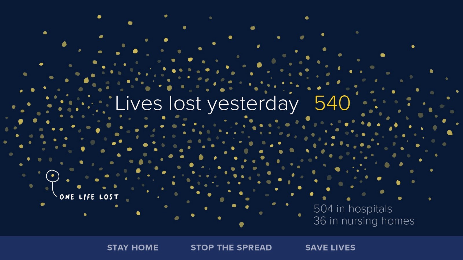
Even when you spend considerable effort creating what you consider to be an amazing visualization, it can be challenging to get people to view it. To overcome this barrier, Nathan Yau of FlowingData sometimes trades clarity for more visually-engaging designs to hook audiences. Contrast San Francisco’s COVID-19 dashboard (above) with Giorgia Lupi’s beeswarm chart. It is possible to simply report lives lost as a data point: 540. Yes, her design choice sacrifices some clarity. This scatter shot of dots prevents a true count of the data points in her chart. But Lupi’s message is clear. Her points-of-light technique and use of annotation — making viewers first realize exactly what each piece is — elicits a stronger emotional response than a chart that prioritized clarity.

Additional examples of effective, unconventional visualizations
Losing nuance through aggregations may not only obfuscate empathy, but also your intended story. These are opportunities to explore novel visualizations types to find a better design choice. Going back to Susie’s map examples, zooming in on a map tells you which small roads are connected and things like what might be a one-way street. These details, analogous to bits of our data, are lost when we zoom out. The following show when novel visualizations are cogent ways to present information but do come with a learning curve.
Analyzing Racial Disparities in Illinois Traffic Stops
DVS Events Director and Data Visualization Designer Mollie Pettit offers an example from her Illinois Traffic Stops Project. In projects previously done with the same data, this information was displayed in a scatter plot format, showing searches of white drivers on one axis, and the searches of minority drivers on the other axis. Although a scatter plot type of plot is more familiar to the audience, it gives the audience more details than they’re actually interested in (the individual percentages rather than skipping to the comparison between the two), and therefore forces them to take extra steps to get the understandings in which they’re most interested. She noted that she also displays an aggregated bar chart for each metric on the website, but that this averaged out view loses nuance in its presentation and does not tell the full intended story, and is therefore not sufficient on its own. While the bee swarm chart is less familiar to many, the design choices were made to give the audience the information they’d be most interested in directly and tell the story more effectively, using labels and tool-tips to facilitate in understanding.

Goldsberry’s BasketballShot Charts
Author, cartographer, and ESPN basketball writer Kirk Goldsberry created spatial shot charts, mapping basketball shots to a court. You can read more about Goldsberry’s story here. He provides his own commentary in the form of annotations and clearly shows where players shoot on the court, encoding both volume and efficiency into one neat map. This helps us connect all three points into one graphic rather than darting around a dashboard trying to sync efficiency with spatial placement of shots.

Visualizing the Iraqi War’s Casualties
Simon Scarr’s infographic displaying Iraqi war’s death tolls uses a set of inverted bar charts, notably a distinct bloody, red color, and an evocative title to fortify his message: human lives were lost on both sides. Scarr makes a controversial but effective design choice here by inverting the bars’ y-axis.
To flex, or not to flex
Data visualization and engineer and educator Amelia Wattenberger reminds us that before we dive into data, we need to ask ourselves,

“What is the main goal of this visualization?”
Your design choices should be driven by your project objectives, your data story, and your audience.
The audience variable can be the most challenging. Your audience’s data literacy affects your design choices. You may not always know the audience’s capabilities and cannot control how much attention will be paid. Thus, you can first design for the lowest common denominator, for greatest inclusion. However, remember that, you can use good design to educate. Your work can serve to simultaneously educate on the story from the dataset and how to read what you’ve created.
Furthermore, consider how your work will be consumed. Presenting your work through a blog post or email is different from a physical presentation where you can walk through and immediately answer questions. If you are present and ready to quickly clarify complicated charts, these are good opportunities to stretch your audience and teach. However, mediums such as online journalism ask people to stay invested as you guide them along your data story. This requires a stronger hook that may need you to design more for engagement. I, for one, am drawn to brightly colored visualizations and animations easily.
Taking into account who your audience is and the overall goals, you have a good idea of how to engineer your visualizations. A dashboard comprised of lines and bars certainly has its place in business settings, especially if you are designing for broader audiences. These familiar charts provide a mental anchor for your audience to remain engaged, and a more engaged audience may also be more willing to learn how to read your unconventional charts. However, these are less appropriate places to design for emotional responses from your audience as the objective is to be informative.
DVS members weigh in
DVS members shared the following suggestions for balancing convention, creativity, and advocating for your unconventional visualizations:
- Start simple. Build confidence over time. Lack of familiarity can be uncomfortable, but exposure can assuage that discomfort and change perception. DVS member Wendy Small suggests first presenting what your client asked to do and then present your alternative version side-by-side. This way, you can directly explain why you feel your method works better and slowly build your audience’s data literacy. You can begin by using the standards charts and slowly add less conventional elements over time.
- Make data exploration a collaborative process. Data Visualization Engineer Sandy Guberti-Ng includes stakeholders in the data exploration phase to help advance uncommon visualizations. This practice illustrates a crucial step in the design process: getting feedback! When viewing more complex visualizations, everyone needs a moment to process the context and to grasp how the visualization should be read. Allowing stakeholders to be a part of the exploration phase eases this barrier. Gathering feedback allows you to see where your design choices are working and where they fall short.
- Give your audience a chance. DVS Events Director and Data Visualization Designer Mollie Pettit recommends giving your viewers credit and trusting your design. Give viewers a moment to digest your visualization and be ready to answer questions. Your visualization may be too complicated for DIY interpretation. That does not mean people are unwilling to learn. Using Goldsberry’s basketball shot chart shown above, little annotations aid viewers in interpretation and storytelling.
We are always operating within constrictions whether it be a time crunch or client expectations. There may not always be opportunities to engineer and present two of the same visualizations. There are still plenty of ways to flex your creative ideas.
Collaborative or personal side projects are great ways to design what you want with full ownership. You’ll also gain a consistent source of feedback that learns your data with you. Shirley Wu’s and Nadieh Bremer’s Data Sketches is a fantastic example of both their personal and collaborative projects. The DVS community has people from such broad backgrounds in their introductions. You can search the introductions channel for a certain topic or DVS Buddies page to build relationships for mentorship, collaboration ideas, or an occasional consult. I have a huge proponent in partnering with people with different educational backgrounds.
Getting to work in your own time
It may feel daunting to synthesize your own end-to-end project. Fortunately, this does not always have to be a huge, beautiful project. Data Visualization challenges are another way to design what you want, how you want, while practicing a new skill using predefined datasets. While expanding your data visualization repertoire, you may stumble upon topics and methods you want to use in future projects. These are opportunities to construct a chart time you thought looked cool, compare how unusual charts display the same information differently, and discuss your creative processes with other participants. Remember we all start somewhere, so don’t be afraid to participate! Here are some sources to get started.
- Makeover Monday is a weekly exercise where organizers Tableau Zen Masters Eva Murray and Andy Kriebel provide you a small dataset, some background information, and a challenge to create your own visualization. You can post your visualizations on Twitter and tag it with #MMVizReview to receive feedback from the community and the organizers in their weekly review of submissions. Andy also shows you how he explores data in Tableau. Both the submission reviews and Andy’s data exploration videos can be found on his YouTube channel. The challenge typically uses Tableau for quick iterations, but you are free to use anything you want.
- Tidy Tuesday follows the same lines as Makeover Monday but is aimed at R users. The organizers provide you with a dataset and an R script to preprocess the data beforehand.
- SportsVizSunday holds monthly exercises for all visualization designers who want to work with sports data. They provide a new dataset monthly spanning sports from F1 to boxing and cricket. These are opportunities to create something more complex within a month instead of a week.
- storytellingwithdata’s long standing monthly challenge starts with an introduction where Cole poses a challenge. Sometimes, it’s redesign a visualization with a provided dataset. Sometimes, it’s a themed challenge. Her range challenges your low and high tech options while solidifying data visualization concepts. The same site has an exercise that is formulated to improve upon something given. This is great for when you feel stuck trying to formulate new ideas but still want to practice creating something novel for yourself.
Some people stream their work to have a more collaborative process with just about anyone who wants to share input. Tuning in on Twitch gives you direct access to comment and ask questions right then and there. You get to watch people’s creative processes, engineering foibles, and empathize with each other when it all inevitably goes wrong.
- Ian Johnson’s Coding with Fire
- Shirley Wu can be seen streaming Wednesdays and Fridays, 2–4 PM PST. She is always engaging with her chat and readily answering questions about her design process.
- Will Chase holds a weekly stream where he works on creative web projects and generative art. Recently, he’s been working on a Svelte.js project. Make sure you ask about his keyboard when he’s on!
Acknowledgements
I’d like to thank Mollie Pettit for giving me the opportunity to host this topic discussion in #dvs-topics-in-data-viz, every DVS member who participated in this discussion: Mollie Pettit, Wendy Small, and Sandy Guberti-Ng. Finally, I’d like to thank Nightingale editor Mary Aviles for providing extra resources and going through draft after draft.

Ben Xiao is a graduate student studying data science and an avid gamer. He was once a professional poker player and now spends his free time watching NBA games, poring over basketball stats, driving virtual race cars, and creating bespoke data visualizations.
- Benjamin Xiao