
People love comparisons, whether between two groups or the difference in an outcome between two time points. Many data (visualization) designers use a clustered bar (or column) chart to visualize two points of change. BUT there are so many options out there!
So, I am dedicating this article to some of my favorite ways to visualize change between two time points that go beyond the clustered bar chart.
Before diving into the new, we are going to take a walk down data design memory lane.
First, let’s set the scene.
The data
For this post, I generated education data for a fictitious school district. This school district has four schools. The superintendent asked the lead data analyst for the school district to produce a display showing the change in the percentage of students across the four schools who were proficient in math between 2018 and 2019:

Bar chart basics
After a first pass of the data, the analyst produced a regular, old, clustered (horizontal) bar chart:
Clustered Horizontal Bar Chart
The (horizontal) clustered bar chart is a tried-and-true design choice. These charts display data categories on the vertical axis, while values are plotted (in horizontal bars) on the horizontal axis.
A clustered bar chart emphasizes differences in a variable by visually grouping related items. When visualizing change using this chart type, some choose to display the newest time point bar above the oldest time point bar.

Sure, it’s simple…and a little boring. I would even go as far as to argue that it is a bit confusing to interpret, no matter which order you place the bars in or how you choose to label the data points. So, back to the drawing board.
After another look at the original design, the analyst thought rotating the chart might spruce things up.
Clustered Column Chart
The clustered column chart is another conventional visualization. These charts display data as a series of grouped vertical bars across the horizontal axis, with values plotted on the vertical axis. But like the clustered bar chart, clustered column charts are not particularly creative and can become cluttered and confusing when many categories are shown.

Now that we have gotten those commemorative charts out of the way let’s look at alternative chart types for visualizing change.
Alternative designs
This is the part of the story when the analyst consults a data designer, and they graciously share their knowledge. And trust me, they are EAGER to expand the analyst’s chart repertoire.
First on their list: the dumbbell plot.
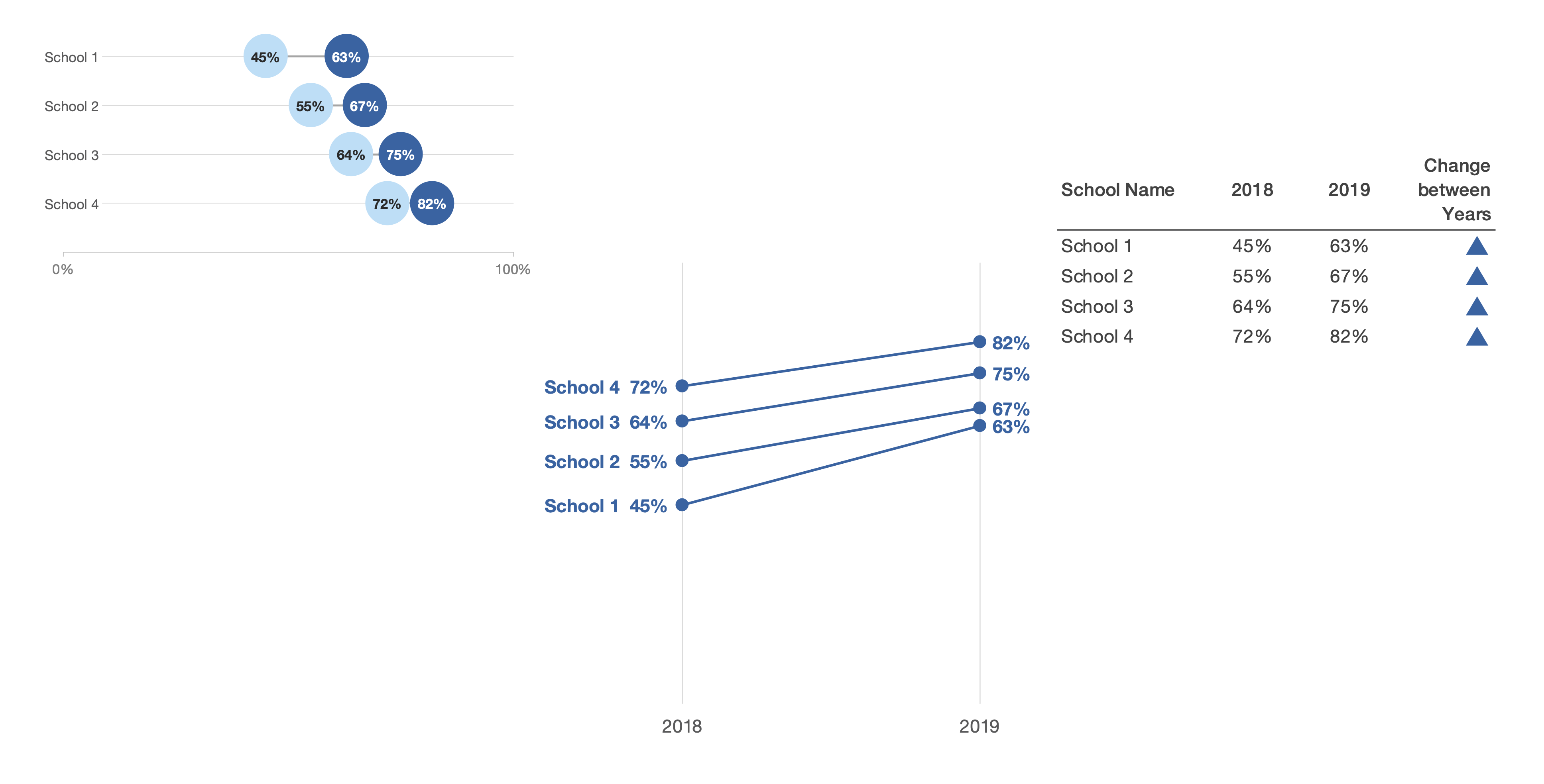
Dumbbell Plot
A (horizontal) dumbbell plot is a visualization that shows the differences between two points. Here, the focus is on the distance between the points. Values are displayed across the horizontal axis, while data categories are shown along the vertical axis. Dumbbell plots are a fantastic choice as their straightforward design minimizes visual clutter, making them easy to read and understand.

Another option shared by the designer is the slope graph.
Slope Graph
Slope graphs are line charts showing (the magnitude and direction of) change between two points for multiple categories. When using this graph, the steepness of the slope of the lines connecting the two points is of interest; a steeper (or flatter) slope indicates a larger (smaller) change.

Since the designer was not sure how many schools would be included in the display, they also taught the analyst about the ‘small multiples’ approach.
Slope Graph Small Multiples
A small multiple is a series of similar graphs or charts arranged in a grid layout. Each chart in a small multiples series shares the same axes, scales, size, and shape. Using the small multiples approach, each school in the original display has its own chart.

This technique is preferred by designers when a chart has many categories. The uniform design and the increased white space simplify interpretation and allow easy comparisons across categories.
A final choice is an icon.
Icons
Icons are graphical symbols that communicate a concept. For example, an upward arrow or triangle pointing upwards could indicate ‘increasing.’
Okay. Okay. Icons are not a chart type per se. BUT icons are a powerful way to communicate information, AND they can easily be incorporated into a variety of formats, including reports, dashboards, and stand-alone tables.
When visualizing change, I love to embed icons within a larger data table. Why? It’s an easy way to appeal to folks who not only need to see the numbers, but also people who want to know whether something changed (and whether the change is positive or negative).
Now, I want to go on record and say that bar charts ARE NOT BORING. I get A LOT of use out of bar charts.
But you know what is boring? A report, slide deck, or dashboard that ONLY includes bar charts.
There are so many visualization techniques at your disposal for displaying change over two time points. Depending on your goal and audience, one option may be more effective than another.
So, don’t limit yourself. Venture beyond the clustered bar chart.

Ama Nyame-Mensah is the founder of Analytics Made Accessible, a data consulting firm. She helps teams and organizations explore, analyze, and communicate their data more effectively. Ama is committed to translating data into compelling stories and making analytics more accessible.
- Ama Nyame-Mensahhttps://nightingaledvs.com/author/amaanyamemensah-com/


