
Personal and group identity are foundational to the human experience, shaping our values, relationships, and self-perceptions. These identities intersect across categories like gender, race, ethnicity, sexuality, and socioeconomic status, creating complex and multifaceted social realities. Intersectionality, a theoretical framework, emphasizes that these identities are not independent but interact to shape unique experiences, particularly within systems of power and oppression. Analyzing these intersections collectively, rather than in isolation, is critical for understanding inequities and advancing equity.
Identity is rarely fixed or mutually exclusive; it is best understood as a “check all that apply” framework. For instance, gender is a fluid construct that encompasses diverse identities, from evolving pronoun use to cultural perspectives like the Fa’afafine of the South Pacific, who are recognized as a third gender. Similarly, race and ethnicity defy strict categorization, as individuals often identify with multiple racial groups or cultural heritages, such as being both Hispanic and Asian. Sexuality also resists rigid boundaries, with terms like “Men who have Sex with Men” (MSM) highlighting behaviors that challenge traditional sexual identity labels. Simplifying these complexities through vague categories like “Other” erases meaningful distinctions and undermines efforts to capture actionable insights. Embracing this fluidity allows for analyses and visualizations that reflect the richness of human diversity.
These challenges are heightened by a shifting sociopolitical climate that has seen efforts to dismantle diversity, equity, and inclusion (DEI) initiatives. Critics of DEI efforts frame them as discriminatory, while supporters argue they are essential for addressing systemic inequities and fostering inclusivity. As such, it is more important than ever to rethink how identity is analyzed and represented in data.
Visualizing identity presents unique challenges, particularly as the number of identity categories increases, leading to exponential growth in potential combinations. By leveraging flexible data categories and creating models that reflect the dynamic nature of identity, data visualization can play a critical role in advancing equity and inclusion. Thoughtful visualization highlights the multifaceted realities of human lives, providing a powerful tool to foster more equitable practices.
Challenges in visualizing intersectionality (Statistical, ethical, and practical)
Intersectionality is vital to socially focused research because it reveals how unique experiences emerge from the intersections of identities, rather than from individual categories like race or gender in isolation. For instance, the experiences of an African American man and a homosexual man differ, but the lived reality of an African American homosexual man represents a distinct combination of challenges and opportunities that cannot be fully understood by examining either identity alone.
Incorporating intersectionality into research and analysis is crucial for designing inclusive and equitable programs and policies. By understanding how identities overlap, researchers can better address the nuanced needs of diverse populations. However, applying intersectionality in practice is fraught with challenges. Translating its complexity into actionable analysis and effective communication is particularly difficult in fields such as social services and public policy, where clear and practical solutions are often prioritized over nuanced representation.
Over the years, I have explored the academic literature, engaged with professional communities/listservs, and even turned to popular forums like r/dataisbeautiful in search of effective ways to visualize and represent intersectional data. Despite these efforts, there is no single solution that fully captures the complexity of intersectionality in a way that is both accessible and clear to a broad audience.
Instead of offering a definitive solution, I will highlight the key challenges involved in working with intersectional data and explain how these difficulties arise during data analysis and storytelling. These challenges can be categorized into three main areas: Statistical Modeling, Research and Reporting Ethics, and Visualization. Additionally, I will share my own imperfect attempts at visualizing intersectional data, with the hope that they inspire further exploration, discussion, and innovation in the field.
Statistical modeling. In quantitative research, studying intersectionality means understanding how overlapping social identities combine to shape experiences, rather than analyzing them separately. Traditional approaches often rely on statistical models that measure how different identity categories interact. For example, instead of looking at gender and race as separate influences, these models examine how being a woman of color might have distinct effects beyond simply adding up the effects of gender and race individually. However, these methods often assume specific types of relationships that may not fully reflect real-world experiences, particularly in public health research.
Newer approaches, such as decision trees and multilevel modeling, offer alternative ways to analyze intersecting identities. Decision trees work by splitting data into smaller groups based on key characteristics, helping to identify patterns among different subgroups. While useful, these trees can sometimes create overly specific divisions that may not apply to other datasets.
Multilevel models provide another way to explore intersectionality by separating the effects of broader social categories (such as race or socioeconomic status) from individual differences. This helps researchers understand how much of an outcome is shaped by group identity versus personal factors. A specific type of multilevel modeling, known as MAIHDA, is particularly useful for examining inequality at both individual and group levels.
Each of these methods has strengths and limitations. While no single approach fully captures the complexity of intersectionality, they offer valuable insights into social inequalities. Given their complexity, effective data visualization is essential to ensure that findings are clear and accessible.
Ethical. The ethical dilemmas surrounding intersectional data are even more complex. In one rural initiative I worked on, we collected about 150 responses, but only one respondent identified as an African American transgender female. Including their data in community-based reporting would effectively de-identify them, violating anonymity and confidentiality.
To address this, some teams employ data suppression, removing such entries from the analysis altogether. While this protects individual identities, it comes at a significant cost. By excluding these voices, we perpetuate the marginalization of underrepresented groups and fail to fully understand the diversity within our communities. Even when such entries are aggregated into an “Other” category, the result is often equally dissatisfying and uninformative.
This ethical conundrum—whether to prioritize the protection of individuals or amplify their voices—is difficult to resolve. The Belmont Report emphasizes Respect for Persons, but how do we best show respect? Is it through safeguarding identity or ensuring representation in the analysis? This question becomes even more fraught in today’s political climate, where DEI initiatives face direct hostility. Informed consent seems like a logical solution, but it is often too simplistic to navigate these nuanced challenges.
Visualization. The final problem of intersectionality is most relevant to this journal. To date, I have experimented with several different visualizations to show the relevant partners not just what the demographics of the population are, but how these populations intertwine. Here, I review these attempts and where they sometimes help, sometimes hurt, but collectively fall short.
Exploring visualization techniques (Strengths, limitations, and innovations)
I have a strong interest in behavioral health, and this paper provided an opportunity to explore the Treatment Episode Data Set (TEDS-a), a national database maintained by the Substance Abuse and Mental Health Services Administration. TEDS includes episode-level data on substance use treatment admissions (TEDS-A) and discharges (TEDS-D), with data collection starting in 1992 for admissions and 2000 for discharges. The datasets offer demographic information (e.g., age, gender, race/ethnicity, employment status) and substance use characteristics (e.g., substances used, age at first use, route of administration, and frequency of use). Data are sourced from facilities receiving state or federal funding, though reporting requirements vary by state. Notably, “gender” in this dataset is defined only as “Male,” “Female,” or “Missing/Unknown/Not Collected/Invalid,” a challenge I take issue with for reasons discussed earlier. Nonetheless, this is the reality of working with this dataset.
All the figures were created by me in R, using various data transformations followed by ggplot2 for visualization, except where noted.
Bar plots
Bar plots are a simple and effective way to display variations within a population, particularly when combined with faceting to show multiple subgroups. Using percentages on the y-axis, rather than raw counts, ensures a consistent scale across facets, making it easier to compare patterns between groups.
However, one of the significant limitations of bar graphs in this context is the issue of double-counting (e.g. a person can be “White” and “Mexican”). When individuals belong to multiple categories, their representation can appear in more than one bar, which can distort the interpretation of the data. Additionally, while bar graphs can highlight distributions within categories, they fail to capture the intersections between them. This limitation means that crucial insights about overlapping identities or relationships between categories may be overlooked.
To address these challenges, it is essential for data analysts to clearly explain the graph’s purpose and limitations, ensuring that viewers understand what the visualization represents—and what it does not. Balancing simplicity with clarity is key to ensuring the graph remains both interpretable and informative.

Sankey diagrams
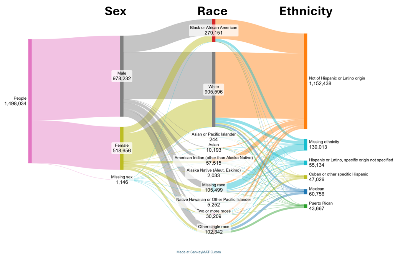
Sankey diagrams are powerful tools for visualizing flows and relationships between categories, particularly when exploring how larger groups break down into smaller subcategories. Traditionally, Sankey diagrams are used to depict processes like budget allocation or pathways, such as the post-high school decisions of a graduating class. However, they are also highly effective in representing intersectionality by illustrating how individuals in one category connect to those in another.
In the context of this analysis, this Sankey diagram visualizes the flow from sex to race and then to ethnicity. This sequential approach highlights the distribution of individuals across these intersecting categories, offering both a numerical and visual understanding of how these groups overlap. The decision to start with sex and then move to race and ethnicity was intentional, as this order begins with the category with the fewest options and progressively adds complexity. Including age was avoided in this diagram to prevent visual clutter and maintain clarity, though this decision was somewhat arbitrary.

By examining this visualization, we can see how much of a given category flows into its subcategories, revealing patterns that may not be immediately obvious from raw data alone. This approach makes it easier to identify disparities, overlaps, and relationships among different identity groups, providing a clearer picture of intersectionality.
I didn’t use R to make this graph. I’ve tried in the past to use various packages but have never been great at correctly structuring the data and then implementing the code. What I have found is the highly useful sankeymatic.com website, a no-code way to implement these diagrams.
Cross-tabular plots
This final visualization is the one I personally prefer, though it is not without its challenges. Instead of using a traditional correlation plot, I opted for a simpler yet powerful approach: cross-tabular summaries. These tables provide a clear and straightforward way to examine how categories intersect without overcomplicating the visualization. The first plot represents a cross-tabulation of race and gender, with the cells displaying the percentage of the overall sample. This approach allows for a quick and intuitive understanding of how these two categories overlap and their relative distributions within the dataset. I used three decimal places because some of these categories are small.

For the second visualization, I extended this approach to incorporate a third dimension: ethnicity. Using faceting, I created separate cross-tabulation plots for each ethnic group, with the cells now representing the actual counts rather than percentages. This decision was intentional, as it emphasizes the real-world implications of the data. By showing the actual number of individuals within each category combination, it serves as a powerful reminder that these are real people who sought treatment, each with unique needs, experiences, and stories.

While this method somewhat avoids the pitfalls of overly complex 3D visualizations, it has limitations. Adding a third dimension through faceting requires viewers to interpret multiple plots simultaneously, which can become overwhelming if not carefully presented. Additionally, as with any visualization that layers information—whether through percentages, actual counts, or multiple facets—it’s essential to strike a balance between clarity and comprehensiveness. Too many dimensions or overly detailed visuals can detract from the overall message.
Yet, I find that this last approach provides a flexible framework for exploring intersectional data in a way that is both interpretable and grounded in real-world contexts. By starting with a simple race-gender summary and then layering in ethnicity through faceted counts, this method strikes a balance between simplicity and depth, allowing for meaningful insights into the data.
Other unsuccessful methods
In exploring ways to better visualize intersectional data, I’ve experimented with several techniques that, while conceptually interesting, ultimately failed to communicate effectively.
- Set theory and concentric circles
Inspired by set theory, I tried using interlocking concentric circles to represent categories and their overlaps, with the overlapping areas displaying intersectional characteristics. While the concept was appealing, in practice, the visualization became very unwieldy. Certain categories were nearly impossible to distinguish, undermining the very purpose of highlighting intersections. Additionally, the coding required was challenging and not worth the limited clarity it provided. - Bar graphs of total numbers
For the sake of thoroughness, I also experimented with a simple bar graph that plotted the total number of individuals within each intersectional category. Unsurprisingly, this method was flawed. Larger categories dominated the visualization, while smaller, marginalized groups were overshadowed or entirely invisible. Instead of highlighting intersectionality, this approach risked perpetuating the same marginalization we’re trying to address. - Qualitative narratives
Another approach I considered was abandoning quantitative visualization altogether. By giving voice to individuals from specific intersectional identities, this method allows them to articulate their unique experiences and needs in a way that no graph or chart ever could. While I deeply value this qualitative approach for its ability to center lived experiences, it doesn’t address the core challenge of intersectional visualization—it simply sidesteps it.
Lessons learned and future directions
A persistent challenge in data analysis arises with “check-all-that-apply” questions, where respondents can select multiple options for a single root question. This is especially true for identity markers such as race and ethnicity. For example, a respondent might identify as Persian, Egyptian, and German, reflecting the nuanced and multifaceted nature of their identity. While this flexibility mirrors real-world experiences, it creates significant challenges for analysis, as the data defy neatly categorized, mutually exclusive frameworks. Some visualization techniques can offer partial solutions by highlighting overlapping identities, but these methods often rely on simplifying assumptions or produce unwieldy outputs that fail to fully capture the richness of intersectional data.
This dilemma underscores a larger issue: how do we effectively measure and communicate the complexity of intersectionality and fluidity? Visualizing intersectional data is inherently difficult because it requires representing the intricate relationships between multiple, interwoven categories. These relationships are not just overlapping but dynamic, changing across contexts and over time. Techniques like cross-tabulations and faceted plots offer some progress, but every additional dimension—whether expressed through color, shape, or layering—increases the risk of a visualization being overwhelming or unintelligible. Yet, we cannot ignore this complexity, as it is precisely what reflects the lived realities of the populations we study.
The Catch-22 of visualizing intersectionality is this: the complexity we aim to convey makes our efforts harder to interpret. Balancing clarity and complexity is a challenge I encounter often and one that requires constant refinement. Adding dimensions to reflect overlapping identities is not a problem to solve but a reality to navigate with care.
There is no perfect solution. Visualizing intersectionality demands thoughtful experimentation, a willingness to embrace complexity, and, most importantly, a commitment to clear and transparent communication. It’s a continuous process of trial and learning, and that’s okay.

Alex Solokov
Alex Solokov is a community psychologist and data scientist with an interest in community health, organizational processes, and implementation science.


