
Working in reporting and analytics for the last six years has made me realize an uncomfortable truth about Tableau: Your beautiful interactive dashboard will often become a static PowerPoint slide.
If you work in sales ops, finance, or any executive-facing analytics team, you already know this. Your vice president won’t open Tableau Server at 9 a.m. before the board meeting. They’ll download your dashboard as an image or powerpoint, paste it into slide 17, and present it to the C-suite.
Once I accepted this reality, I started treating this as a design problem. Here are five non-negotiable factors I learned on my Tableau journey.

 The first Excel dashboard, created in 1990 using the first version of Excel for Windows. Source: Microsoft
1. Design for PowerPoint From Day One
Device preview matters exponentially more when your dashboard will live in a powerpoint deck.
In the early stages of redesigning an executive-level sales report, I built my dashboard in Tableau’s default “Desktop Browser” view. When I downloaded it as PowerPoint, it crushed into a single slide with illegible text — a formatting disaster right before a leadership presentation.
The fix here is using Tableau’s built-in PowerPoint layout (16:9 aspect ratio) from day one.
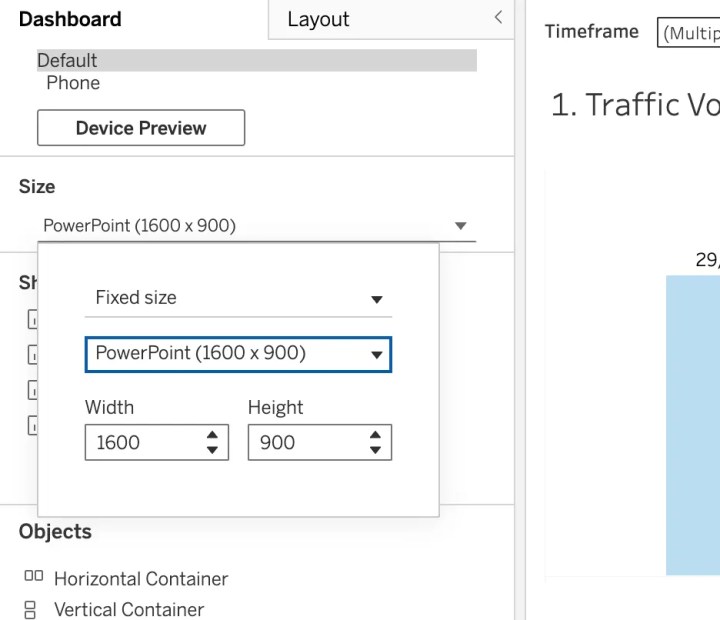
This ensures your dashboard fits perfectly into standard Google Slides or PowerPoint without awkward cropping or white space. Don’t design for Tableau’s default dimensions — design for where your dashboard will actually be consumed.
Pro tip: Always test your export before the final version. Click “Dashboard > Export as PowerPoint” to preview exactly what stakeholders will see.
2. Accept That 80% of Functionality Disappears
This is the hardest lesson: You must build assuming zero interactivity.
What dies in PowerPoint:
- Filters (static view only)
- Parameters (whatever was selected during download)
- Hover tooltips (invisible)
- Drill-downs (gone)
- Dashboard actions (non-functional)
This changes your design strategy. Now you have to build multiple static versions of what each filter setting your users will want to view. For example, my executives were interested in seeing pipeline performance across sales regions, sales clusters, business units, and product lines. What would have been one dashboard filter is now separate dashboards I had to create:
- “Pipeline_Review_by_Sales_Region”
- “Pipeline_Review_by_Sales_Cluster”
- “Pipeline_Review_by_Business_Unit”
- “Pipeline_Review_by_Product_Line”
Yes, it’s more work. Yes, it feels redundant. But it’s the only way to ensure your stakeholders see what they need without interactivity.
Every critical insight must be visible on page load. If it requires a click to reveal, assume it will never be seen.
3. Use Containers for Layout Control
When your dashboard contains multiple visualizations, containers keep everything locked in place during the PowerPoint export. Without them, floating objects shift unpredictably — your perfectly aligned KPI cards end up overlapping your bar chart in the downloaded version.
PowerPoint downloads don’t tolerate white space. A minimalist Tableau dashboard might look elegant on screen, but it looks unfinished and unprofessional in a deck. Executives expect dense, information-rich slides.
Why containers solve both problems:
- They lock your layout in place (no shifting elements)
- They help you maximize space efficiently (no awkward gaps)
- They give you precise control over how information flows

This dashboard exports with excessive white space, making it look unprofessional in decks.
Best practice workflow:
- Create a low-fidelity mockup of your dashboard layout
- Build the container structure first (horizontal and vertical containers)
- Drop visualizations into containers last
Pro tip: Watch this Tableau container best practices video before building your next dashboard — it’ll save you hours of reformatting frustration.
4. Establish Governance Standards for Version Control and Collaboration
If you’re working collaboratively or managing multiple dashboard versions, implement a simple visual system:

Use the color coding available for dashboards:
- 🟢 Green : Production-ready, safe to download
- 🟡 Yellow : Work in progress, do not present
- 🔴 Red : Draft/testing only
Keep consistent and clear worksheet naming conventions. This will save your sanity.)
❌ DON’T: “Bookings (1)”, “Bookings (1)(1)”, “Sheet 3”
✅ DO: “Q4_Bookings_Final”, “Pipeline_Review_v3”, “Pipeline Coverage_BarChart”
5. Add Company Logos
Align as closely as possible to your organization’s standard slide deck template.
Why this matters: Your dashboard might be internal today, but it’ll be in a client presentation tomorrow. When your VP forwards it externally without asking you first (and they will), professional branding matters.
Where to place logos:
- Top-left or top-right corner (consistent with company templates)
- Footer with date/data source
- Consider adding a “confidential” watermark for internal metrics
The Bottom Line
The moment you accept that your Tableau dashboard will become a PowerPoint slide, you start designing better dashboards.
Stop optimizing for interactivity. Start optimizing for screenshots.
Use the 16:9 layout. Build static versions of filtered views. Lock everything in containers. Name your worksheets like a professional. Add your company logo.
Your stakeholders don’t care about your elegant parameter actions if they can’t paste your dashboard into their Monday morning deck.
Sometimes being a great analyst means accepting that your masterpiece will be Ctrl+C’d, Ctrl+V’d into slide 23 — and designing for that reality from the start.

Rituparna Das
Rituparna is a Senior Business Analyst leading sales analytics and dashboard development at a data management company, with six years of experience across data visualization, business intelligence, and stakeholder communication. She mentors analysts transitioning into the field through the University of Washington and the Data Visualization Society. Originally from India and now based in Seattle, she writes on Medium and can be found on LinkedIn.


