
Have you ever heard of Mary Eleanor Spear? I don’t recall seeing her name come up in discussions or presentations about the pioneers of this field. I’ve been in the online data visualization community for about a decade now, and I must admit I have not heard of her until earlier this year. As I sit down to write this article, there is currently no Wikipedia page for her. She’s not exactly well known.
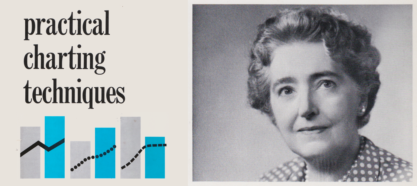
I began to wonder why Spear has become nearly unknown and I set out to learn more about her. First, I bought and read both of her books, Charting Statistics (1952) and Practical Charting Techniques (1969). Both are no longer in print but you can easily find/buy them from used book dealers and old public library inventory. More on these books in a moment.
I also took an evening to research her background using Ancestry.com. I went through various official records and traced her family tree up and down a few generations. I eventually tracked down and got ahold of her granddaughter Jamie who lives in Illinois. Jamie and I chatted over the phone about her memories of her grandmother for a couple of hours recently. It was a delightful conversation, and I was touched by her recollection of this woman she grew up admiring.
A career in the U.S. federal government
Mary Eleanor Spear lived from 1897 till 1986 and had an impressive career in data visualization before the field was even known by that name. As a young woman in her early 20s, she began her career in Washington D.C. by taking a job drafting charts of economic data for the Internal Revenue Service. The 1920 census for District 0119 in Washington D.C. lists her name as Mary Eleanor Hunt (she hadn’t yet married her husband Albert Spear at that point), and it lists her occupation as “Draftsman”. An interesting start.
We can find other records of her career, including titles and salary because these records are in the public domain. For example, in 1952, the same year in which her first book was published by McGraw-Hill, she worked for the Office of Statistical Standards within the Bureau of Labor Statistics. Her job title that year was “Visual Information Specialist” and her pay was $6,940 — the equivalent of about $67,000 in today’s dollars.
Keep in mind that this would have been after more than three decades of working for the federal government. I was able to find similar records covering the previous four years of her career, and we can see she received a modest salary progression over that time:
According to her granddaughter, her career mattered a great deal to Spear, and her professional relationships were very important to her. Jamie remembers that her grandmother was very close to her publisher at McGraw Hill. She was good friends with Pulitzer Prize-winning cartoonist James T. Berryman. She loved to relate how J Edgar Hoover, the first Director of the Federal Bureau of Investigation, fondly referred to her as “Little Bit” as Spear stood less than five feet tall.
Jamie told me that her grandmother taught her that “a woman had to be independent, to make it on her own”. She was told to “show ’em you can do it!” When Jamie moved in with her grandmother in the late 1960s / early 1970s, she was required to get a job, and so she did.

A proud author
Both of Spear’s books are really fascinating. They harken back to a time when visualizations were created by hand. I’m just old enough to have an inkling of what she refers to in her books. I took a mechanical drafting class in my senior year of high school in 1996 before I had an email address or cell phone, and we learned how to use drafting tables with articulating arms and T squares. There was just one AutoCAD station at the front of the classroom that we would take turns using it now and then.
Spear includes all kinds of interesting advice about how to create effective charts using these handheld tools and instruments, like what size pens to use for different sections of text, or how to cut tape for use as lines on a line chart, or how to create crosshatches by hand using graph paper, a T square and a triangle.

Jamie told me that her grandmother was so proud of those books. She remembers her grandmother working very hard on them at her home. Spear loved art and she saw these creations as her own form of art. In the opening paragraph of her very first book, Spear states the following:
“Graphic presentation is a functional form of art as much as modern painting or architectural design. The painter studies his subject to determine what colors and style and design will best express his ideas. The same kind of imagination is exercised by the graphic artist and analyst.”
In order to practice her art as often as she could, Spear set up a drafting room next to her bedroom upstairs in her home in Takoma Park, Maryland. Jamie remembers the room quite vividly. “The room had rolls and rolls of tape — different types and different colors — as well as huge poster-sized charts and graphs and so many tools and rulers and what-nots.”
To get an idea of what type of the ‘what-nots’ Jamie was referring to, take a look at this image of a Dietzgen pantograph that was owned by Spear and is now in the possession of the Smithsonian National Museum of American History.
What did this contraption do, exactly? The pantograph was invented in 1603 by Christoph Scheiner, and it was used to create scaled up or scaled-down versions of a drawing. It’s amazing how different things were back then, and how much more time and effort was required to do simple things we take for granted, such as changing the size of an image in the same proportion.
Spear’s drafting table in her home studio took up almost half the room and Jamie remembers her grandmother’s chair next to the drafting table along with five small stools — one for each of her grandchildren. They would spend time in the studio with their grandmother while she was working, and watch her in action.
Jamie remembers very vividly that her grandmother had beautiful hands with long, perfect nails that she would use to pick the tape from the rolls and pull it to create her charts. These details of how she practiced her craft were important to her. She would even pay her grandchildren twenty-five cents each if they didn’t bite their nails — something they clearly all avoided, and still do to this day.
As much as Jamie has fond memories of spending time with her grandmother in her drafting room, there were times when none of the grandchildren were welcome in it, and that was while Spear was working on her books. In those moments, there was to be no running in the house, and no one was allowed upstairs at all. Jamie remembers her grandmother being very devoted to her craft — and she worked tirelessly on her books.
An overlooked contribution
On page 166 of her 1952 book, in a chapter titled “The Bar Chart”, Spear shows very clearly an early form of a chart type called the Box Plot that she calls the “Range Bar.” Here it is:

What’s interesting about this to me is that if you look up the Wikipedia page for Box Plot, at the present moment, you will not find Spear’s name appearing anywhere in the article. You will, however, read the following:
“Since the mathematician John W. Tukey introduced this type of visual data display in 1969, several variations on the traditional box plot have been described.”
The way I see it, the range bar appearing in Spear’s book is close enough in form to the box plot to warrant a mention on this Wikipedia page. Hopefully, by the time you read this, you’ll be able to find an updated page for the box plot with her name included on it.
Of course, Wikipedia isn’t the only place to look. Encouragingly there are other online sources that credit Spear with publishing a version of this chart type at such an early stage. For example, in their 2011 paper “40 years of boxplots”, Hadley Wickham and Lisa Stryjewski have the following to say:
“The basic graphic form of the boxplot, the range-bar, was established in the early 1950’s (by) Spear (1952, pg. 164)”
I was able to find a few mentions of Spear’s name by other data visualization practitioners and authors. Edward Tufte actually calls out her work on Twitter and in his landmark data visualization book Visual Display of Quantitative Information.
It’s nice to see that some are recognizing Spear for her work and calling attention to her contributions. It should be noted that Spear did not claim to be the inventor of the range bar plot, and you can even find a reference to this chart type as early as 1948, just a few short years before her first book was published.
I find it unfortunate that she has been left out of the Box plot entry on Wikipedia, as it is the defacto digital record for basic information. Her missing biographical page is also troubling; potentially part of a much larger gender gap, as it was recently pointed out that of the 1.5 million English biographies on Wikipedia, only 17 percent are of women.
But it’s not just Wikipedia (and it’s not just me) who was unaware of Spear’s story and work. If we compare Spear against a few male pioneers in Google search traffic over the past five years, we see that her green bar and line don’t even show up on the chart at all. Furthermore, while Playfair, Minard, and Tukey are all recognized as “Topics” in the search algorithm, Spear’s name is not recognized as a “Topic” at all and her name instead registers as nothing more than a Search term.
Credit where credit is due
I do feel like this is something we can fix. It’s common knowledge in our field to know about the pioneers of the eighteenth and nineteenth centuries like William Playfair and Charles Minard, or pioneers from the twentieth century like Willard Cope Brinton and John Tukey. These men were amazing practitioners, authors, and teachers who contributed to the development of the language of data. They helped to set the stage for the emergence of analytics and visualization in our day, and they are appreciated by many for good reason.
But these talented men are not the only ones who paved the way for us, and Florence Nightingale is not the only woman whose pioneering work is worth mentioning. There are others who put in the work and have received far less attention and credit. Others who were brave and passionate enough to make their voices heard at a time when it was not necessarily welcomed by all.
As has been pointed out eloquently by Stephanie Evergreen, we need to go Beyond Nightingale. We need to explore our history and flesh out our understanding of how our field came to be. This applies to present-day voices just as much as it does to pioneering voices of old. It’s time to stop telling ourselves we’re balanced just because we include a single token woman or a single token anyone. That goes for the conference panels we put together, the academics and practitioners we follow and retweet, the books and articles we read, the employees we hire.
In order to get to the place where this field is welcoming and accepting of all voices, we each need to do more to identify and root out our own biases and search out and amplify the voices that have traditionally been marginalized or ignored.
Voices like Mary Eleanor Spear’s.


Ben Jones is the founder and CEO of Data Literacy, LLC, a training and education company that’s on a mission to help people learn the language of data. Ben teaches data visualization at the University of Washington, he’s the author of Communicating Data With Tableau (O’Reilly, 2014) and the forthcoming Avoiding Data Pitfalls (Wiley, 2019) and he also writes about data topics at his blog DataRemixed.
- Ben Jones


