
Thoughts on embracing complexity and the future of data
Giorgia Lupi is an award-winning information designer. She recently became a partner at Pentagram, their only one specializing in data visualization. Her portfolio is vast, stunning and hard to summarize. She co-created the books Observe, Collect, Draw! and Dear Data with her friend and fellow designer Stefanie Posavec. Her work is part of the permanent collection at the Museum of Modern Art (MoMA) and currently part of the Nature-Cooper Hewitt Design Triennial at the Smithsonian Design Museum. Her TED Talk on data humanism has been viewed over 1.2 million times. Her list of installations, talks, and clients is longer than we can list in an introduction. One can say she’s been busy…
Nightingale editor-in-chief Jason Forrest and I had the great privilege of sitting down to ask her some questions. (GL= Giorgia Lupi, AB= Alyssa Bell, JF= Jason Forrest)

JF: You really don’t need to introduce yourself, but let’s start by telling us who you are and your relationship to the Data Visualization Society(DVS)?
GL: My name is Giorgia Lupi and I define myself as an information designer. In 2011 I co-founded a company called Accurat that has offices in Milan, Italy, which is my country, and in New York where I moved seven years ago. I joined Pentagram, which is a design firm with offices in New York, London, Austin, and Berlin as one of the partners in the New York office, and I’m excited about this new chapter!
I probably joined the Data Visualization Society later than I should have. When DVS started I was kind of really just overwhelmed by the transition to Pentagram and I was like, I don’t want any more Slacks so for the moment, but I’m happy to be on board now!
AB: Why do you introduce yourself as an information designer? Where does that come from?
GL: I think that definitions blur the boundaries from data visualization designer to information designer. I feel like they’re still very subjective. But I like to call myself as an information designer because I like to think of what I do as giving people access to information and shaping the way that people (as readers, or users of an application, or visitors of a show) access information. So that’s why I prefer information design rather than data visualization. I feel that there’s a broader experiential component that starts before collecting the data and visualizing data. It’s really envisioning how the different context, goals, and audiences will access information.


JF : It’s interesting that you use that role because when people think about data visualization, there are these kinds of basic chart styles — you know, bar and line charts — but your work speaks to visualizing information in a different way. How did you evolve past these basic chart styles?
GL: Yeah, I mean it’s interesting. I am an architect as my background, so I really never formally studied data visualization or computer science. I approached the world of representing information by thinking about what the numbers and data represent as opposed to focusing on the charts that are already available.
With my work, I try not to use standard charts. Well, I mean, I’m not against using these charts at all. But what I’m exploring is how to start from what I have to work with at the moment, instead of starting from what the conventions are that have already been defined — such as a bar chart, a radar chart, a timeline.
So if the data that I’m collecting or that I’m working with doesn’t necessarily fit a bar chart, I don’t want it to fit a bar chart, I want to fit the design the best way to represent the realities and the stories that are embedded in the visualization. Many times the projects that I work on are really dense and rich with information. The charts cannot embed all the richness of the information that I want to convey. So the question was how I came to go beyond standard charts, but I think I’ve never sought to use a standard chart at all!


AB: You touched on the “richness” of your work, both of the data and how you choose to represent it. One of the questions we wanted to ask was that you seem to often rely heavily on an elaborate legend. Can you talk a little bit about your experience with how the audience interprets that and whether they engage with it or don’t engage with it?
GL: Sure. It depends on the context and again, I know that my work is particular. I haven’t really done data visualizations for immediate decision-making purposes. So of course if you are designing for a pilot that is landing a plane, well, you don’t have time to read a legend. So I think there’s an important distinction that needs to be made when you can ask the readers to engage directly.

I would make the comparison with listicles vs a deep article. Well, of course, there are people who want to get to the summary and the listicles are there for them, but there are people who want to read the actual research. My work in visualization is definitely towards the second part of the comparison. Because I try to build a language that is based upon what I find in the data, a legend is really important because it’s the only way for making sure that people will get access to the information.
I think that in physical spaces (such as a big newspaper or an installation) people will take the time to read it. I find it harder in digital spaces because the attention span is usually shorter and also because of the way that we interact with information. So my more complex work is actually in the physical spaces (again, whether it is meant to be printed or experienced as part of an installation) and this is why I think it’s worth it if you have rich stories to tell, to ask readers to engage.
I don’t define myself as an artist. Sometimes I work with cultural institutions and with museum installations… to me that doesn’t mean that I’m an artist. I still define myself as a designer because it’s truly important for me to give readers and visitors access to the actual information. This is another reason why I always provide a legend and that’s something that artists sometimes don’t do. They prefer to create pieces that are in a way loosely influenced by information, but not to create a bridge for the visitors to access it. There’s no better or worse way. It’s just the way that I work.
JF: I’ve never once considered that the difference between data art and an information design installation is connected to the legend itself, which is effectively the key to not only understanding the visualization but also mapping that visualization to the data — to the meaning.
GL: Yeah, this is my definition for me. I’m not an artist also because I really love working with clients and boundaries — things that don’t necessarily come just from my willingness to explore. I think that artists sometimes are more interested in delivering an experience and then, you know, people can interpret it or not. It’s fine. But to me, I am a designer because I’m a facilitator, I’m a translator, so I need to give access to the information that is actually the base of the story. I really want a reader or visitor to be able to read everything that was in the data if they wanted.


JF: One of the things you’ve talked about is complexity and I know in your Manifesto for data humanism one of the points is about embracing complexity. I think that stands very much in contradiction to a lot of minimalist trends and the data: ink ratio. Why have you found yourself so interested in embracing complexity?
GL: Because reality is complex. There are many points of view. There are many interesting stories that can’t be reduced to simple charts and also because to really understand something, you need to have the context. If you abstract your data from the context and really only get to the actual numbers, well, there’s only so much you can embed there. I feel that data visualization shouldn’t be a simplification of reality; the visualization should make reality more accessible.

Of course, there are levels of legibility and the denser you go with your visualization the more context you embed. Well, then you really need to be very good at building in hierarchies, and building a way for people to be able to focus on one aspect at a time and then to be able to merge it as a big picture.
Another example is when a client comes to you and says “Oh no, that’s too complicated. I want something that my manager can read in 2 minutes without even looking at a legend.” Well, but do they really make an important decision based on simplified charts? They don’t, or if so, then who runs the company? They will then go back to read the 50 pages required to make these important decisions. So I guess there’s a little bit more that we can do to balance that.
AB: Do you find yourself engaging with questions around complexity differently? Has it crystallized for you or evolved?
GL: In the very beginning, I started to talk about complexity and most of my work was only for like printed magazines, I guess that I found more skepticism. But as I started to apply the same principles to many different mediums, I think people are understanding more and more the value to enrich any type of data visualization project with context.
Again, there are situations where it’s impossible to retrieve the context. But many of the times, the stories that we tell with data are meant to be experienced, are meant to be read. So in all of these cases, it’s important to embed the type of context.
And lately, people are getting more in agreement with me. I mean that’s anecdotal, but even when I speak at conferences now I have more comments like “Oh, I really get it because I can’t simplify all that was going on in the past quarter only with the values of the numbers that are there.” The questions that I get now are more about “how can I convince people that are not used to spending time with the data visualization to get there?”

JF: When you released data humanism as an article/manifesto, did you find a lot of antagonism towards it? Do you think that your ideas will evolve enough to have a second edition or a revision of Data Humanism?
GL: This is super fascinating. I didn’t find skepticism or critiques. I think everybody was sort of intrigued by the idea, even just the name data & humanism. It was a particular moment in time, which it sort of still is, where everybody talks about data but many people are still scared by Big Data. They think that data is too complicated.
On the other end, there are experts who rely on data too much. They think that data will solve all our problems and they think the data are perfect. And so I think the name [data humanism] merged these two different, separate worlds. Data actually represents people — it represent us — because we human beings created this thing that we call data as a way to record our reality.
I think that resonated with people and I’m not saying that everybody got it or gets it completely. It’s also an umbrella under which I’m trying to gather all of my thoughts that are evolving, but I think that everybody was kind of intrigued. I have never really heard someone who was opposite. They might be asking questions, but I found mostly positive responses.
To your second question — definitely. I am evolving constantly. The manifesto that you see, the “visual manifesto,” has been a photograph of a moment in time when I wanted to put out all the things that I thought could have benefited by a change of perspective. Right now I’m trying more and more to apply to actual business cases and actual clients this prospective and then figuring out how that can be a guide for my work and will hopefully make more impact.
AB: Let’s pivot to the very exciting news about your huge move to Pentagram. They’re obviously an institution with a huge portfolio, but you’re the first partner for dataviz — kind of a change in direction. In talking, I thought was really great that you mention the tension between “people who fear data” and the “people who think that data can solve everything.” So where do you see your move letting you weigh in on that question?

GL: I was immediately very excited when they asked me to join as a partner — while I don’t have a traditional graphic design background — because I’ve always admired what the Pentagram partners did in terms of shaping our visual culture, what we think about brands. What intrigues me is right now, data can really be a language (or a medium or material) that we can use for brand identity campaigns, and we can use for filling public spaces with messages that can become elevated to be speaking to the general public, which is what fascinates me the most.
I am most intrigued to communicate with people who are not expert. This idea that we can broaden where we can see data and the fact that data can become part of our everyday life into what we see, what we wear, or what we consume — that’s really intriguing. I don’t necessarily have the path forward mapped, but I know that this is a very special place to be, especially right now.
So I guess that was a long-winded answer. I see myself as trying to use data as the medium that it is, which is an abstraction of reality and a way that we have to filter reality in the first place, then as a creative material to tell stories. I want to do it in a way that hopefully can become, again, part of everybody’s daily life. That’s a grandiose goal that I have.
AB: I’m processing that much cool information all at one time.
JF: I know! I’d just like to explore that a little bit more. In your Fast Company interview, which is awesome, you said: “I want to explore things that I don’t think have been done before.” Teaming that with what you just said about trying to work more in public spaces, can you elaborate on what you think has never been done before? How do you look around the corner and peek into the grey space? What do you think it is?
GL: I think it’s not about the ‘what’ I think it’s about the ‘how’. If you think about all the projects at Pentagram: their visual identity, their brand identities, their editorials, signage, wayfinding and environmental graphics, even sequence titles for movies — everything that is communication design, even on a packaging of a product or in what we wear, a pattern — well those have all been designed many times. But not so many times with data. So it’s not necessarily about things that have never been done before, but I want to find a different ‘how.’ I want to do it with data, in my way, so not with data that they already have on a promo spreadsheet. What interests me the most is what I call the data we do not see.
That is usually the data that you can craft only if you have specific questions to ask and then you can filter any reality, like a brand heritage or an institutional archive, through these lenses which are mostly qualitative and then use that like a graphic design material.


JF: So “the data we cannot see” is another very evocative phrase and it seems to me that you use that pretty marvelously in the MoMA exhibition where you basically compiled the data.
GL: Yeah, lately I do it more and more. I’m doing it for a couple of projects here as well. And for the MoMA show, I think what’s interesting to me is how can we, through again what we so coldly call “data,” give access to the curatorial process. Because in that show Paola Antonelli, the curator, put together a very genius list of 111 objects that all together paint a picture of how fashion influenced our lives, cultures, and our relationships. I was really intrigued to be like, “but why the Air Force One as opposed to another model sneakers?”
In speaking to Paola I understood that she created her own lists and she worked with invisible layers of data that I really wanted to find out and have as a way for people to access Why These Objects. So the questions that I asked to build the data set were not about “where is it from?” Or “how many pieces have been sold?” But more about: “is it a medium or a message?” Meaning is it iconic for the technical and aesthetic features, or for what it’s represented? Or things like “is it a way to conform to a movement or to escape from a movement?” Which is really what was going on in Paola’s mind. I was working very closely with Paola and I was really trying to understand how to be a facilitator between what was behind the curatorial process and the people who will see this exhibition.

AB: You’ve talked extensively in the past about making time to engage with personal projects. And I think that’s something a lot of people wish that they’d commit more time to. How do you decide what you’re exploring, is it related to what you’re working on? Do you have a list of things you hope to get to? Or do you just kind of take them as they come?
GL: I mean I have an endless list of things that I want to explore. So that’s a thing, but also there is time that is more for playing for me. So for example, lately I’ve started to sketch abstract data patterns that in my mind, I know can be interesting visual models for visualization, but I don’t have the data there.
And that for me is in between an exploration and also really a playful activity that I enjoy doing. So sometimes I think that making space for activities that are also enjoyable, if you can make them relatable to what you want to explore is a plus and it makes you feel not too busy to do it.
I have many ideas and some will stick, but some you think “that is an amazing idea!” and then a month after when you really have the time to put into that you’re like “… you know, it wasn’t that great.” So I think it’s in between having the list and then being open to being influenced by something that you read, or something that you talked with a colleague about.
It’s not that everybody can really have so much time to explore. Like right now I think I’m lucky because Pentagram is an umbrella under which you can also take speculative projects. And so every partner in the past, you know, they work on clients projects but also they really try to make the time for studio projects for the people that they work with. We work to grow and explore, but also to always be able to keep a fresh eye on how you’re doing things. But again, there are moments in life — there might be years, like a couple of years — that you can’t take time. I think it’s just a matter of recognizing that if you want to do it, you need to find a way to make the time as opposed to finding the time, which is different.
JF: All right, so you have talked about your sketchbooks, and you’ve been sharing your sketches on social media. My question is what do the bad ones look like?

GL: So I think they look imbalanced and not elegant. But you know lately, I’m also finding a way to then re-balance them to be like, “hmm I don’t like how this part of this sketch is coming up” so how can I balance it? You know, it’s similar to when you’re getting a haircut and you cut too much on one side and then you try to balance it until it’s fine, but sometimes you cut too short. Sometimes, you know the other way around, in balancing it too much it becomes too dense. But that opens an endless conversation about what do you define beautiful and aesthetically pleasing and what you don’t. It’s kind of subjective, and to me, it’s when I see that it’s imbalanced or inelegant or there are some visual dissonances, I have to decide to either ditch it or try to save it, but that’s really a personal decision.
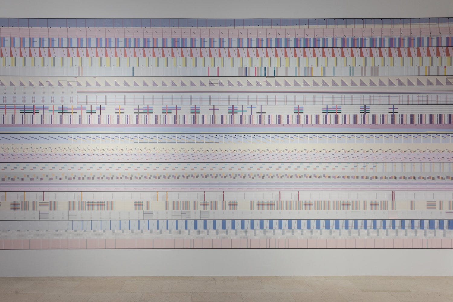
JF: Ok, This is a deep cut, just be prepared… So one of the things that I thought was fascinating was to see you comment about Annie Albers work, I think it was at the Tate, and then to see The Room of Change. Is there a direct kind of influence or inspiration from one to the other?

GL: That is very interesting because I absolutely remember when I saw the exhibition at The Tate, it was January and we were working on Broken Nature. So even though I knew that I wanted to build a data tapestry, because I knew already at that moment that that would have been the case, but for sure it must have influenced the sort of like weaving pattern that sometimes you can see. So that is really a good memory you have!


(Clockwise from top left) Anni Albers Black White Red, 1926/1964 (link), The Room of Change, 2019 (link), The Room of Change — © La Triennale di Milano — foto Gianluca Di Ioia (link), Annie Albers South of the Border, 1958 (link)
JF: You didn’t think about that before?
GL: Not in this direct way. Many of the times, and I think that is true for everybody, there’s a lot of intuition that goes in between “I’ve seen that thing that’s interesting” and I’m working on this other thing and like naturally and intuitively things slip by. It’s really the first time that I think about the connection between these two moments. And again, I know that the overall idea was already in there and the sketch about this timeline with a repetitive pattern was already there. I’m thinking though that definitely some of the overlapping of the vertical and horizontal threads might have been subconsciously inspired by that exhibit.
JF: That’s wonderful. Yeah, it’s funny because when I saw the Room of Change show in the New York Times, that was my first question.
AB: He’s been pocketing that all year.
JF: Yeah, I’m being outed.

Thank you again to Giorgia Lupi for sitting down with us for such a wonderful interview. You can find more of her work on her website, or by following her on Twitter or Instagram.

Jason Forrest is a data visualization designer and writer living in New York City. He is the director of the Data Visualization Lab for McKinsey and Company. In addition to being on the board of directors of the Data Visualization Society, he is also the editor-in-chief of Nightingale: The Journal of the Data Visualization Society. He writes about the intersection of culture and information design and is currently working on a book about pictorial statistics.
Alyssa Bell
-
Alyssa Bell


