
“Even for print, I have questions about the subtlety in colour difference,” a member of our data journalism team admitted when the subject of accessibility was raised. “It’s like a Farrow & Ball swatch, which is nice in a Georgian home, but sometimes a little too subtle.”
Data visualisation is something we at Economist Impact take very seriously. Our group has 150 years of experience publishing charts, yet we continuously question how we talk about and show data. We learn and adapt by critiquing work from ourselves and others as the data visualisation field continues to mature.
Launched towards the end of 2021, Economist Impact is the latest addition to a family of businesses which form The Economist Group. Working with governments, NGOs, and international institutions, we use data visualisation to present our policy research and insights, while helping to drive change with unique digital storytelling experiences. The need for a dedicated data design system was obvious from the beginning. Our brand design toolkit was never intended to handle the complexities that data bring and that information designers face day in, day out.
Everyone, it seemed, had their own take on what our new data design system should be and what it should do. Addressing inconsistency was a strong area of contention. Others wanted guidance to encourage more varied chart selections so that our innovative approach to research could be better reflected in how we show it. But above all else, we heard that we needed to ensure our charts are as clear, insightful, and accessible as possible.
The first requirement of our charts is that they should be readily understandable.
Page one of The Economist Style Guide offers the following advice: “Clarity of writing usually follows clarity of thought. So think what you want to say, then say it as simply as possible.” As an extension of our writing and how we deliver insight, our new data design system was shaped to help our charts follow that same path.
We offer our designers a few tips to ensure their charts are as clear as possible. First, we encourage them to try writing the chart headline before plotting the data. Boiling down the primary message helps bring focus and clarity. Next, we suggest they consider the types of data relationships that best demonstrate the headline. The UK’s Office for National Statistics (ONS) lists eight common relationships that charts usually display: magnitude, time series, ranking, part-to-whole, deviation, distribution, correlation, and spatial. We’ve included simplified examples of each of those in our data design system to encourage our designers to consider all possibilities. Additionally, we ask our designers to think about what data can afford to be discarded. Showing too much can dilute the message, but removing too much may obscure the underlying context—we suggest using callouts or visual hierarchy to preserve detail without burdening the reader.
All of this is fairly standard advice that should not surprise anyone familiar with data visualisation, yet its inclusion in our design system is vital to ensure we never lose sight of what we want to achieve with our charts.
If accessibility standards cannot be met, we will lose business.
Beyond that general advice, one of the main goals when producing our new data design system was to address concerns of accessibility. Few would dispute the importance of design inclusivity, particularly for an organisation like The Economist Group with a wide reach. Yet so often, inclusivity is overlooked when selecting chart colours. “This looks good; others must think the same” is a dangerously irresponsible attitude to take. At its core, data visualisation relies on encoding and decoding information in a way that our brains can effectively interpret. If the decoding fails, so too does the interpretation. Whether through ignorance or other failings, not taking account of a reader’s ability to process colour risks a communication breakdown.
But accessibility standards and guidance are murky when it comes to data visualisation. Consider colour vision deficiency, a.k.a. colour blindness. There is not only one form of colour blindness, nor is there a one-size-fits-all solution. Also, this is not a rare disorder—some 8% of males have difficulty distinguishing red from green. When cultural conventions (in the West at least) state that desirable data be shown in green and less desirable in red, we have an accessibility problem. Even we at Economist Impact have succumbed to such crimes of colour in the past.
Developing a data design system that meets accessibility standards also requires planning for the unexpected. Data are frequently messy and unpredictable. Designers demand flexibility and options, but more options mean more chances for things to go wrong. We advise designers to use as few colours as possible, but sometimes an expanded palette is needed.
So, to help us rapidly test colour palette ideas against accessibility standards, we developed and prototyped a colour accessibility tool. “Colour accessibility” is a bit of a mouthful, hence this tool became affectionately known as “Cassy.”
Cassy began as a simple set of grouped objects in Adobe Illustrator, where a single colour change immediately presented possible colour pairings to help us spot where brightness or hue were too similar. Filters from the colour blindness simulator Color Oracle helped us make further refinements to prevent problematic pairings. Cassy became an invaluable asset, not only for us to prototype and refine our own palettes before testing them with real charts, but also to assess and learn from palettes made by others who were clearly responding to the same challenge.

Testing colour combinations from palettes we found during our research. Left shows normal vision; right shows Color Oracle’s deuteranopia filter. From top to bottom: PwC; The Guardian; BBC; Carbon Design System by IBM; and the system we developed at Economist Impact.
As we realised her value, Cassy 2.0 took a leap into Google Sheets. Using colour hex codes, she was able to quantitatively measure relative luminance and contrast ratios for every pair of colours across a set. Web Content Accessibility Guidelines (WCAG) 2.1 standards call for a contrast ratio of at least 3:1 for “meaningful graphics.” Achieving this is a mathematical impossibility for any palette containing just a small handful of colours, let alone one as comprehensive as a data design system requires. This is why we needed to provide additional guidance for cases when colours in charts touch directly. Still, this knowledge helped us to refine our recommended categorical palette and the advised sequencing to maximise its effectiveness.
Cassy 3.0 currently lives on the web as a tool that combines the best bits from her previous guises. While many contrast tools only measure the relative luminance between two colours at a time, Cassy checks every possible combination of 14 colours simultaneously, for a total of 91 pairings. Colours can be selected and edited using the bars at the top and left of the screen, while the central grid shows a visual representation of colour pairings. The contrast ratio is displayed in each instance, appearing in either a white box if it meets or exceeds the user-defined contrast threshold (higher values are better) or a black box if it falls below.

Cassy is an experimental tool developed by Economist Impact to measure contrast ratios between colour pairs.
Although she remains experimental and was not originally conceived as a public tool, anyone wanting to explore palettes can find Cassy online. For us, as useful as she is, the true value of Cassy came from our learnings about colour as we saw her develop. Accessibility isn’t something which can be measured through a single lens; contrast ratios are just one part of a more complex picture.
To learn more, we also recommend the wonderful Viz Palette, a tool by Susie Lu and Elijah Meeks that flags conflicts for different types of colour blindness. We could not resist testing a variety of palettes, both our own and from others, with the BBC’s system proving a particularly tough example to top.
Lastly, a mention on sequential and diverging scales. Thanks to chroma.js, these are a walk in the park. In our data design system we’ve specified colours at every stop for palettes featuring different numbers of classes. We have also clearly indicated if text labels should be black or white in every situation to ensure compliance.
Rather than simply being a set of rules that constrain how we present our data, we hope our data design system encourages new ways of thinking within our business. For some members of our team, data is still secondary to the written word, but we are keen to pivot and allow visualisations to lead the conversation. And we are still only just beginning. Today, our data design system is a 100-page Google Slides deck. As it attracts more eyes and weaves its way deeper into our workflow, we see more opportunities for both it and ourselves to evolve.

Providing designers with specific colours for a variety of situations helps to streamline the workflow, maintain consistency, and boost accessibility.

Our data design system offers guidance to help highlight the most important aspects of the data.
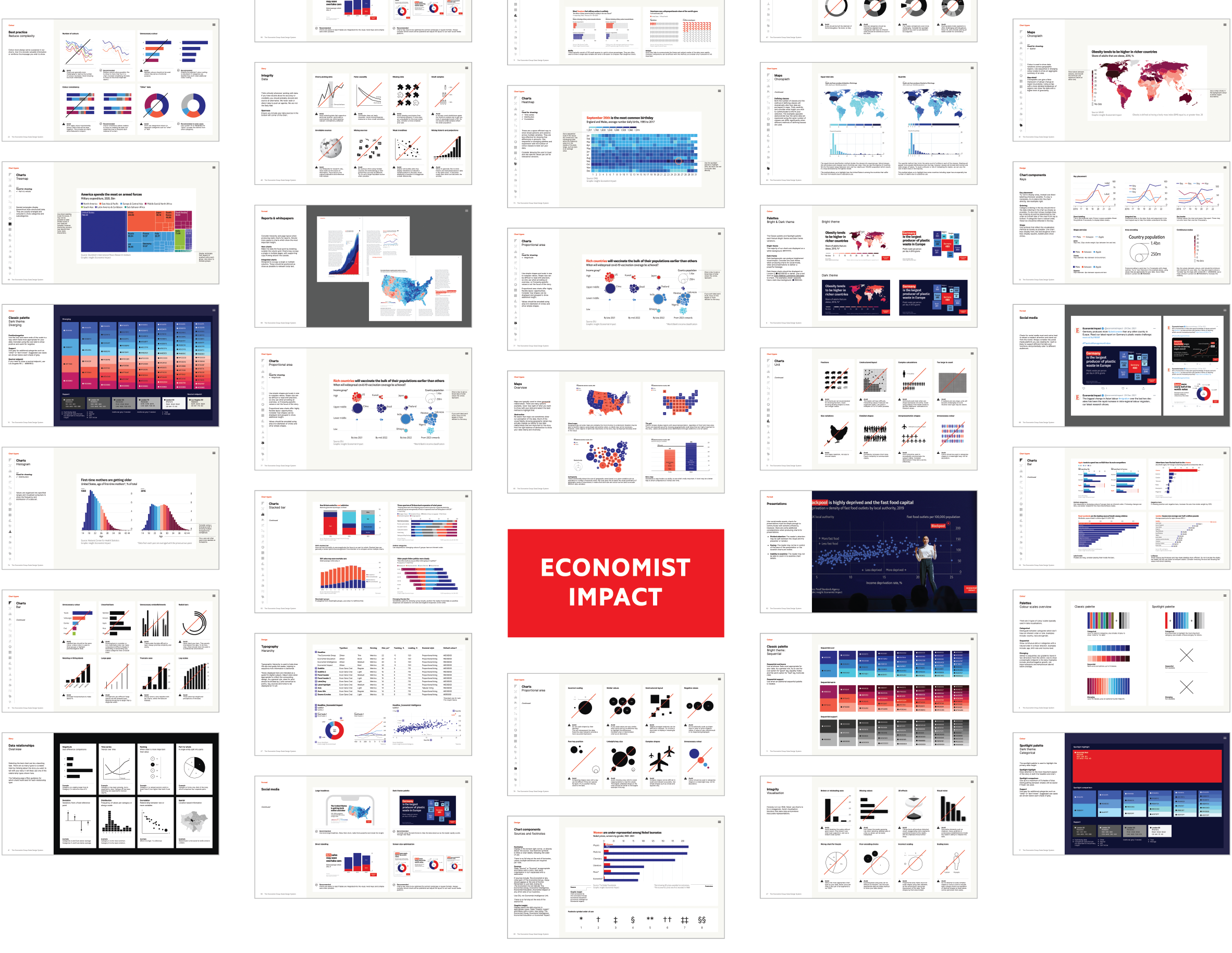
This article originally appeared in Issue 3 of Nightingale magazine. Get your copy here!
Ben Willers
Ben Willers is an information designer at Economist Impact.
- Ben Willers


