Do you know individuals who seem to focus on one thing for their whole life? I’m on the opposite side of the scale. Inspired by Alli Torban’s “How I’ve spent my time” viz, a course on Domestika from Stefanie Posavec and my interest in doing datavis together with others, I made a workshop to reflect in a group on this topic—with the help of drawing a datavis.
As a former organiser of UX Camp Hamburg—an annual UX bar camp—and now of the DataViz Meetup Hamburg, one of the many things I am curious about is: can I use data visualisation as a tool to foster community and exchange? Thus, I took the opportunity to give a workshop at the above mentioned bar camp. To create a together-datavis about the interests of the participants over time. In a slot of 45 minutes only. To see what happens. To make people talk and think.
Understanding the challenge
I sketched it for myself first. Defined colours for interests, made a timeline on an x-axis, thought about specific moments that helped me remember what I was into at that time and drew that onto the y-axis. An easy exercise.

But how should this work out with more people? How many colours would we need? How can we draw it into one chart? All at once? How many participants would there even be? How many different interests would they have? How old would they be? I was swaying between “forget it, that is going to be too complex” and “let’s find out”.
So, I tried. I organised my process and wrote down a prompt to identify what data types there would be: “Which topics were you interested in at a certain moment of your life?” Hence, I needed to find a visualisation that presents data by different people, development over time and interests grouped into categories. How many manifestations these data types would have, I would know for sure only then, in the workshop.
Finding a visual idea
I skimmed through datavizproject.com and sketched ideas. I was searching for a flexible type of visualisation that everyone could draw at the same time. Everything showing data by area size dropped out. We would have needed to calculate it beforehand. The data should be collected while drawing. Besides, I decided to show time spans instead of a whole timeline for each participant, to simplify the process and address the problem that there would be people of all sorts of ages.
I checked out charts with distinct symbols as Column Sparklines. They turned out to be not flexible enough. Bee Swarm Plots. Too much chaos. Just bar charts out of different coloured lines stacked upon each other. How long would that take until everyone got hold of a pen in a particular colour? A heatmap would be cool with squares of transparent paper we could layer! “But who would buy so much paper and cut all the squares?” I was asking myself.

In search of different inspiration, I took Visualising Complexity (by Darjan Hil and Nicole Lachenmeier) with me to the playground. Instead of looking into it, I bathed it in the contents of my water bottle. This book being all wet, Dear Data (by Stefanie Posavec and Giorgia Lupi) became my bedtime reading. And there it was. Giorgia Lupi’s “Phone addiction” visualisation: different circles spread over the postcard, surrounded by the data points.
Each participant could work on their own “circle”. The “circles” would hold different symbols embodying different interests. And the circles wouldn’t be circles, but forms depending on the decades the participant has already spent on earth. They will be spread over a canvas. This way, everyone would be able to work on their own datavis at the same time. We wouldn’t need different colours.
Planning the details
I sketched the idea. Planned the structure of the workshop. Squeezing everything into 45 minutes. Drew the legend beforehand. Made an analogue presentation to be independent from technical restrictions at the venue. I collected the material and bought paper on a huge roll. One thing I learned from previous workshops: better bring your own material and be prepared for any local conditions. Since I found pens in grey and blue, I came up with another piece of information to add to the drawing: symbols for interests that are still relevant today would be blue, while all others would be grey.
My plan: Give an introduction and explain the data visualisation we are going to build. Collect interests together and cluster them into categories. Assign a symbol to each category. Give the participants some time to sketch their own part. At the same time, pre-draw the bigger forms according to the different ages. Put everything together.
What happened?
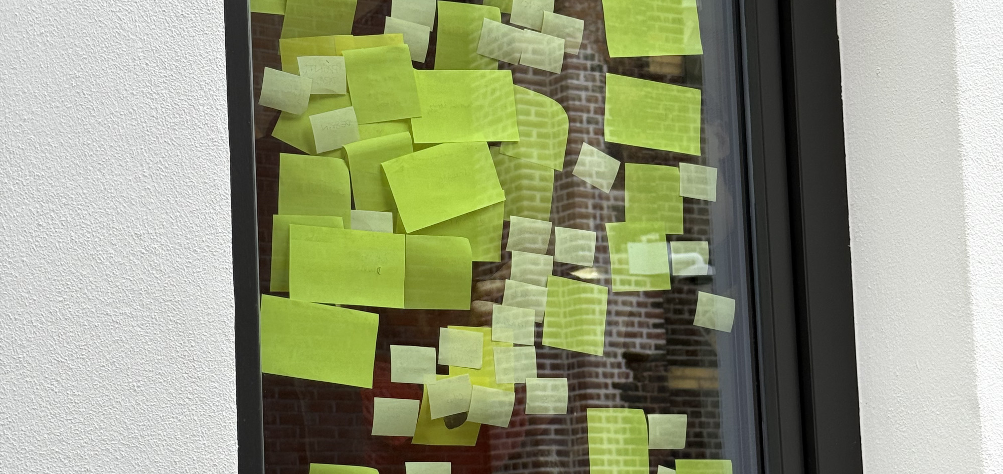
We ended up in the canteen. There we had a big table to draw on, and no space to stick post-its to. So, the collection of interests and clustering took quite some time. We had to use the windows. The final drawing worked out quite well. At least with the participants not heading off for lunch. The benefit of being so present in public: everyone else could take a look at our emerging drawing.

All in all, I gained the experience that producing a data visualisation with more people at once can work out—if one defines everything beforehand. It is still usable for self-reflection and talking then. Probably more than any dot voting. However, I don’t think participants can learn much about data visualisation, and they sadly cannot become creative on their own. Still, I hope that with a bit more time and in a calmer setting, we will achieve even better results. What’s your take on this? Have you ever tried anything similar? I am still curious.


