
I work helping clients—mostly corporate—to create reports about their businesses. I create dashboards, design PowerPoint slides, and help data analysts improve their design choices. All of this requires precision, accuracy, processes, and frameworks. Most of what I create for clients is derived from true and tested templates and guidelines. I am often limited to using computer tools (Excel, Power BI, Tableau) to create the final products. There’s also the constant crunch from budgets and timelines. This means there’s little room for creative pursuits or for trying outrageous new things, even if they could be beneficial for the users.
But I got into datavis because of the creative side of communicating an otherwise boring dataset in exciting ways. So, every once in a while, I take a break from client work and go on a bit of a tangent, seeking new ideas and techniques for expressing data in visual form.
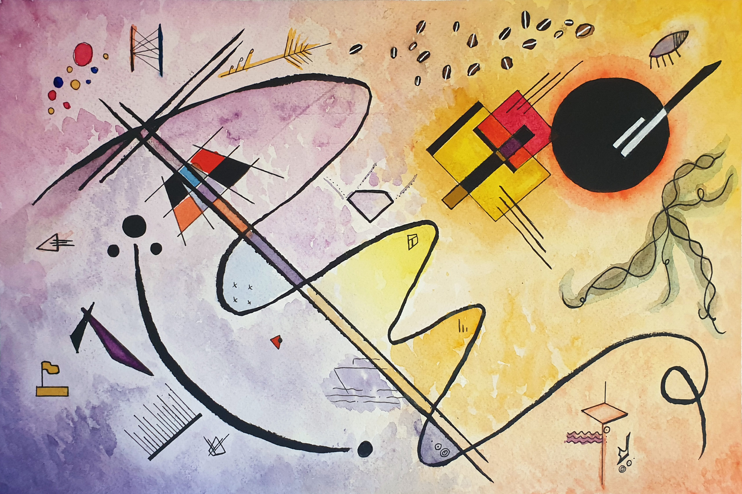
In August 2022, inspiration came while revisiting the data journal Observe, Collect, Draw by Stefanie Posavec and Giorgia Lupi, where I found an exercise about creating a datavis portrait. The idea is to collect characteristics from a person (their age, where they live, things they like) and assign a symbol to each. Then, you assemble all symbols in a composition. The composition can take any style, but the example in the journal was rooted in Modernist art styles.
I wondered: What if I created a self-portrait from this same idea? What would I tell others about myself? What data should I collect? How would I represent what makes me, me? This is when a new side project was born: a Data Visualisation Self-Portrait.

Gathering inspiration
I have long been a fan of the data humanism movement, in awe of how analog data visualisation works. Expressing a dataset as a physical object, far from computer tools and code, is an amazing opportunity in a world obsessed with technology. So, I started thinking: Could I dip my toes in uncharted waters and create an analog data visualisation piece, and if so, how would I go about it? It is all a bit overwhelming when you think about it: There are endless materials and possibilities. How can you possibly choose what to use to create a physical datavis piece?

This is when I found myself falling into an endless rabbit hole, looking up modernist artists, their techniques, and how abstract art came to be. I learned a lot about Kandinsky, Klee, Malevich, Hilma af Klimt, Mondrian, and Joaquin Torres-Garcia and how they used abstraction to express themselves and depict their lives and surroundings.
The modernists come from the standpoint that you can represent the world through colours and abstract shapes without relying so much on depicting reality with high fidelity. When you think about it, data visualisation sort of does a similar thing: We grab a dataset and abstract it into shapes and colours, trying to represent a small slice of reality through visual conventions.
Defining and refining the idea
With the inspiration in hand, it was time to define what I was going to do. I always like to define a few rules of thumb and constraints when working on an open-ended project like this one. I jumped into it without much idea of what the end result should be or how I would get there; I just took a few notes about what I was trying to do and how I could go about it.
First comes the data. What do I want to tell others about myself? For this particular piece, I wanted to represent things beyond just demographics. I asked myself:
- What do I like doing?
- What did my career look like?
- How did I decide to start working as an independent professional?
- How’s that going?
Many of the things I jotted down had value and meaning behind them. They weren’t simply numeric values that could be easily counted, aggregated, and represented through patterns. For example, I like coffee, and I enjoy reading. How much do I like brewing coffee or reading? Is it even possible to create a common scale to compare my love for each of these hobbies?
The same challenge was true if I was talking about my career. I had multiple different jobs. I transitioned careers. My choices weren’t a linear path like we normally envision timelines. It is full of ups, downs and U-turns. How do I even record and report that? So many questions.
First, I listed a few things I’d tell people about myself, my career, my inspirations to work in datavis and other bits and bobs.

Second was the challenge of defining how this should be visualised. I don’t see my life as split neatly into sections. Real life is a messy intertwining of work, hobbies, personal stuff, and feelings and perceptions about the whole thing. If I close my eyes, the image I see when thinking about all these things is more of a big splash of elements than a neatly organised infographic. With that in mind, this is how I defined what would guide this project: Each element going into the final work represents a bit of my life, and each bit will be represented by either a symbol or a colour.
Lastly comes the question of materials. I like drawing, but I am no artist. I am comfortable using pencils and ink, and I mostly draw without much colour—black and white is my go-to. Using colour is something I loved doing as a kid, but it was somewhat lost as I grew up. I saw this as a good opportunity to try that again. I had initially set myself to draw using just paper, pencil and ink (fine liners and brush pens). For colour, I’d go with coloured pencils and pens.
Thinking about composition, then sketching
The first step was to define the themes and symbols I wanted to display as part of my self-portrait. How would I represent things like I like coffee, or, I worked with supply chain operations? The idea was to come up with the most minimal shape that could still somewhat represent the idea I was trying to convey. I filled countless sketchbook pages with little doodles until I landed on the main symbols I would use. I took note of each of them on a Post-it. The Post-its were colour-coded according to each symbol’s general “theme”: work, life, hobbies, inspiration.

Then, I had to define the composition. This is a problem I had thought about but wasn’t sure how to solve until I decided on which shapes I would be working with. I had to work all of these seemingly unrelated symbols into a page and have it make some visual sense. My sketchbook was filled with tentative compositions that didn’t really go anywhere.
My curiosity sometimes takes the best of me, and this was a moment I stopped everything and dived way more than I should have into how abstract artists defined the composition. I learned about organic versus static compositions, grids, balance, and focal points. After way too many YouTube videos of people making art, I felt like I had a better idea of how it would all sit together. I also came up with a somewhat mathematical way to scale elements based on their weight, which helped me to define where each area would sit alongside their natural relation to one another. In the end, though, this is all more rhyme than reason; much of it is still driven by the feeling of what looked good on the page rather than some magical formula.
The next step was to put it all together in a preliminary thumbnail. That is a common device used in art, akin to wireframing in datavis. I sketched a rough prototype of what the finished piece would look like and adjusted it before committing to the final materials for the finished piece.

Finally, it was time to replicate the thumbnail composition into the actual size I would be using for the final piece. The thumbnail was an A5 piece of sketchbook paper. The final version would be on an A3 piece of smooth paper—which is good when working with pens and pencils.
The next part of the process—watercolours?
At this point, the piece was mostly done; the placement of elements was there, and the composition was balanced in a new way that I was mostly happy with. But as I was testing materials and choosing colours, I realised something was lacking. I couldn’t replicate the energy, dynamism, and fluidness I had intended with the use of pens and pencils. Remember when I said I wanted less precision? Art made with pencils, fine lines and pens is all about precision. The points are small, and the detailing is easy. Working on broad strokes, though, is really difficult.
I am not a painter. I had never painted before. But if Bob Ross taught me anything, it’s that I should have fun with whatever materials I want; there are no mistakes, just happy little accidents. After some consideration, I decided I wanted to try watercolours. I purchased a basic palette of good quality paints, some basic brushes and a block of watercolour paper and set out to learn how to use this new medium.

I felt like a kid rediscovering the joys of splashing paint everywhere. Add countless hours of reading how-to tutorials and watching more videos than I’d like to count. I love learning new things, and this was a great opportunity to get outside of my comfort zone.
It was a bit of a tangent from the original outline, but that’s one of the joys of personal projects like this: You are allowed to deviate from the plan, try new things, take time to learn, and bring in a possibly better solution. And it indeed was better! Many layers later, my final piece was ready to dry.


Breaking the rules again: the digital part
This project was meant to help me break free from the rules I have to follow in my day job. It gave me permission to try something new without much prior planning, to change course halfway through, and to focus on form over function. It helped me see colours and composition differently and to learn about the lives and work of fascinating artists from the modernist movement.
I had initially set myself to only use analog means to create this piece, and I did it: It is ready in this abstract form. I love showing it to friends and seeing them exploring and trying to decipher what is going on and what each element means.
But, after some consideration, I decided to scan it and add some scaffolding on Adobe Illustrator. The reason I did it was more of a practical one: I wanted it to be the About Me section on my new website, and it wouldn’t be fair to just upload it there and expect everyone to just make sense of it with no context. Recreating all the symbols as legend icons in Illustrator was a bit of a challenge, but heaps of fun again—particularly with the more organic shapes.

Personal projects like this are a great way to help you see the practice and craft of data visualisation beyond reports, dashboards, and traditional chart styles. And even though they look like a completely unrelated practice, they can be a great way to learn about composition, placement, colour, and transmitting emotion without relying on words—all awesome skills that can help you improve your more traditional visualisation work (like it has helped me!).
Most of all, they’re a lot of fun!

Thabata Romanowski
Thabata, also known as T. from Data Rocks, is a Data Visualisation Specialist from Aotearoa, New Zealand. She helps people understand, interact with and do more with their data through visual communication. Her work can take multiple forms - sometimes as a dashboard, infographic, data story or art. Her tools of choice include Tableau, Power BI, Figma and Adobe Illustrator. She also helps busy data teams to embed design as part of their development process, resulting in better experiences and adoption of data products. She loves reading and shares insights about her favourite books from her Data Viz Bookshelf weekly on her blog and on Medium.
- Thabata Romanowski


