
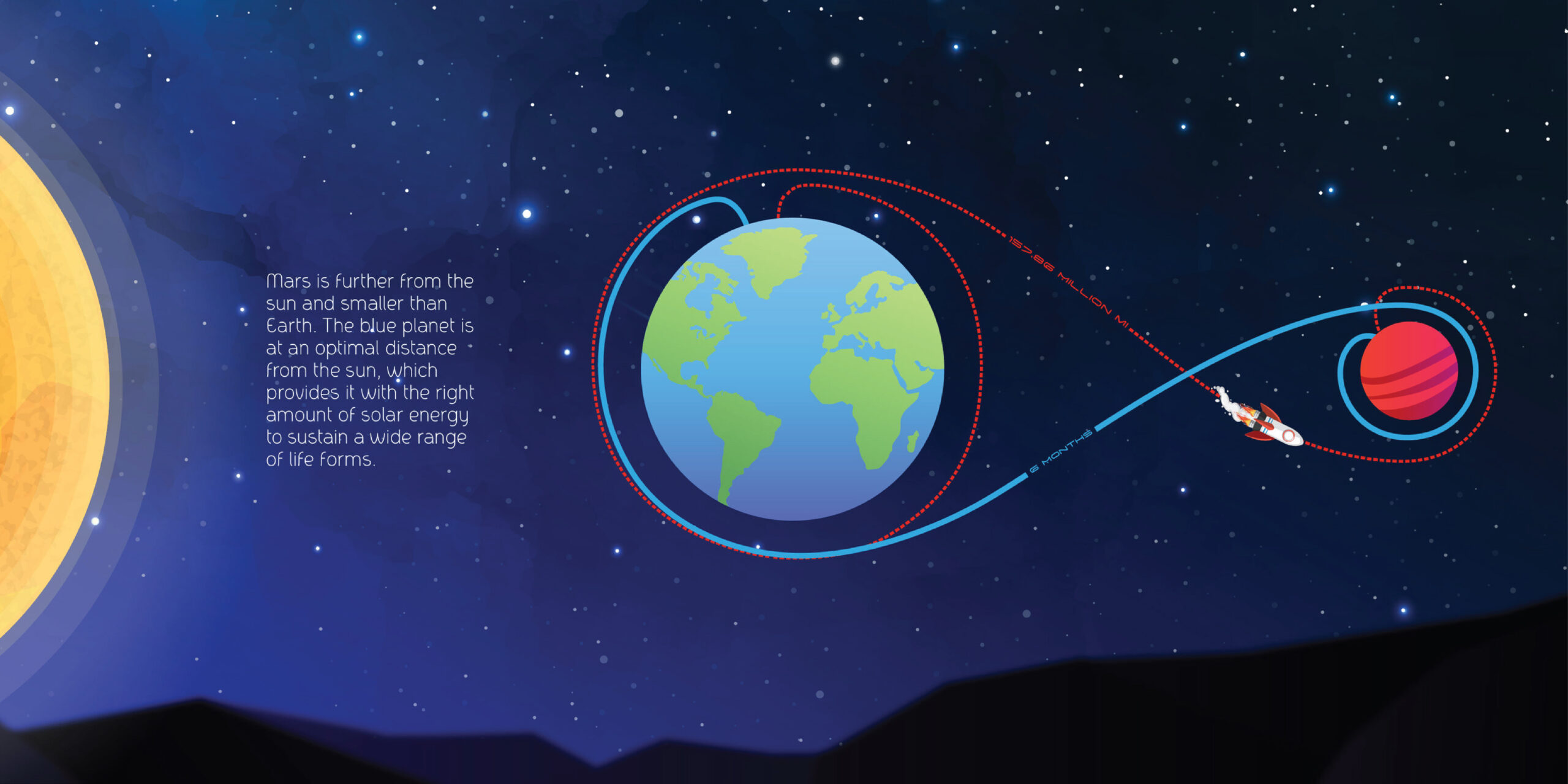
Mars is easy to measure but hard to understand. Numbers can describe it, but they don’t bring it closer. My mars data visualization project began with a simple question: what if design could bridge the distance between science and human perception? What if the cold precision of planetary data could be reimagined as a visual story, one that anyone, from a child to a professional, could intuitively grasp?
Translating complexity into clarity
The work began deep within NASA’s archives, climate records, atmospheric compositions, geological mappings, and orbital analyses. Each dataset was vast, intricate, and uninviting. But design doesn’t fear complexity; it reorganizes it. Through visual semiotics, cognitive mapping, color theory, and narrative structure, I translated those scientific abstractions into patterns of meaning. The goal wasn’t to simplify the data, but to find its rhythm, the pulse hidden beneath the graphs.
Design, in this context, became a language of empathy. For children, Mars was reborn through expressive color fields, rounded geometry, and tactile playfulness—visuals that invite curiosity and spark questions rather than deliver answers. For adults, the system evolved into something more meditative: atmospheric gradients, precise linework, and editorial pacing that mirror the cadence of scientific reading. Together, these two design systems form parallel narratives that translate the same planet through different emotional grammars.


Encounters, not charts
Each visualization is not a chart but an encounter—a way to feel the Martian cold, the weight of its thin air, the long patience of its orbit. The data’s story emerges not from what it measures, but from how it’s seen. That is where design’s strength lies: in transforming measurement into experience, precision into perspective.


Design as interpretive intelligence
In a world drowning in information, this project argues for design as a form of interpretive intelligence. Data alone doesn’t make meaning; it waits for design to awaken it. Every chart, map, and dataset is a silent conversation until someone gives it voice—through composition, color, hierarchy, and narrative flow. The designer’s role is not to beautify facts but to translate them into human insight. This act of translation is not purely aesthetic; it’s ethical. It decides what people notice, what they value, what they remember. In that sense, design holds a quiet but immense responsibility, to make truth visible without distortion, to turn knowledge into understanding.

Empathy in the rational
When seen through that lens, Designing Mars becomes less a project about a distant planet and more a reflection on how we process the universe around us. It suggests that empathy can exist in the most rational of fields, that even planetary science can be reimagined through emotion, curiosity, and wonder. The project was recently honored as a Silver Winner at the 2025 Spark Design Awards, a recognition that reinforces its central idea, that the future of information design lies in its ability to move people, not just inform them.
This project stands on a simple belief: design is not an accessory to science, it is the lens that makes science human. When we redesign how information is seen, we also redesign how it is understood. Through deliberate visual language, Mars transforms from a remote field of data into a world we can comprehend, connect with, and imagine. That is the quiet power of design, it doesn’t just clarify information; it brings the universe closer.


Rhea Shukla
Rhea Shukla is an award-recognized visual experience designer working across brand systems and digital experiences. She holds a Master’s degree from the Savannah College of Art and Design and currently works at a marketing and advertising agency, translating complex ideas into clear, human-centered visual narratives.
- Rhea Shukla


