
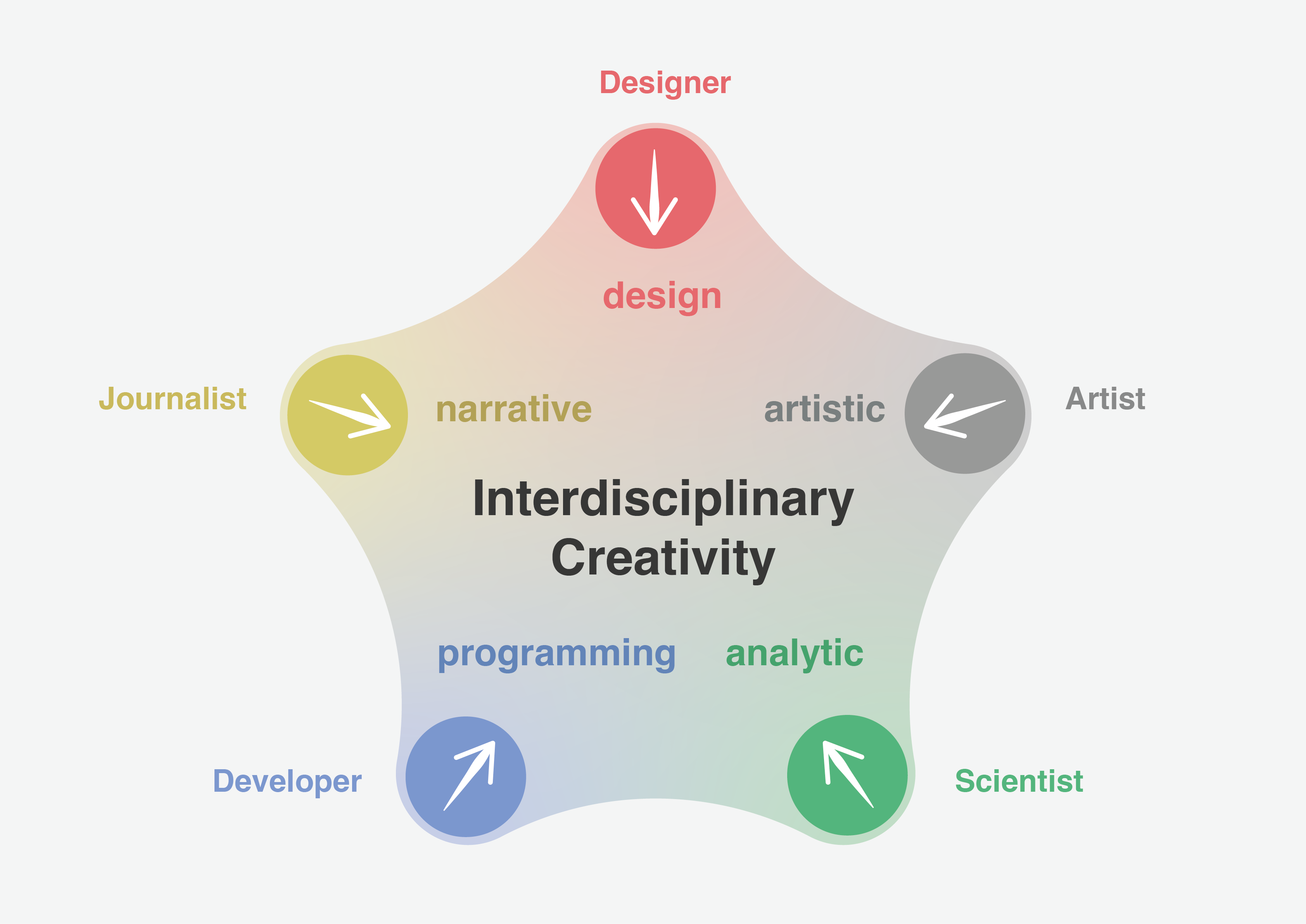
The problem: collaboration without predetermined context
The context of Complexity Science Hub (CSH) has afforded us the opportunity to ask difficult questions about the collaborative nature of visualization. CSH is an institution that operates within an international network of like-minded institutions, fostering a dynamic exchange of knowledge and talent. While data visualization often involves collaboration between teams with different skill sets, a dominant business context generally drives the team’s communication goals. What would be the result of a collaboration environment with no predetermined dominant context? What would be the result of a team collaboration in which different skills were treated as colors of a palette, where each skill added its strength, where the team itself decided the concept and direction of the project? Could we use Complexity Science problems to create an environment in which all professional disciplines—scientists, journalists, artists, designers, developers—could provide their own type of creativity, that ability to produce results that are both novel and appropriate?
Complexity Science is a new scientific practice that is inherently interdisciplinary. It links state-of-the-art mathematics, modeling, data, and computer science with fundamental questions posed by various disciplines, such as medicine, economics, ecology, or social sciences. The results of complexity science research can be cross-disciplinary and conceptually abstract. Some recent CSH publications include a Maximum Entropy model that can be used to generate new melodies emulating a given musical corpus, an analysis of how a social media landscape (aka the platform formerly known as Twitter) endangers science communication, and the impact of the Russia-Ukraine war on global food production. Each of these scientific publications includes some form of data visualization to address the difficulty of communicating complex mathematical relationships to a general audience. Visualizing the results of this research demands expertise in a combination of graphic design, visual narrative, visual art, data analysis, and programming skills.
Each of these skills generates its own perspective, but perspectives are not equal to skills. We know that bringing together teams with multiple skills can produce better visual communication for a general audience, but the associated perspectives are always shaped by the team’s context. While a few large news organizations have teams that include journalists, designers, developers, and analysts working together, their context is the production of journalism. Visualizations on the same subject can be very different from those created by a team focused on artistic production or data exploration.
The Visualizing Complexity Science Workshop
We hypothesized that the interplay within a team with diverse skills tasked with visualizing complexity science projects would produce a different kind of interdisciplinary creativity. To test this hypothesis, we created the first iteration of a Visualizing Complexity Science Workshop in 2023. The program was conceived by Liuhuaying Yang, CSH data visualization researcher, in collaboration with Paul Kahn, and took place at CSH Vienna over five consecutive days. The shared goal was to engage people from different backgrounds in a collaborative effort to visualize results from actual complexity science research projects.
Workshop participants were recruited through a call for participation that sought to attract people with any combination of professional experience from the five disciplines. In Table 1 we describe the disciplines in terms of the skills and strengths of a practitioner and the skills typically missing or weak.


We expected that the interplay of these characteristics and needs would produce self-organizing teams with diverse skills. We hoped that combining the team’s expertise would result in a form of interdisciplinary creativity that could be applied to the specific challenges of visualizing complexity science projects.
The call for participation attracted sufficient participants from a variety of professional backgrounds to create six teams. As we anticipated, the five disciplines were not equally represented. We had more scientists than journalists and more designers than artists. At the same time, we had many participants whose professional experience combined several roles. Participants included journalists with science backgrounds, designers and scientists who did visual art, and developers with science experience.

To establish a supportive and collaborative environment for the participants, we added three elements.
Complexity Science research projects
We wanted the workshop to closely resemble the task of visualizing complexity science research. With that goal in mind, we recruited researchers from Complexity Science Hub to lecture on their respective research ideas from a current scientific paper. Dr. Eddie Lee and Dr. Dániel Kondor chose to share their research problems. Each scientist prepared a presentation and large datasets that could be used as the basis for visualizations.
Lee’s research (Forests) examined growth, death, and resource competition in forests. He shared a paper recently published in PNAS, along with growth data for forests as diverse as Alaska and Panama. His research explored the mathematical relationships of growth, identifying formulas that predict the scale and distribution of trees in forests, among other growth patterns.

Kondor’s research (Farmers) proposed a competition model to explain the rise and fall of population among the communities that spread the agricultural ‘neolithic package’ from east to west across Europe. The neolithic population estimates are based on extensive archeological investigations and Carbon-14 dating. Kondor’s recent paper addressed the question of what may have caused periodic population declines. His team had developed a model to simulate the spread of population and predict the conflicts that would result from competition for resources.
Self-assessment and team formation
We solicited a structured self-assessment from each participant concerning their areas of professional interest, familiarity with software tools, competencies in data analysis, programming, and visual design. We used this information to design individual name badges that reflected each participant’s professional experience and their relative analytic, visual, and coding strengths. These name badges became a tool for team-formation exercises.
The team formation process began with brief presentations by each of the participants. Each participant presented themself to the group, followed by a structured series of one-on-one discussions. The group was divided into inner and outer ‘rings’ that rotated to give everyone a chance to present and question each other. These rings were then further divided until everyone had a chance to speak directly to each other.
We also asked each team to consider three kinds of visualization contexts:
- Presentation: visualization to communicate ideas to a professional audience in a paper or lecture
- Dissemination: visualization to educate and engage with a broad audience in a narrative, interactive, or animated format
- Exhibition: visual installation to educate and engage a broad audience in a museum or public space
Following these one-on-one interactions, and given this information about the projects, context, and individual strengths and weaknesses, we challenged the group to form teams and report their choices. Our main concern was that there be at least one person on each team capable of processing the large datasets. The participants self-organized into four-to-six person teams. Two teams chose to work on the Farmers, while four teams chose the Forest project. Once the teams were formed, it became clear that the self-organizing process resulted in a good mix of data capabilities and professional backgrounds.
Guest speakers
We invited experts from the fields of journalism, complexity science, data visualization, and art to present their work. The eight speakers were:
- Dr. Dirk Brockmann, Professor at the Institute of Biology at Humboldt-University of Berlin, on complexity science visualization;
- Meng Wei, head of the Caixin Vislab in China, on data journalism;
- Jen Christiansen, senior graphics editor of Scientific American, on scientific illustration;
- Dr. Samuel Huron, associate professor at Télécom Paris, on physical data visualization,
- Robin Meier Wiratunga, artist and composer, and Dr. Guy Amichay, a postdoctoral fellow at Northwestern University, on art installation;
- Alberto Pino, artist and printmaker, on engravings based on NetSci conference papers;
- Paul Kahn, information designer, on historical data visualization examples.
These talks were intended to inspire the workshop participants and inform them of different perspectives towards visualizing scientific ideas and concepts. We saw examples of art museum installations and scientific publications, web-based interactives for the general public in China and for the international scientific audience, examples of visualizing data with physical objects and visual connections between historical and contemporary examples. Our speakers attended the workshop and were available to speak with participants and critique team exercises and presentations during the workshop.

Exercises
In addition to speaker talks and teamwork, we created three group exercises to give all participants a chance to present visual ideas.
The Ideation exercise was a challenge to articulate and present ten ideas related to the chosen research and datasets. Each team was asked to converge on three ideas and present them to the group.
The Data Sketch exercise challenged each team to find as many unique data patterns as possible in their datasets. Everyone then competed to present a data pattern, making sure not to repeat anything already presented.

The Blueprint and Sketch exercise gave each team an opportunity to report on their progress toward choosing a visualization idea and audience. Each team chose someone to present this first draft of their ideas. This was followed by two sketching exercises. First, each participant sketched a visualization based on their team’s blueprint presentation. Second, everyone was asked to choose a sketch from another team, and revise that visualization in a more creative way.
Results from the first workshop
The results from the first workshop were encouraging on several levels: technically, creatively, and socially.
Technically, we found that the teams were able to understand the scientific and mathematical concepts along with the datasets presented by the scientists. All the teams were able to use the data as the basis for their visualizations. The combination of skill sets within the teams supported the basic collaboration needed to support creative thinking.

Creatively, the content, context, and collaboration time allowed each team to produce final presentations they could be proud of as first iterations. A five-day workshop is a large commitment for professionals and a short time in which to produce sophisticated results. Within these constraints, all of the teams were able to build the first iterations that visualized the complexity science data for their chosen context and audience. Many of the presentations were made up of distinct parts that would benefit from further revision and integration. The dominant context chosen by the team was Dissemination, while the intended audiences for the presentations varied from general adults to science students to young children. The chosen format for the visualizations varied widely. The teams employed a broad range of visual strategies. Final presentations included scrollytelling narratives, web-based applications, time-based animation of forest growth, sonification of data combined with animations and charts, comparisons of real-world and model-based datasets, and illustrated storybooks. One of the workshop participants, Rutuja Pawar, described the data humanism strategy employed by her team in her article Art in Numbers.

Socially, we noted the enthusiasm expressed by many participants for this chance to think, work, and create outside of their usual professional constraints. Perhaps this was the most noticeable result of having no predetermined dominant context for the visualizations. Many participants, whether they worked as data analysts, research scientists, or business journalists, were able to use their creative talents outside the constraints presented by their usual professional roles. The results were intellectually challenging and personally satisfying.

Future work: Visualizing Complexity Science Workshop 2024
Based on our initial experience, we have decided to offer a second iteration of Visualizing Complexity Science Workshop in August 2024, with some modifications to the program. We hope to improve the interaction between the scientists and the teams by providing more time for Q&A sessions. We will also reduce the number of speakers and design exercises to provide more time for teams to focus on developing their initial blueprints and final presentations. The scientific theme for the project will change. Both Lee and Kondor’s projects involved system modeling in physical space. Projects chosen for this second workshop will study how relationships emerge and evolve in network space. We will encourage teams to explore beyond network visualizations for communicating research, considering alternative visual representations or communication methods that may better convey the findings’ essence.

Liuhuaying Yang, a data visualization practitioner based in Vienna, serves as both a researcher and faculty member at the Complexity Science Hub. With a Master of Fine Arts in Information Design and Visualization from Northeastern University, her expertise lies in crafting interactive and customized data visualizations. Her work "Four Seasons" earned first place in the interactive category of the World Dataviz Prize 2023.

Paul Kahn’s engagement with visualization of large knowledge structures began with hypertext research projects in the 1980s and continued with the development of diagram techniques for describing information architecture. He taught Information Design History for 7 years at Northeastern University’s Information Design & Data Visualization program. He created Kahn+Assoc., the first agency in France focused on information architecture, preceded by a decade leading Dynamic Diagrams in Providence RI. He served as Experience Design Director at Mad*Pow and now devotes himself to teaching and writing in France. In 2020 he led Covid-19 Online Visualization Collection (COVIC), and has written about insights from the thousands of visualizations created during the pandemic.
-
Paul Kahn

-
Paul Kahn

-
Paul Kahn

-
Paul Kahn


